
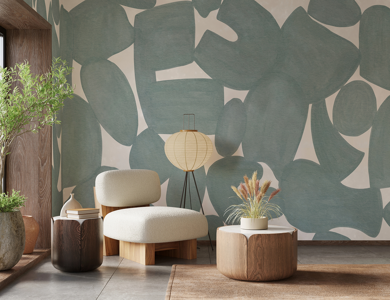
Blue is the colour most people reach for when they want a room to feel calm, and it is usually the safest choice in the house. Abstract designs are what stop it being the dullest. Whether you are drawn to a soft watercolour wash, a gradient fading from deep navy to almost white, a graphic geometric or a simplified floral, blue abstract wallpaper stretches from a quiet backdrop all the way to a full statement wall. Because that range is so wide, the real decision is not whether blue suits your home, but how much you want the wall itself to do.
In this guide, we'll walk through the different blue abstract wallpaper styles, compare which rooms each one suits, weigh up pattern against mural and light against dark, and share the colour and material pairings that keep blue feeling warm rather than cold. You'll also find twenty of our favourite blue abstract designs, with notes on where each one earns its place.
What Are The Different Blue Abstract Wallpaper Styles?
Blue abstract wallpaper spans a wide range, from soft painterly washes and gradient fades to hard-edged geometrics and simplified florals. The styles below each bring blue into a room in a different way, so the right one depends less on the colour and more on how much movement you want on the wall.
Blue Abstract Watercolour Wallpaper
If you love the idea of a mural but not a defined subject, abstract watercolour is the middle ground. Washes of blue bleed into one another the way paint does on wet paper, suggesting hills, water or weather without committing to any of them. The softness is the point, and it is what makes these designs so easy to live with over years rather than seasons. They pair naturally with cream, oatmeal and pale timber, and they give a plainly furnished room the one thing it usually lacks, which is movement.
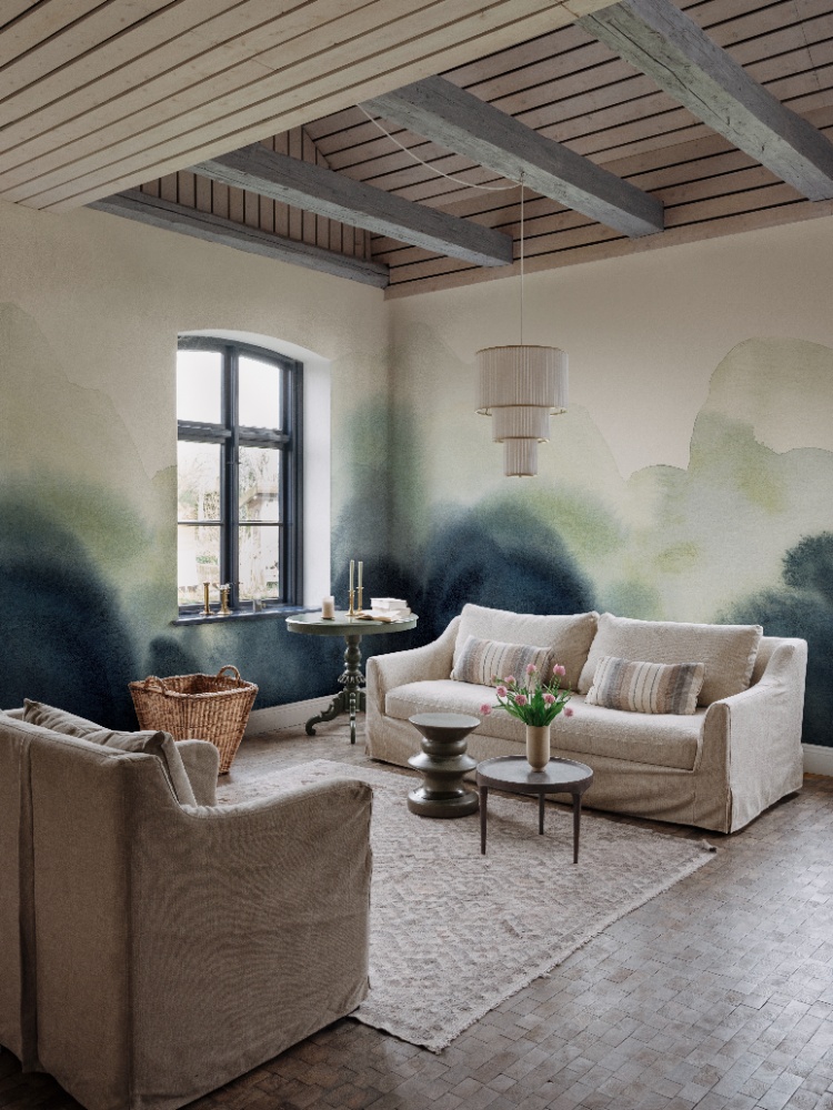
Featured: Flowing Hills, Abstract Mural Wallpaper
Explore the different types of abstract watercolour wallpaper, the best rooms to use them in, how to choose the right colours for your space, and practical styling tips to help you create a cohesive and beautiful home.
Blue Abstract Geometric Wallpaper
For a sharper take on blue, geometric designs bring structure where watercolour brings atmosphere. Arches, blocks, curves and repeating shapes hold their edges, so the wall reads as deliberate and graphic rather than dreamy. A soft teal or slate ground keeps that structure from feeling cold, and a contrast outline in cream or mustard adds warmth without altering the palette. Reach for this style in a living room or home office with mid-century or modern furniture, where clean lines elsewhere give the pattern something to answer to.
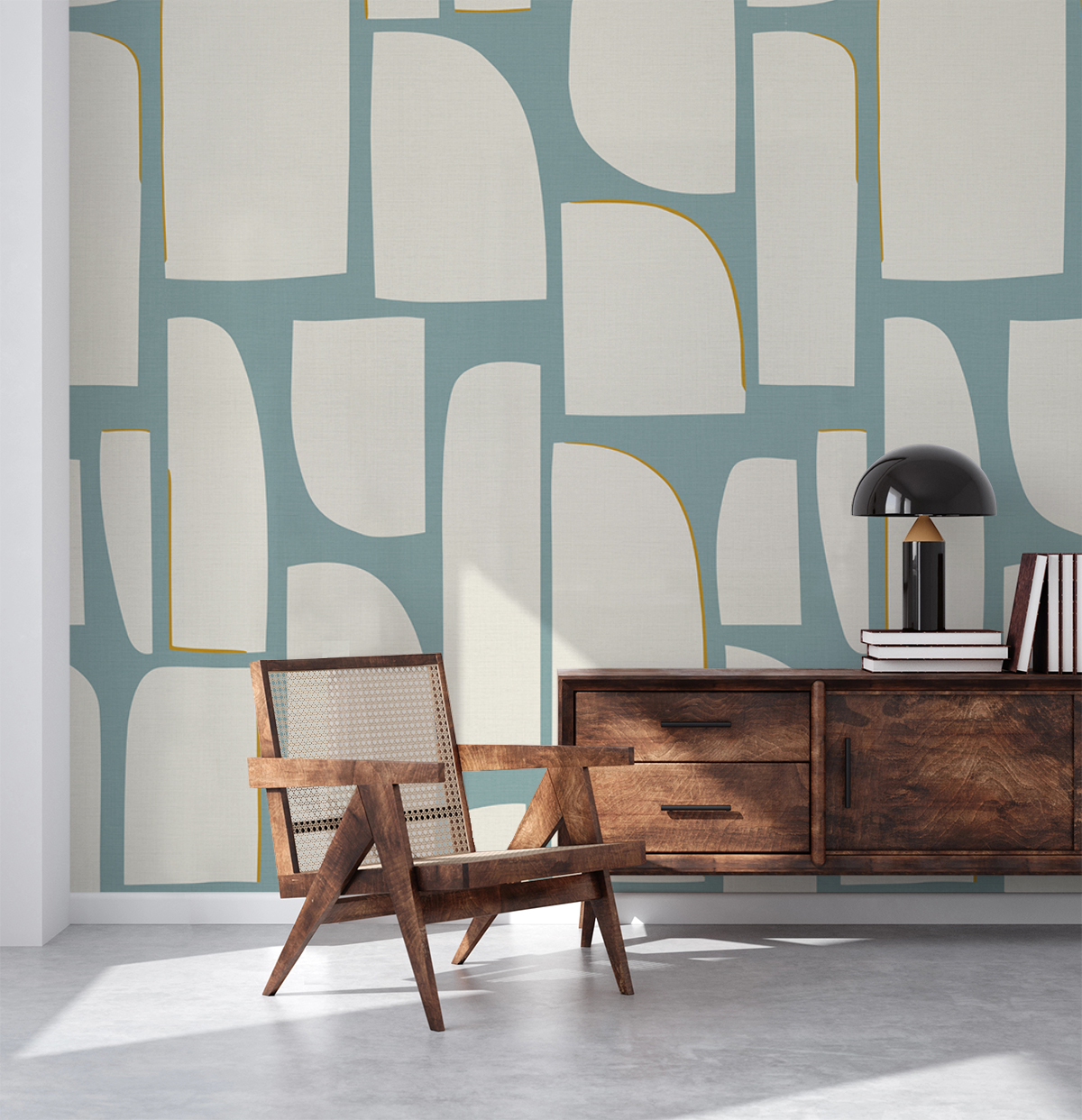
Featured: Arch Blocks, Geometric Wallpaper
Explore different abstract geometric wallpaper styles, best rooms, practical styling tips, and inspiring designs to help you find the perfect wallpaper for your modern home.
Blue Abstract Floral Wallpaper
Abstract floral keeps the shape of a flower and drops the detail, which is what makes it feel current rather than traditional. Silhouettes, oversized stems and simplified blooms sit against a flat blue ground, giving you the softness of a floral without the fussiness of a small repeating print. Scale sets the mood here: large, widely spaced forms feel calm and contemporary, while denser patterns read busier. Bedrooms take this style particularly well, especially when the stems rise behind the headboard and the rest of the room stays quiet.
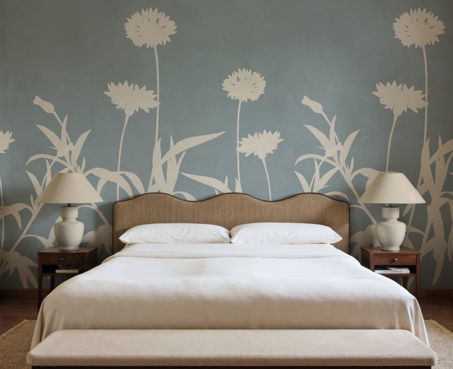
Featured: Floral Silhouette, Mural Wallpaper
Browse our full collection of abstract floral wallpaper designs and find the one that feels like home, one bloom at a time.
Blue Star And Galaxy Wallpaper
Blue star and galaxy wallpaper sits at the atmospheric end of the abstract range, turning a plain wall into a night sky of inky navy and midnight tones scattered with stars, gold flecks and soft nebulae. It reads as calm rather than busy, because the design is mostly open space with detail drifting through it. That makes it a natural fit for bedrooms and children's rooms, where you want a wall that rewards a second look at bedtime without keeping anyone awake. Deep blue also does something useful in a room with a lot of daylight, absorbing glare and giving pale furniture something solid to sit against.
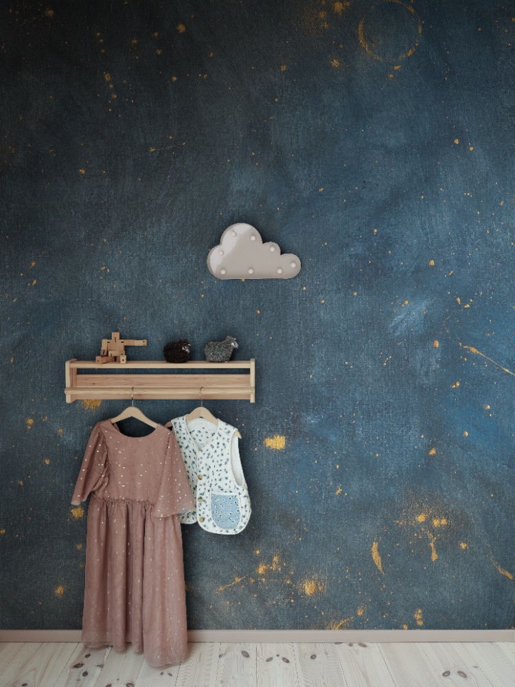
Featured: Sky Star, Mural Wallpaper
Featuring breathtaking cosmic scenes, twinkling stars, and mesmerizing nebulae, our star and galaxy wallpapers bring the magic of space into your home. Perfect for creating a dreamy, celestial ambiance in any room.
Blue Sky And Cloud Wallpaper
Whether you prefer a pale morning sky or something moodier and closer to dusk, blue sky and cloud wallpaper is abstraction at its softest, bringing height and air into a room. A cloudscape has no repeat to trace and no hard edges to line up, so the eye keeps moving and the wall feels further away than it is. Ceilings look taller, corners look softer, and a low room feels less boxed in. It suits living rooms and bedrooms in particular, where you are usually seated and looking across a wall rather than straight at it.
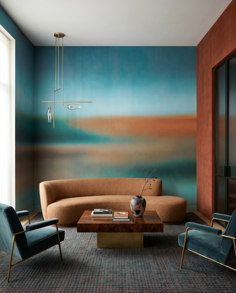
Featured: Rotko Clay, Ombre Mural Wallpaper
From soft, pastel skies to dramatic cloudscapes and dreamy sunsets, our sky and cloud wallpapers evoke a sense of calm, lightness, and spaciousness — perfect for creating a peaceful retreat at home.
Blue Ombre Wallpaper
Ombre is the quietest abstract there is, and the simplest way to bring blue into a home. A single colour fades from deep to almost nothing across the wall, so you get the weight of a dark shade low down and the lightness of a near-white towards the ceiling, with no pattern competing with your furniture. Grey-blues and slate tones are the most forgiving, sitting comfortably beside timber, linen and brass. If you have hesitated over a bold feature wall before, this is usually the version that wins people over.
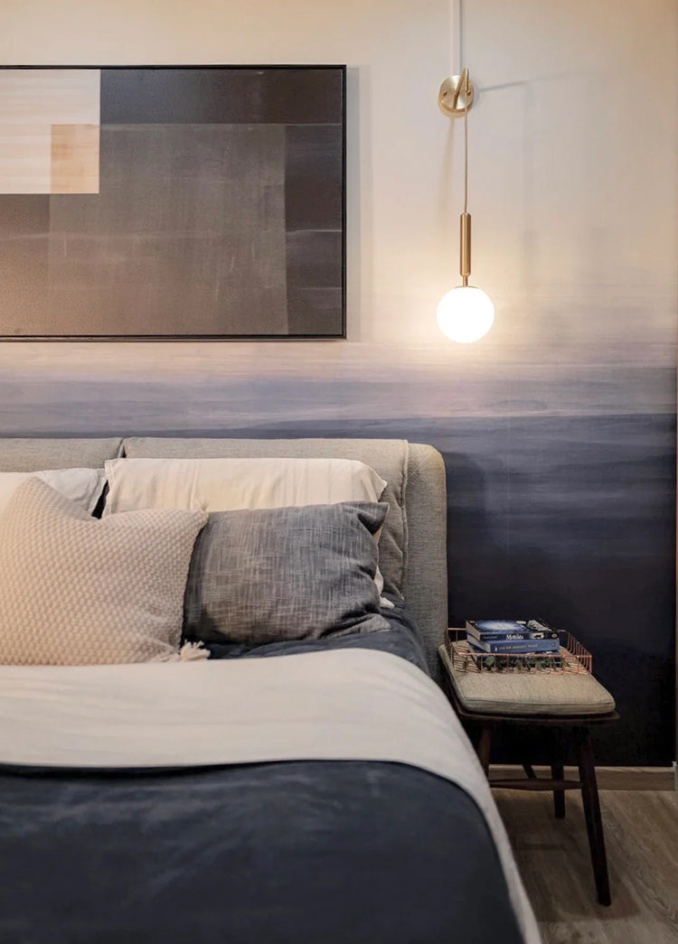
Featured: Gradient Ombre, Mural Wallpaper
Discover more ombre wallpaper ideas and why everyone is loving this trend.
Blue Ocean Wallpaper
Few things carry blue as convincingly as water. Ocean wallpaper works in that register, running from small marine motifs to full seascape murals with swell, spray and depth built in, and the more abstract end of the style, where water is suggested through washes of colour rather than drawn in detail, is the version that holds a full wall best. Because the tones shift constantly, from pale surface light through to deep indigo, the effect is immersive without feeling heavy. It earns its place in bedrooms and bathrooms, where the association with water already suits the room, and in any space you want to feel a few degrees cooler and calmer than it really is.
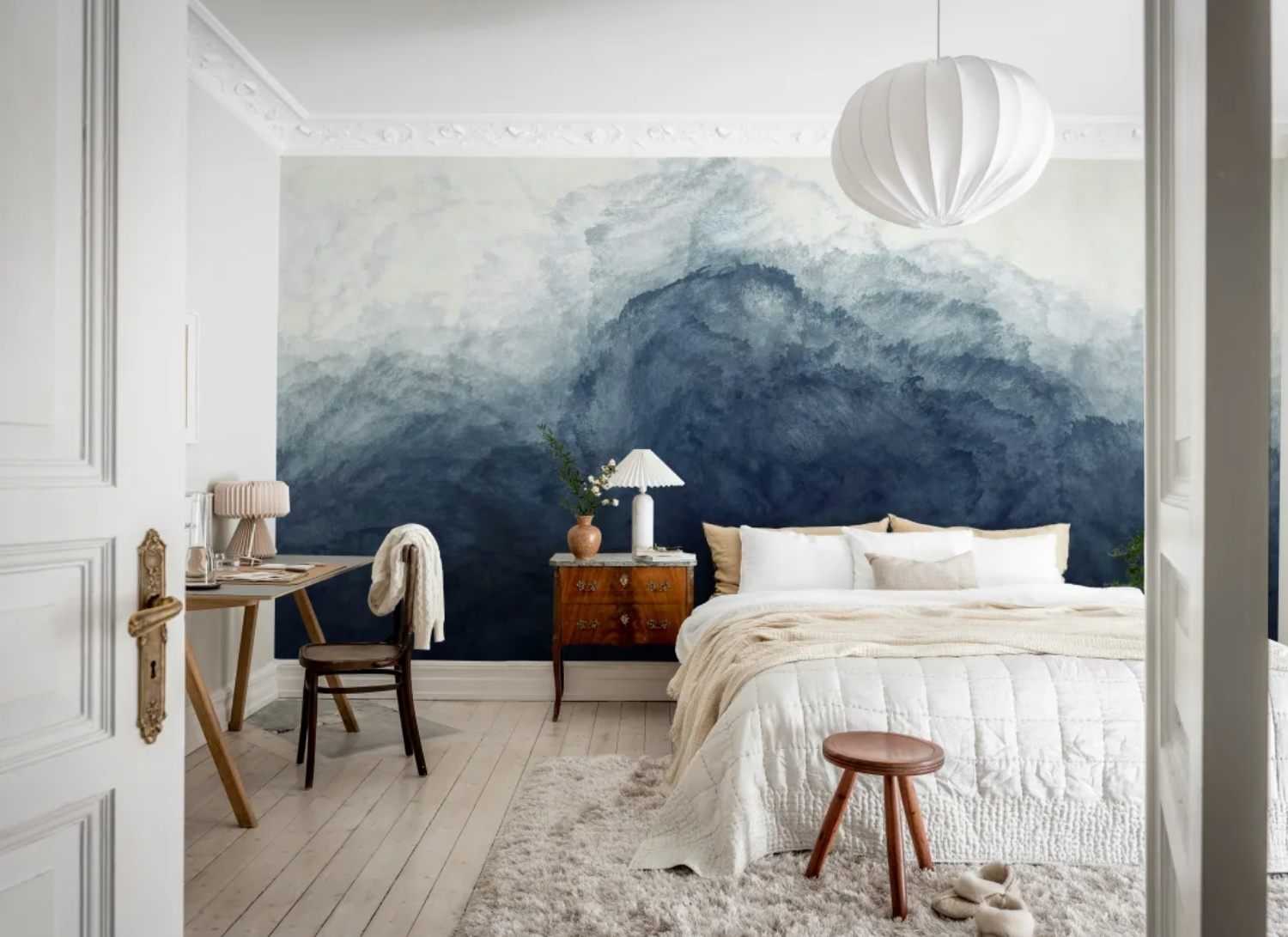
Featured: Abstract Watercolor, Mural Wallpaper
Whether you prefer subtle marine motifs or immersive seascape murals, ocean wallpaper creates depth, balance and a lasting sense of calm throughout your home. Discover more ocean wallpaper designs.
Blue Landscape Wallpaper
Mist over a treeline, a distant ridge, a valley fading into haze. Blue landscape wallpaper puts a view on the wall of a room that may not have one, and the softer, more abstract versions where detail dissolves into atmosphere are the ones that read best at full-wall scale. Blue is the colour distance naturally takes, which is why these designs feel so convincing. The palest tones sit at the horizon and the strongest at the base, giving the wall a clear top and bottom that helps it settle in a smaller space. Hallways, bathrooms and studies all benefit, since each is somewhere you pass through or sit in briefly.
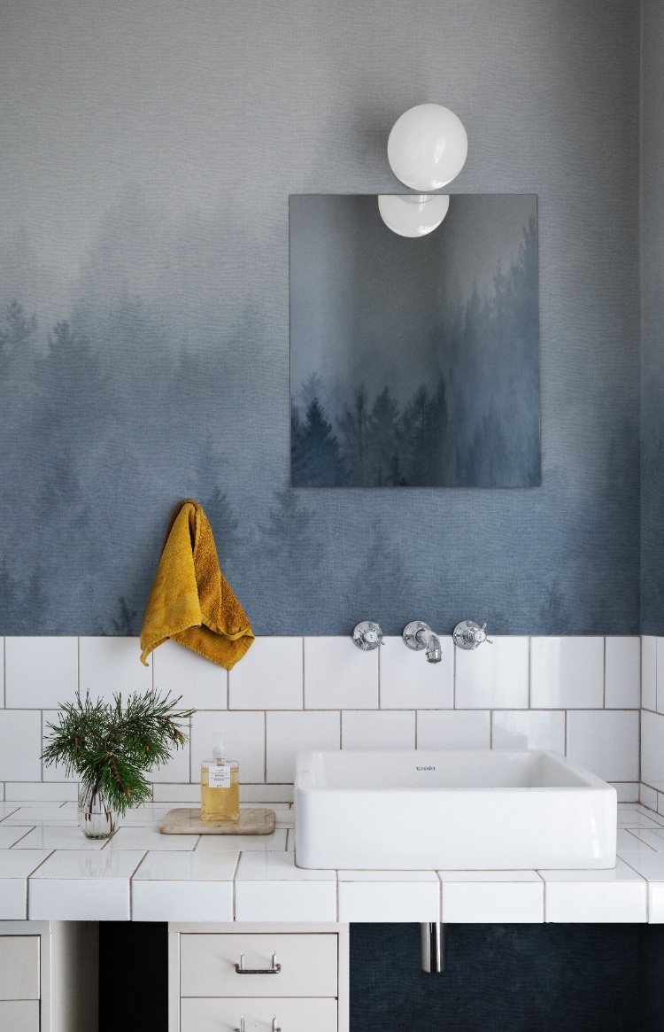
Featured: Cloudy Forest, Mural Wallpaper
Immerse yourself in the breathtaking beauty of our landscape wallpaper designs.
Which Rooms Are Best For Blue Abstract Wallpaper?
Blue abstract wallpaper works in almost every room, but the version that suits each one differs. Living rooms and bedrooms take large, soft murals best, dining rooms can carry stronger pattern, and offices and children's rooms want the palest end of the range.
Blue Abstract Wallpaper For The Living Room
The living room gives blue abstract wallpaper the most space to work, and it is the one room where a full-wall mural usually beats a repeating pattern. You sit three or four metres back from the wall here, far enough to take in a gradient or a wash in a single view, which is exactly the distance these designs are drawn for. Blue also holds up against the warm materials most living rooms already have, so olive, tan, walnut and brass all sit comfortably beside it. Hang the mural behind the sofa or on the wall facing the main window, and check where the darkest band of your gradient falls before ordering, since anything below roughly 60cm from the floor disappears behind the seating.
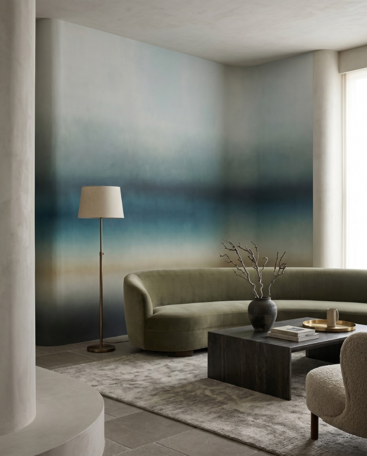
Featured: Rotko Blush, Ombre Mural Wallpaper
Discover more living room wallpapers that not only reflect your personal style but also help create a warm, welcoming atmosphere your whole family will enjoy.
Blue Abstract Wallpaper For A Kid's Room
In a child's room, the argument is for keeping blue soft. A pale, gradual ombre gives you colour on the wall without the visual noise of a character print, and it still suits the room when a toddler becomes a teenager, which is the practical reason it outlasts most nursery decisions. It also leaves room for everything else a child's room accumulates, since framed prints, shelves and toys all read clearly against a graded wall in a way they never do against a busy pattern. Put the palest part of the gradient at the top so the ceiling stays bright, and if the cot or bed sits against the mural wall, measure the headboard height first and confirm the colour you actually want to see still sits above that line.
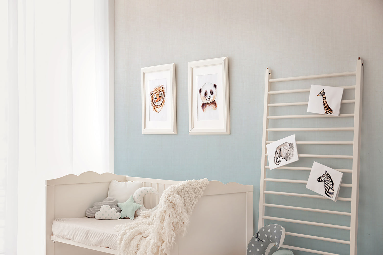
Featured: Tessa, Ombre Wallpaper
Choose your child's favourite design from our curated collection of kids wallpapers.
Blue Abstract Wallpaper For A Home Office
A home office wall has a job no other wall does, which is to hold your attention when you look up and release it when you look back down. Soft blue and blue-green watercolour designs manage that balance better than most, calm enough to work in front of, interesting enough that the room does not feel like a cupboard with a desk in it. Keep the palette pale if your desk faces the wall, because a dark mural at arm's length competes with a screen and tires the eyes over a full day. Large, open shapes beat small repeats for the same reason. If you take video calls, put the mural on the wall behind your chair, where it reads as a considered backdrop rather than a pattern crawling behind your head.
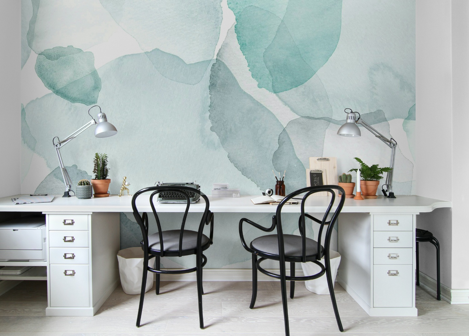
Featured: Shadow Petals, Abstract Mural Wallpaper
An office doesn't have to feel dull or uninspiring. Whether you're drawn to calming scenery that helps you unwind and refocus, or energising patterns that boost creativity, our collection of modern office wallpapers is designed to support the way you work.
Blue Abstract Wallpaper For The Dining Room
Dining rooms carry more pattern than anywhere else in the house, because you use them in short bursts and usually with the lights low. That is what makes a stronger blue viable here, whether it is a graphic brushstroke stripe or a bolder geometric, and why this is one of the few rooms where papering all four walls still works. Blue has a reputation for feeling cool, so warm it with what you already own, since timber, rattan, terracotta and warm lighting all pull it back. Aim for 2700K bulbs rather than anything above 3000K, which flattens a mid-blue towards grey by evening. Check the pattern against your chair-back height as well, because a vertical design interrupted at the same point by six chairs looks accidental rather than planned.
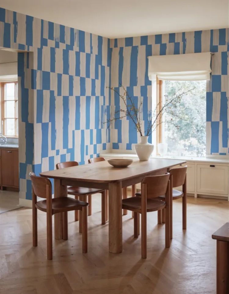
Featured: Broken Stripes, Abstract Pattern Wallpaper
Create a beautiful gathering space with our collection of dining room wallpapers. From traditional patterns and rich colours for formal dining settings, to light, airy motifs for everyday gatherings, our wallpaper designs are curated to suit a variety of styles.
Blue Abstract Wallpaper For The Bedroom
If there is one room blue was made for, it is the bedroom, where the colour's association with rest does half the work before you choose anything else. Deeper, moodier designs come into their own here in a way they can feel heavy elsewhere, particularly across the top of the wall, where a stormy wash sits above the bed and fades out well before it reaches the floor. That fade matters practically as well as visually, since a mural holding its darkest tone at skirting level shows scuffs and vacuum marks far more readily. Bedrooms are also the room you see most often in artificial light, so tape a sample above the headboard and look at it after dark before committing, because blue shifts more between daylight and lamplight than almost any other colour.
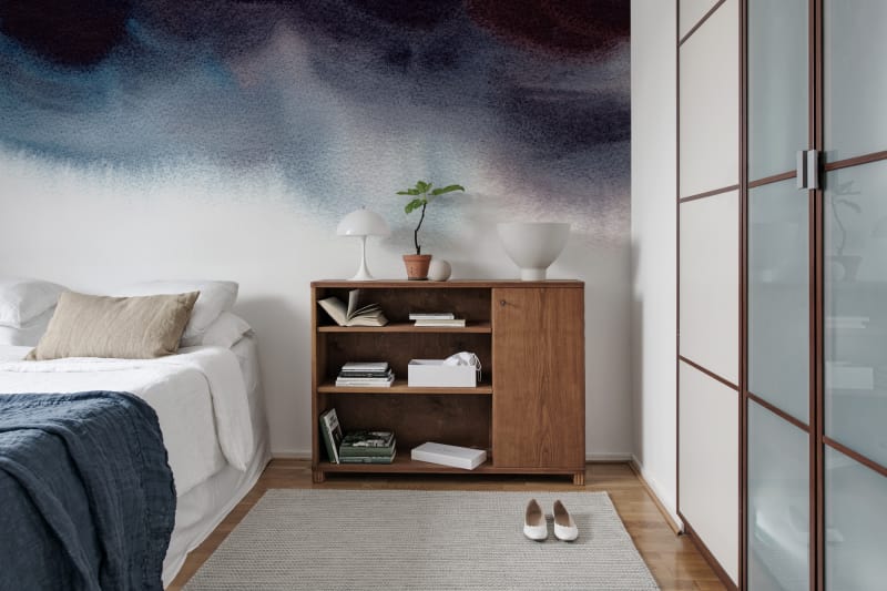
Featured: Merlina, Ombre Mural Wallpaper
Your bedroom should be a sanctuary — a space that reflects your personal style and helps you unwind at the end of the day. Explore our bedroom wallpaper designs to create your perfect retreat.
Blue Abstract Wallpaper #1: Addison Chalk, Ombre Wallpaper
Not every blue wall needs a pattern. Addison Chalk, Ombre Wallpaper gives you the soft, mottled surface of hand-applied plaster in a pale grey-blue, adding depth and a sense of age while still working as a plain backdrop. It is the design to choose when a room already has plenty going on, since framed art, shelving and fluted timber all read clearly against it rather than competing for attention. The chalky finish suits modern, Scandinavian and Mediterranean-inspired interiors equally well, and three colourways mean it can sit cool or warm. A quiet choice, and a hard one to tire of.
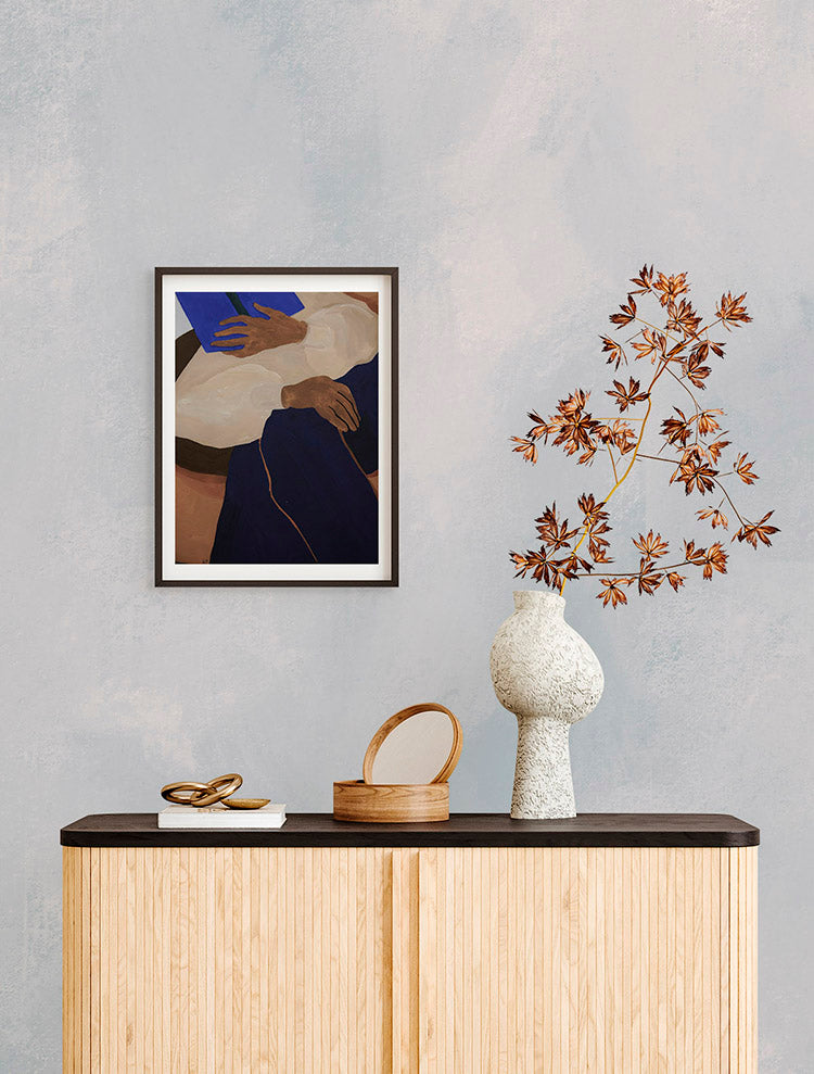
Featured: Addison Chalk, Ombre Wallpaper
Blue Abstract Wallpaper #2: Affluence, Sapphire Mural Wallpaper
For a dining room that should feel like an occasion, Affluence, Sapphire Mural Wallpaper delivers drama without noise. Sweeping gold contour lines travel across a deep, shadowed blue ground in long looping curves, catching the light differently as you move through the room. The contrast between matte ground and metallic line is what gives the design its dimension, so it reads as rich rather than flat under both daylight and lamplight. It suits dining rooms, living spaces, bedrooms and offices where you want an elevated, contemporary touch, and it holds its own against period features such as cornicing and panelled doors.
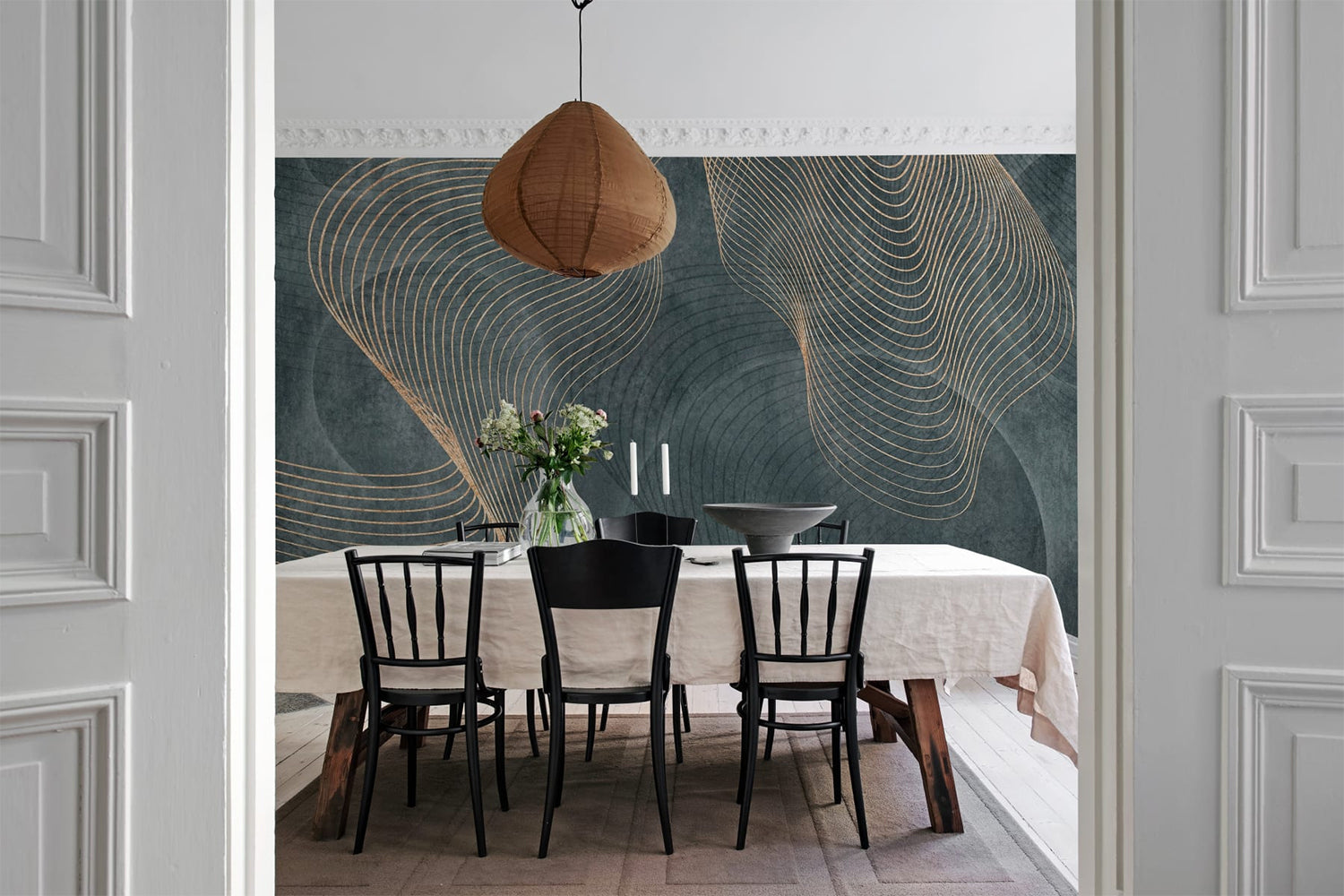
Featured: Affluence, Sapphire Mural Wallpaper
Blue Abstract Wallpaper #3: Agate Crystal, Marble Mural Wallpaper
Few blue abstract designs make an entrance like this one. Agate Crystal, Marble Mural Wallpaper draws on polished agate and fluid marble veining, layering navy, ice blue and white with gold-toned mineral accents that trace across the wall like seams running through stone. Because the pattern shifts constantly, no two sections look alike, which is exactly what stops a large expanse from feeling repetitive. It works across a full wall in an open-plan living or dining space, and pairs well with minimalist furniture, warm woods and brass. Three colourways are available in Blue, Green and Onyx Black.
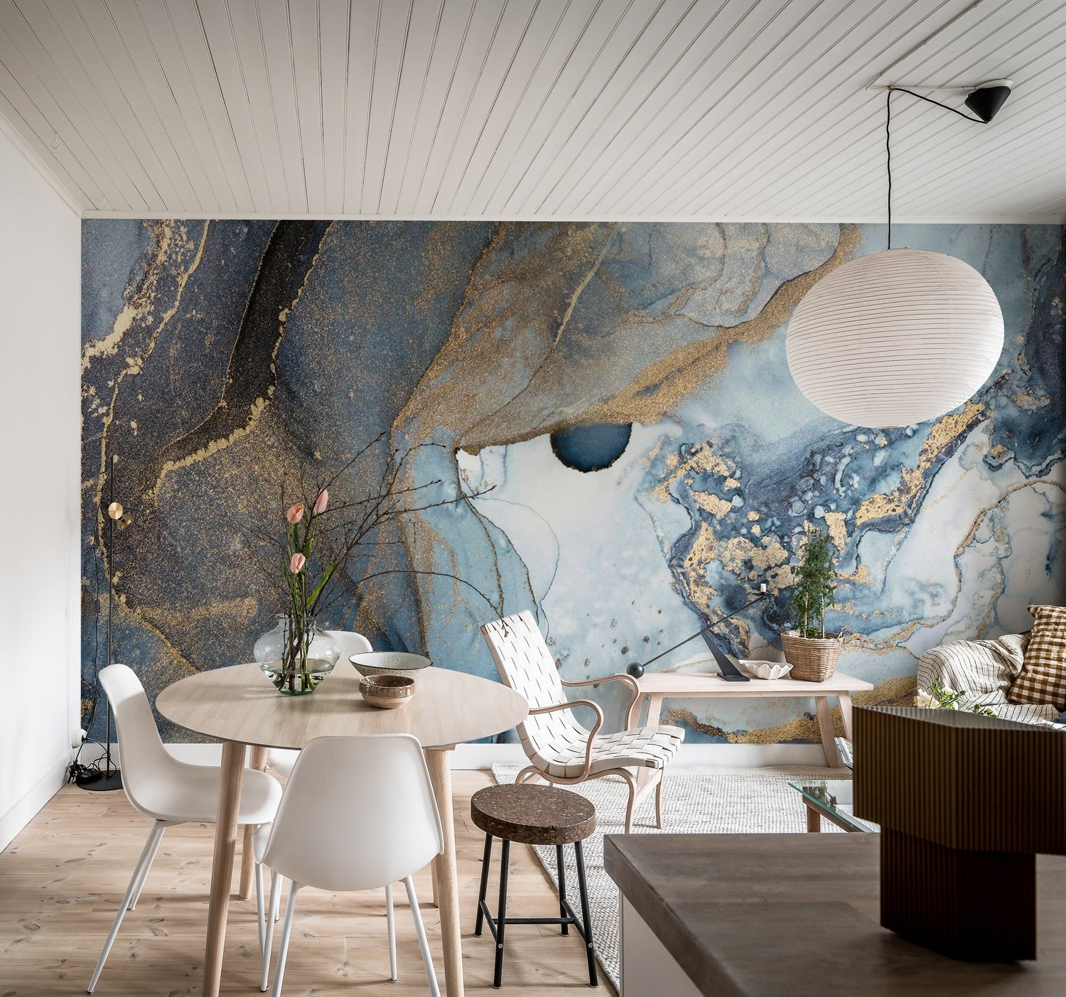
Featured: Agate Crystal, Marble Mural Wallpaper
Blue Abstract Wallpaper #4: Asana, Abstract Mural Wallpaper
Asana, Abstract Mural Wallpaper proves how well a soft blue abstract works in a room you might not expect. Overlapping washes of pale blue, sage and stone drift across the wall, held together by fine drawn lines that give the composition just enough structure to feel deliberate. The earthy palette sits comfortably against natural materials, so wood, linen and rattan all feel at home with it, and it stays calm enough to run behind a busy space rather than adding to the noise. Use it in a kitchen, living room or bedroom where you want colour and movement without a defined subject.
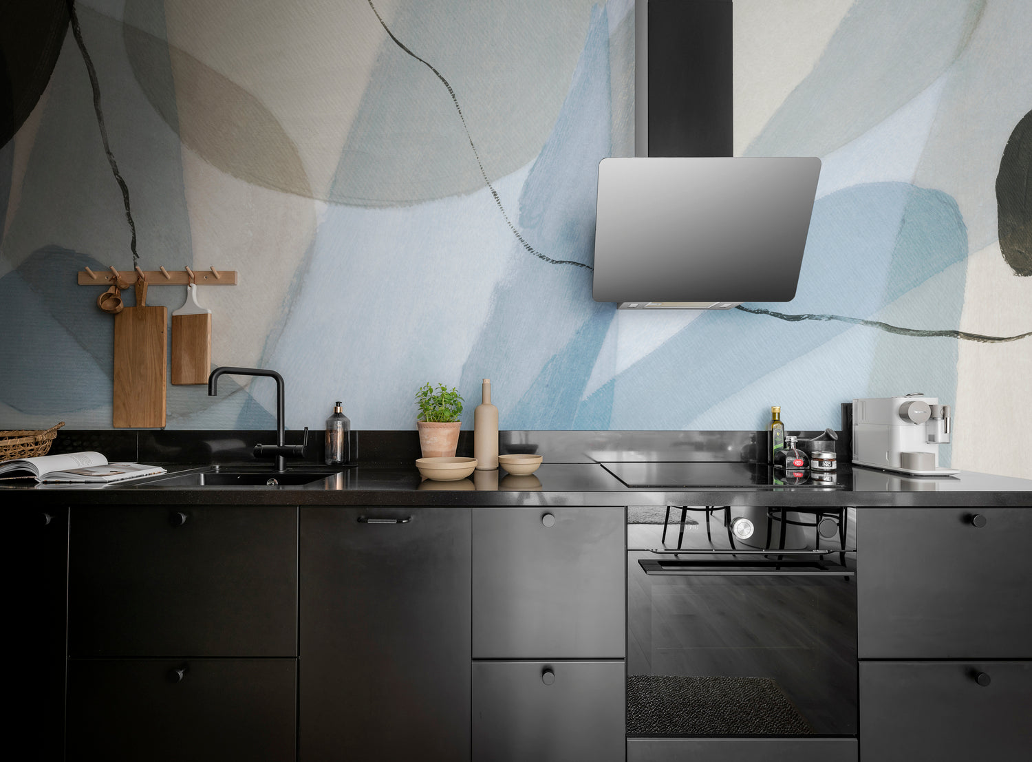
Featured: Asana, Abstract Mural Wallpaper
Blue Abstract Wallpaper #5: Blake Horizon, Ombre Mural Wallpaper
When you want a wall to recede rather than perform, Blake Horizon, Ombre Mural Wallpaper is the one to reach for. A smooth gradient runs from an almost white top through soft grey-blue and into a deeper slate at floor level, with no texture or pattern to catch the eye on the way down. That makes it useful in a room that is already full, since furniture and objects sit clearly against it. It suits bedrooms, living areas and reading corners where rest matters more than impact, and three colourways are available in Blue, Turquoise and Sand.
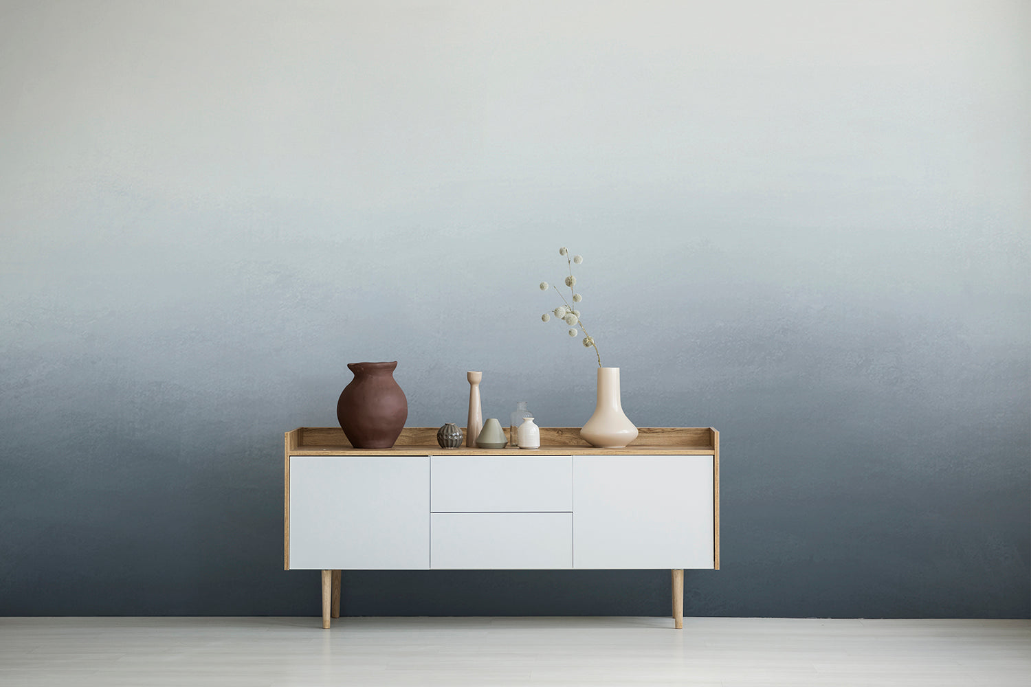
Featured: Blake Horizon, Ombre Mural Wallpaper
Blue Abstract Wallpaper #6: Breeze, Waves Mural Wallpaper
Look closely at Breeze, Waves Mural Wallpaper and the pale surface resolves into millions of fine white lines, etched into an icy blue ground to suggest an undulating sea. From across the room it reads as texture rather than pattern, which is why it can cover every wall without closing a space in. The Japandi influence shows in that restraint, blending Asian design with Scandinavian calm. It is a particularly good fit for a period room with ornate cornicing, where the delicacy of the line work answers the plasterwork above it.
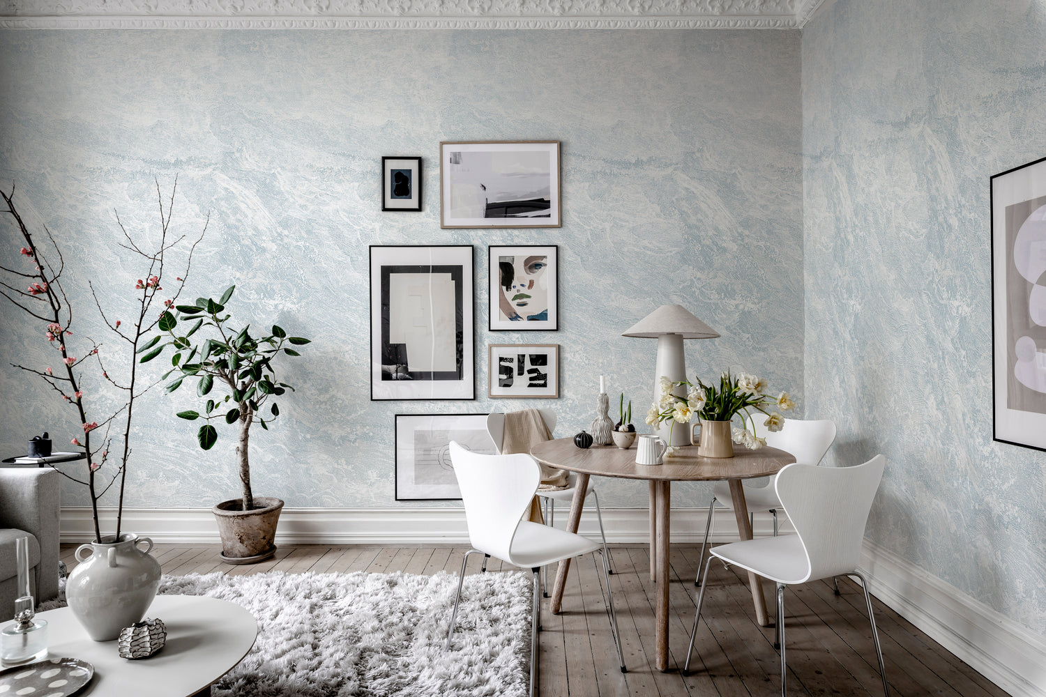
Featured: Breeze, Waves Mural Wallpaper
Blue Abstract Wallpaper #7: Calbri, Ombre Wallpaper
When you want blue at full strength, Calbri, Ombre Wallpaper delivers it. Two tones blend into one another in a slow, faded transition, and in the dark blue colourway the result is deep, enveloping and genuinely dramatic. Rooms like this reward commitment, so let the walls, curtains and upholstery sit in the same family rather than fighting the colour with brilliant white. It works particularly well in a living room or bedroom you use mostly in the evening, where lamplight brings the gradient forward and the depth becomes an asset rather than a risk.
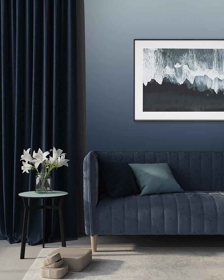
Featured: Calbri, Ombre Wallpaper
Blue Abstract Wallpaper #8: Delilah Waves, Watercolour Ombre Wallpaper
Most ombre runs straight down a wall. Delilah Waves, Watercolour Ombre Wallpaper blends on the diagonal instead, so the pale corner sits high on one side while the deeper tone gathers low on the other, giving the wall a sense of drift. Hand-painted brushstrokes keep the surface soft rather than mechanical, and the effect stays airy enough for a hallway or a small room. Available in Sand and Blue, it pairs easily with natural textures, soft furnishings and minimalist decor, and it is one of the simplest ways to add movement to a wall without adding pattern.
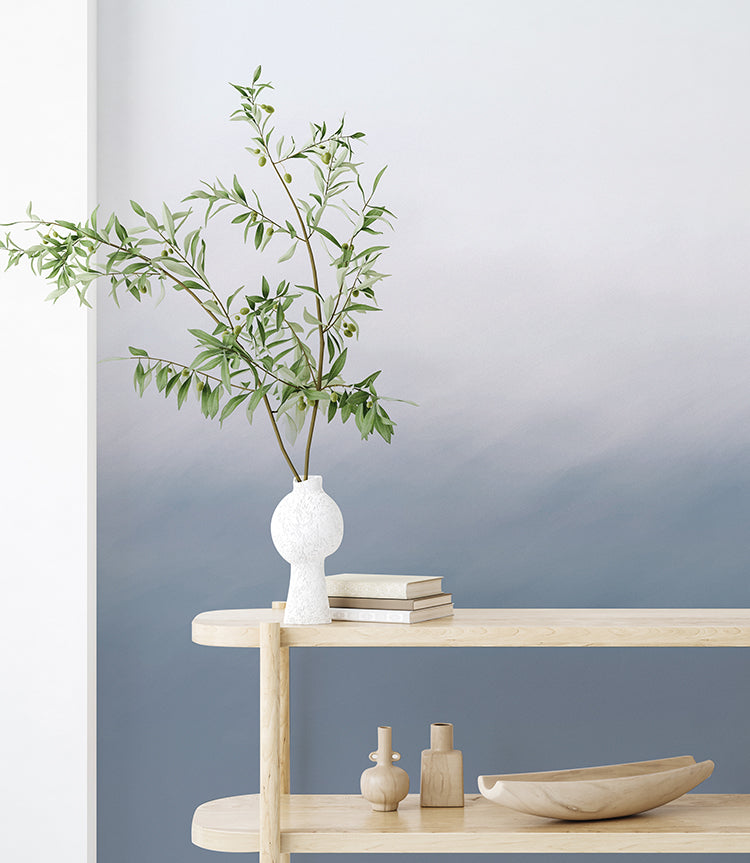
Featured: Delilah Waves, Watercolour Ombre Wallpaper
Blue Abstract Wallpaper #9: Dome Ombre Gradient, Wallpaper
Here is a blue abstract wallpaper that deliberately does not cover the whole wall. Dome Ombre Gradient, Wallpaper prints as a large arch, a soft gradient rising and curving to a rounded top, so it works as a shape on the wall rather than a full mural. That makes it a neat solution behind a cot, a daybed or a desk, where it frames the furniture and leaves the rest of the room plain. Nurseries, children's rooms, bedrooms and reading nooks all suit it, and it gives you the calm of an ombre in a much smaller footprint.
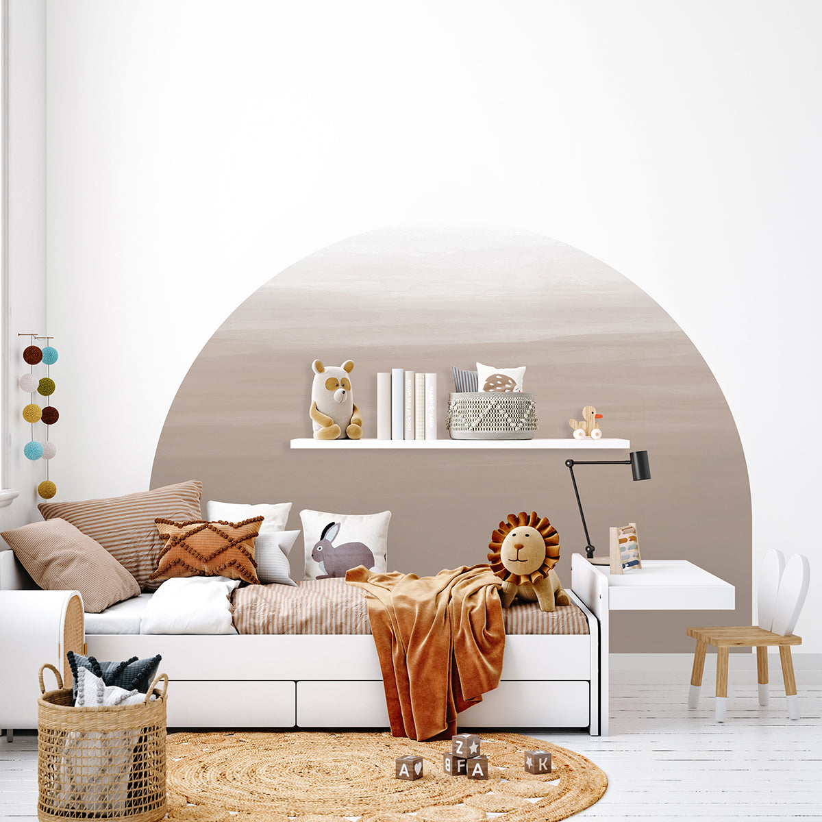
Featured: Dome Ombre Gradient, Wallpaper
Blue Abstract Wallpaper #10: Forest Landscape, Ombre Mural Wallpaper
Layer after layer of pine ridge fades into the distance here, each one paler than the last until the furthest treeline almost disappears. Forest Landscape, Ombre Mural Wallpaper uses that stacking to create real depth, so a flat wall reads as a view stretching back for miles. The dark blue colourway keeps the strongest tone low and the mist high, which is what makes it feel calm rather than heavy. Set against timber, linen and muted greens, it suits a living room, a bedroom, or any space you want to feel further from the street than it is.
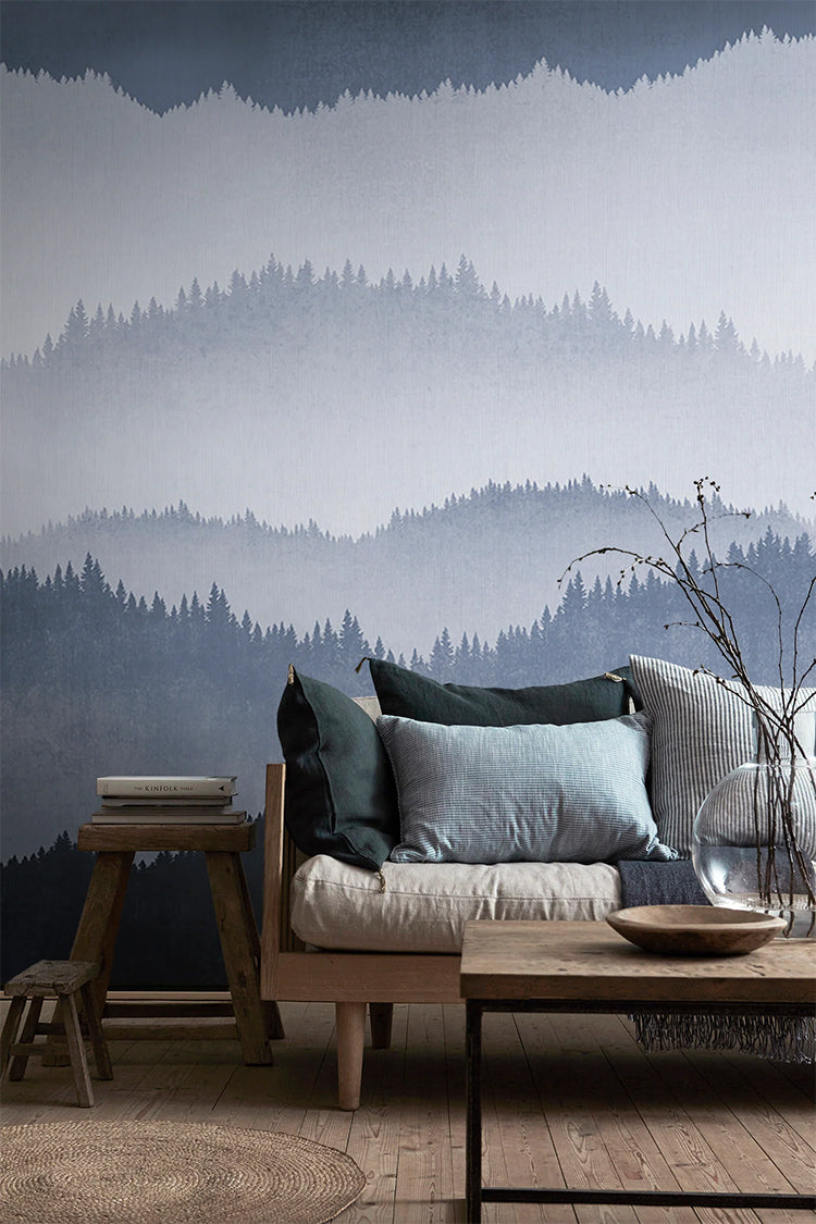
Featured: Forest Landscape, Ombre Mural Wallpaper
Blue Abstract Wallpaper #11: Geometric Blue & Gold, Pattern Wallpaper
Anyone who finds watercolour murals too soft should start here. Geometric Blue & Gold, Pattern Wallpaper builds cubes and hexagons from graded blues, outlines them in fine white and drops in occasional facets of gold, so the wall carries both structure and shine. The tonal range does the heavy lifting, moving from pale sky at the top to near-navy at the base, which gives a flat surface the sense of light falling across it. Use it on a single wall in a home office or living room, where the geometry answers the lines of desks, shelving and windows.
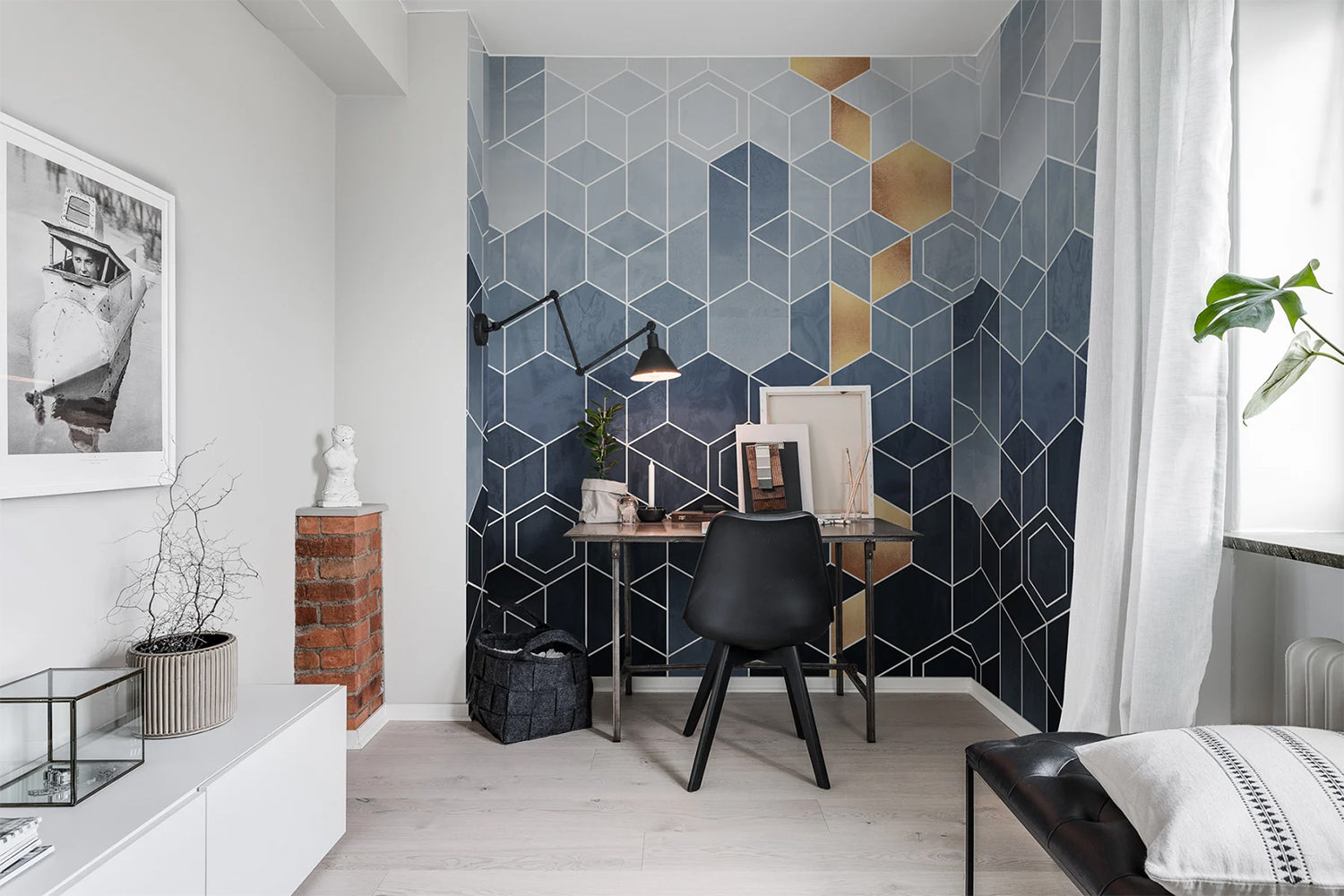
Featured: Geometric Blue & Gold, Pattern Wallpaper
Blue Abstract Wallpaper #12: Greg Horizon, Ombre Mural Wallpaper
Greg Horizon, Ombre Mural Wallpaper is the most dramatic gradient in this selection. A pale, atmospheric haze sits across the top of the wall and gives way to a deep, almost black base, with enough painterly texture in the transition to stop it looking digital. The Grey Blue colourway is the one for a cool, cocooning room, and it works best where the ceiling is high enough to let the pale band breathe. Ideal for living rooms, bedrooms and hallways, it pairs beautifully with cream boucle, warm timber and brass, all of which lift the darkness at eye level.
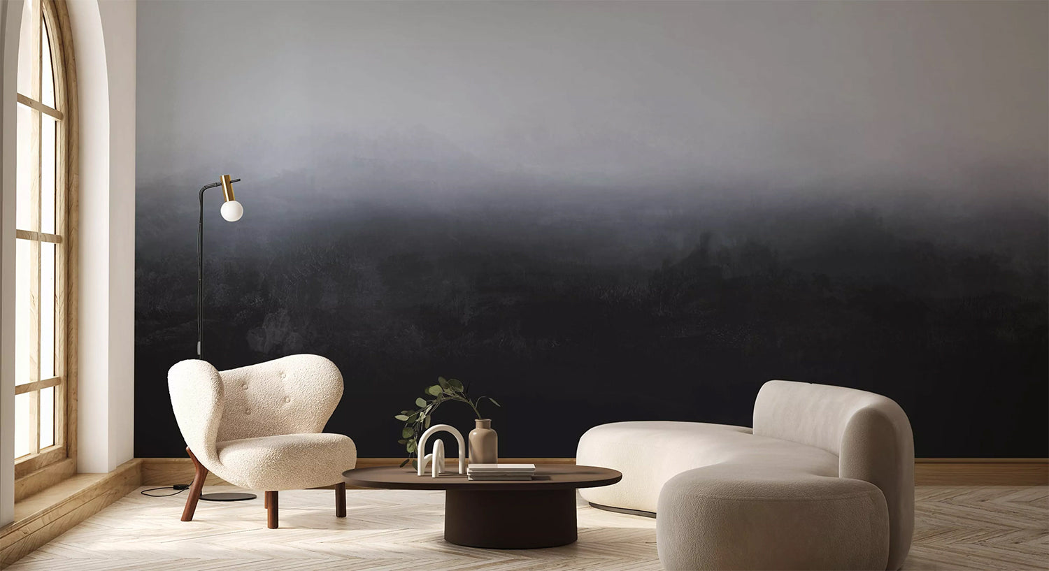
Featured: Greg Horizon, Ombre Mural Wallpaper
Blue Abstract Wallpaper #13: Midnight Brushstrokes, Pattern Wallpaper
If your walls need pattern rather than atmosphere, Midnight Brushstrokes, Pattern Wallpaper is the strongest option here. Curved and straight brushstrokes in cream sit against a midnight blue ground in a loose grid, so the design has rhythm and repetition without the rigidity of a formal geometric. The high contrast is what gives it presence, and it holds up well in small doses, which is why it works so effectively lining the back of open shelving. Beyond that it suits living rooms, home offices and dining areas, pairing naturally with warm wood, brass and clean-lined furniture.
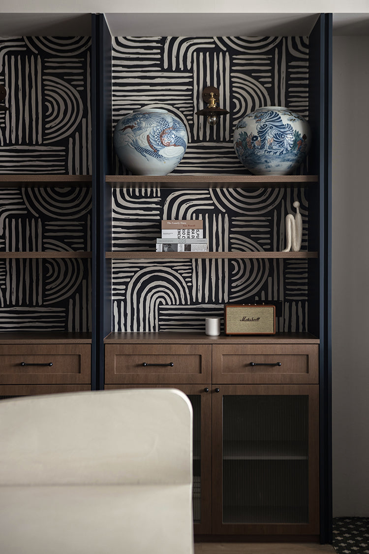
Featured: Midnight Brushstrokes, Pattern Wallpaper
Blue Abstract Wallpaper #14: Morangen, Floral Mural Wallpaper
For a gentler kind of blue, look to flowers rather than water or sky. Morangen, Floral Mural Wallpaper paints poppies, seed pods and fine botanical stems in layered watercolour washes, with indigo pooling in the petals against a soft grey ground. Because the blooms are tall and widely spaced, the design stays airy and never crowds a room, which is what makes it as workable in a small space as a large one. It is available in Hazel and Indigo Blue, and it suits bedrooms, guest rooms and reading nooks alongside rattan, linen and pale wood.
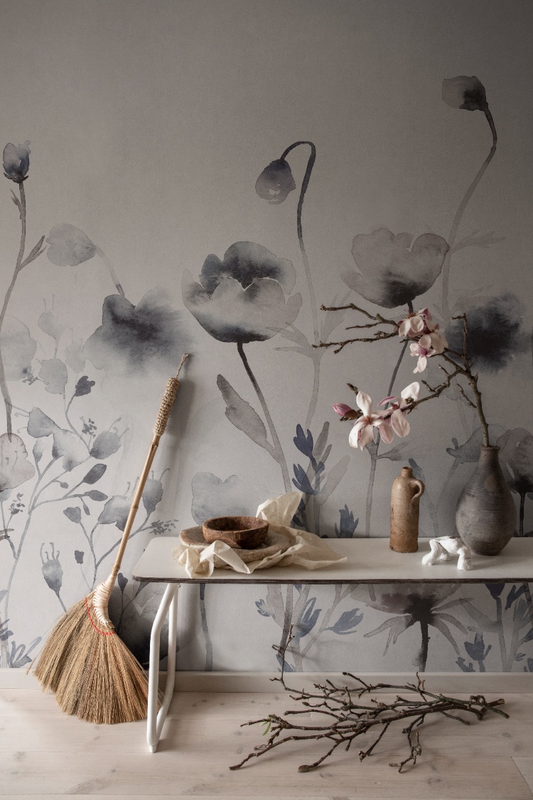
Featured: Morangen, Floral Mural Wallpaper
Blue Abstract Wallpaper #15: Orange Blue Gradient, Mural Wallpaper
Pair blue with orange and the whole mood changes. Orange Blue Gradient, Mural Wallpaper runs a smooth ombre from a warm sunset orange into a deep, cool blue, so a single wall carries both the warmth and the calm rather than choosing between them. Wrapped around a corner it reads like the last light of the day, which is a striking effect in a room full of hard surfaces. It works in living rooms, bedrooms, dining areas and workspaces, and it suits modern and eclectic interiors that can take a confident, saturated colour statement.
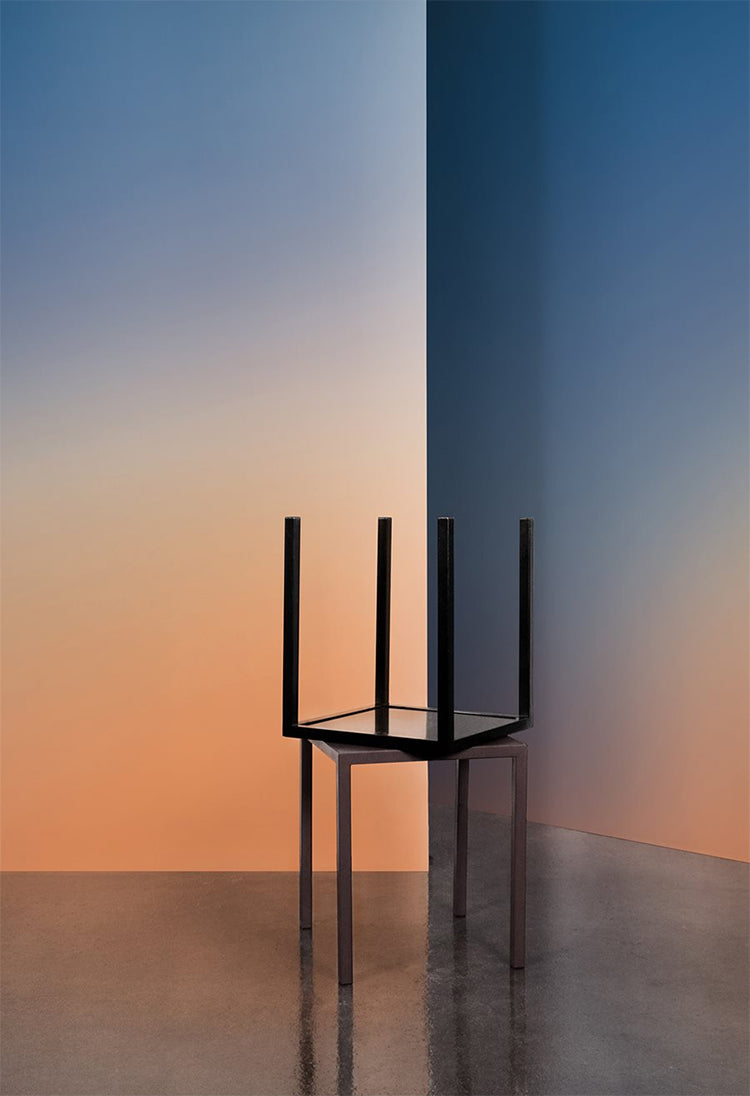
Featured: Orange Blue Gradient, Mural Wallpaper
Blue Abstract Wallpaper #16: Pebble Form, Abstract Mural Wallpaper
Big shapes, few of them, and plenty of confidence. Pebble Form, Abstract Mural Wallpaper scatters oversized organic silhouettes in muted blue-grey across a warm cream ground, drawing on abstract art and mid-century modern shape-making. Because the forms are so large, the design reads clearly from across a room and works best where you can take in the whole wall at once. It is a natural fit for a living room, a hallway or an entrance, and it sits particularly well with boucle, pale timber and paper lighting, which soften the graphic edges without dulling them.
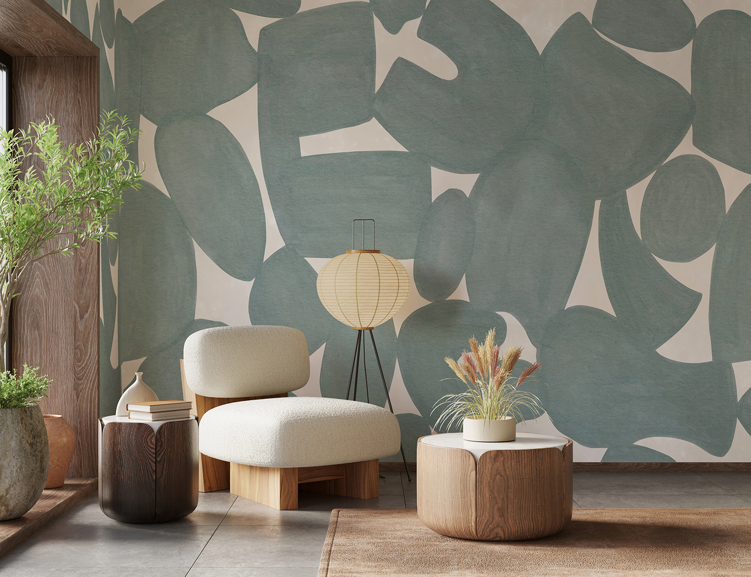
Featured: Pebble Form, Abstract Mural Wallpaper
Blue Abstract Wallpaper #17: Roerich Hills, Abstract Mural Wallpaper
Set against dark panelling, Roerich Hills, Abstract Mural Wallpaper stops looking like wallpaper altogether. Deep navy-teal peaks roll back into near-black shadow beneath a pale, misty sky, and the saturated ink-wash tones give it the presence of a large painting rather than a wall covering. It is a natural partner for Japandi, Japanese-inspired and modern dramatic interiors, and it becomes genuinely immersive alongside black trim, dark timber or deep boucle upholstery. Use it in a bedroom, living room, home office, powder room or dining room where you want the space to feel enclosed and considered.
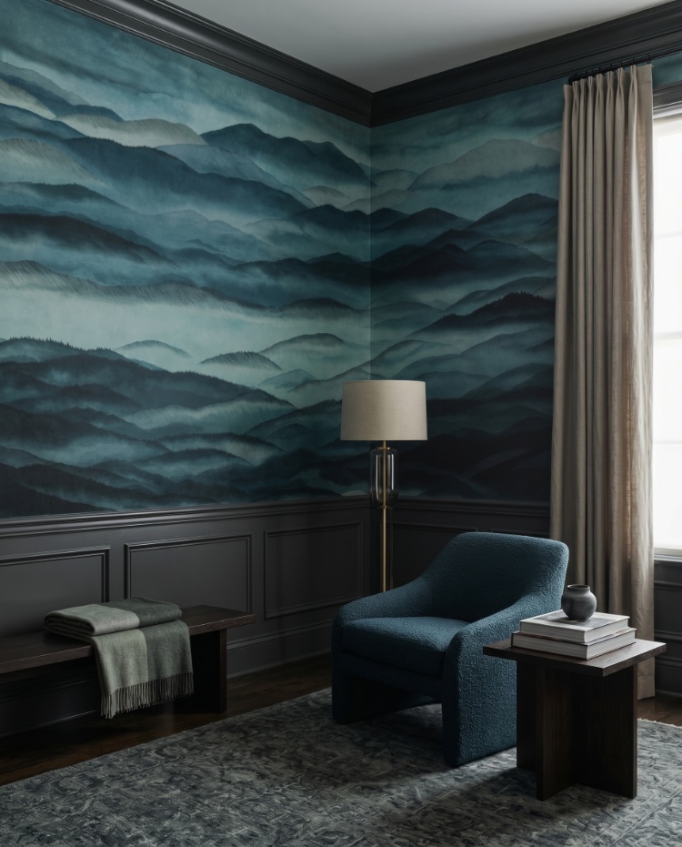
Featured: Roerich Hills, Abstract Mural Wallpaper
Blue Abstract Wallpaper #18: Terra Tessel, Pattern Wallpaper
Terra Tessel, Pattern Wallpaper brings the look of Moroccan zellige tile to walls that never go near water. Slim rectangular blocks are laid in a close grid, each carrying slightly different tone and brushwork, which is what stops the repeat from reading as printed tile. In the Blue colourway the effect is soft and weathered rather than crisp, adding texture to a room without adding pattern in the usual sense. It suits entryways, dining areas, kitchens, bathrooms outside wet zones and feature walls, and it pairs well with mid-century furniture, woven textures and matte black accents.
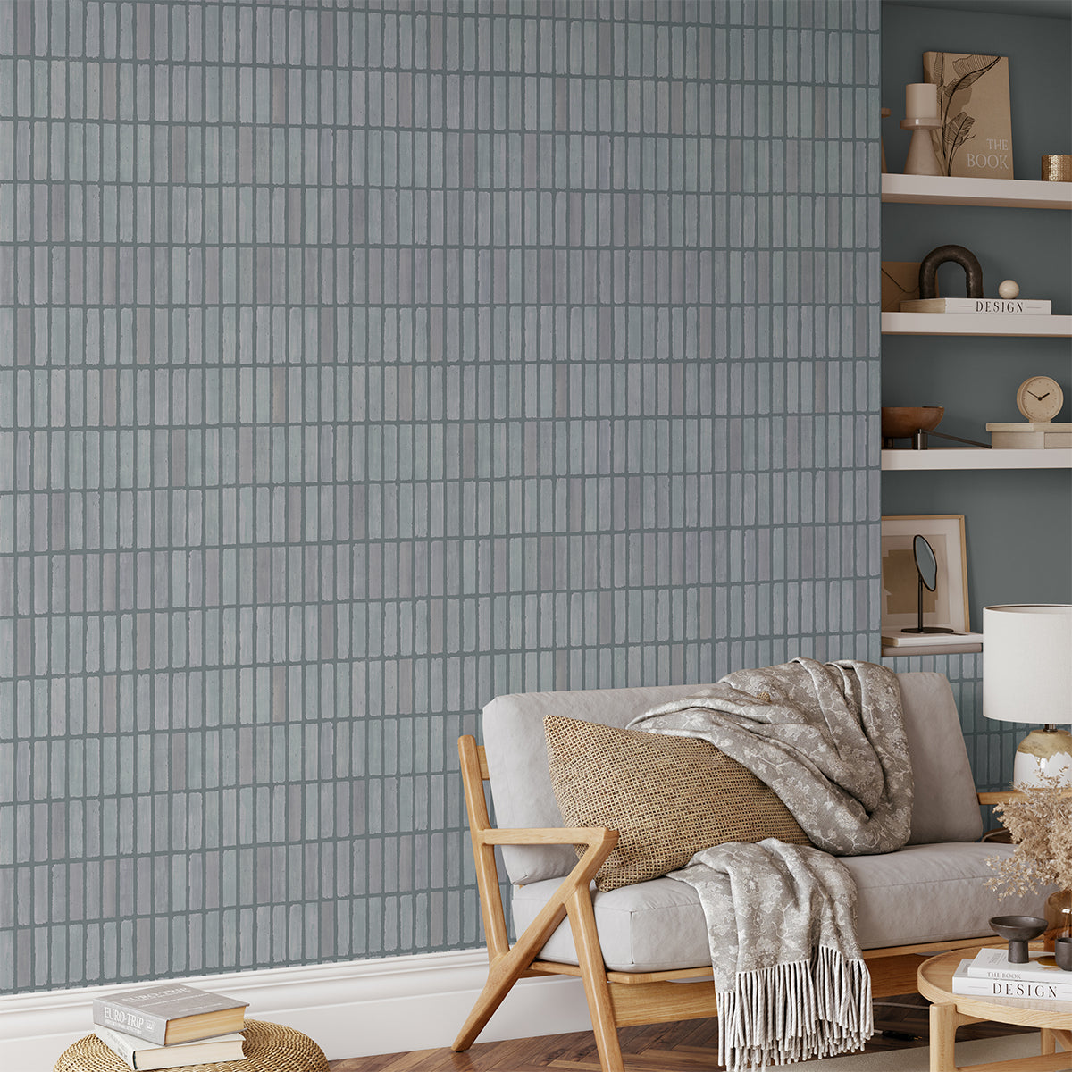
Featured: Terra Tessel, Pattern Wallpaper
Blue Abstract Wallpaper #19: Vista, Watercolor Ombre Wallpaper
Some walls should barely announce themselves. Vista, Watercolor Ombre Wallpaper is built for exactly that, washing pale grey-white into a dusky blue with the soft, uneven edge of watercolour on paper rather than a mechanical fade. It suggests a distant horizon without drawing anything in particular, so nothing on the wall competes with what you place in front of it. Minimal interiors are its natural home, and it is the design to choose when you want a room to feel finished rather than decorated. Simple, quiet, and unlikely to date.
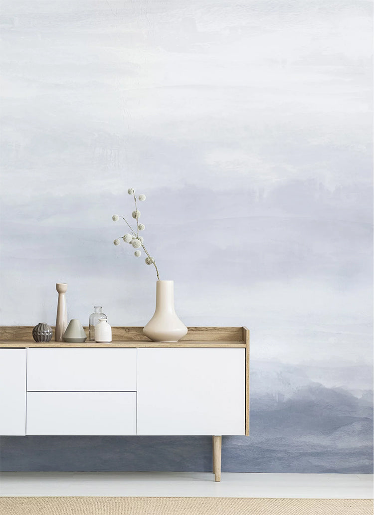
Featured: Vista, Watercolor Ombre Wallpaper
Blue Abstract Wallpaper #20: Zen, Abstract Mural Wallpaper
Sand raked into slow curves is the starting point for Zen, Abstract Mural Wallpaper. Flowing concentric lines loop across the wall at a large scale, creating gentle movement and a steady rhythm that is easy to sit with day after day. In the Misty Blue colourway the line work stays tonal and quiet, so the pattern registers as texture from a distance and reveals its detail up close. It suits bedrooms, living rooms, dining areas and home offices, and three colourways are available in Terracotta, Green and Misty Blue.
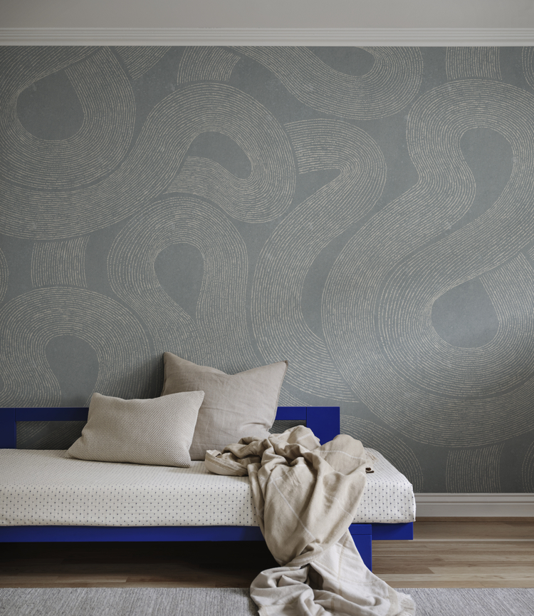
Featured: Zen, Abstract Mural Wallpaper
Should You Choose A Blue Abstract Pattern Or A Mural?
The difference comes down to repetition. A pattern repeats across every drop, so it can cover as many walls as you like, while a mural is a single large image printed to the dimensions of one specific wall. Pattern is the safer choice for a room broken up by doors and windows, and a mural is the better one when you have a clear, uninterrupted wall to give it.
Blue Abstract Pattern Wallpaper
Pattern is the practical option, and the one to choose when the room is working against you. Because the design repeats, it survives being interrupted, so a wall broken up by a doorway, a radiator or an awkward chimney breast still looks intentional. A useful rule before you order: count the openings on the wall you want to paper, and if there is more than one door or window, go with pattern. Repetition also makes repairs possible, since a damaged drop can be replaced years later and still match its neighbours. Order one extra roll at the time of purchase and store it flat, because dye lots shift between print runs and a later reorder rarely matches exactly.
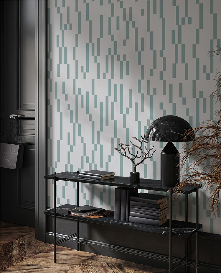
Featured: Geometric Blocks, Pattern Wallpaper
From classic and timeless patterns to modern and whimsical prints, our pattern wallpaper collection offers a wide range of options to transform your living spaces.
Blue Abstract Mural Wallpaper
A mural asks more of you before you order and gives more back once it is up. It is printed to the dimensions of your wall, so measure the width in three places and the height in three places, then order to the largest of each, since very few walls are truly square and the surplus is trimmed during installation. Check where the composition's focal point falls as well. A sofa back sits at roughly 85cm and a headboard between 100 and 120cm, so anything you actually want to see needs to sit above that line. The one genuine drawback is repair, because a mural panel cannot be patched invisibly. Buy a spare panel if the design matters to you.
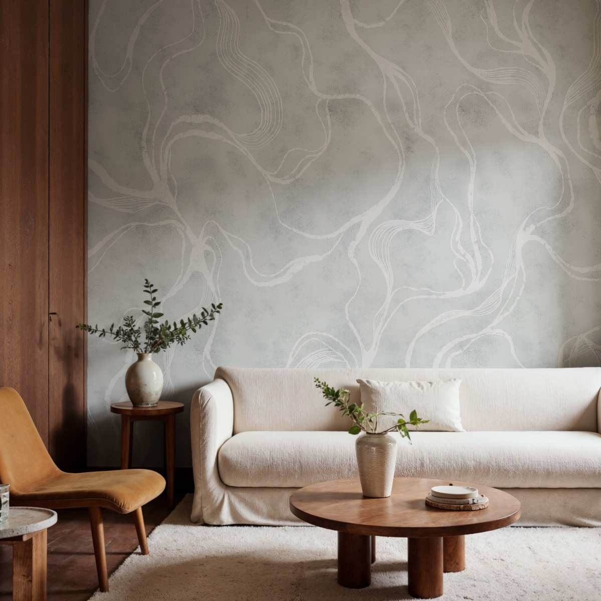
Featured: Soft Curve, Abstract Mural Wallpaper
Explore insightful tips and clever ways to use abstract mural wallpapers in small spaces.
Should You Choose Light Or Dark Blue Abstract Wallpaper?
Let the direction your room faces decide this, not its size. Dark blue suits rooms used mainly in the evening and rooms with cool north light, while light blue works best where warm daylight reaches the wall for most of the day.
Dark Blue Abstract Wallpaper
Dark blue is not the risk most people assume, and a north-facing room is where it makes the most sense. Pale blue under cool north light drifts towards grey and can feel cold, while a deep blue reads as deliberate and holds its colour. Two things make it work. Paint the ceiling and remaining walls in the palest tone taken from the design rather than brilliant white, which looks harsh beside deep blue and draws the eye to every join. Then light the room with lamps at different heights on 2700K bulbs, because a single ceiling light above a dark wall creates a bright patch in the middle and leaves the corners dead. One warning: deep blue shows scuffs and dust at skirting height, so keep the darkest tones above furniture where you can.
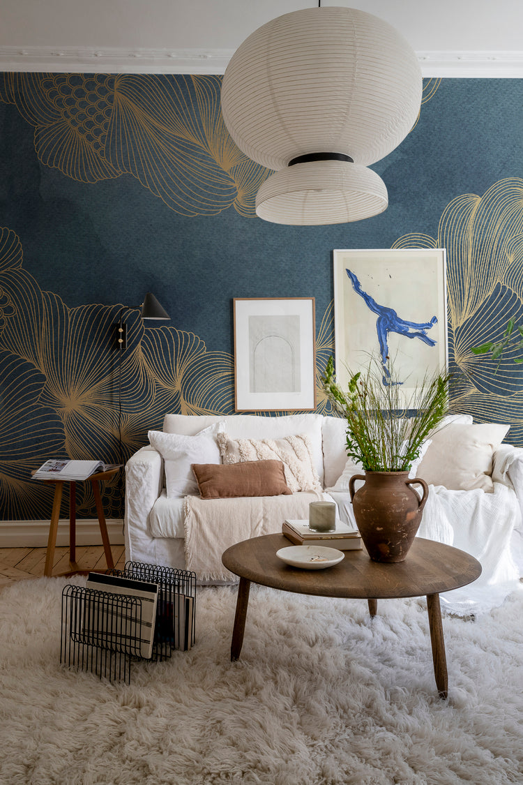
Featured: Opulent Beauty, Mural Wallpaper
From deep blues and rich greens to dramatic blacks and warm earthy tones, dark wallpapers add depth, contrast, and atmosphere to any space. Make a confident design statement with our curated collection of dark wallpaper designs.
Light Blue Abstract Wallpaper
Light blue opens a room up, but it is the more sensitive of the two and worth testing properly before you commit. Direct afternoon sun bleaches a pale blue towards white while it is on the wall, and over years it can genuinely fade, so avoid the wall in a south or west-facing room that takes hours of direct light. In a north-facing room, choose a light blue with a warm or green undertone, since a cool one turns grey. Tape a sample to the actual wall and look at it three times: in the morning, mid-afternoon, and after dark under your own lamps. Blue shifts more between daylight and lamplight than any other colour, and this one check prevents most of the regrets people have.
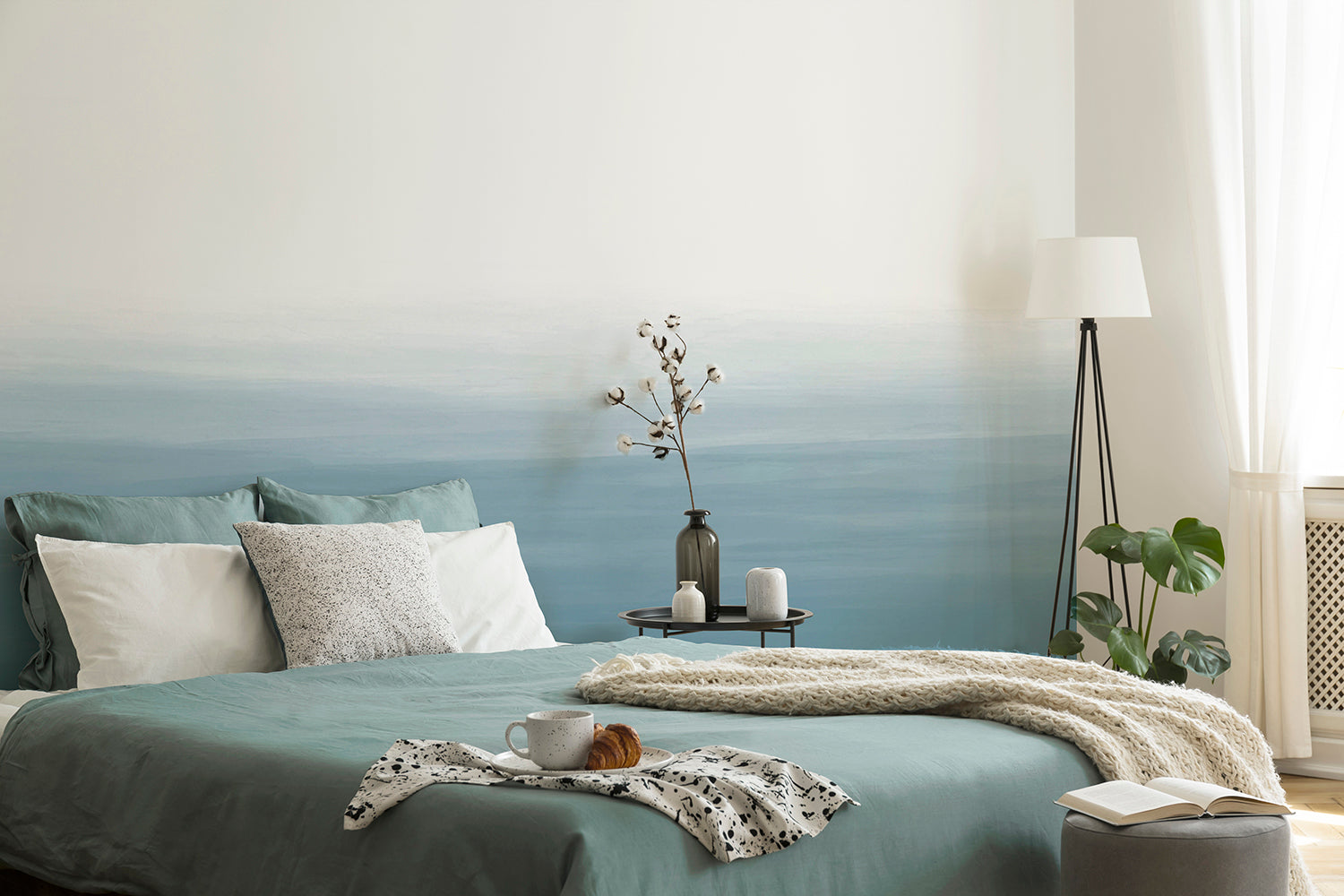
Featured: Gradient Ombre, Mural Wallpaper
Create a sense of openness and ease with our curated collection of light wallpaper designs.
What Colours Go With Blue Abstract Wallpaper?
Blue takes warm accents far better than cool ones. Terracotta, rust, tan and mustard bring it to life, warm off-whites keep it calm rather than clinical, and the wood and metal you choose decides whether the finished room reads modern or traditional.
Warm Contrasts: Terracotta, Rust And Tan
Blue and orange sit opposite one another on the colour wheel, which is why terracotta, rust, tan and mustard do so much work in a blue room. You do not need much of it. One rust cushion or a tan leather chair against a deep blue wall is enough to stop a scheme feeling cold, and a useful rule is to keep the warm colour to roughly a tenth of what you see in the room. Push past that and the two start competing rather than balancing. If you want a lower-risk version of the same idea, use warm materials instead of warm colours, since a jute rug, a terracotta pot or an unglazed vase gives you the same lift with far less commitment. It is also the easiest layer to change when you want the room to feel different.
Neutrals That Do Not Fight The Blue
The neutral you choose matters more alongside blue than almost any other colour. Brilliant white picks up a cold cast next to a mid or deep blue, so white bedding, a white sofa or white lampshades can end up looking grey and faintly tired rather than crisp. Oatmeal, bone, putty and warm off-white all read as clean while supplying the warmth blue lacks, and they photograph considerably better. Linen and wool help for the same reason, because their texture breaks up flat colour and softens the contrast. If you already own white bedding and would rather not replace it, lay a heavier throw in a warm neutral across the foot of the bed. That single layer is usually enough to stop the white reading cold.
Wood Tones And Metal Finishes
Wood tone is the detail most people overlook, and the one most likely to quietly undo a blue room. Walnut, warm oak and teak all sit beautifully against blue because their warmth balances it. Red-toned woods are the problem, since cherry, mahogany and many warm laminate floors carry an orange-red that clashes with a mid-blue rather than complementing it, and unlike a cushion you cannot swap a floor out later. If that describes your flooring, choose a deeper or greyer blue, which handles the contrast far better than a bright one. Metals are more forgiving. Brass and antique gold warm a cool blue and suit deeper shades, while matte black sharpens a paler blue and suits geometric designs. Choose one and repeat it three times in the room rather than mixing both.
Choosing The Perfect Blue Abstract Wallpaper For Your Home
The best blue abstract wallpaper is one that reflects the way you want a room to feel while working with the light that room actually gets. Whether you're drawn to painterly watercolour washes, gradual ombre fades, bold geometric shapes or simplified florals, a thoughtfully chosen design can turn a plain wall into one of the most memorable rooms in your home. Pair it with warm neutrals, natural timber and lighting chosen for the time of day you use the space, and you'll create a room that feels both practical and beautifully designed.
Ready to start your project? Explore our full collection of abstract wallpaper for more designs across every colourway, or browse our blue wallpaper range to see the full spread of shades, from pale sky through to deep navy. Every design is made to measure, so it can be sized to a single feature wall or wrapped around an entire room.
At Hello Circus, we believe every wall deserves something special. That’s why all our wallpapers are custom-made to fit your wall’s exact dimensions — no generic rolls, just a perfect fit. Priced by the square metre (Height × Width × Unit Price), you only pay for what you need.
Choose the Right Wallpaper Material
Whether you’re decorating your forever home, updating a rental property, or refreshing a single feature wall, choosing the right wallpaper material can make all the difference. At Hello Circus, every wallpaper design is available in three premium materials, so you can select the option that best suits your space, installation preferences, and lifestyle.
- Non-Woven Matte Wallpaper: Our most popular choice, featuring a smooth, non-reflective finish that creates a beautifully soft look. Durable, breathable, and easy to install using the paste-the-wall method, it’s ideal for most residential interiors.
- Heavy Duty Textured Vinyl Wallpaper: Designed for busy households and commercial spaces, this premium textured finish offers added durability and a luxurious tactile feel. It’s perfect for high-traffic areas where extra resilience is required.
- Peel and Stick Wallpaper: A self-adhesive option that makes decorating quick and convenient. Ideal for renters, DIY enthusiasts, or anyone who prefers a paste-free installation, peel and stick wallpaper allows you to refresh your walls with minimal fuss while enjoying the same beautiful Hello Circus designs.
Whichever material you choose, every wallpaper is custom-made to your wall’s exact dimensions using high-quality printing and vibrant, colour-rich inks, ensuring a beautiful finish that’s made to last.
Curious About the Cost? Try Our Wallpaper Visualiser
- Enter your wall’s width and height for an instant price.
- Preview how your chosen wallpaper will look on your wall — especially helpful for murals, where placement matters.
Still deciding? Order a sample to feel the texture, quality, and finish before you commit.
How to Calculate How Much Wallpaper You Need?
Before purchasing, it’s important to measure your wall accurately to avoid over- or under-ordering. Here’s a simple way to get started:
- Measure the width of the wall from edge to edge.
- Measure the height from floor to ceiling.
- Allow for extra, around 10cm, to account for trimming and pattern matching.
Need help? Read our guide on how to measure your wall for wallpaper or get in touch with us.
Why Choose Hello Circus Wallpaper?
What makes our wallpapers different? Every Hello Circus wallpaper is made to order using premium materials designed to deliver exceptional quality, durability, and beautiful colour reproduction.
- Premium quality: Printed in Europe on durable non-woven paper, our wallpapers are reinforced with nylon fibres to stay smooth, strong, and long-lasting.
- Matte and non-reflective: Our non-woven wallpapers are coated with a soft, non-reflective matte finish that brings warmth and elegance to your space without harsh glare.
- Safe and non-toxic: We use VOC-free inks and PVC-free, breathable paper, so you can create a beautiful home without worrying about harmful chemicals — especially important for little ones.
- Antimicrobial protection: Helps prevent the growth of mould, mildew, and bacteria, keeping your walls cleaner and fresher for longer.
- Wallpaper washability: All our wallpapers are washable, meaning everyday dirt and water stains can be wiped away using a damp cloth or sponge.
- Resistant to colour fading: Designed with colourfast technology to keep your wallpaper vibrant and rich over time.
- Fire resilient: Our wallpapers meet European fire safety standards (EN ISO 11925-2), providing an extra layer of reassurance for your home.
Read more about our wallpaper materials and check out our ultimate guide to wallpapers for answers to the most commonly asked questions.
Let’s Connect
Have a project in mind or interested in partnering with us? We’d love to hear from you.
- Bulk orders
- Corporate orders
- Selling with us
- Collaborations
- Press features
Feel free to get in touch.



