
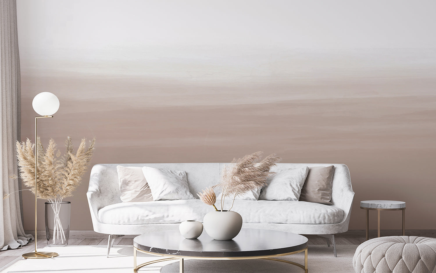
Brown ombre wallpaper has become one of the most requested looks in interiors, and it is easy to see why. A single wall that fades from pale sand into deep, warm brown gives a room depth and atmosphere without a repeating pattern to grow tired of. Because the effect comes from the gradient rather than a motif, it also behaves differently from ordinary wallpaper: where you place the dark end, and what light falls on it, matters more than almost anything else you decide.
In this guide, we'll walk through the main brown ombre wallpaper styles, compare the colourways from soft sand through to deep espresso, and help you work out which rooms suit the look best. We'll also settle the question of whether the dark end belongs at the top or the bottom, share six of our favourite designs, and cover the styling details that make the real difference once the paper is up.
What Are The Different Brown Ombre Wallpaper Styles?
Brown ombre wallpaper comes in three main styles: soft abstract watercolour washes, misty landscape murals, and atmospheric sky and cloud gradients. All three use the same gentle fade from light to dark, but the mood changes depending on whether the brown is painterly, scenic or sky-like.
Abstract Watercolour Brown Ombre Wallpaper
For those who want colour on the walls without a pattern to commit to, an abstract watercolour ombre is the gentlest way in. Washes of warm taupe and soft brown bleed upwards into a pale, almost-white top, so the wall reads as texture rather than a design. It sits quietly behind furniture, which makes it a natural fit for living rooms, bedrooms and nurseries where you want calm rather than busy. The vertical fade also helps a low ceiling feel taller, because it draws the eye up towards the lighter half.
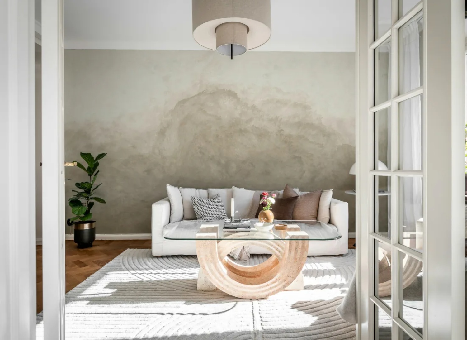
Featured: Abstract Watercolor, Mural Wallpaper
Explore the different types of abstract watercolour wallpaper, the best rooms to use them in, how to choose the right colours for your space, and practical styling tips to help you create a cohesive and beautiful home.
Landscape Brown Ombre Wallpaper
If you're drawn to depth and distance, a landscape mural gives brown ombre somewhere to go. Rows of misty pines recede from a dark foreground into a hazy horizon of warm olive-brown, and that recession makes a wall feel far further away than it is. Landscape ombre suits rooms you want to feel enveloping: a living room with a low sofa set against it, a bedroom behind the headboard, or the long blank wall of a dining space. Keep the furnishings pale and let the wall carry all the depth.
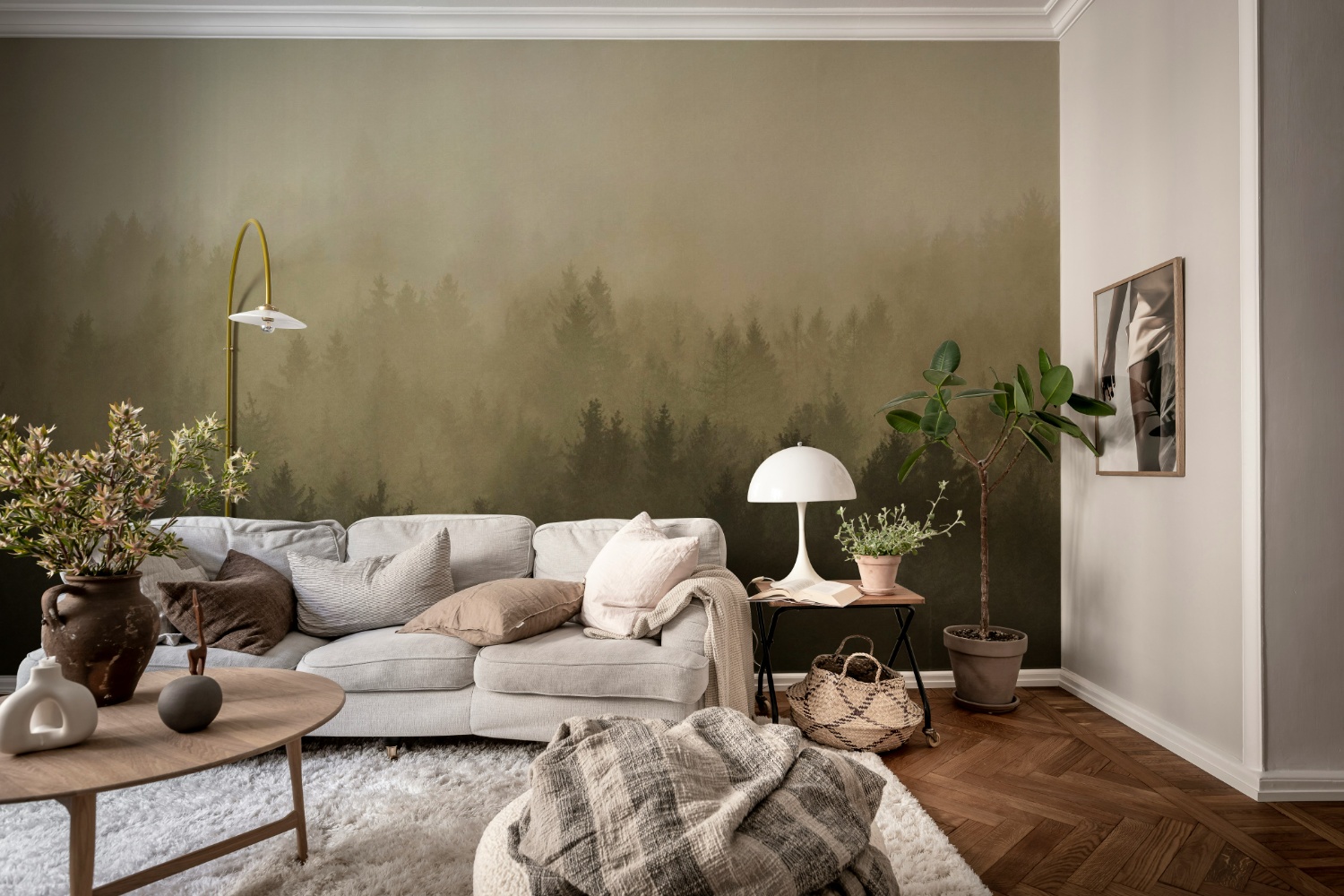
Featured: Cloudy Forest, Mural Wallpaper
Immerse yourself in the breathtaking beauty of our landscape wallpaper designs.
Sky And Cloud Brown Ombre Wallpaper
Dawn and dusk skies are where brown ombre turns dramatic. Bands of sand, soft rust and deep charcoal-brown blur into one another the way light does at the very end of the day, giving a room warmth with a slightly cinematic edge. Whether you're papering a dining room, a snug or a hallway, this style earns its place in spaces used mostly after dark, when lamplight picks up the warmer tones in the gradient. Pair it with wood, tan leather and low, warm lighting.
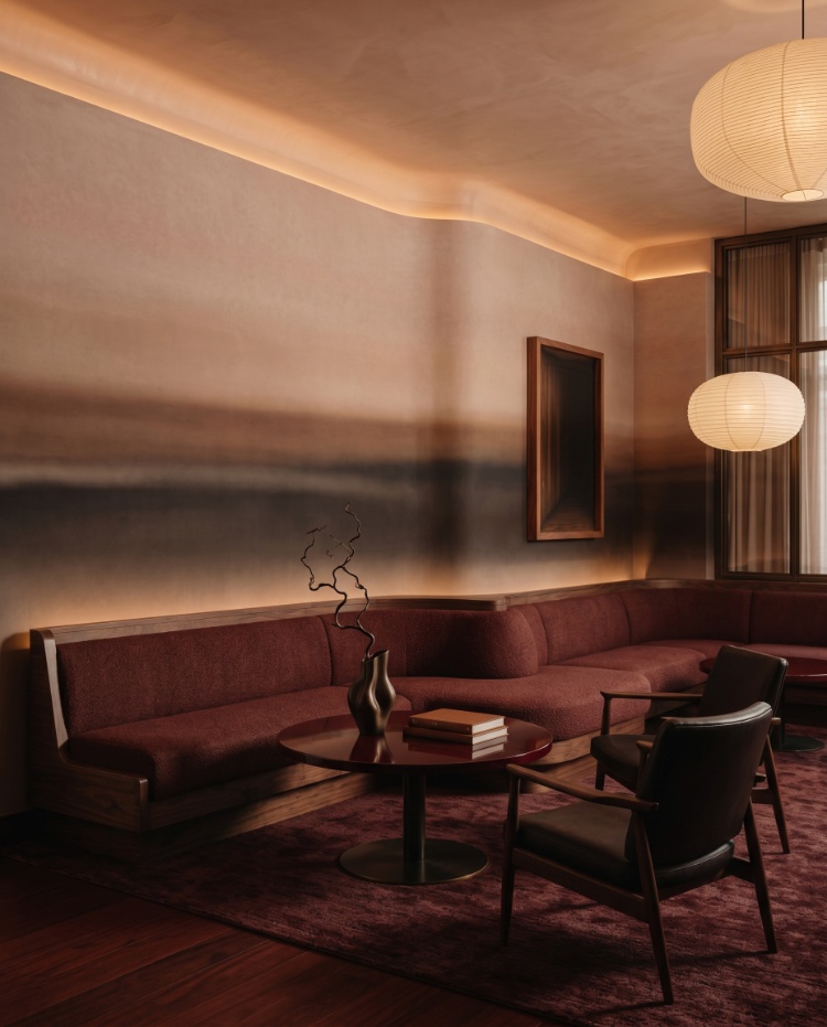
Featured: Rotko Dawn, Ombre Mural Wallpaper
From soft, pastel skies to dramatic cloudscapes and dreamy sunsets, our sky and cloud wallpapers evoke a sense of calm, lightness, and spaciousness — perfect for creating a peaceful retreat at home.
What Are Popular Colourways For Brown Ombre Wallpaper?
The most popular brown ombre colourways are sand and greige, taupe and mushroom, chocolate and espresso, and sienna and rust. They differ less in hue than in how much light each one needs, which is the thing worth settling before you order.
Sand And Greige
Sand is the colourway to choose if your room faces north or gets very little direct sun. It carries just enough warmth to stop a pale wall turning cold and grey, which is exactly what happens to true white in weak light. The contrast between its light and dark ends is narrow, so it also forgives an uneven or patched wall better than a deeper gradient will. The trade-off is that it can wash out entirely under bright afternoon sun, so in a south-facing room where you want the ombre to actually register, go one step darker.
Taupe And Mushroom
Taupe is the safest choice if you are keeping furniture you already own. It sits almost exactly between warm and cool, so it does not fight a grey sofa or yellow-toned oak, which is where more saturated browns tend to cause trouble. It is also the colourway most people have in mind when they search for brown ombre wallpaper, which makes it the easiest to build a room around. Order a sample and tape it to the wall for two full days before you commit, because taupe shifts more than any other neutral between morning and evening light.
Chocolate And Espresso
Deep chocolate is the one to reach for in a room you mainly use after dark. Under lamplight it reads rich and enveloping, and it makes a dining room or a snug feel considered rather than simply gloomy. Two practical cautions come with it. First, it needs a warm bulb to look its best, or it flattens out. Second, it shows dust and scuffs at skirting height far more readily than a pale gradient does, so if the darkest band will sit behind a dining chair or the back of a sofa, think about that contact point before you order.
Sienna And Rust
Sienna is where brown tips towards terracotta, and it is the most decisive of the four. The warmth reads as deliberate colour rather than a neutral, so it suits people who want a scheme rather than a backdrop. It sits beautifully with olive green, unlacquered brass and clay pottery, and it is genuinely flattering in a room where people gather. Take care pairing it with orange-toned pine or a red-brown timber floor, though. Two warm reds in the same room start to compete, and the floor usually wins.
Which Rooms Are Best For Brown Ombre Wallpaper?
Brown ombre wallpaper works best in living rooms, bedrooms, dining rooms and home offices. These are the spaces with either a wide, uninterrupted wall for the gradient to run across, or the kind of evening and lamplit use that brings warm brown tones to life.
Living Room
Of all the rooms in a home, the living room gives brown ombre wallpaper the most to work with, because it usually offers one wide, uninterrupted wall where a full gradient can be read properly. Ombre needs room to breathe, and a fade squeezed between a doorway and a window loses most of its effect. Brown also behaves beautifully across a living room's long day of use, reading cool and almost grey in flat morning light, then deepening and glowing once the lamps come on. Position the mural so the darkest part of the gradient sits at roughly sofa height, which lets your furniture anchor into the wall rather than float against it. Olive or oatmeal upholstery, walnut and one warm metal finish will do the rest.
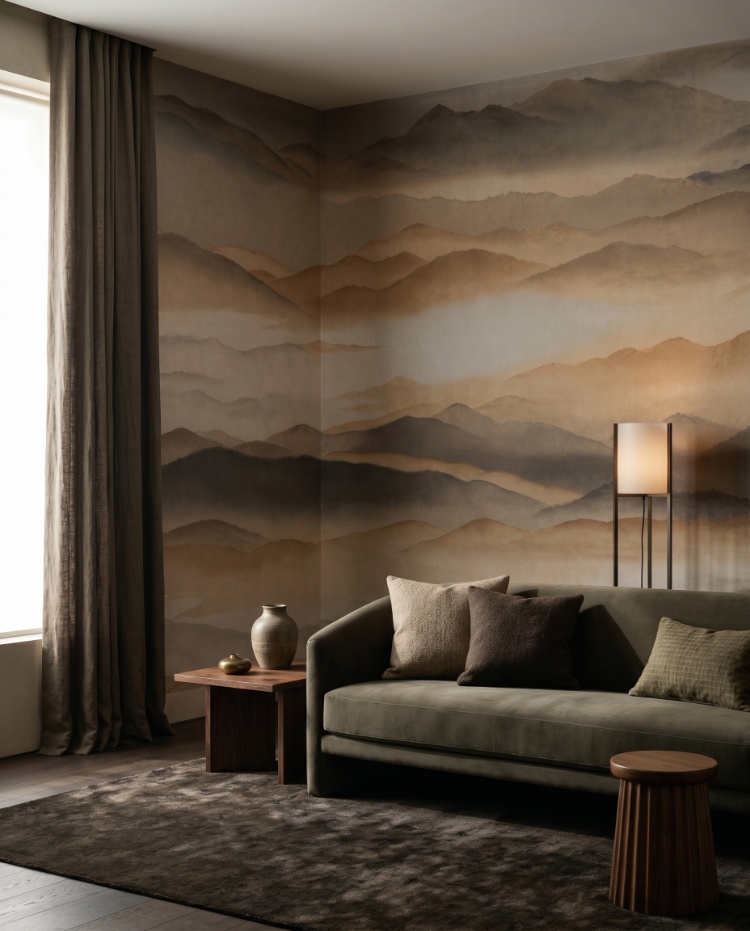
Featured: Roerich Silence, Abstract Mural Wallpaper
Discover more living room wallpapers that not only reflect your personal style but also help create a warm, welcoming atmosphere your whole family will enjoy.
Bedroom
Brown ombre suits a bedroom because the fade from pale to deep echoes the way a room settles at dusk, which is exactly the mood you want at the end of the day. Run the mural across the headboard wall so the darkest band of colour sits behind the bed and the lighter wash lifts towards the ceiling. The result feels enveloping without the visual noise of a repeating pattern, so nothing competes for attention while you are winding down. Sand and mushroom tones are the safest starting point here, because they stay soft rather than heavy in morning light. In a smaller bedroom, keeping the pale end of the gradient at the top is the single most useful trick, since it stops the walls closing in.
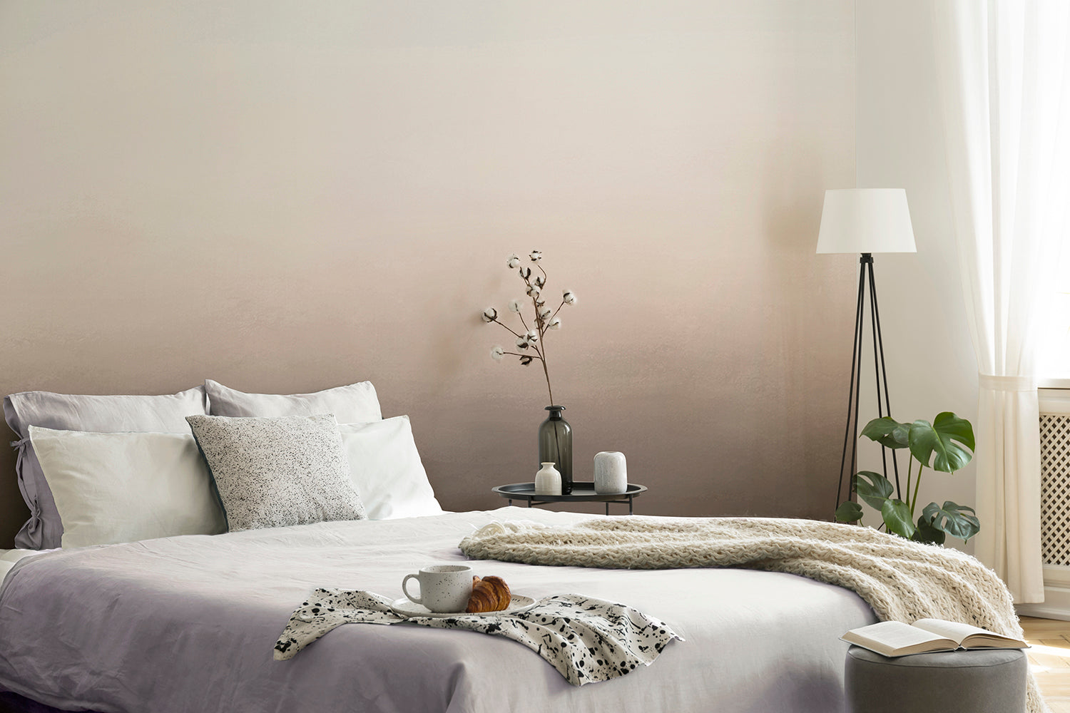
Featured: Blake Horizon, Ombre Mural Wallpaper
Your bedroom should be a sanctuary — a space that reflects your personal style and helps you unwind at the end of the day. Explore our bedroom wallpaper designs to create your perfect retreat.
Dining Room
Dining rooms are where brown ombre looks most dramatic, largely because they are used after dark. Warm tones gain depth under lamplight and candlelight, so a gradient that reads as quietly pleasant at midday becomes genuinely rich by dinner. That makes the dining room the right place for the deeper, more saturated designs you might hold back from in a bedroom. Because a gradient carries no repeating motif, nothing gets awkwardly cut off around a sideboard or doorway, and the receding tones add depth without making a compact room feel smaller. Hang the pendant low over the table so the light pools downwards, and pick up the mural's warmth with a timber tabletop and brass or amber glass.
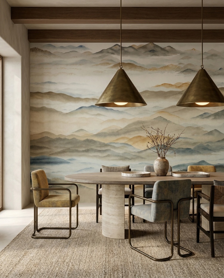
Featured: Roerich Valley, Abstract Mural Wallpaper
Create a beautiful gathering space with our collection of dining room wallpapers. From traditional patterns and rich colours for formal dining settings, to light, airy motifs for everyday gatherings, our wallpaper designs are curated to suit a variety of styles.
Home Office
In a home office, the appeal of brown ombre wallpaper is practical as much as decorative: a soft gradient gives your eyes somewhere restful to land between tasks. Unlike a busy repeating pattern, ombre does not compete for attention on a wall you end up looking at for hours. Where you place it matters. If your desk faces the mural, keep the lighter end of the gradient at eye level so the backdrop stays open, and if the wall sits behind you, a deeper brown reads well on video calls because it is calm and uncluttered. Home offices are often the smallest room in the house, and layered, receding tones help push the wall visually further back. Finish with a pale timber desk and warm task lighting.
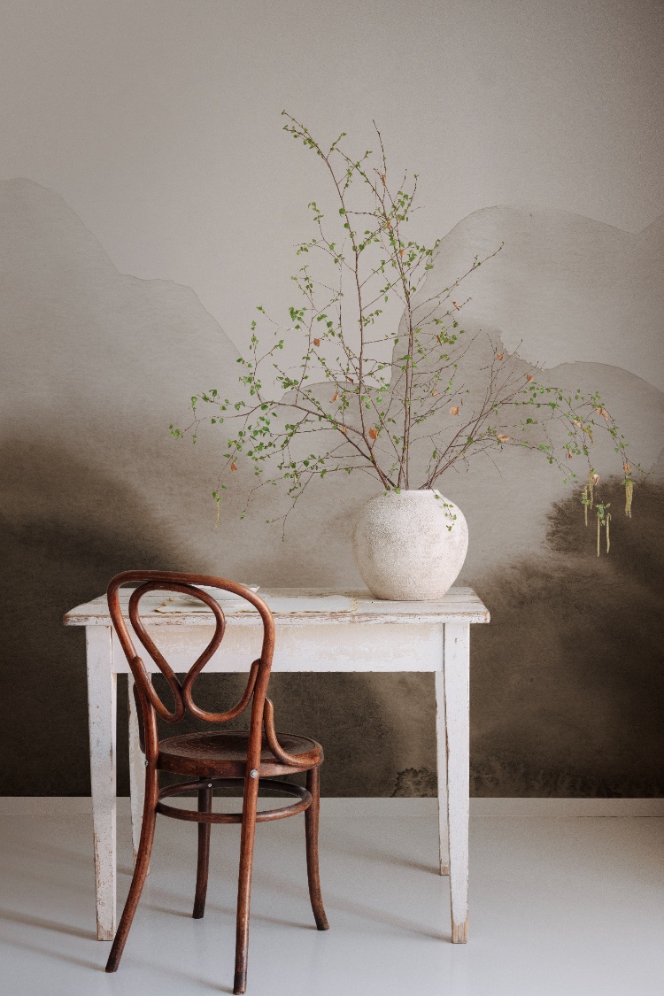
Featured: Flowing Hills, Abstract Mural Wallpaper
An office doesn't have to feel dull or uninspiring. Whether you're drawn to calming scenery that helps you unwind and refocus, or energising patterns that boost creativity, our collection of modern office wallpapers is designed to support the way you work.
Entryway
An entryway is the one room where brown ombre wallpaper can be as bold as you like, because nobody lingers long enough to tire of it. Most entryways are small and short on natural light, and that is exactly where a warm chalky brown earns its place, making the space feel intentional rather than merely dim in a way white paint never quite manages. Watch two practical details. Put the darkest part of the gradient at the bottom, where bags, shoes and coat hems make contact, and if a console table or radiator sits on the main wall, check the fade is still moving above it rather than finishing behind the furniture.

Featured: Addison Chalk, Ombre Wallpaper
If you're looking to give your entryway some love, explore our small entry design ideas and wallpapers to get inspired!
Brown Ombre Wallpaper #1: Gradient Ombre, Mural Wallpaper
Anyone searching for classic brown ombre wallpaper should start here. The gradient runs from a pale, almost-white top into a deep warm taupe at skirting level, and that vertical fade is the trick that makes a ceiling feel higher than it is. It suits bedrooms and living rooms particularly well, since the darkest band sits behind the furniture and lets sofas and headboards anchor into the wall. Four colourways are available, so you can dial the depth up or down depending on how much natural light the room actually gets.
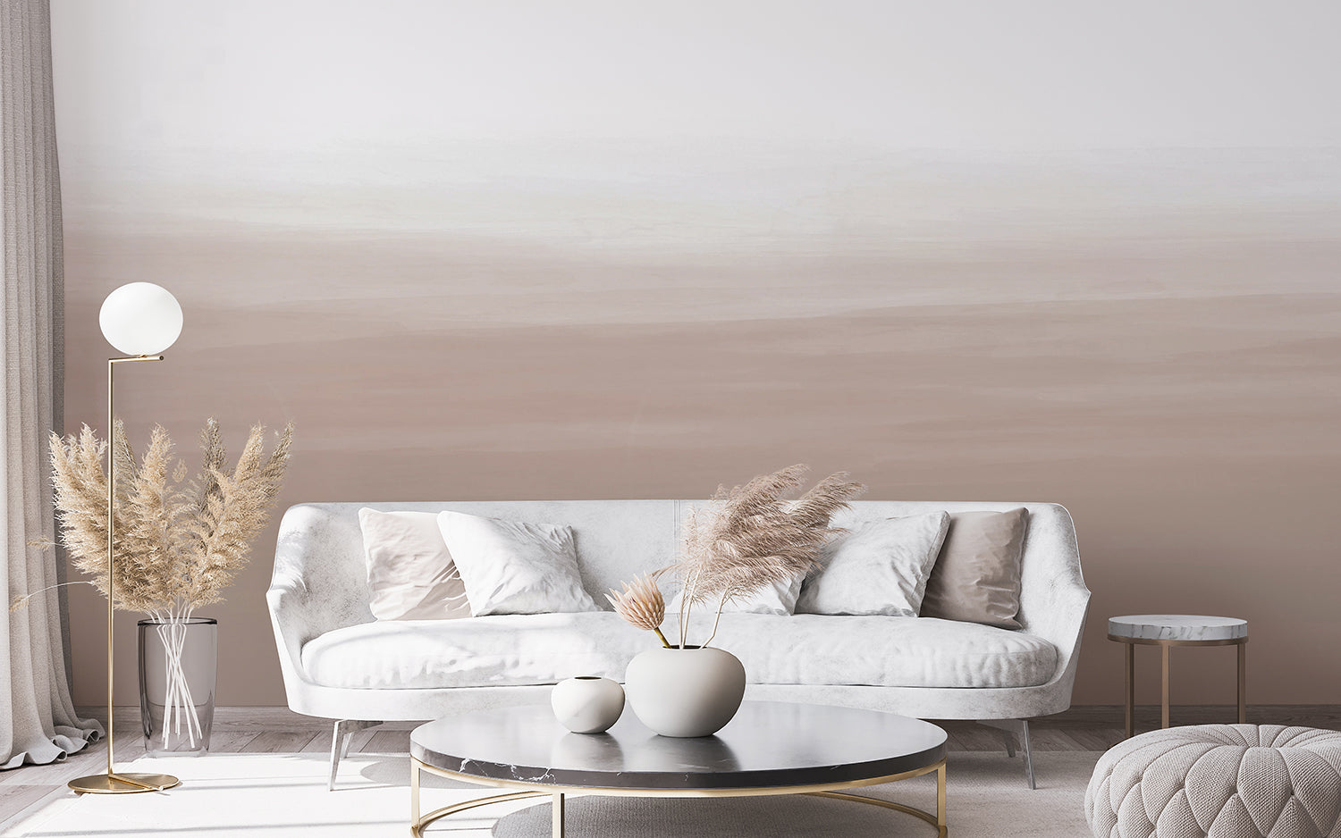
Featured: Gradient Ombre, Mural Wallpaper
Brown Ombre Wallpaper #2: Roerich Twilight, Abstract Mural Wallpaper
Roerich Twilight is the most atmospheric option here, and the one to choose if you want a wall that rewards a second look. Layered mountain ranges in warm sienna and gold recede into cool blue-grey shadow, creating real depth on a flat surface. The hand-painted, ink-wash quality suits Japandi, Scandinavian and wabi-sabi interiors, and it holds its own in living rooms, dining rooms and home offices alike. Pair it with bouclé, burl wood and natural stone, and the room settles into an earthy, tonal palette without anything competing.
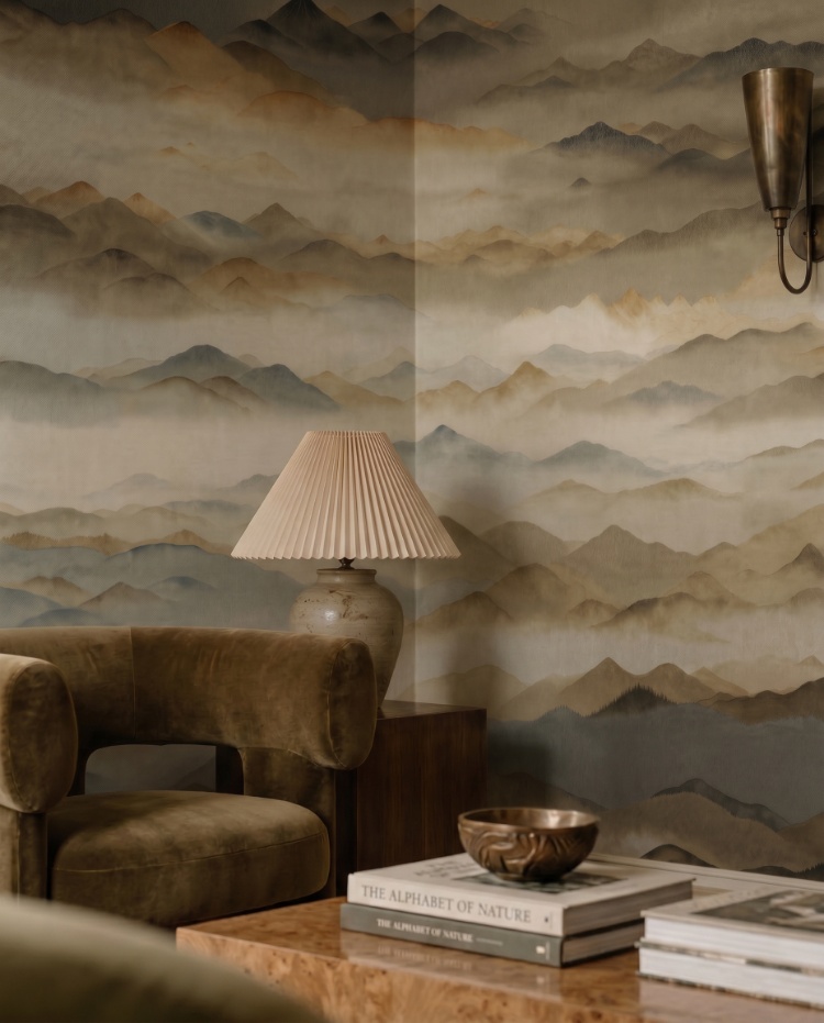
Featured: Roerich Twilight, Abstract Mural Wallpaper
Brown Ombre Wallpaper #3: Stella Skies, Ombre Wallpaper
For a softer take on brown ombre wallpaper, Stella Skies borrows the way colour drains from the sky at the end of the day. The gradient is smooth and airy rather than heavy, so it adds atmosphere to a room without darkening it, which matters in spaces short on natural light. Bedrooms and living rooms are the obvious homes for it. Choose the sand colourway if you're building a warm neutral scheme, since it leans greige and works beautifully with cream upholstery, pale timber and dried grasses.
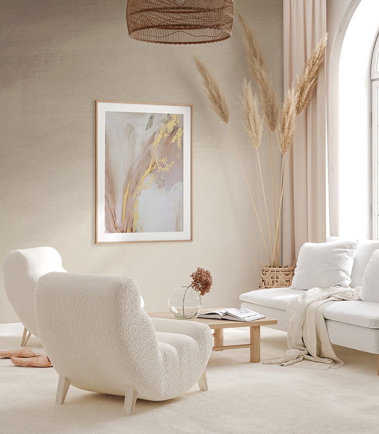
Featured: Stella Skies, Ombre Wallpaper
Brown Ombre Wallpaper #4: Vista, Watercolor Ombre Wallpaper
Vista is the lightest touch in this line-up, and the right pick when you want brown ombre wallpaper that barely announces itself. Its watercolour wash drifts through soft sand and warm grey the way a hazy horizon does, adding depth to a wall without adding weight. That restraint makes it useful in rooms already working hard: a hallway with a console, a home office behind a desk, or a bedroom where you want calm above all else. Style it simply, with pale oak, ceramics and a single dried stem, and let the wall stay quiet.
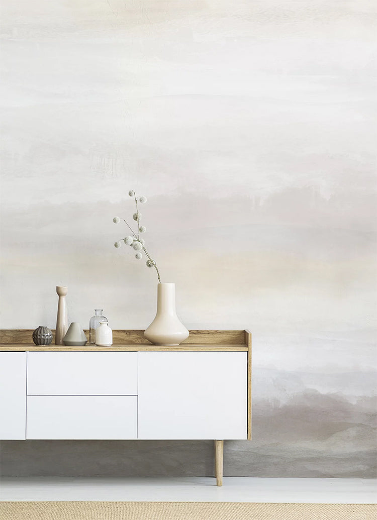
Featured: Vista, Watercolor Ombre Wallpaper
Brown Ombre Wallpaper #5: Luminate Gradient, Ombre Mural Wallpaper
If you want a gradient that shifts with the light rather than sitting still, Luminate Gradient is the one to look at. Its smooth, unbroken transition moves from a warm, sunlit tone into a soft neutral, giving walls depth without a single hard edge. That makes it a natural choice for living rooms and bedrooms, where you're after atmosphere rather than pattern. With six colourways to choose from, you can push it warm for a brown ombre wallpaper scheme or keep it cooler and more minimal, and it works equally well in contemporary and softly traditional interiors.
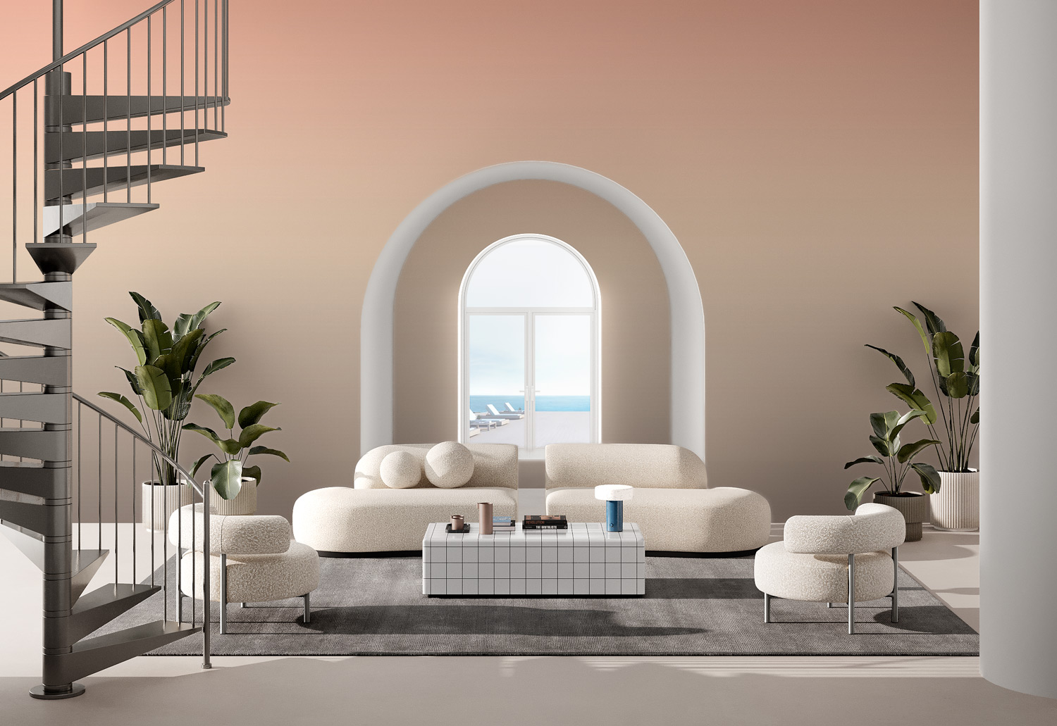
Featured: Luminate Gradient, Ombre Mural Wallpaper
Brown Ombre Wallpaper #6: Calbri, Ombre Wallpaper
Calbri keeps things deliberately quiet. Built from just two blended tones, it fades so gradually that the join is impossible to find, which is exactly what you want when a wall needs to recede rather than announce itself. Use it in a bedroom, a snug or a small hallway where a busier design would crowd the space. The nude colourway is the warmest in the range and sits comfortably alongside timber, rattan and tan leather, so it slots easily into the earthy palettes that brown ombre wallpaper schemes tend to be built around.
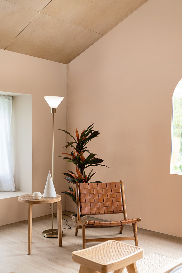
Featured: Calbri, Ombre Wallpaper
Brown Ombre Wallpaper #7: Delilah Waves, Watercolour Ombre Wallpaper
Delilah Waves is worth a look if you find most ombre a little too uniform. Its gradient is hand-painted rather than mechanical, with visible watercolour brushstrokes that blend on a soft diagonal instead of a flat horizontal line, which gives the wall movement as well as depth. In the Sand colourway it runs from cream at the top into warm mushroom brown at skirting level, so it settles happily in a bedroom, a living room or behind a hallway console. Pair it with pale timber, textured ceramics and a little greenery, and keep everything else understated.
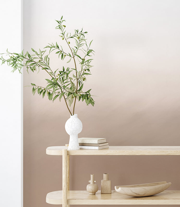
Featured: Delilah Waves, Watercolour Ombre Wallpaper
Should The Dark End Of Brown Ombre Wallpaper Go At The Top Or The Bottom?
In most rooms the dark end should go at the bottom. Grounding the gradient at floor level mirrors the way light actually falls in a space, and it makes the ceiling feel higher, which is the effect nearly everyone is after.
Dark At The Bottom
Running the darkest band along the skirting is the right orientation for the majority of homes. It anchors your furniture, it hides the scuffs that inevitably collect at floor level, and it pulls the eye upwards towards the pale end. For it to work, the transition has to clear your tallest piece of furniture. Measure your sofa back or headboard, add roughly 20cm, and check the gradient is still visibly fading above that line. If the fade has finished below the top of the sofa, all you will actually see day to day is a band of flat colour.
Dark At The Top
Reversing the gradient so the dark sits overhead creates a heavier, more enveloping room, and it needs ceiling height to succeed. Below about 2.4 metres it reads as low rather than dramatic. Where it genuinely earns its place is a room with a tall window or a stairwell, because the dark upper band frames the light coming in and the effect becomes architectural. If this is the look you want, check whether the design can be supplied reversed before you order, since not every mural can be flipped without the artwork reading oddly.
How Do You Style A Room Around Brown Ombre Wallpaper?
Style the room by treating the mural as its only strong statement, then matching two things to it: the paint on the remaining walls, and the colour temperature of your lighting. Those two decisions do more for the finished room than any amount of accessorising.
Choosing Paint For The Remaining Walls
Match the other walls to the palest tone in the gradient rather than defaulting to brilliant white. Brilliant white next to a warm brown reads faintly blue, and that mismatch is the most common reason a mural ends up looking stuck on rather than built in. The simplest method is to photograph the top of the mural in daylight, take the photo to a paint counter to be matched, then go one shade lighter than the match. Paint the skirting and architrave in that same tone rather than white, so there is no hard line cutting across the base of the wall.
Getting The Lighting Right
Warm bulbs are not optional with brown ombre wallpaper. Anything above roughly 3000K drains the warmth out of the gradient and leaves it looking grey and muddy, so aim for 2700K across the whole room, not just the lamp nearest the wall. Avoid downlights positioned close to the mural, because they throw scallops of light that cut straight across the fade and break it into visible sections. Floor and table lamps set back from the wall are far kinder, since they light the room rather than the wallpaper and let the gradient read as continuous.
Placing Furniture Against The Gradient
Put your largest piece against the darkest part of the wall. A sofa, bed or sideboard set against the deep end looks deliberate, while the same piece against the pale end tends to look as though it has drifted there. Leave the palest section clear where you can, because that is where the gradient is most visible and most worth seeing. In a narrow room it is worth pulling furniture about 5cm off the wall, slightly more than you otherwise would, so the upholstery colour does not bleed visually into the mural behind it.
Hanging Art And Mirrors
A mural is already doing the job of artwork, so hang noticeably less than you normally would. If you do want something on that wall, place it over the palest and least eventful section, and choose a frame in a tone lifted from the darkest end of the gradient so it ties back rather than interrupting. A mirror on the opposite wall is usually the better move than art on the mural itself, because it reflects the gradient back into the room and makes the whole scheme feel larger.
Choosing The Perfect Brown Ombre Wallpaper For Your Home
The best brown ombre wallpaper is one that suits the way you want a room to feel while working with the light that room actually gets. Whether you are drawn to a soft watercolour wash, a misty landscape mural, an atmospheric dusk sky or a deep chocolate gradient, the right choice can turn a plain wall into one of the most memorable rooms in your home. Match the paint on your remaining walls to the palest tone in the design, keep your bulbs warm, and the finished space will feel both practical and beautifully designed.
Ready to start your project? Explore our full collection of ombre wallpaper to find made-to-measure designs that suit living rooms, bedrooms, dining rooms and home offices alike, and order a sample first so you can see how the gradient behaves in your own light.
Transform Your Home with Made-to-Measure Wallpaper
Explore our full collection of wallpaper designs and get inspired to find the perfect design for your home. Installation services are available in selected countries — just add it at checkout if it’s offered in your area.
At Hello Circus, we believe every wall deserves something special. That’s why all our wallpapers are custom-made to fit your wall’s exact dimensions — no generic rolls, just a perfect fit. Priced by the square metre (Height × Width × Unit Price), you only pay for what you need.
Choose the Right Wallpaper Material
Whether you’re decorating your forever home, updating a rental property, or refreshing a single feature wall, choosing the right wallpaper material can make all the difference. At Hello Circus, every wallpaper design is available in three premium materials, so you can select the option that best suits your space, installation preferences, and lifestyle.
- Non-Woven Matte Wallpaper: Our most popular choice, featuring a smooth, non-reflective finish that creates a beautifully soft look. Durable, breathable, and easy to install using the paste-the-wall method, it’s ideal for most residential interiors.
- Heavy Duty Textured Vinyl Wallpaper: Designed for busy households and commercial spaces, this premium textured finish offers added durability and a luxurious tactile feel. It’s perfect for high-traffic areas where extra resilience is required.
- Peel and Stick Wallpaper: A self-adhesive option that makes decorating quick and convenient. Ideal for renters, DIY enthusiasts, or anyone who prefers a paste-free installation, peel and stick wallpaper allows you to refresh your walls with minimal fuss while enjoying the same beautiful Hello Circus designs.
Whichever material you choose, every wallpaper is custom-made to your wall’s exact dimensions using high-quality printing and vibrant, colour-rich inks, ensuring a beautiful finish that’s made to last.
Curious About the Cost? Try Our Wallpaper Visualiser
- Enter your wall’s width and height for an instant price.
- Preview how your chosen wallpaper will look on your wall — especially helpful for murals, where placement matters.
Still deciding? Order a sample to feel the texture, quality, and finish before you commit.
How to Calculate How Much Wallpaper You Need?
Before purchasing, it’s important to measure your wall accurately to avoid over- or under-ordering. Here’s a simple way to get started:
- Measure the width of the wall from edge to edge.
- Measure the height from floor to ceiling.
- Allow for extra, around 10cm, to account for trimming and pattern matching.
Need help? Read our guide on how to measure your wall for wallpaper or get in touch with us.
Why Choose Hello Circus Wallpaper?
What makes our wallpapers different? Every Hello Circus wallpaper is made to order using premium materials designed to deliver exceptional quality, durability, and beautiful colour reproduction.
- Premium quality: Printed in Europe on durable non-woven paper, our wallpapers are reinforced with nylon fibres to stay smooth, strong, and long-lasting.
- Matte and non-reflective: Our non-woven wallpapers are coated with a soft, non-reflective matte finish that brings warmth and elegance to your space without harsh glare.
- Safe and non-toxic: We use VOC-free inks and PVC-free, breathable paper, so you can create a beautiful home without worrying about harmful chemicals — especially important for little ones.
- Antimicrobial protection: Helps prevent the growth of mould, mildew, and bacteria, keeping your walls cleaner and fresher for longer.
- Wallpaper washability: All our wallpapers are washable, meaning everyday dirt and water stains can be wiped away using a damp cloth or sponge.
- Resistant to colour fading: Designed with colourfast technology to keep your wallpaper vibrant and rich over time.
- Fire resilient: Our wallpapers meet European fire safety standards (EN ISO 11925-2), providing an extra layer of reassurance for your home.
Read more about our wallpaper materials and check out our ultimate guide to wallpapers for answers to the most commonly asked questions.
Let’s Connect
Have a project in mind or interested in partnering with us? We’d love to hear from you.
- Bulk orders
- Corporate orders
- Selling with us
- Collaborations
- Press features
Feel free to get in touch.



