
Pink ombre wallpaper fades from one shade into another across the wall, with no repeating pattern to break the effect. That single quality is what makes it so easy to live with. You get colour and depth without the busyness of a print, which is why a gradient can suit a narrow hallway and a large living room equally well.
This guide covers the three main styles of pink ombre wallpaper, the rooms each one suits best, and three designs worth a closer look. You will also find practical advice on choosing the right shade for the light your room gets, deciding whether the gradient should run vertically or horizontally, and styling the finished wall so it looks considered rather than accidental.
What Are The Different Pink Ombre Wallpaper Styles?
Pink ombre wallpaper comes in three main styles: abstract watercolour, landscape, and sky and cloud designs. Each one handles the gradient differently, and that difference is what decides the mood it creates and the rooms it suits best.
Abstract Watercolour Pink Ombre Wallpaper
If you want the softest possible version of pink ombre, a watercolour design is where to begin. The colour is laid down in loose, painterly washes that bloom and settle rather than sitting in neat bands, so the shift from dusty rose up to pale cream reads as something painted by hand. That blurred edge is what makes it so forgiving. There is no hard line for the eye to catch, and no obvious point where the pattern repeats. It suits bedrooms particularly well, where you want the mood to feel calm rather than graphic, and it sits happily alongside natural linen, pale wood and woven textures.
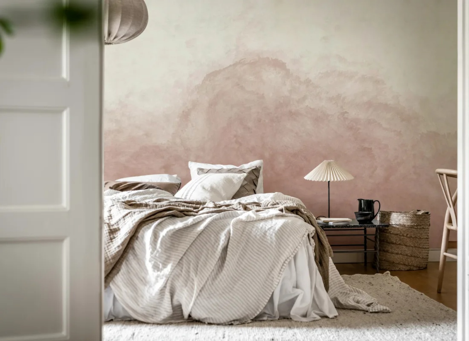
Featured: Abstract Watercolor, Mural Wallpaper
Explore the different types of abstract watercolour wallpaper, the best rooms to use them in, how to choose the right colours for your space, and practical styling tips to help you create a cohesive and beautiful home.
Pink Ombre Landscape Wallpaper
Pink ombre takes on real depth when it is built into a landscape. Layered treelines and hillsides fade back into mist, each row a little paler than the one in front, so the gradient does the work of perspective instead of simply moving from dark to light. Rendered in dusty rose and mauve rather than the greens you might expect, a forest scene like this feels quiet and faintly dreamlike. It is a strong choice for a living room or a study, where you want a wall you can look into rather than just at, and it holds its own against darker furniture and rustic wood.
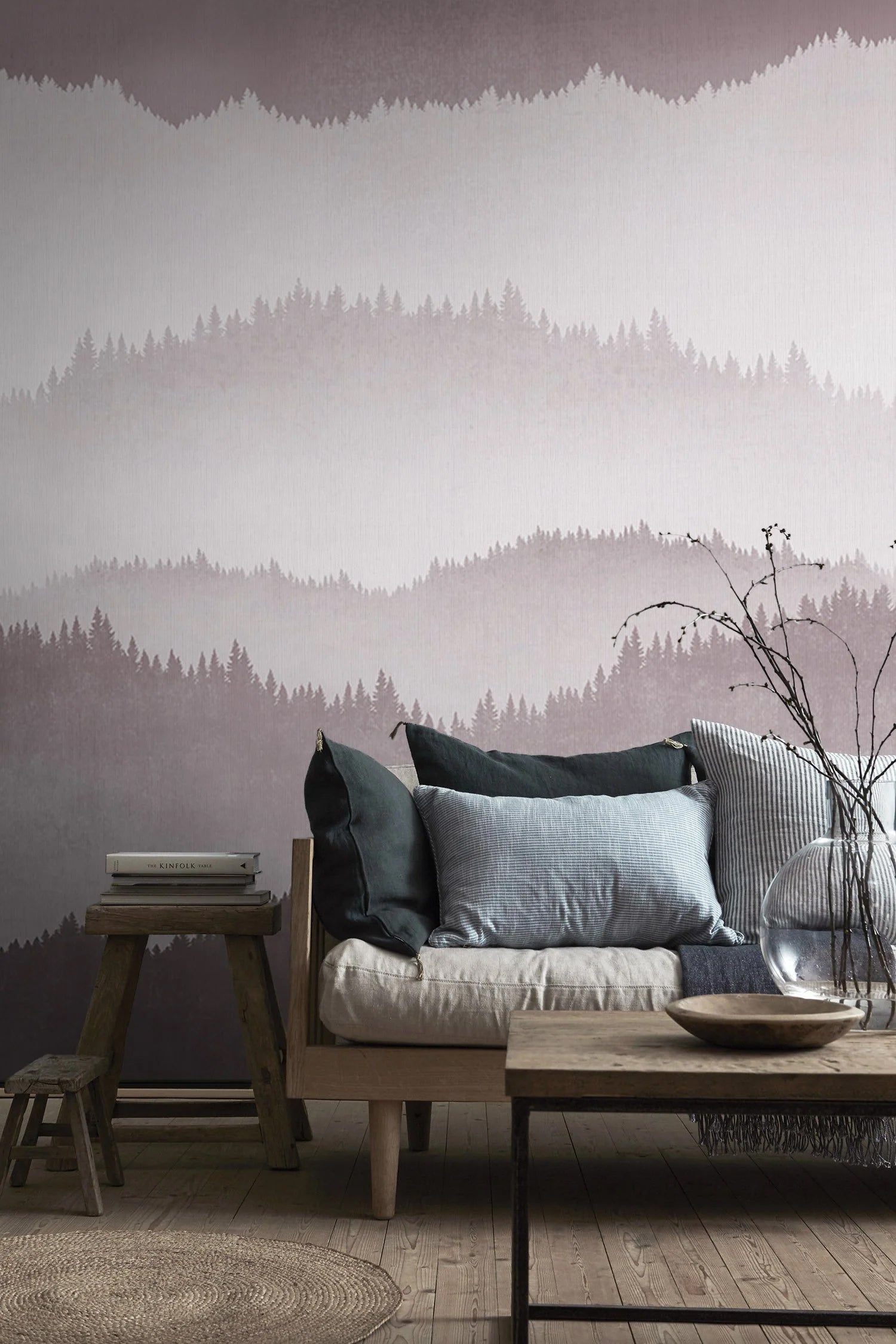
Featured: Forest Landscape, Ombre Mural Wallpaper
Immerse yourself in the breathtaking beauty of our landscape wallpaper designs.
Sky And Cloud Pink Ombre Wallpaper
Skies are where ombre comes from in the first place, which makes cloud designs the most natural home for a pink gradient. Colour drifts from blush at the top through to warm cream lower down, with no visible edges at all, and the effect is closer to light falling across a wall than to a pattern printed onto it. Rooms feel taller and airier as a result, because the eye keeps travelling upward with the gradient. Pair it with warm accents such as terracotta, rattan and off-white upholstery, and the pink stays grounded and contemporary rather than sweet.
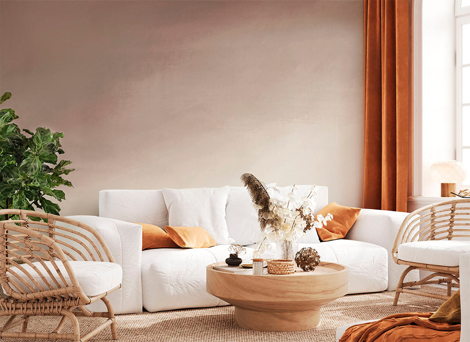
Featured: Stella Skies, Ombre Wallpaper
From soft, pastel skies to dramatic cloudscapes and dreamy sunsets, our sky and cloud wallpapers evoke a sense of calm, lightness, and spaciousness — perfect for creating a peaceful retreat at home.
Which Rooms Are Best For Pink Ombre Wallpaper?
Pink ombre wallpaper works in almost any room, but the shade you choose should follow the light the room gets and how long you spend in it. Bedrooms and living rooms suit softer, wider gradients, while dining rooms, entryways and hallways can carry a deeper pink.
Bedroom
Bedrooms are where pink ombre works hardest, because a gradient settles a room without flattening it the way a single block colour does. A deep design like this one anchors its darkest tone at skirting level and lets it lift into soft dusty pink as it rises, which draws the eye upward and makes a low ceiling feel further away. Darker gradients also suit north-facing bedrooms, where a pale pink can turn grey and lifeless by mid-afternoon. Keep the bedding calm in grey, white or oatmeal so the wall stays the focal point, and build interest with texture instead of more colour, a chunky knit throw or washed linen. Hang it behind the bed, where you see it least while sleeping and most on walking in.
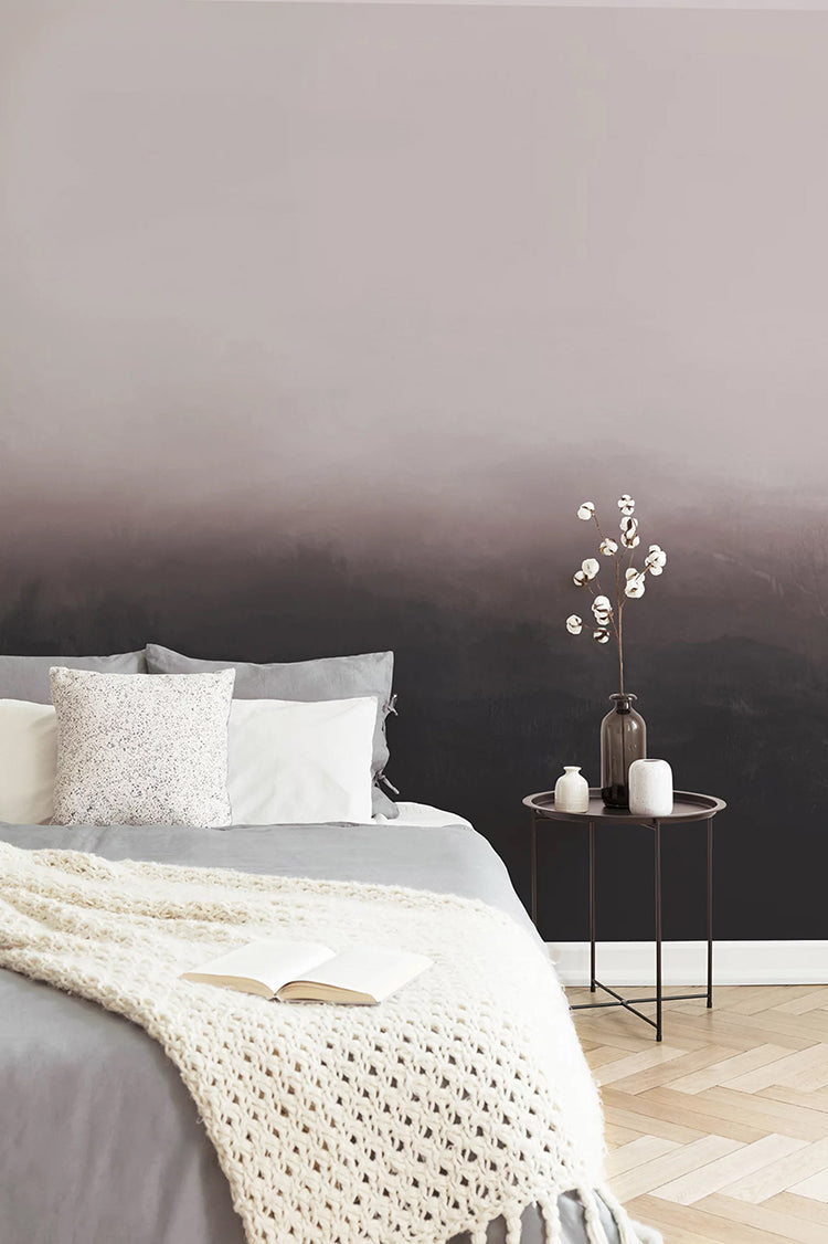
Featured: Greg Horizon, Ombre Mural Wallpaper
Your bedroom should be a sanctuary — a space that reflects your personal style and helps you unwind at the end of the day. Explore our bedroom wallpaper designs to create your perfect retreat.
Living Room
In a living room, the deciding factor is usually how much wall you have to fill. Pink ombre suits large, open spaces because a gradient needs room to travel, and squeezed into a narrow alcove the shift from one tone to the next gets lost. A warm design running from coral at ceiling height down to soft sand at floor level gives a big room a sense of light, almost as though the sun is coming in from above. It also does plenty of the decorating on its own, so the furniture can stay quiet. Cream bouclé, pale timber and a grey rug all sit comfortably against it. If your living room is small, choose a paler pink and let it wrap the whole room rather than sitting on a single feature wall.
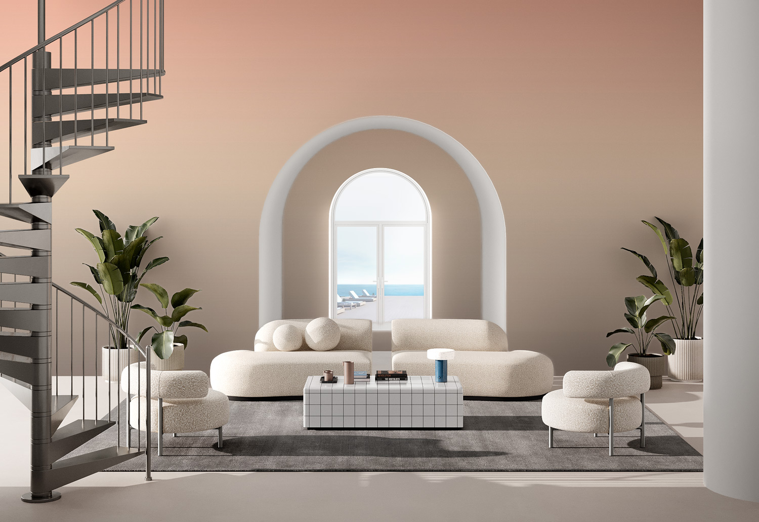
Featured: Luminate Gradient, Ombre Mural Wallpaper
Discover more living room wallpapers that not only reflect your personal style but also help create a warm, welcoming atmosphere your whole family will enjoy.
Dining Room
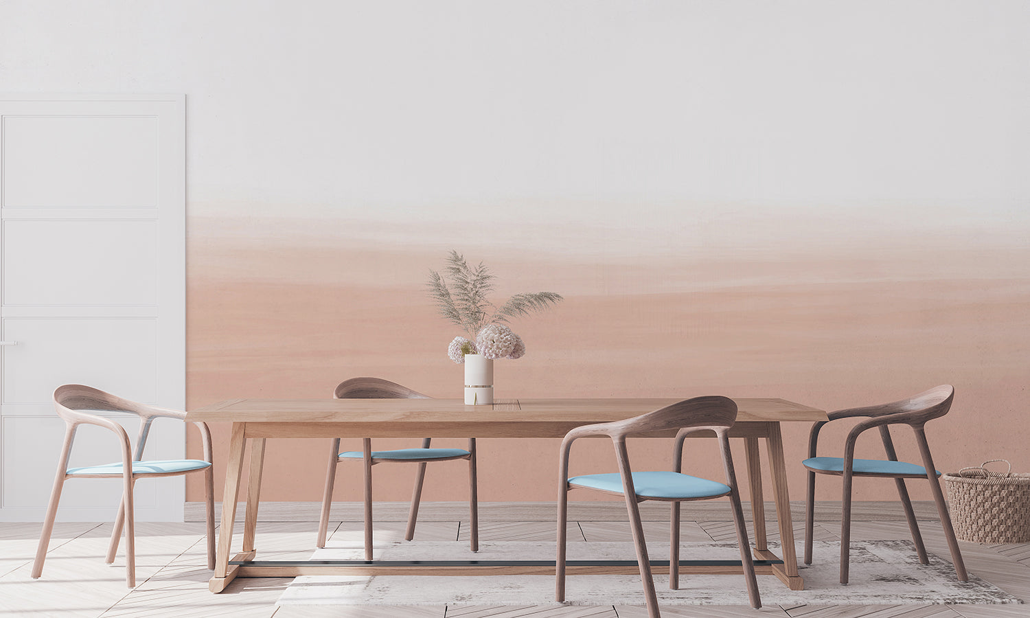
A dining room can take a stronger pink than most rooms in the house, since you tend to be in it for an hour or two at a time rather than all evening. Blush works especially well here because it flatters under both daylight and lamplight, and it warms up a space that can otherwise feel formal. A gradient that stays pale at the top and deepens towards the floor keeps the ceiling feeling high while grounding the table, which matters in a room where everyone is seated and looking across at the walls. Pale timber furniture is the natural partner. A cool accent such as soft blue on the chair seats stops the scheme reading as too sweet, and flowers in a related pink tie the wall back into the room.
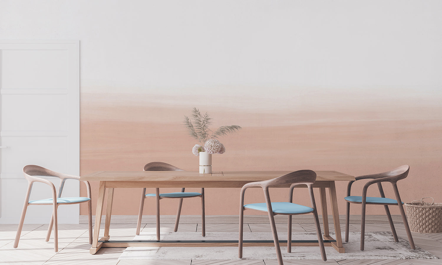
Featured: Gradient Ombre, Mural Wallpaper
Create a beautiful gathering space with our collection of dining room wallpapers. From traditional patterns and rich colours for formal dining settings, to light, airy motifs for everyday gatherings, our wallpaper designs are curated to suit a variety of styles.
Entryway
An entryway is where a bolder pink pays off, because you pass through it rather than sit in it and it sets the tone for everything beyond. The square footage is usually small, so covering it costs little and you can commit to a shade you might hesitate over in a living room. A soft chalky finish like this one has barely any directional fade, which suits a space where you only ever see one wall at a time and a strong top-to-bottom gradient would feel cut off before it finishes. Since most entryways borrow their light rather than having a window of their own, pick a pink with enough warmth in it to hold up under artificial light. Keep the console vignette simple, and hang a single framed piece over the palest part of the wall so it stands out.
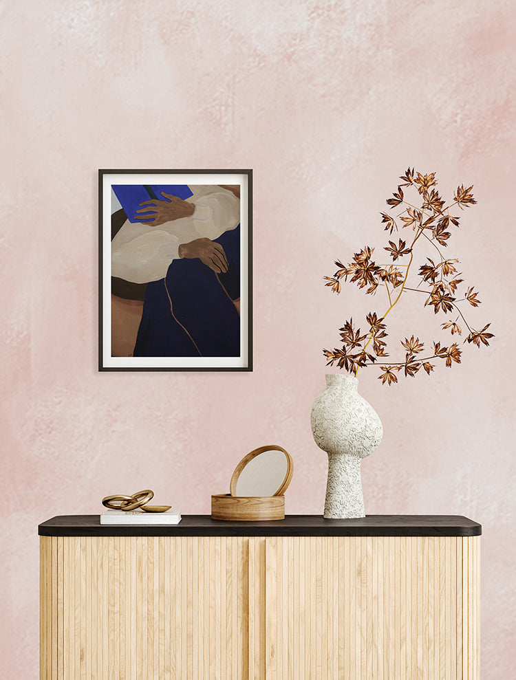
Featured: Addison Chalk, Ombre Wallpaper
If you're looking to give your entryway some love, explore our small entry design ideas and wallpapers to get inspired!
Hallway
Hallways gain more from pink ombre than almost any other room, largely because they have so little else going on. There is rarely enough wall for a busy pattern and rarely enough natural light for a dark one, and a soft gradient answers both problems at once. A watercolour design fading from cream at the top down to dusty rose gives a narrow corridor a sense of depth without crowding it, and the upward shift makes the ceiling feel higher as you walk through. Since hallways take knocks and scuff marks, a mid-tone pink across the lower half is more practical than a pale one. Keep furniture low and shallow, a slim sideboard rather than anything deep, so the wall stays visible from one end to the other.
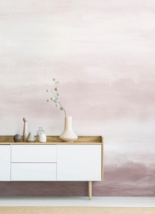
Featured: Vista, Watercolor Ombre Wallpaper
Explore more hallway wallpaper ideas and design tips.
Pink Ombre Wallpaper #1: Aista, Ombre Watercolour Wallpaper
Anyone drawn to pink ombre wallpaper but worried it will overpower a room should start with Aista. The blush tones are soft and chalky, closer to a plaster finish than a bold colour, and the watercolour gradient shifts so gradually from dark to light that you notice it only after a moment. That restraint is what makes it so versatile. It sits quietly behind strong furniture, and it holds up against unexpected pairings such as olive velvet or navy without either colour fighting the other. Consider it for a living room or study where you want warmth rather than a statement.
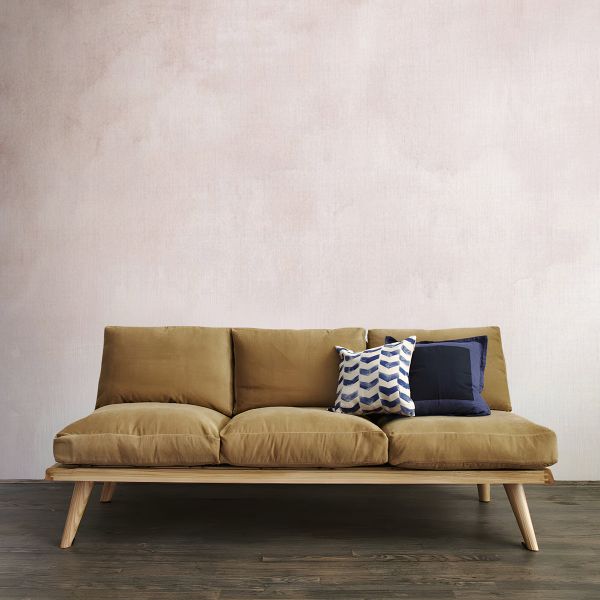
Featured: Aista, Ombre Watercolour Wallpaper
Pink Ombre Wallpaper #2: Calbri, Ombre Wallpaper
Calbri is the pink ombre wallpaper to reach for when you want colour on every wall rather than one. Two tones blend into each other in a smooth, matte gradient with no pattern or texture to interrupt it, so the design carries around corners and across window reveals without an obvious join. Pale blush at the top settles into a deeper dusty rose towards the floor, which keeps a room feeling tall while grounding it. The effect suits calm, pared-back interiors, and it looks especially good against woven leather, rattan and warm timber.
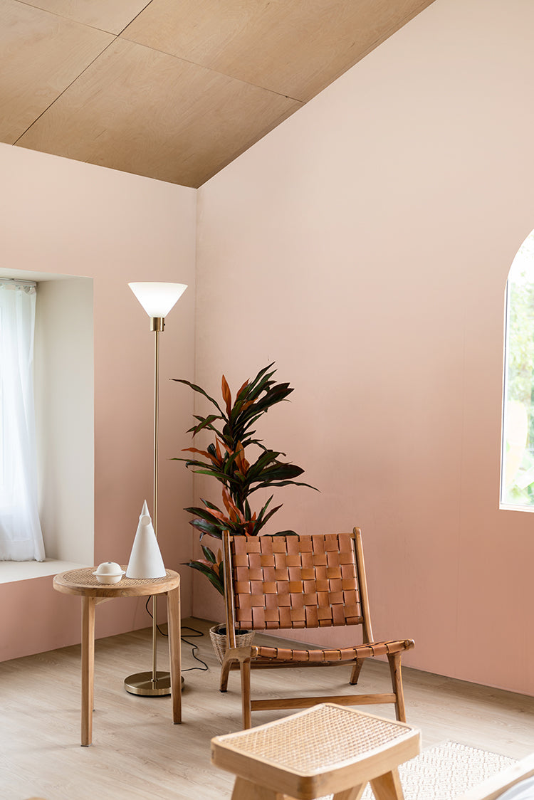
Featured: Calbri, Ombre Wallpaper
Pink Ombre Wallpaper #3: Watercolour Pastel, Ombre Mural Wallpaper
Warmth is what separates this design from the paler pink ombre wallpapers in the range. Peach and cream at the top give way to blush and then to a deeper terracotta near the floor, with soft watercolour brushstrokes and a light scattering of speckles adding movement across the wall. Rooms that get afternoon sun suit it best, since the warmer tones amplify light that is already there. It works well in bedrooms, living areas and creative spaces, and the relaxed finish pairs naturally with pine, jute, macramé and other handmade textures.
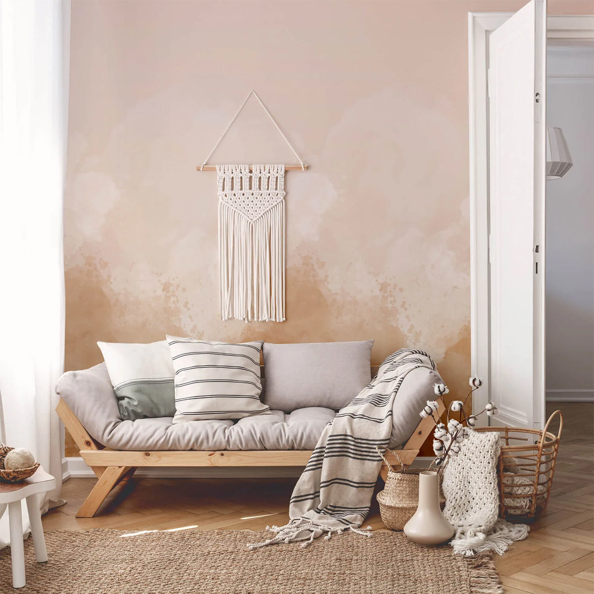
Featured: Watercolour Pastel, Ombre Mural Wallpaper
How Do You Choose The Right Shade Of Pink Ombre Wallpaper?
The right shade depends less on personal taste than on the light your room gets. Cool light drains the warmth out of pink and makes pale shades look grey, so work out the undertone you need before you start shortlisting designs.
Match The Shade To Your Room's Light
Check which way the room faces before anything else. In the UK, a north-facing room takes cool, blue-toned light all day, which pulls the warmth out of a pale blush and can leave it looking grey by mid-afternoon. Warmer pinks carrying peach or terracotta hold their colour in that light. South-facing rooms have the opposite problem, since strong warm light pushes an already warm pink towards orange, so cooler dusty rose and mauve stay better balanced. In Australia and New Zealand this is reversed, with south-facing rooms getting the cool light. In Singapore and other equatorial climates the aspect matters far less than intensity, and the real question is whether the room takes hard afternoon sun, which will wash out anything too pale.
Warm Pink Or Cool Pink
Separate the two families before you shortlist. Warm pinks lean towards peach, coral and terracotta, and they make a room feel sunnier than it is, which suits cooler rooms and anywhere you want more energy. Cool pinks lean towards dusty rose, mauve and plum, reading calmer and slightly more formal, which is why they sit so well in bedrooms and dining rooms. Mixing the two families in one room is where schemes usually come unstuck, so once you have picked a direction, let the cushions, rugs and artwork follow it.
How To Test A Shade Before You Order
Order a sample and tape it to the wall rather than judging it in your hand. Look at it three times across a day, mid-morning, mid-afternoon and at night under your own lamps, because a pink that looks right at noon can turn muddy under warm bulbs. Two things people forget: hold the sample against your skirting board and flooring, since those are the fixed colours it has to live with, and pin it at the height where the darkest part of the gradient will actually sit. The dark end sets the mood of the whole room, and it is the part most people never test.
Should Pink Ombre Wallpaper Run Vertically Or Horizontally?
Most pink ombre wallpaper runs vertically with the darkest tone at the bottom, and that suits the majority of rooms. Choose a horizontal gradient only when the problem you are solving is a narrow room rather than a low ceiling.
Vertical Gradients For Height
Running the gradient vertically with the dark end at skirting level is the safest choice, because it copies the way light behaves in a real room and reads as natural rather than designed. The pale top draws the eye upward, which makes a standard ceiling feel higher and is worth doing in any room under about 2.4 metres. Flipping it so the dark tone sits at the ceiling pulls the ceiling down and makes a room feel enclosed. That is a mistake in a hallway, and a deliberate, rather effective one in a bedroom where you actually want a sense of cosiness.
Horizontal Gradients For Width
Reach for a horizontal gradient when a room is long and narrow. Running the colour from dark at one end of the wall through to light at the other keeps the eye travelling sideways, which stretches the space visually in the direction it needs. Choose the longest uninterrupted wall in the room for this, and avoid a wall broken up by doors or windows, since every opening interrupts the fade and undoes the effect.
Where To Place The Transition Line
Decide where the gradient changes before you decide anything else, because that line will pull the eye whether you planned it or not. Landing it at eye level, roughly 1.5 metres, cuts the wall in half and makes the room feel shorter than it is. Put it either low, below about 85 centimetres so a sofa back or headboard sits in front of it, or high, above door height at around 2 metres. Measure your ceiling height before you order, too. Ombre murals are printed to a set drop, and if your ceiling is lower than the design height the panel gets trimmed, and what you usually lose is the palest end of the gradient, which is the part doing the lifting.
How Do You Style Pink Ombre Wallpaper?
Let the wall lead and keep everything else quiet. A gradient is already doing the work of both colour and pattern, so the job of your furniture and accessories is to support it rather than compete with it.
Choose One Accent Colour And Repeat It
Pick a single accent from the darkest tone in the gradient and use it exactly twice more in the room. Once reads as accidental and three times starts to look themed, but twice, on a cushion and a lampshade, or a throw and a vase, makes the scheme look deliberate. Three pairings reliably work: cream, oatmeal and pale timber for the calmest result; terracotta, rattan and burnt orange to warm a blush and stop it reading as sweet; and navy, olive or soft blue as a cool contrast, which is the pairing fewest people try and the one that most effectively stops a pink room feeling juvenile. Keep large upholstery neutral whichever you choose, and build interest through texture, linen, jute, woven leather and chunky knits, rather than through more colour.
What To Hang On A Pink Ombre Wall
Hang less than you think, and hang it over the palest part of the wall. Artwork placed on the darkest section tends to disappear, particularly in a dark frame, while the same piece over a pale area reads clearly. Skip the gallery wall altogether. The gradient is already the artwork, and a grid of frames fights the fade rather than sitting on it. One large piece, a round mirror, or nothing at all will each look better. If you do go for a mirror, place it where it reflects the pale end of the gradient back into the room.
Getting The Trim And Metals Right
Two details decide whether the finished room looks considered or slightly off. Paint skirting boards, architraves and doors in a warm white rather than a bright brilliant white, because a cool white sitting next to pink makes the pink look dirty by comparison. For hardware, lighting and frames, warm metals are the natural partner, so brass, antique gold and bronze pick up the warmth in the gradient while chrome and cool silver sit against it awkwardly. If your fittings are already chrome and you would rather not change them, a warm timber or rattan piece nearby will bridge the two.
Still deciding on a pink shade? Our guide to pink wallpaper from soft blush to bold fuchsia walks through the full range, which helps if you are weighing a gradient against a solid colour. And if it is the gradient that appeals more than the pink, our ombre wallpaper ideas and tips cover the same ground across every colourway.



