
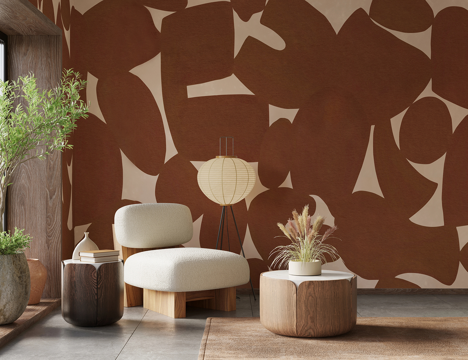
Warm colours have a way of making a room feel lived-in and welcoming, often before a single piece of furniture is in place. Whether you're drawn to sweeping terracotta abstracts, sunlit landscapes, classic stripes or cosy gingham checks, the right warm wallpaper can turn an ordinary room into a space you'll want to linger in long after the sun goes down. Because warm tones shift so noticeably with the light and the colours around them, choosing the right shade and setting matters just as much as choosing the design.
In this guide, we'll explore the most popular warm wallpaper styles and colourways, compare light and dark shades, reveal which rooms suit them best, and help you decide between a mural and a pattern. We'll also share practical advice on lighting your walls and styling the rest of the room, so your warm wallpaper looks as inviting in real life as it does on the sample.
What Are Popular Colourways For Warm Wallpaper?
The most popular colourways for warm wallpaper are terracotta, yellow, warm beige, blush pink, red and burgundy, and brown. They all share a red or yellow undertone, which is what makes a room feel cosy, but they vary a lot in intensity. Beige and blush wrap a room softly, terracotta and yellow bring energy, and deep reds and browns add depth and drama.
Terracotta Wallpaper
If you love the colours of sun-baked clay and Mediterranean pottery, terracotta is one of the easiest warm tones to live with. It sits between orange, pink and brown, so it feels earthy rather than loud. Softer versions blend into small leafy or floral patterns that can cover every wall. Terracotta pairs naturally with sage green, cream, oak and rattan. Check your floor first: orange-toned pine or honey oak can clash with terracotta at skirting level, so hold a sample against the floor as well as the wall. In north-facing rooms it leans browner, which many people find even cosier.
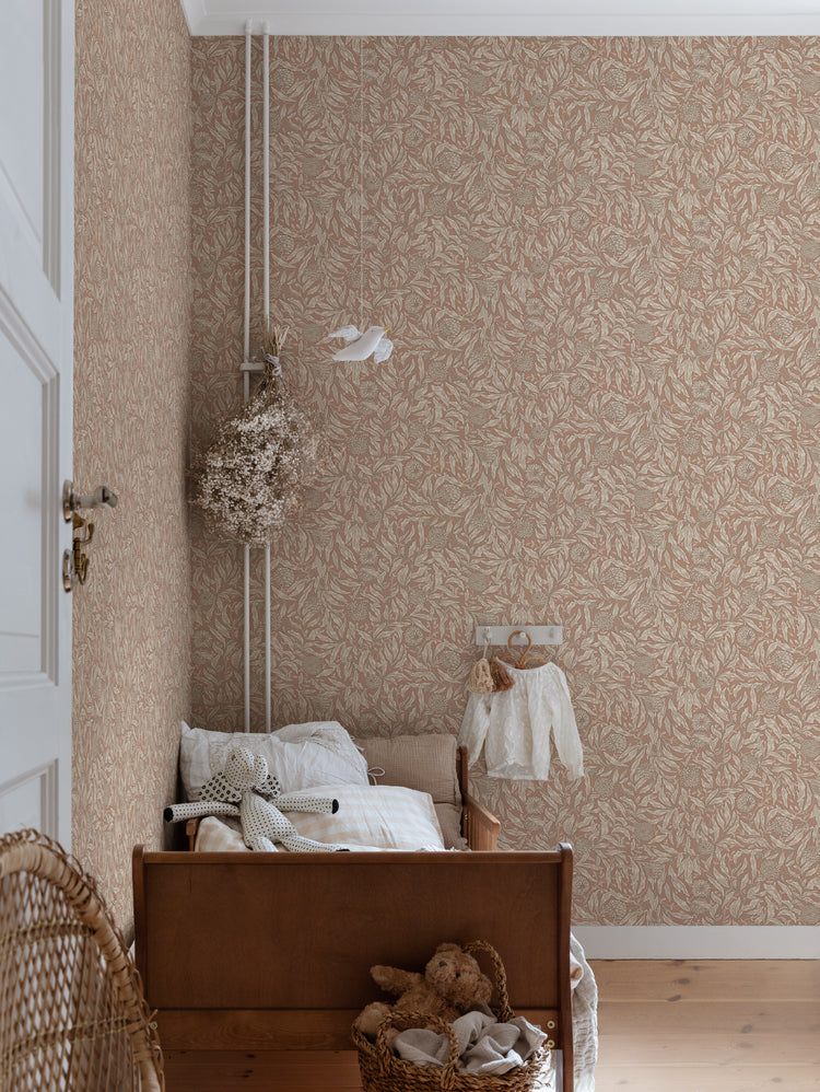
Featured: Olof, Floral Pattern Wallpaper
Yellow Wallpaper
Nothing brings sunshine indoors quite like yellow, and the shade you choose makes all the difference. Lemon and primrose can feel sharp across a whole wall. Mustard, ochre and saffron have a touch of brown that makes them richer and far easier to live with. These deeper yellows suit vintage florals, woven textures and retro geometrics, and they're especially good in hallways and living rooms that need a lift. A large yellow wall reflects colour onto the ceiling and nearby paintwork, so soft off-white trim usually looks better than brilliant white. Wicker, pale timber and linen keep the look relaxed.
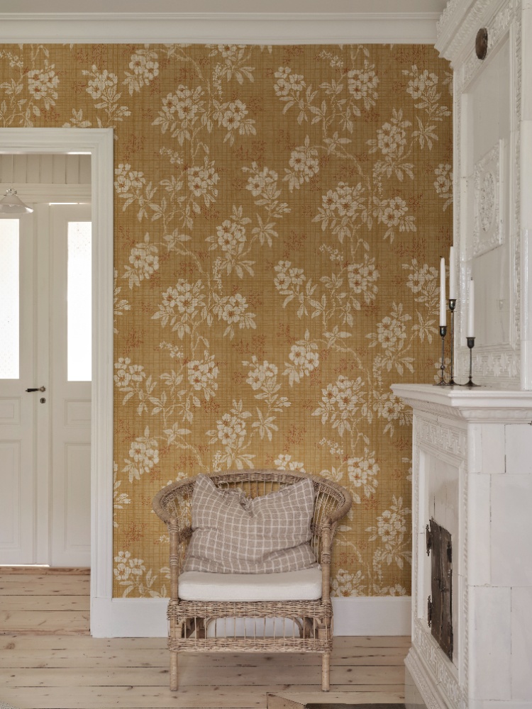
Featured: Vera, Floral Pattern Wallpaper
Infuse your space with warmth and energy through our curation of yellow wallpaper designs. From soft ochres and sun-washed pastels to bold terracottas and vibrant citrus tones, these wallpapers bring a sense of joy, creativity, and character to any room.
Warm Beige Wallpaper
For those who want warmth without committing to a strong colour, warm beige is the quiet favourite. Sand, oatmeal and biscuit have a yellow or pink undertone that keeps them soft and inviting, unlike cooler stone beiges that can drift grey. Beige works best with tone-on-tone designs, where birds, leaves or flowers are printed a shade lighter than the background. Up close the pattern adds interest, but from across the room it reads as calm texture. That makes beige ideal for bedrooms and for wrapping all four walls. Choose a design with visible texture or a linen effect, because flat beige can look tired in low light.
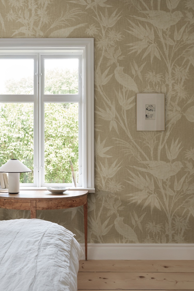
Featured: Celeste, Bird and Floral Mural Wallpaper
Discover the perfect blend of elegance and serenity with our wide range of beige wallpaper designs.
Blush Pink Wallpaper
Blush pink is warmer and more grown-up than many people expect, as long as you pick the right shade. Dusty, chalky pinks with a hint of grey or brown feel sophisticated, while sugary candy pinks are better saved for a child's room. Plain and limewash-effect designs show blush at its best, giving a soft, sunlit glow that flatters furniture and skin tones alike. It pairs especially well with terracotta, olive green, oak and caramel leather. Under warm 2700K bulbs blush leans towards peach, so tape a sample up and check it after dark as well as in daylight before ordering.
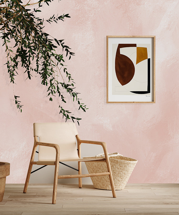
Featured: Addison Chalk, Ombre Wallpaper
Explore the different styles of pink wallpapers — a colour that continues to inspire elegance, comfort, and modern charm.
Red & Burgundy Wallpaper
Whether you're decorating a dining room or a snug you mostly use in the evening, red brings instant richness. The family runs from dusty rose-red and brick through to deep burgundy and wine. Softer reds suit traditional and vintage designs such as forest scenes, toile-style landscapes and classic florals, where a pale background lets the colour glow without overpowering the room. Save deep burgundy for a single feature wall, because it absorbs a lot of light and can make a small room feel smaller. Keep the rest of the scheme simple with cream linen, pale wood and white ceramics. Avoid cherry or mahogany furniture, which tends to disappear against a red wall.
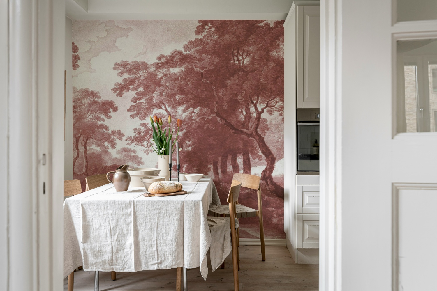
Featured: The Vintage Grove, Forest Mural Wallpaper
Explore more red wallpaper designs to refresh your living spaces.
Brown Wallpaper
Brown is the most grounding of the warm colourways, bringing the calm of wood, earth and stone onto your walls. Today's browns go far beyond dark panelling, from soft taupe and caramel to deep chocolate. They work well in abstract murals, ombre designs and landscapes with a soft, painterly fade. A design that runs from pale at the top to darker at the bottom is a clever choice, because the lighter upper wall keeps the ceiling feeling high. Brown suits minimal, Japandi and rustic interiors alike. Paint the other walls in the palest tone of the wallpaper rather than brilliant white, which can look blue next to warm brown.
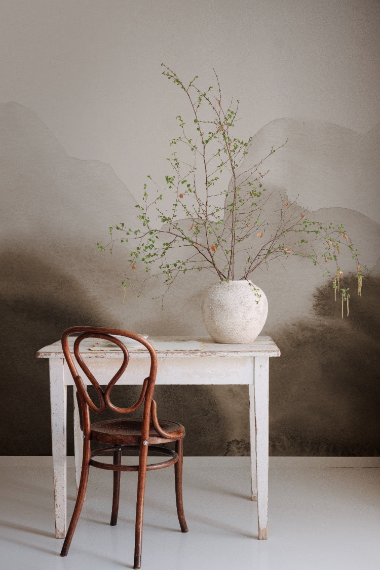
Featured: Flowing Hills, Abstract Mural Wallpaper
Explore the rich and earthy tones of brown wallpapers that bring warmth and sophistication to any space. Whether you're seeking a classic or contemporary look, our carefully curated selection offers a range of brown hues and captivating designs.
Should You Choose Light Or Dark Warm Wallpaper?
Choose light warm wallpaper if you want a bright, airy room that still feels cosy. Choose dark warm wallpaper if you want a dramatic, enveloping space. Both share the same red or yellow undertones, and the difference is depth. Light shades reflect more daylight and suit smaller or dimmer rooms, while dark shades absorb light and come alive in the evening.
Light Warm Wallpaper
If you love warmth but your room is small, low-ceilinged or short on daylight, light warm wallpaper gives you the best of both. Cream, sand, peach and pale terracotta reflect light back into the room, so the walls feel softer and further away rather than closing in. That makes light warm designs the easiest choice for papering every wall, even in kitchens and hallways where the paper wraps around doors and cabinets. Look for designs with a fine warm line or motif on a pale background, such as toiles and delicate florals. From across the room the lines blend into a soft warm tint, while up close you see all the detail. In kitchens, light warm wallpaper also sits well with cream or pale wood cabinetry, so walls and units blend into one calm backdrop.
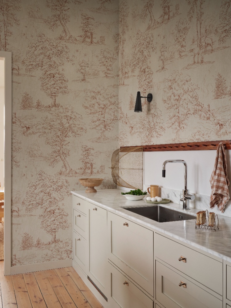
Featured: Montfort, Toile Mural Wallpaper
Create a sense of openness and ease with our curated collection of light wallpaper designs.
Dark Warm Wallpaper
Whether it's a dining room, a snug or a bedroom you mainly use at night, dark warm wallpaper creates a cocooning atmosphere that lighter shades can't match. Deep rust, chocolate, burgundy and dark amber absorb light, so the corners seem to soften and the room feels intimate rather than boxy. Dark designs work best in rooms that get good daylight or that you mostly use after dark. In a small, dim room you use all day, they can feel heavy. Plan for more lighting than usual, with at least three light sources at different heights, because dark walls reflect far less light. If you're unsure about going fully dark, a design that layers deep and mid tones, such as misty landscapes, gives depth without the full commitment.
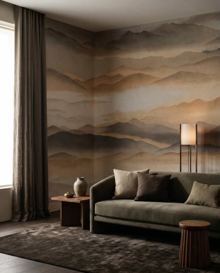
Featured: Roerich Silence, Abstract Mural Wallpaper
From deep blues and rich greens to dramatic blacks and warm earthy tones, dark wallpapers add depth, contrast, and atmosphere to any space. Make a confident design statement with our curated collection of dark wallpaper designs.
What Are The Different Warm Wallpaper Styles?
Warm wallpaper comes in almost every style, from flowing abstracts and sunlit landscapes to classic stripes and checks. What ties them together is the palette: terracotta, ochre, rust, blush and brown give even the most graphic pattern a soft, welcoming feel.
Warm Abstract Wallpaper
For those who love art on the walls but don't want a literal scene, warm abstract wallpaper is a beautiful middle ground. Sweeping lines, organic curves and loose brushstrokes in terracotta, rust and sand bring movement to a room, while the earthy palette keeps it calm. Large-scale abstracts work especially well behind a bed or sofa, where the furniture breaks up the pattern and stops it feeling busy. Before ordering, measure the height of your headboard or sofa back and check that the boldest part of the design will sit above it rather than hidden behind. Linen bedding, walnut and brushed brass pick up the warmth without competing.
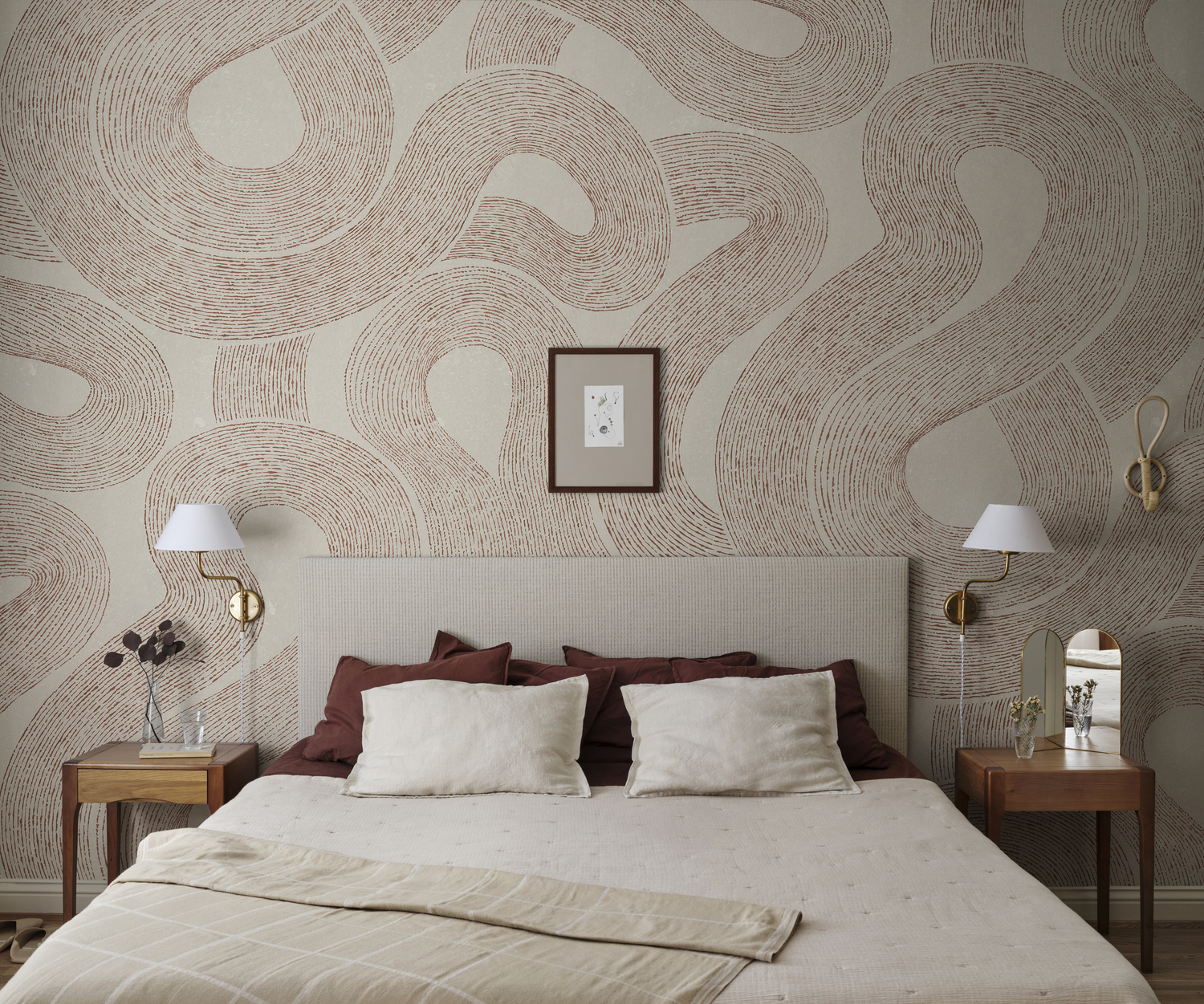
Featured: Zen, Abstract Mural Wallpaper
Bring creativity and character into your home with our curated collection of abstract wallpaper designs.
Warm Landscape Wallpaper
If you dream of somewhere sunnier, a warm landscape mural can take you there every day. Palm groves, desert dunes and golden hills in mustard, ochre and caramel feel like late-afternoon light, which makes them a natural fit for living rooms and dining spaces. Landscapes look best on your longest uninterrupted wall, because doors and windows cut through the horizon and break up the scene. Keep the furniture in front low so the view stays visible. Sage, olive and natural timber echo the outdoors and stop a strong yellow from becoming overwhelming.
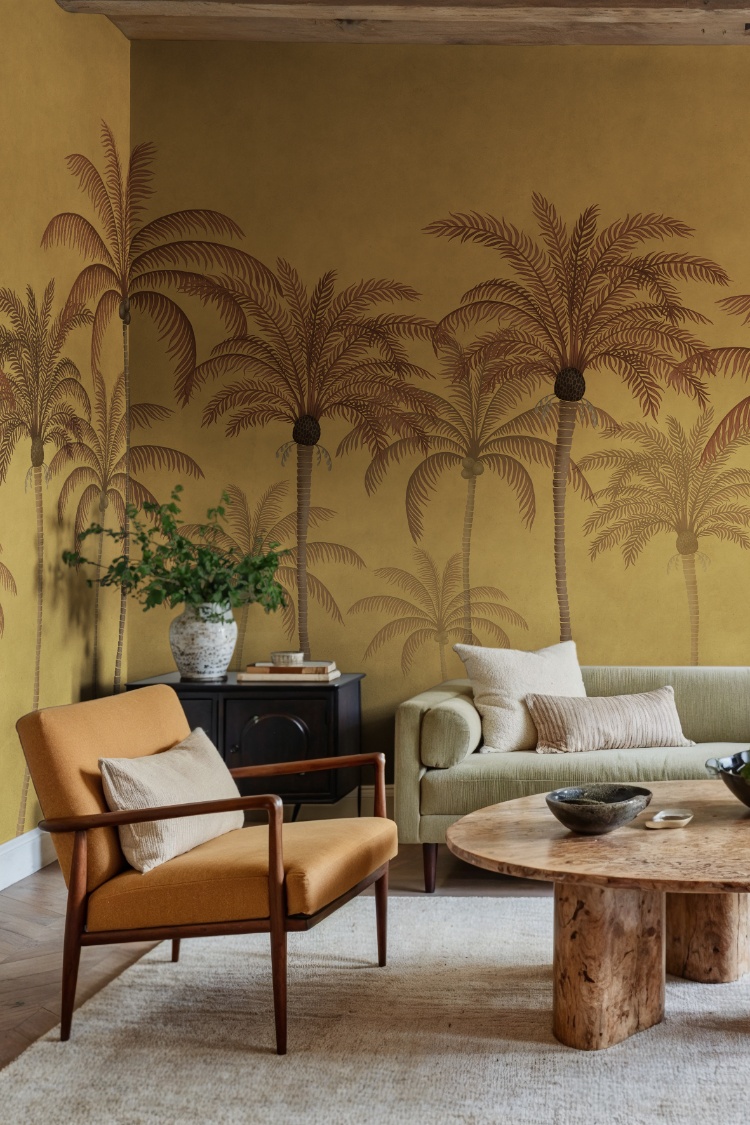
Featured: Palm Parade, Tropical Mural Wallpaper
Immerse yourself in the breathtaking beauty of our landscape wallpaper designs.
Warm Floral Wallpaper
Florals take on a completely different character in a warm palette. Instead of pretty pastels, think oversized blooms and leaves painted in ochre, rust, peach and olive, closer to a modern artwork than a traditional print. These bold, painterly designs suit living rooms with high ceilings and generous walls, where the scale has room to breathe. In a smaller room, a tighter floral is the safer choice, as huge motifs can make a compact space feel crowded. Repeat just one of the design's colours in a large piece, such as an olive sofa or a rust rug, rather than trying to match every shade.
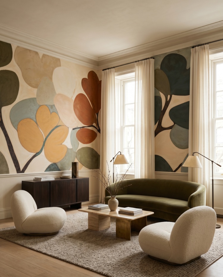
Featured: Emil's Bouquet, Abstract Mural Wallpaper
Transform your living spaces into enchanting floral wonderlands with our captivating collection of floral wallpaper designs.
Warm Ombre Wallpaper
Ombre is one of the most atmospheric ways to bring warmth into a room. The colour fades gently from one tone to the next, often from pale peach or rose at the top to deep brown or charcoal near the floor, much like a sky at dusk. Because the darkest band sits low, ombre grounds the furniture while the lighter upper wall keeps the ceiling feeling lifted. It is especially effective in lounges and snugs lit by lamps or concealed LED strips, which make the gradient glow in the evening. Choose a wall without windows if you can, because a window chops the fade into sections and you lose the seamless effect.
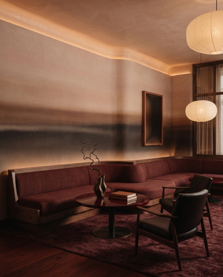
Featured: Rotko Dawn, Ombre Mural Wallpaper
Discover more ombre wallpaper ideas and why everyone is loving this trend.
Warm Geometric Wallpaper
Whether you love mid-century design or modern graphic interiors, warm geometric wallpaper adds structure with plenty of personality. Arches, quarter circles and interlocking shapes in red, terracotta or mustard against cream feel retro and confident, especially at a large scale. Bold geometrics are best kept to one feature wall, such as behind a sideboard or in a dining nook, with the other walls painted to match the pattern's background colour. Think about where the shapes meet the ceiling and corners, because a half-cut circle at eye level is far more noticeable than a cut in a loose, organic design. Rustic timber, cane and concrete balance the strong colour.
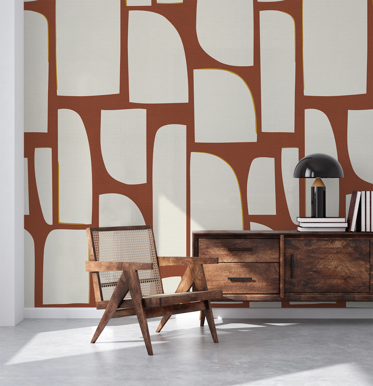
Featured: Arch Blocks, Geometric Wallpaper
Add structure, style, and visual interest to your space with our curated collection of geometric wallpaper designs.
Warm Checkered Wallpaper
Checks have made a big comeback, and in warm shades they feel especially cosy. Soft gingham and plaid in terracotta, peach or caramel bring a relaxed, country-kitchen charm, while larger checks look more contemporary. Kitchens, breakfast nooks and children's rooms all suit this style. Scale matters in a small room: a smaller check reads as gentle texture from across the space, while large checks can make the walls feel closer. Linen tablecloths, bentwood chairs and terracotta ceramics complete the look.
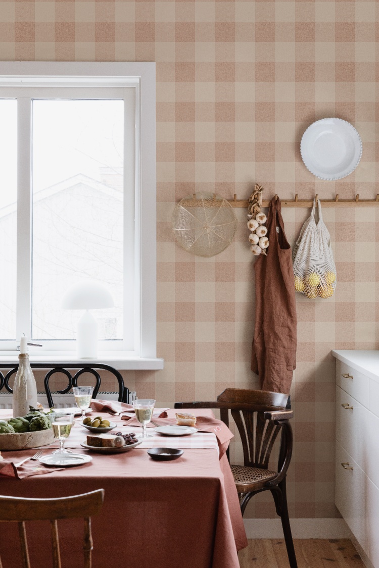
Featured: Lykke, Checkered Pattern Wallpaper
Explore more checkered wallpapers that offer a timeless balance of rhythm and symmetry.
Warm Striped Wallpaper
Stripes are a timeless way to add warmth with a tailored, classic feel. In taupe, caramel or rust with cream, they read as soft and refined rather than bold, which makes them ideal for bedrooms and hallways. Vertical stripes draw the eye upwards, so they are a clever choice for rooms with lower ceilings. Narrow ticking stripes feel relaxed and slightly vintage, while wider bands look more formal. Stripes make any lean in a wall or ceiling easy to spot, so it's worth checking your walls with a spirit level and asking your installer to plumb each drop.
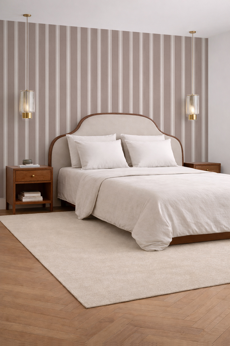
Featured: Kyra, Striped Wallpaper
Effortlessly classic and endlessly versatile, striped wallpaper designs bring structure, balance, and a refined sense of style to any room. Explore our striped wallpaper collection for more inspiration.
Which Rooms Are Best For Warm Wallpaper?
Warm wallpaper works in almost any room, but it's at its best in bedrooms, living rooms, children's rooms, dining rooms and home offices, the places where you want to relax, gather or feel at home. The key is matching the strength of the colour to how much light the room gets and how you use it.
Warm Wallpaper For Bedrooms
Bedrooms are perhaps the most natural home for warm wallpaper, because soft reds, terracottas and creams help a room feel restful as the day winds down. A warm feature wall behind the bed gives you colour you see as you walk in, without filling your view when you're lying down. In a small bedroom, a light warm background with a fine pattern, such as a narrow coral and cream stripe, keeps things airy while still feeling cosy. Warm tones are especially useful in north-facing bedrooms, where they balance cooler, greyer daylight. Pair with white or oatmeal bedding and a warm wood bedside table, and use bedside lamps with warm bulbs so the colour stays soft at night.
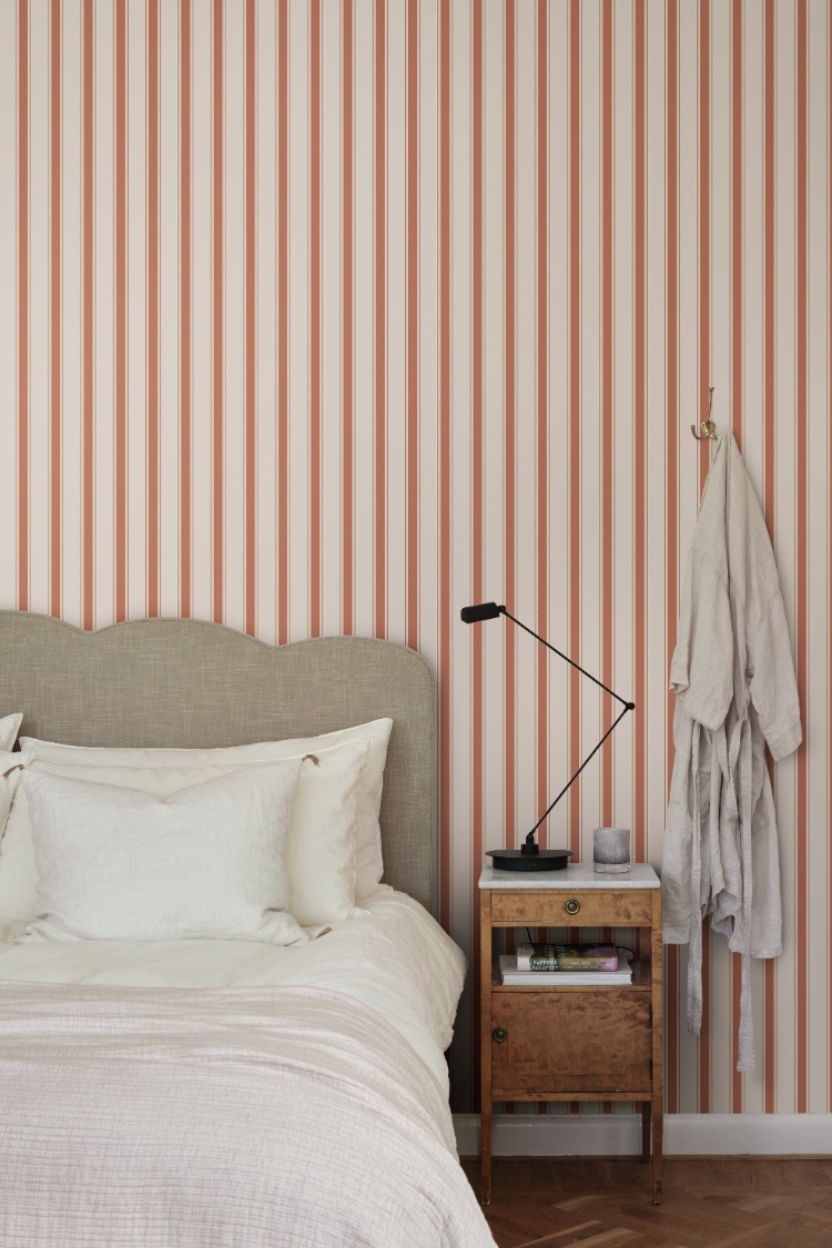
Featured: Gustav, Striped Wallpaper
Your bedroom should be a sanctuary, a space that reflects your personal style and helps you unwind at the end of the day. Explore our bedroom wallpaper designs to create your perfect retreat.
Warm Wallpaper For Living Rooms
In a living room, warm wallpaper creates an instant welcome, whether you choose a bold rust mural or a gentle sandy texture. Living rooms are usually the largest space and the first one guests see, so they can handle bigger, bolder patterns, such as oversized abstract shapes across a full feature wall. Think about how the room is used through the day. Deep terracotta and brown look richest by lamplight in the evening, while lighter caramel and beige stop a sunny room from feeling heavy at midday. If your TV sits on the feature wall, choose a design with calmer areas at screen height so the pattern doesn't compete with what you're watching. Bouclé, light oak and natural fibre rugs soften strong, earthy colour.
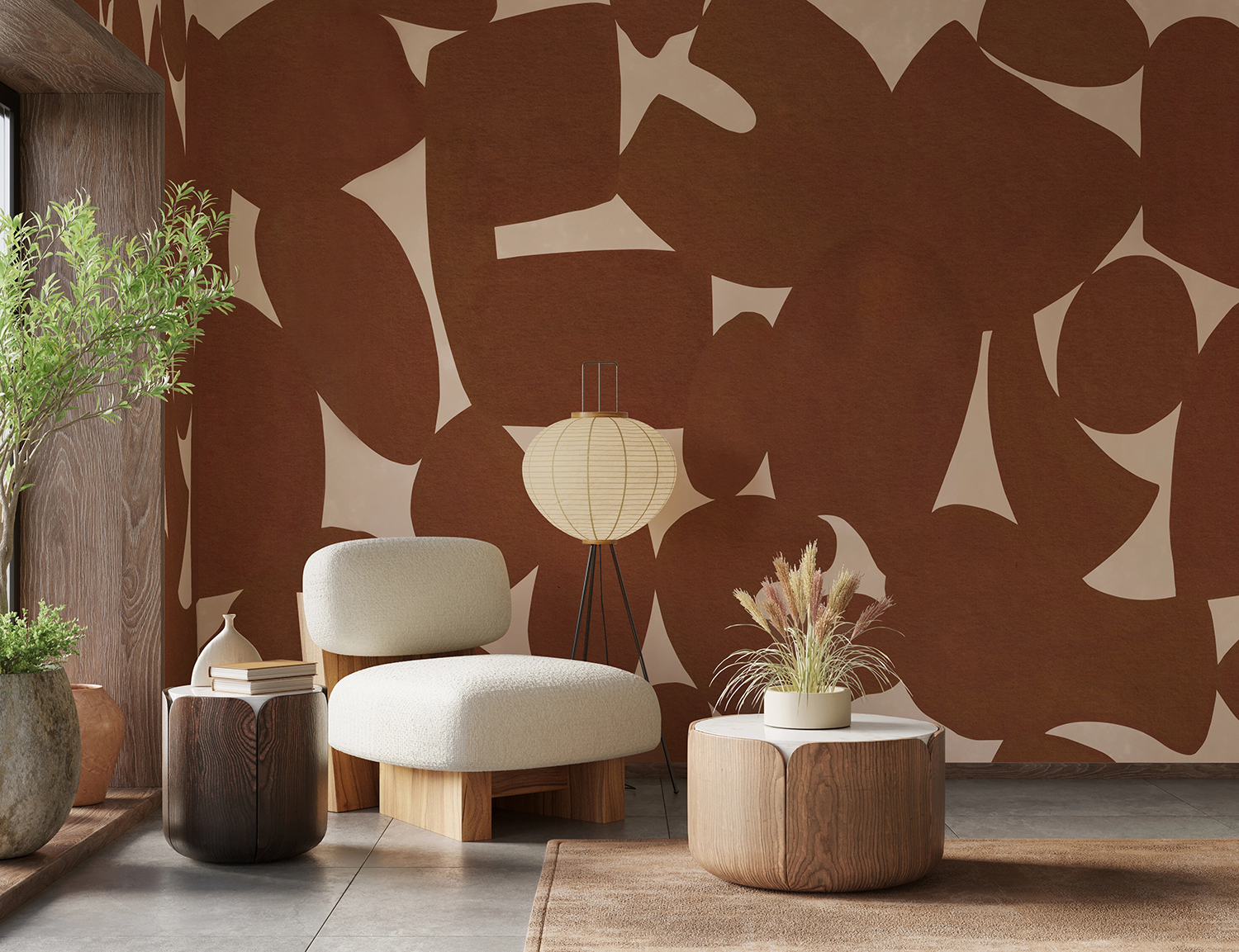
Featured: Pebble Form, Abstract Mural Wallpaper
Discover more living room wallpapers that not only reflect your personal style but also help create a warm, welcoming atmosphere your whole family will enjoy.
Warm Wallpaper For Kids' Rooms
Children's rooms suit warm wallpaper wonderfully, especially dusty pink, peach and soft terracotta, which feel cosy without the overstimulation of bright primary colours. Playful animal and nature patterns in a muted warm palette will suit your child for far longer than cartoon themes. Small, repeating patterns are forgiving because they hide minor marks and scuffs better than plain colours, though it's still worth checking for a wipeable finish. If you'd rather not paper the whole room, frame one area, such as a reading nook, an alcove or the wall behind the cot, and keep the other walls white or pale cream. Natural wood, one bright accent piece and simple storage keep the room calm and practical.
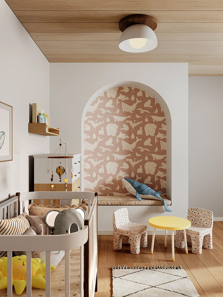
Featured: Frosty Friends, Animal Pattern Wallpaper
Choose your child’s favourite design from our curated collection of kids wallpapers.
Warm Wallpaper For Dining Rooms
Dining rooms are where warm wallpaper really comes into its own. Browns, ochres and reds create an intimate, enveloping mood for long meals with family and friends. You spend most of your time in a dining room sitting down, so choose a design with interest high on the wall, like branches or foliage reaching down from above. It stays visible over seated guests and isn't hidden by a banquette or chair backs. Warm colours also look their best under a low pendant over the table, which casts a soft pool of light across the wall. In an open-plan kitchen diner, paper only the dining wall to zone the space. Pale timber and linen upholstery let the wall take centre stage.
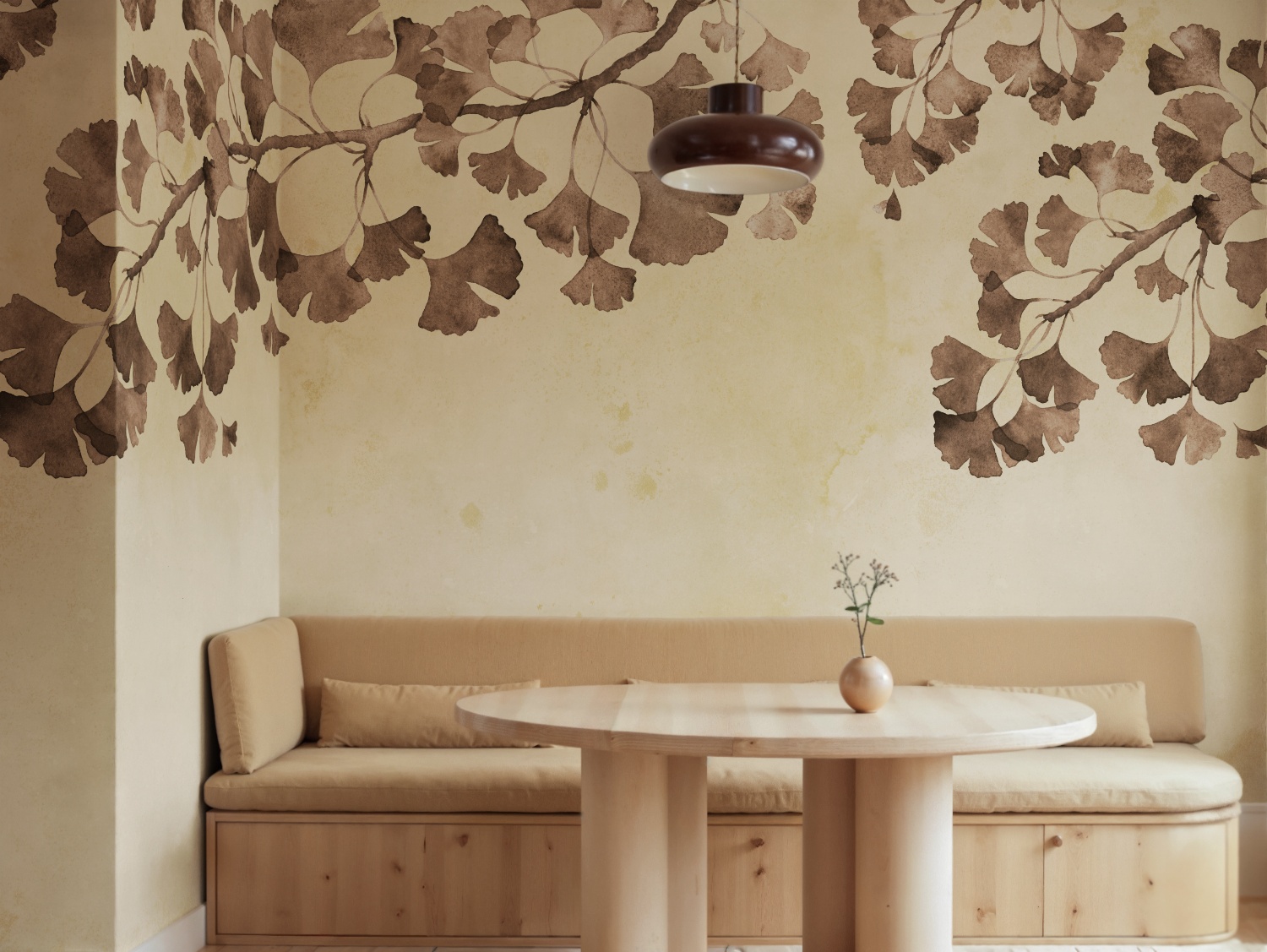
Featured: Maidenhair Tree, Mural Wallpaper
Create a beautiful gathering space with our collection of dining room wallpapers. From traditional patterns and rich colours for formal dining settings, to light, airy motifs for everyday gatherings, our wallpaper designs are curated to suit a variety of styles.
Warm Wallpaper For Home Offices
A home office needs warm wallpaper that feels calm rather than stimulating, so you can concentrate without the room feeling cold or clinical. Soft hazel, taupe and muted blush in loose watercolour florals or gentle landscapes add character without pulling your focus. Avoid busy, high-contrast patterns directly in your line of sight, which can become tiring over a long working day. If you take video calls, remember that the wall behind your chair is the one everyone sees, so it may deserve the wallpaper as much as the wall you face. Rattan, pale wood and a few natural textures keep the space relaxed.
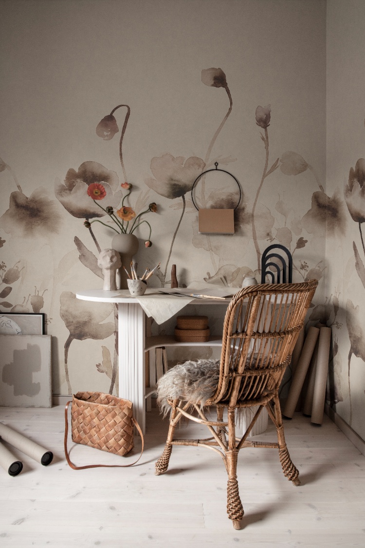
Featured: Morangen, Floral Mural Wallpaper
An office doesn’t have to feel dull or uninspiring. Whether you’re drawn to calming scenery that helps you unwind and refocus, or energising patterns that boost creativity, our collection of modern office wallpapers is designed to support the way you work.
Should You Choose A Warm Mural Or Pattern Wallpaper?
Choose a mural if you want one wall to be the focal point of the room. Choose a pattern if you want warmth spread evenly across several walls, or the room is broken up by windows, doors and built-in units. A mural is one large design made to fit your wall, while a pattern repeats on every drop. Warm tones make that difference more noticeable: a mural concentrates the colour into a statement, while a pattern breaks it into a gentler, all-over warmth.
Warm Mural Wallpaper
If you want a wall that feels like a piece of art, a warm mural is the way to go. Large-scale scenes such as misty mountains, sweeping abstracts or golden landscapes create real depth, and the gradual shifts between sand, amber and brown look almost like light falling across the room. Murals are printed to your measurements, so measure the width and height at three points each and use the largest figure, since very few walls are perfectly square. A mural can wrap around a corner for a more enveloping feel. Keep furnishings plain and textured, such as linen curtains and a solid-coloured sofa, so the wall stays the focus.
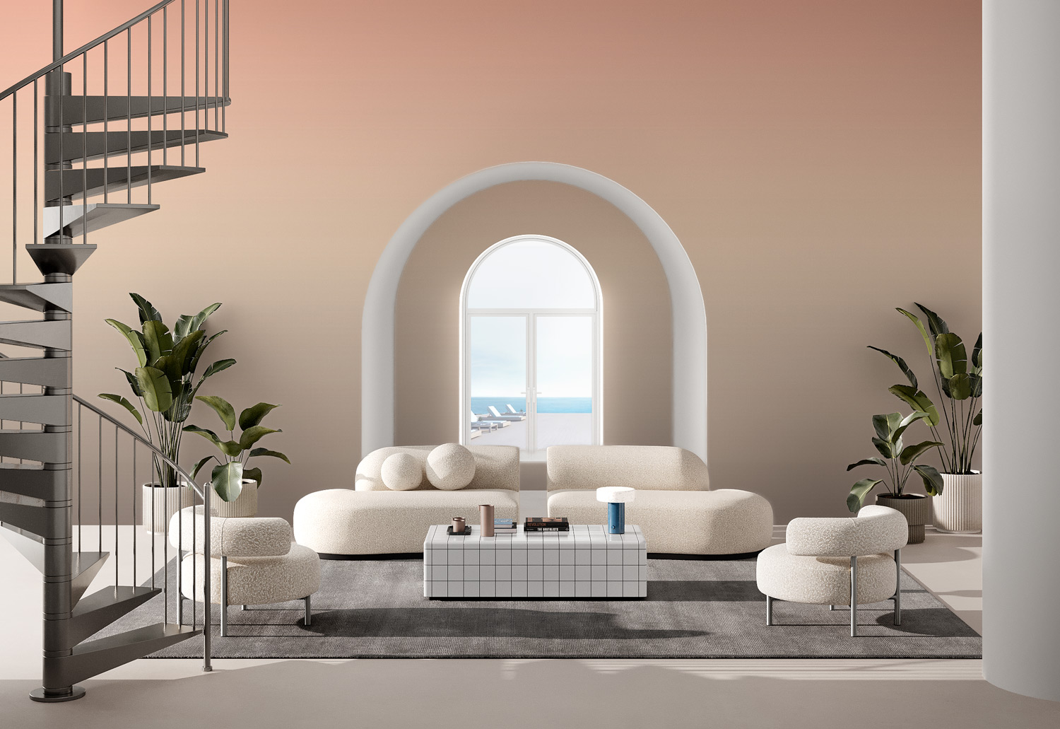
Featured: Luminate Gradient, Ombre Mural Wallpaper
Create a room that tells a story with our stunning collection of mural wallpapers.
Warm Pattern Wallpaper
Pattern wallpaper is the practical choice for rooms full of interruptions, like kitchens and hallways, where cabinets, windows, splashbacks and light switches break up the walls. Because the design repeats on every drop, cuts around sockets or a window frame disappear into the pattern instead of slicing through the middle of a scene. Warm toiles, flowing waves and small florals also let you paper every wall without the colour becoming overwhelming, because the cream or sand background between motifs keeps the room light. Check the pattern repeat before you order. Large repeats suit tall, uninterrupted walls, while smaller repeats work better with low ceilings and tight spaces. A large repeat also creates more waste when matching drops, so ask how much extra to allow.
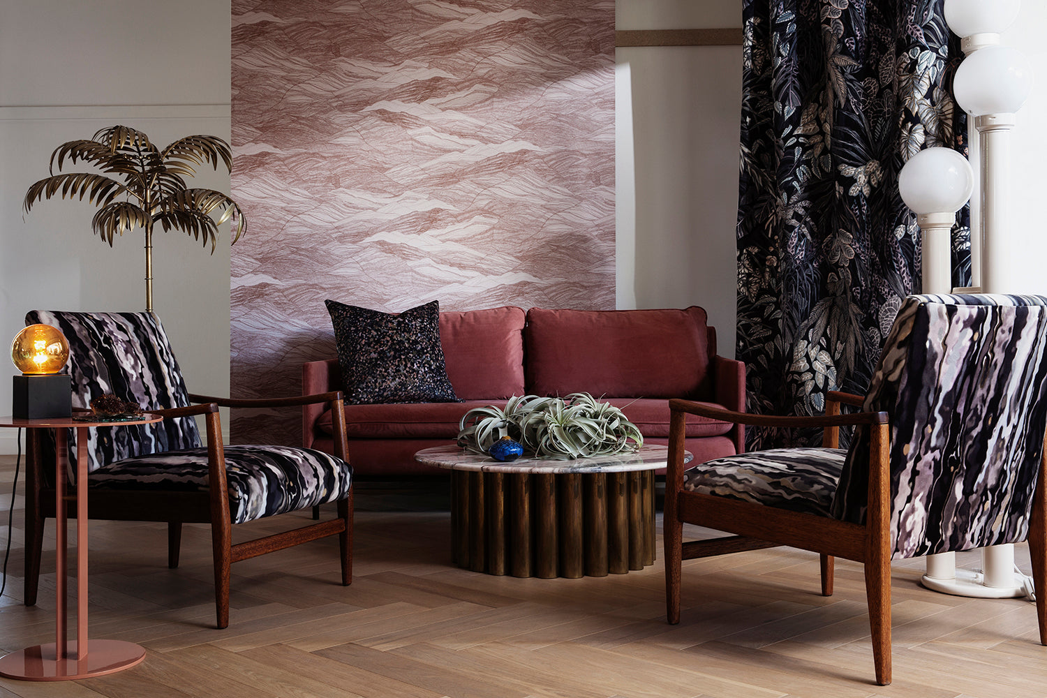
Featured: Tidal Waves, Pattern Wallpaper
From classic and timeless patterns to modern and whimsical prints, our pattern wallpaper collection offers a wide range of options to transform your living spaces.
Quick Ways To Decide
- Count the interruptions. If the wall has more than one door, window or built-in unit, a pattern will usually look better than a mural.
- Stand where you'll see it most. A mural needs some distance to be appreciated. In a narrow hallway, where you're never more than a metre or two from the wall, a pattern works harder.
- Check what will cover the wall. Tall bookcases, wardrobes or kitchen units hide part of a mural scene, but a pattern loses nothing.
- Decide how much colour you want. A warm mural on one wall with pale paint elsewhere gives a strong focal point. A small warm pattern on every wall gives an all-round cosy feel.
- In open-plan spaces, use a mural to anchor one zone, such as behind the dining table or sofa, and keep the rest of the space calm.
What Lighting Works Best With Warm Wallpaper?
Warm wallpaper looks best under warm white bulbs of around 2700K, ideally layered through lamps and wall lights rather than one overhead light. Lighting changes warm tones more than almost anything else in a room. The same terracotta can look rich and glowing in the evening, then flat and muddy under the wrong bulb.
Which Bulb Colour Temperature Should You Use?
Choose warm white bulbs of 2700K for living rooms, bedrooms and dining rooms, as they bring out the red and yellow undertones that make warm wallpaper feel cosy. In kitchens and home offices, where you need crisper light to work by, 3000K is a good compromise. Avoid cool white or "daylight" bulbs of 4000K and above near warm wallpaper. They make terracotta look muddy, beige look grey and blush look cold. Check the CRI (colour rendering index) on the box as well, and aim for 90 or higher so colours look true rather than washed out. Dimmable or smart bulbs let you soften the light further in the evening.
How Does Natural Light Change Warm Wallpaper?
The direction your room faces makes a big difference. Rooms that face away from the sun (north-facing in the UK and US, south-facing in Australia) get cooler, more even light, which deepens warm tones and can make them look duller. Here, choose a slightly lighter or brighter shade than you think you need. Sun-facing rooms get warm, golden light that intensifies warm colours, so a strong orange or red can feel hot by mid-afternoon. A softer, more muted shade is easier to live with. Always tape a sample to the wall and check it in the morning, at midday and after dark, over at least two days.
Where Should You Place Lights Around Warm Wallpaper?
Avoid downlights fitted close to a wallpapered wall. They cast bright scallops of light down the surface that interrupt a mural and exaggerate any unevenness. Table and floor lamps at sofa height create soft pools of light that make deep colours glow, while a picture light or wall washer above a mural lights the whole design evenly. If you're adding LED strips under shelves or along a ceiling cove, check the colour temperature first, as many budget strips are 4000K or cooler and give warm wallpaper a bluish cast. On textured or grasscloth-effect designs, light from farther away gives an even wash. Light grazing the surface at a sharp angle shows up seams.
How Do You Style Warm Wallpaper?
The easiest way to style warm wallpaper is to take your other colours from the wallpaper itself, so the paint, wood, metal and fabrics all share its undertone. Then add one cooler accent to stop the room feeling one-note.
What Colour Should You Paint The Other Walls And Ceiling?
Take the paint colour from the wallpaper's background rather than choosing a separate white, because brilliant white tends to look stark and slightly blue next to warm tones. Most paint suppliers can colour-match from a sample piece. For the ceiling, use the same pale tone or a version lightened by a quarter, which softens the line where wall meets ceiling. In a small room you want to feel cocooning, such as a snug or cloakroom, you can paint the ceiling in a deeper tone from the design instead. Paint skirting boards and door frames to match the walls for a seamless look, or pick out a deeper shade from the wallpaper for a more traditional finish.
Which Materials And Finishes Pair Well With Warm Wallpaper?
Choose warm metals such as brass, bronze and copper for lights, handles and frames. Chrome and polished nickel can look cold against terracotta and ochre. With wood, hold a sample of your floor or furniture against the wallpaper before committing, because an orange-toned pine can clash with orange-red designs while oak, ash and walnut usually sit comfortably. Matte, textured fabrics like linen, wool and bouclé keep warm colours soft. Glossy surfaces reflect the colour back and intensify it. Bring in one cool accent, such as olive, sage, teal or deep navy, in about a tenth of the room. A velvet cushion, a vase or a single chair is enough to make the warm tones stand out.
How Do You Keep Warm Wallpaper From Feeling Overwhelming?
On a patterned or mural wall, hang one large piece of art with a wide pale mount rather than a busy gallery wall, which competes with the design. Choose curtains in a plain fabric that picks up one tone from the wallpaper, or in simple cream. Two strong prints in the same eyeline rarely work together unless one is much smaller in scale. If your walls are deep terracotta, brown or burgundy and your floor is dark, a lighter rug balances the room so it doesn't feel enclosed. A mirror on the wall opposite a window bounces extra daylight around, which helps rich warm colours read clearly during the day.
Transform Your Home with Made-to-Measure Wallpaper
Explore our full collection of wallpaper designs and get inspired to find the perfect design for your home. Installation services are available in selected countries — just add it at checkout if it’s offered in your area.
At Hello Circus, we believe every wall deserves something special. That’s why all our wallpapers are custom-made to fit your wall’s exact dimensions — no generic rolls, just a perfect fit. Priced by the square metre (Height × Width × Unit Price), you only pay for what you need.
Choose the Right Wallpaper Material
Whether you’re decorating your forever home, updating a rental property, or refreshing a single feature wall, choosing the right wallpaper material can make all the difference. At Hello Circus, every wallpaper design is available in three premium materials, so you can select the option that best suits your space, installation preferences, and lifestyle.
- Non-Woven Matte Wallpaper: Our most popular choice, featuring a smooth, non-reflective finish that creates a beautifully soft look. Durable, breathable, and easy to install using the paste-the-wall method, it’s ideal for most residential interiors.
- Heavy Duty Textured Vinyl Wallpaper: Designed for busy households and commercial spaces, this premium textured finish offers added durability and a luxurious tactile feel. It’s perfect for high-traffic areas where extra resilience is required.
- Peel and Stick Wallpaper: A self-adhesive option that makes decorating quick and convenient. Ideal for renters, DIY enthusiasts, or anyone who prefers a paste-free installation, peel and stick wallpaper allows you to refresh your walls with minimal fuss while enjoying the same beautiful Hello Circus designs.
Whichever material you choose, every wallpaper is custom-made to your wall’s exact dimensions using high-quality printing and vibrant, colour-rich inks, ensuring a beautiful finish that’s made to last.
Curious About the Cost? Try Our Wallpaper Visualiser
- Enter your wall’s width and height for an instant price.
- Preview how your chosen wallpaper will look on your wall — especially helpful for murals, where placement matters.
Still deciding? Order a sample to feel the texture, quality, and finish before you commit.
How to Calculate How Much Wallpaper You Need?
Before purchasing, it’s important to measure your wall accurately to avoid over- or under-ordering. Here’s a simple way to get started:
- Measure the width of the wall from edge to edge.
- Measure the height from floor to ceiling.
- Allow for extra, around 10cm, to account for trimming and pattern matching.
Need help? Read our guide on how to measure your wall for wallpaper or get in touch with us.
Why Choose Hello Circus Wallpaper?
What makes our wallpapers different? Every Hello Circus wallpaper is made to order using premium materials designed to deliver exceptional quality, durability, and beautiful colour reproduction.
- Premium quality: Printed in Europe on durable non-woven paper, our wallpapers are reinforced with nylon fibres to stay smooth, strong, and long-lasting.
- Matte and non-reflective: Our non-woven wallpapers are coated with a soft, non-reflective matte finish that brings warmth and elegance to your space without harsh glare.
- Safe and non-toxic: We use VOC-free inks and PVC-free, breathable paper, so you can create a beautiful home without worrying about harmful chemicals — especially important for little ones.
- Antimicrobial protection: Helps prevent the growth of mould, mildew, and bacteria, keeping your walls cleaner and fresher for longer.
- Wallpaper washability: All our wallpapers are washable, meaning everyday dirt and water stains can be wiped away using a damp cloth or sponge.
- Resistant to colour fading: Designed with colourfast technology to keep your wallpaper vibrant and rich over time.
- Fire resilient: Our wallpapers meet European fire safety standards (EN ISO 11925-2), providing an extra layer of reassurance for your home.
Read more about our wallpaper materials and check out our ultimate guide to wallpapers for answers to the most commonly asked questions.
Let’s Connect
Have a project in mind or interested in partnering with us? We’d love to hear from you.
- Bulk orders
- Corporate orders
- Selling with us
- Collaborations
- Press features
Feel free to get in touch.



