
Plain pink wallpaper has quietly become one of the most versatile choices in modern interiors. Once considered overly sweet or reserved for children’s rooms, today’s blush and powder pink tones are sophisticated, calming, and surprisingly easy to style. The right shade of pink can act almost like a neutral — softening a space, enhancing natural light, and creating warmth without overwhelming your décor.
Whether you’re drawn to a minimalist solid finish, a gentle ombre gradient, or a softly textured effect, plain pink wallpaper offers a refined way to introduce colour into your home. In this guide, we’ll explore how to choose the right shade, how lighting affects pink on your walls, and how to style it so it feels modern, balanced, and beautifully intentional.
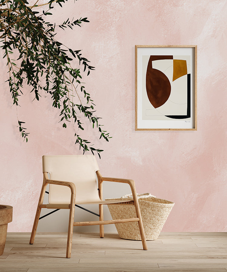
Plain Pink Wallpaper Wallpaper #1: Blush Solid, Concrete Wallpaper
Bring calm, modern simplicity home with Blush Solid, Concrete Wallpaper — a Plain Pink Wallpaper look with a softly textured concrete finish. The blush tone keeps the wall feeling warm and inviting, while the subtle surface effect adds depth without visual clutter. It’s ideal when you want a minimalist backdrop that still feels designed: style it with framed prints, sculptural lighting, or natural wood for an easy, contemporary balance. Use it across a whole room for a clean, cohesive feel, or as a feature wall to anchor your space with gentle colour and quiet character.
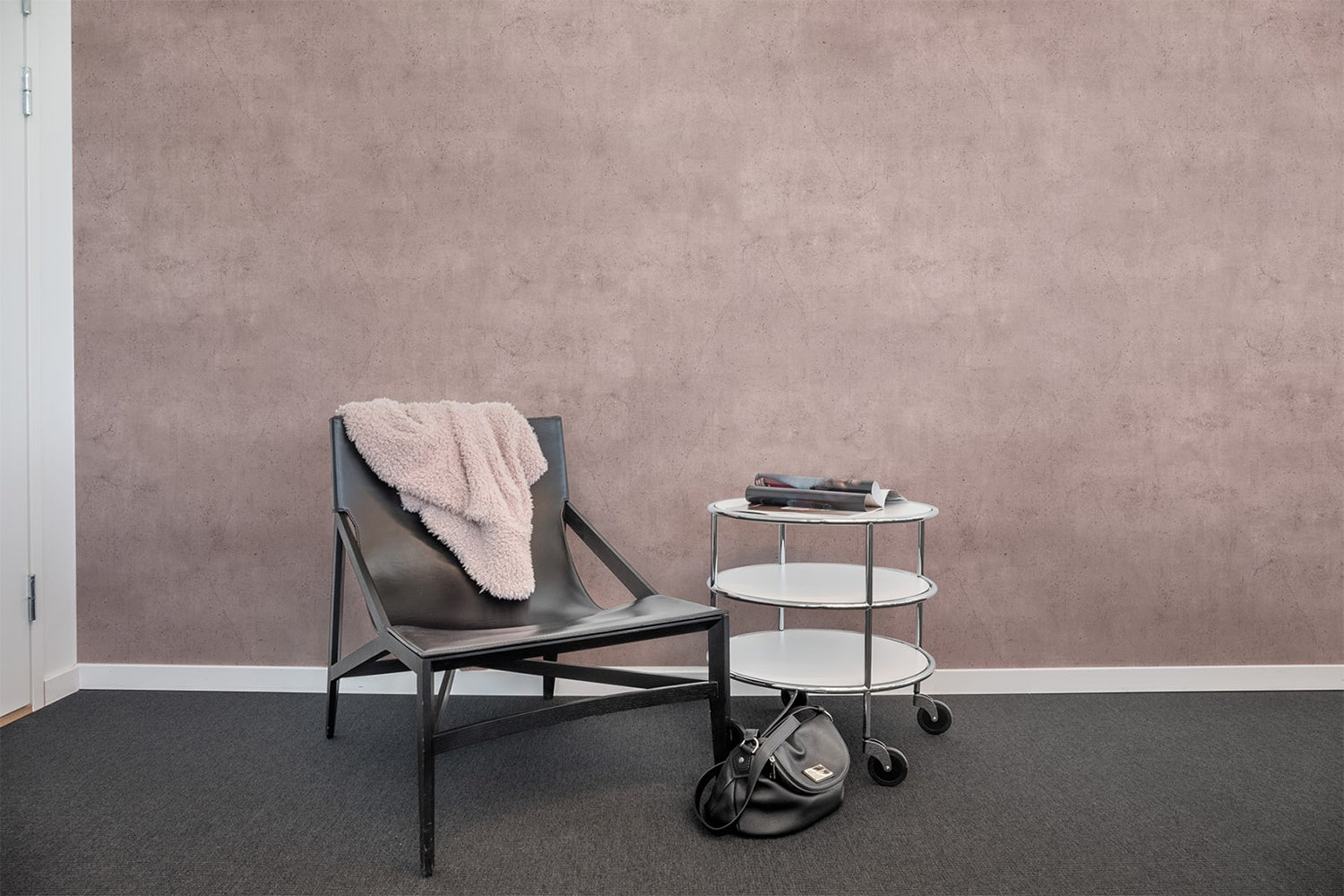
Featured: Blush Solid, Concrete Wallpaper
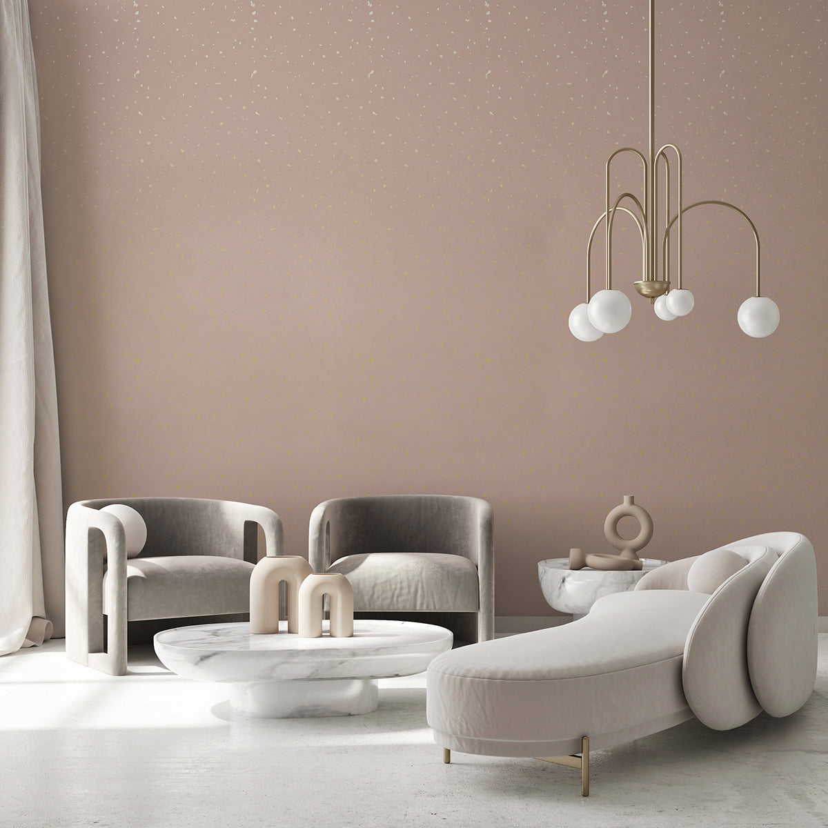
Plain Pink Wallpaper Wallpaper #2: Speckles, Pattern Wallpaper
Speckles, Pattern Wallpaper is a Plain Pink Wallpaper base with a playful, ultra-subtle speckle detail that adds texture without overpowering your décor. The soft blush background keeps everything light and airy, while the scattered pattern brings gentle movement—perfect if you want more interest than a flat colour but still crave a clean, modern look. It works brilliantly in bedrooms, nurseries, and creative corners, pairing easily with neutrals, warm woods, and soft whites. Choose it for an effortless refresh that feels fresh, relaxed, and quietly uplifting.
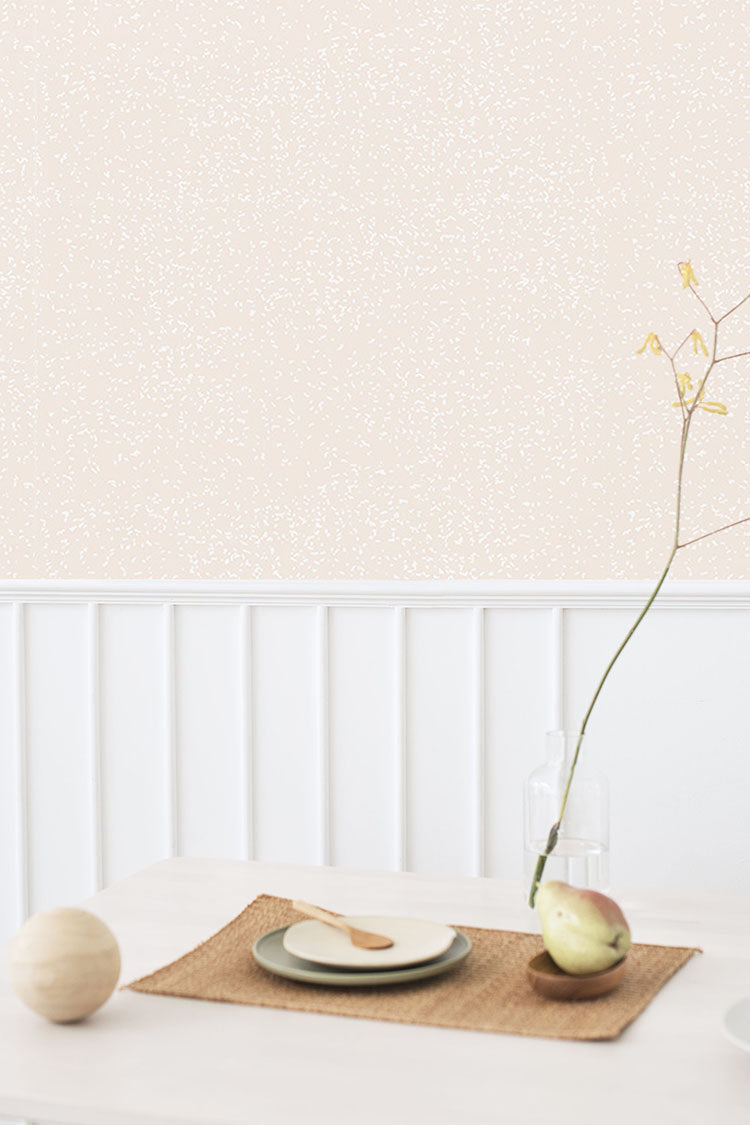
Featured: Speckles, Pattern Wallpaper
Plain Pink Wallpaper Wallpaper #3: Aista, Ombre Watercolour Wallpaper
Aista, Ombre Watercolour Wallpaper turns the idea of Plain Pink Wallpaper into a soft, artistic gradient. The watercolour finish creates a painted, cloud-like blend of tones that shifts smoothly from deeper blush to lighter pink, adding atmosphere while keeping the overall feel calm and minimal. It’s a beautiful choice for bedrooms and serene living spaces where you want a soothing backdrop with a little more depth than a solid wall. Style it with clean-lined furniture and soft textiles to enhance the gentle, tranquil mood.
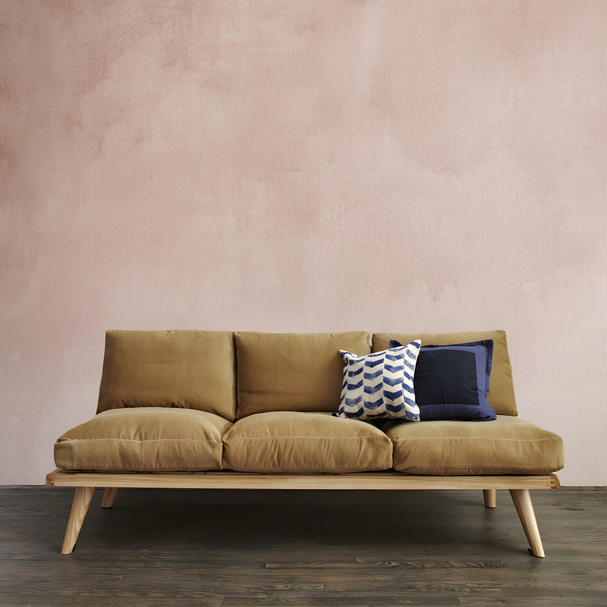
Featured: Aista, Ombre Watercolour Wallpaper
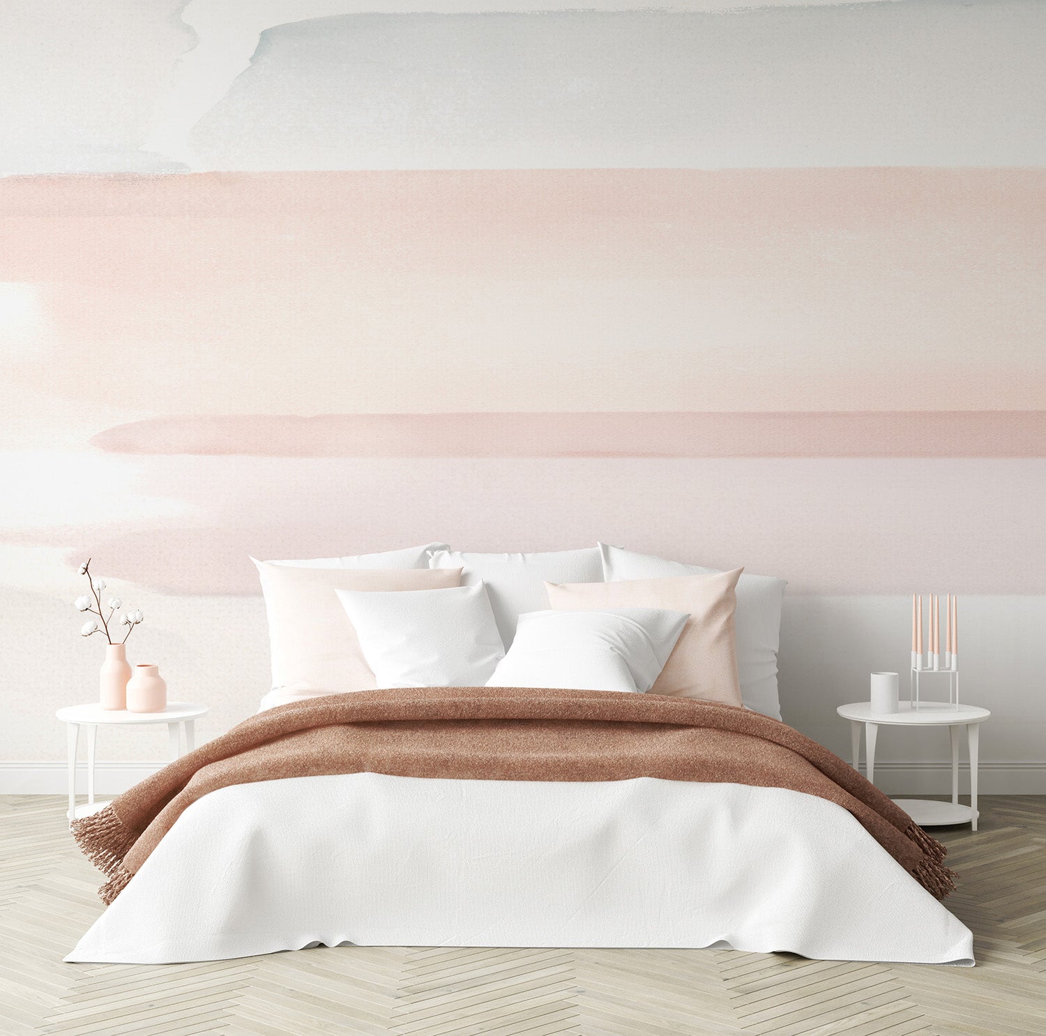
Plain Pink Wallpaper Wallpaper #4: Vista, Watercolor Ombre Wallpaper
Vista, Watercolor Ombre Wallpaper delivers a refined Plain Pink Wallpaper aesthetic through a smooth, sky-like gradient. The watercolour effect adds softness and depth, creating a tranquil transition of blush tones that feels modern yet timeless. It’s ideal for minimalist interiors that still want warmth—think calm bedrooms, airy living rooms, or focused home offices. The gentle tonal shift helps add dimension without busy patterning, making it easy to decorate around. Pair with light neutrals, warm metals, and natural textures for an elevated, serene finish.
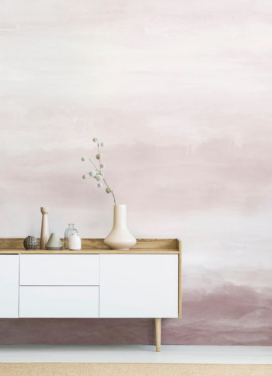
Featured: Vista, Watercolor Ombre Wallpaper
Plain Pink Wallpaper Wallpaper #5: Watercolour Gradient, Ombre Mural Wallpaper
Watercolour Gradient, Ombre Mural Wallpaper reimagines Plain Pink Wallpaper with fluid, hand-painted washes that blend seamlessly across the wall. The soft ombre effect mimics natural light and shadow, bringing depth and atmosphere while keeping the mood calm and contemporary. Use it to create a soothing retreat in a bedroom, nursery, or quiet reading nook, or as a statement feature wall that still feels subtle and sophisticated. The gentle transition of tones makes styling easy—layer in soft whites, pale woods, and tactile fabrics for instant serenity.
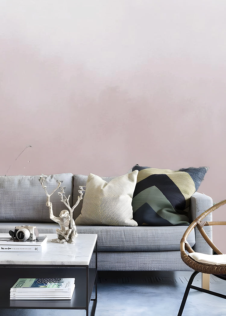
Featured: Watercolour Gradient, Ombre Mural Wallpaper
Plain Pink Wallpaper Wallpaper #6: Perfect Fit Powder Pink, Pattern Wallpaper
Perfect Fit Powder Pink, Pattern Wallpaper is a polished take on Plain Pink Wallpaper, with elegant white and gold accents set against a soft pink background. The pattern adds a touch of charm and sophistication while staying versatile enough for a range of interiors—from classic to modern. It’s especially striking as a feature wall, where the delicate detailing can catch the light and elevate the space without feeling overly bold. Pair it with creamy neutrals, warm metallics, and simple décor for a refined, eye-catching finish.
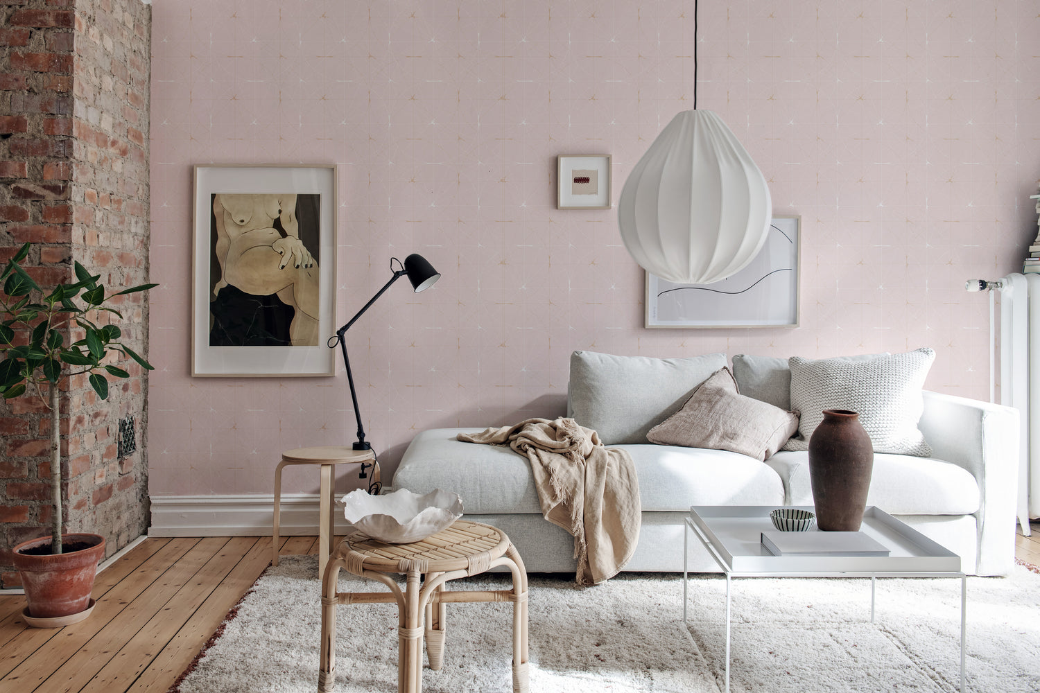
Featured: Perfect Fit Powder Pink, Pattern Wallpaper
Plain Pink Wallpaper Wallpaper #7: Watercolour Pastel Brushstrokes, Mural Wallpaper
Watercolour Pastel Brushstrokes, Mural Wallpaper blends artistic brushwork with a gentle Plain Pink Wallpaper feel, layering blush with complementary pastel tones like dusty peach, clay, and soft blue. The result is expressive but calming—ideal when you want your walls to feel curated and creative without becoming chaotic. This mural-style design works beautifully in bedrooms, studios, and family spaces where softness matters. Style it with simple furniture and natural textures to let the brushstrokes shine, creating a tranquil backdrop that still feels full of personality.
Featured: Watercolour Pastel Brushstrokes, Mural Wallpaper
Plain Pink Wallpaper Wallpaper #8: Addison Chalk, Ombre Wallpaper
Addison Chalk, Ombre Wallpaper offers a softly textured, plaster-like look with a calming gradient—perfect if you want Plain Pink Wallpaper with added warmth and depth. The chalky finish feels understated and natural, pairing effortlessly with modern, Scandinavian, or Mediterranean-inspired interiors. Use it as a gentle backdrop for clean-lined furniture, woven textures, and tonal styling, or let it create a serene feature wall that anchors the room. Available in multiple colourways, it’s designed to complement a wide range of moods while keeping your space light and relaxed.
Featured: Addison Chalk, Ombre Wallpaper
Plain Pink Wallpaper Wallpaper #9: Gold Metallic Confetti Speckles Wallpaper
Gold Metallic Confetti Speckles Wallpaper adds sparkle to a Plain Pink Wallpaper palette, combining a soft pink base with a playful confetti speckle effect and a shimmering metallic finish. It’s a brilliant option for feature walls, hallways, or anywhere you want a little magic without going full maximalist. The textured, linen-like top layer enhances the glow, making the room feel brighter and more celebratory. Use it to lift a neutral scheme, complement warm woods and brass accents, or create an inviting statement corner that feels special every day.
Featured: Gold Metallic Confetti Speckles Wallpaper
Plain Pink Wallpaper Wallpaper #10: Stella Skies, Ombre Wallpaper
Stella Skies, Ombre Wallpaper captures the serenity of open horizons with a smooth transition of tones—an elegant way to wear Plain Pink Wallpaper with extra depth. The gentle gradient flows from light to darker blush, creating a sense of space and calm that suits bedrooms, living rooms, and restful corners. It brings atmosphere without busy patterning, making it easy to style around with minimal décor, soft linens, and natural finishes. Choose it when you want a modern, airy backdrop that feels soothing, expansive, and quietly sophisticated.
Featured: Stella Skies, Ombre Wallpaper
Plain Pink Wallpaper Wallpaper #11: Shiplap, Vertical Striped Wallpaper
Shiplap, Vertical Striped Wallpaper gives you a structured, panelled effect in a dusty blush tone—ideal for a Plain Pink Wallpaper look with architectural character. The tongue-and-groove style striping creates a timeless “painted panelling” feel, adding height and definition to the wall. Use it to lift living spaces, bedrooms, or entryways with a classic-yet-modern finish. You can apply it to the full wall or as a half-wall effect depending on your layout and style. Pair with simple furnishings and warm neutrals for effortless elegance.
Featured: Shiplap, Vertical Striped Wallpaper
Choosing The Right Shade Of Plain Pink Wallpaper
Blush Vs Powder Pink: What’s The Difference?
When you’re shopping for plain pink wallpaper, the shade you choose does most of the design “heavy lifting”. Blush pink tends to lean slightly muted and sophisticated — think soft rose with a gentle, modern warmth. It’s often the easiest option to treat like a neutral, especially if you’re pairing it with whites, creams, or natural wood. Powder pink, on the other hand, usually feels lighter and cleaner, sometimes with a slightly pastel or “cotton candy” softness. It can look especially fresh in bright rooms, but it may read more playful if the rest of your décor is also light-toned. If you want your plain pink wallpaper to feel grown-up and calming, blush is often the safer bet; if you want airy sweetness and brightness, powder pink can be perfect.
Warm Vs Cool Pink Undertones And Why It Matters
Two plain pink wallpapers can look similar online and completely different on your wall, and undertones are usually why. Warm pinks carry hints of peach, coral, or terracotta, which makes them feel cosy and flattering — especially alongside warm whites, beige, rattan, oak, or brass. Cool pinks lean towards lilac or blue-based rose tones, which can feel crisp, modern, and slightly more “editorial”, pairing well with grey, black accents, chrome, or cooler whites. A quick check: hold your pink sample next to a plain white sheet and then next to a cream one. If it looks better beside cream, it’s likely warm; if it feels cleaner beside bright white, it may be cool. Choosing the right undertone helps your plain pink wallpaper look intentional rather than “slightly off”.
How Lighting Changes Pink On The Wall
Lighting can make plain pink wallpaper look softer, stronger, warmer, or cooler depending on the time of day and the direction your room faces. North-facing rooms often cast a cooler light, which can make pink feel a bit more muted or even slightly greyed; warmer blush shades can help counteract that. South-facing rooms get warmer, brighter light, which can make pink appear more saturated — so very soft pastel pinks may suddenly feel bolder than expected. Artificial lighting matters too: warm bulbs enhance peachy undertones, while cooler LEDs can pull out lilac tones. Before you decide, look at your sample in the morning, afternoon, and evening, with both natural light and your lamps switched on.
Tips For Sampling Before You Commit
When it comes to choosing plain pink wallpaper, sampling isn’t just a nice extra — it’s the step that gives you real confidence in your decision. Pink is beautifully responsive to its surroundings, and the same shade can look softer, warmer, or slightly cooler depending on the light. That’s exactly why, at Hello Circus, we offer samples — so you can test your chosen design properly in your own space before committing.
Tape your sample onto the actual wall you’re planning to wallpaper and live with it for a few days. Notice how it looks first thing in the morning, in bright afternoon light, and again in the evening with lamps on. North-facing rooms can cool pink down, while south-facing spaces can make it glow warmer and brighter. Even your lightbulbs play a role — warm bulbs enhance peachy blush tones, while cooler LEDs can bring out softer lilac undertones.
Transform Your Home with Made-to-Measure Pink Wallpaper
Explore our full pink wallpaper collection and get inspired to find the perfect design for your home. Installation services are available in selected countries — just add it at checkout if it’s offered in your area.
At Hello Circus, we believe every wall deserves something special. That’s why all our wallpapers are custom-made to fit your wall’s exact dimensions — no generic rolls, just a perfect fit. Priced by the square metre (Height × Width × Unit Price), you only pay for what you need.
Curious about the cost? Try our Wallpaper Visualiser:
-
Enter your wall’s width and height for an instant price
-
Preview how your chosen wallpaper will look on your wall — especially helpful for murals, where placement matters
Still deciding? Order a sample to feel the texture, quality, and finish before you commit.
How to Calculate How Much Wallpaper You Need?
Before purchasing, it’s important to measure your wall accurately to avoid over- or under-ordering. Here’s a simple way to get started:
-
Measure the width of the wall from edge to edge
-
Measure the height from floor to ceiling
-
Allow for extra (about 10cm) to account for trimming and pattern matching
Need help? Read our guide on how to measure your wall for wallpaper or get in touch with us.
What Makes Our Wallpapers Different?
-
Premium quality: Printed in Europe on durable non-woven paper, our wallpapers are reinforced with nylon fibres to stay smooth, strong, and long-lasting.
-
Matte and non-reflective: Our non-woven wallpapers are coated with soft and non-reflective matte finishing that brings warmth and elegance to your space - no harsh glares.
-
Safe and non-toxic: We use VOC-free inks and PVC-free, breathable paper, so you can create a beautiful home without worrying about harmful chemicals — especially important for little ones.
-
Antimicrobial protection: Helps prevent the growth of mould, mildew, and bacteria — keeping your walls cleaner and fresher for longer.
-
Wallpaper washability: All our wallpapers are washable, meaning that their surface is resistant to damage, and any domestic dirt or water stains can be wiped with a damp cloth or sponge.
-
Resistant to colour fading: Designed with colourfast technology to keep your wallpaper vibrant and rich over time.
-
Fire resilient: Our wallpapers meet European fire safety standards (EN ISO 11925-2), adding an extra layer of reassurance to your space.
Read more about our wallpaper materials and check out our ultimate guide to wallpapers for answers to the most commonly asked questions about wallpapers.
Let’s Connect
Have a project in mind or interested in partnering with us? We’d love to hear from you.
-
Bulk orders
-
Corporate orders
-
Selling with us
-
Collaborations
-
Press features
Feel free to get in touch.


