Abstract watercolour wallpaper is a versatile way to add colour, depth, and personality to your home. Inspired by flowing brushstrokes, soft gradients, and organic forms, these designs can create anything from a calm bedroom retreat to a striking living room feature wall. Whether you prefer subtle ombre effects, expressive abstract murals, or landscape-inspired designs, there are styles to suit every interior. In this guide, we'll explore the different types of abstract watercolour wallpaper, the best rooms to use them in, how to choose the right colours for your space, and practical styling tips to help you create a cohesive and beautiful home.
What Are The Different Abstract Watercolour Wallpaper Styles?
- Soft Curve Abstract: Gentle shapes and muted tones for calm, modern rooms.
- Ombre Gradient: Colour transitions that soften walls without feeling busy.
- Bold Terrain Abstract: Stronger shapes and contrast for feature-wall impact.
- Painterly Watercolour: Fluid, hand-painted effects that feel artistic and relaxed.
- Pastel Abstract: Light colours ideal for bedrooms, nurseries, and smaller spaces.
Whether you're looking to create a calming retreat, add artistic character, or introduce a striking feature wall, abstract watercolour wallpaper offers endless possibilities. Explore our curated selection of designs below to discover styles, colours, and compositions that can help bring your vision to life.
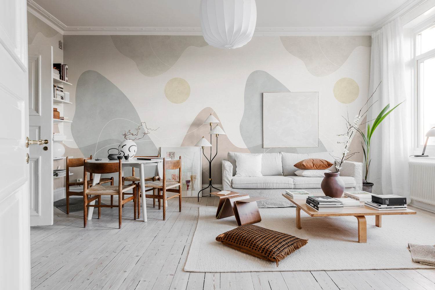
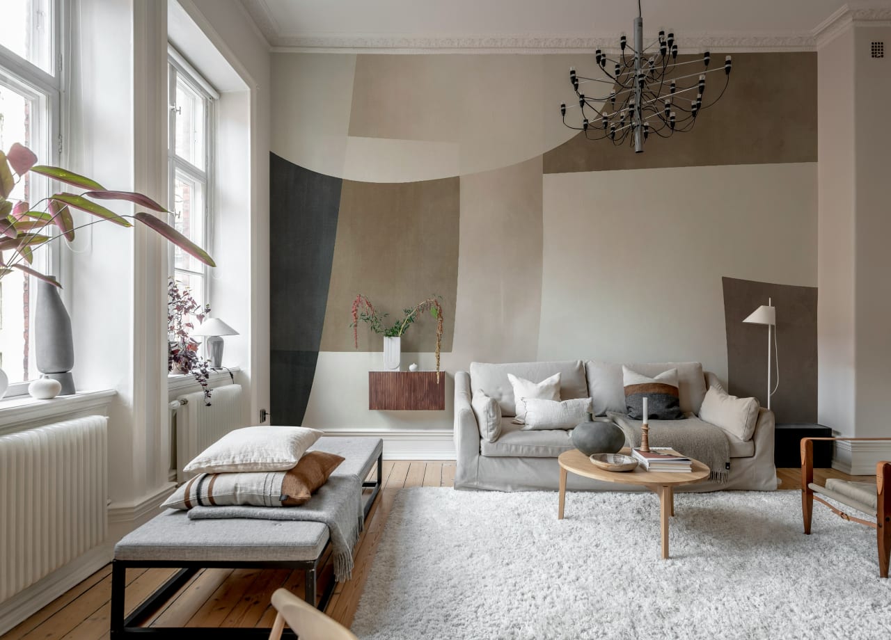
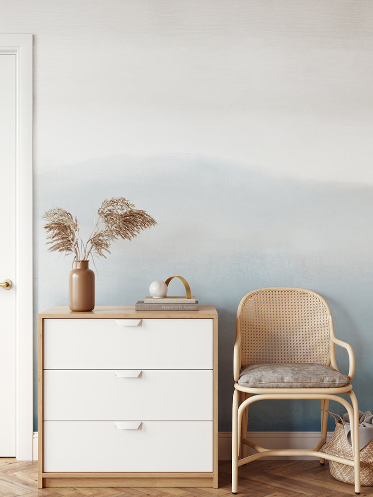
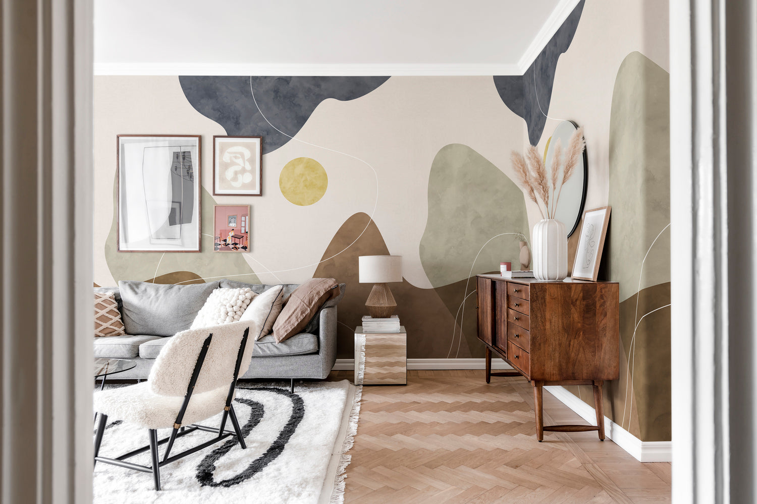
Abstract Watercolour Wallpaper #1: Soft Curve, Abstract Mural Wallpaper
For homeowners seeking an abstract watercolour wallpaper that feels both modern and relaxing, Soft Curve is an excellent choice. Rather than relying on bold colours or busy patterns, this mural creates interest through flowing ribbon-like lines that move gently across a textured backdrop. The effect is reminiscent of water currents, drifting clouds, or organic contours found in nature.
Because the design contains generous open space, it helps a room feel lighter and less cluttered. This makes it particularly effective in dining rooms, bedrooms, and home offices where a calm atmosphere is important. Soft Curve also pairs naturally with Scandinavian interiors, pale timber furniture, linen fabrics, and neutral colour palettes. Available in Blue, Green, Black, and Beige, it offers a versatile way to introduce movement and character without overwhelming the room.
Featured: Soft Curve, Abstract Mural Wallpaper
Abstract Watercolour Wallpaper #2: Abstract Watercolor, Mural Wallpaper
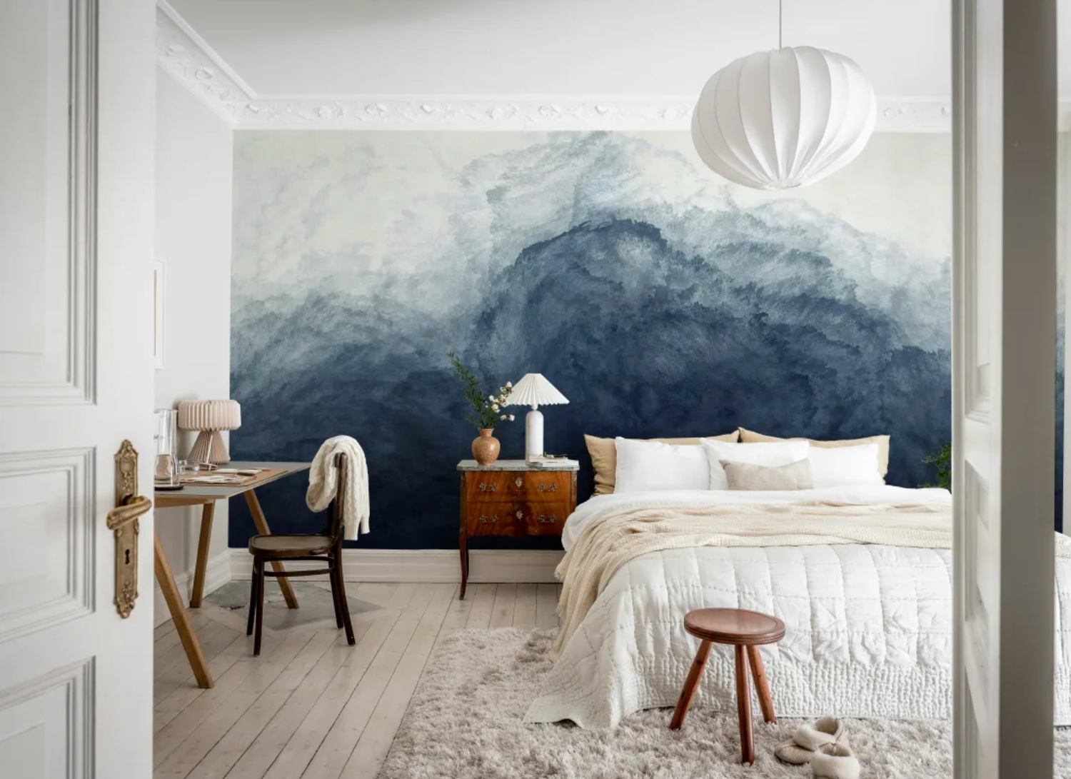
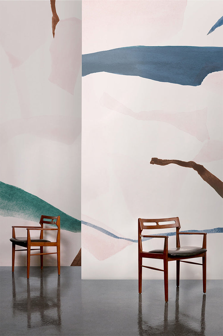
If you want your abstract watercolour wallpaper to become the focal point of a room, Abstract Watercolor delivers a more expressive and artistic look. Inspired by rolling mist, distant mountains, and ocean waves, the mural uses layered watercolour washes that blend seamlessly from rich pigments into soft, feathered edges.
The result is a design that feels immersive and atmospheric, creating depth across an entire wall. Homeowners often use murals like this behind a bed, dining table, or sofa to establish a strong visual anchor without introducing hard geometric shapes. Available in Blue, Pink, Light Blue, and Beige, the design adapts easily to both contemporary and transitional interiors while maintaining a distinctly painterly character.

Featured: Abstract Watercolor, Mural Wallpaper
Abstract Watercolour Wallpaper #3: Asana, Abstract , Mural Wallpaper
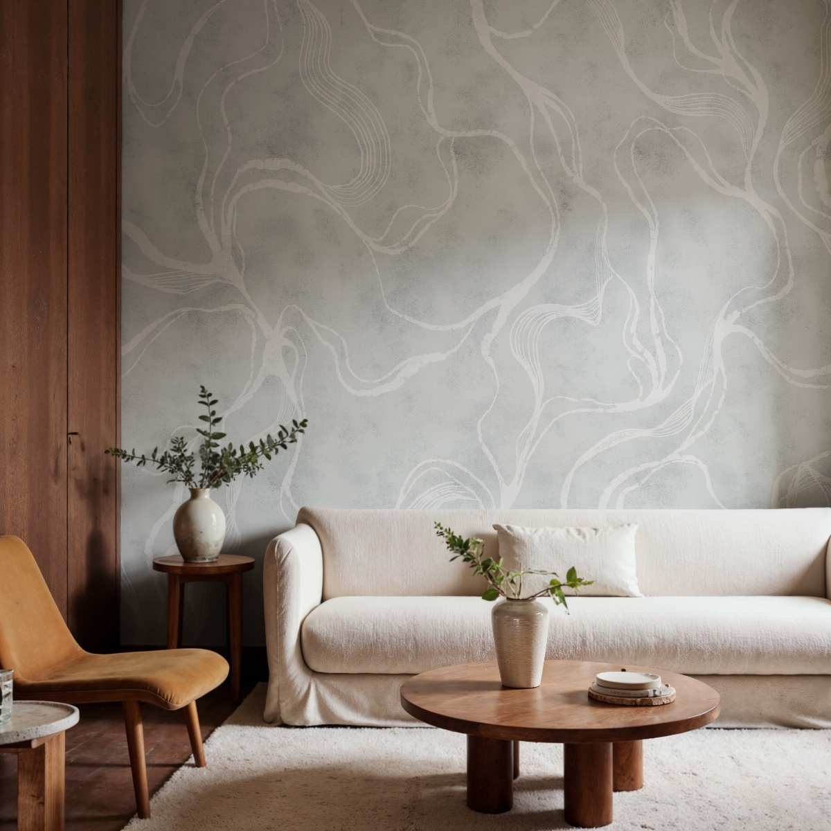
For interiors inspired by natural materials and mindful living, Asana offers a beautifully balanced interpretation of abstract watercolour wallpaper. The design combines earthy tones with graceful brushstrokes, creating a mural that feels artistic without becoming the centre of attention.
Its versatility is one of its greatest strengths. Whether paired with oak furniture, linen upholstery, woven textures, or minimalist décor, Asana helps create a cohesive and welcoming environment. The brushwork introduces movement and personality, while the muted palette keeps the room feeling grounded. It is particularly suited to homeowners who want a design-led space that still feels warm, comfortable, and easy to live in.
Featured: Asana, Abstract , Mural Wallpaper
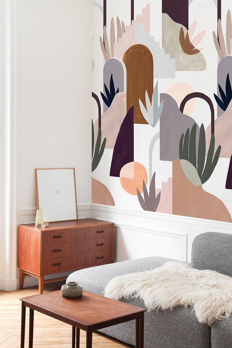
Abstract Watercolour Wallpaper #4: Geometry, Mural Wallpaper
Geometry takes abstract watercolour wallpaper in a more playful and contemporary direction. By combining pastel watercolour effects with geometric forms, this mural achieves a balance between artistic softness and visual structure.
For homeowners who love colour but want to avoid chaotic patterns, Geometry offers an appealing middle ground. The geometric shapes bring order and definition, while the watercolour palette keeps the overall look light and approachable. This versatility makes it suitable for everything from living rooms and bedrooms to children's spaces and home offices. It is an ideal choice for adding creativity and personality while maintaining a clean, modern aesthetic.
Featured: Geometry, Mural Wallpaper
Add structure, style, and visual interest to your space with our curated collection of geometric wallpaper designs.
Abstract Watercolour Wallpaper #5: Terrain, Abstract Mural Wallpaper
Some abstract watercolour wallpapers make a bold statement, while others quietly transform a room. Terrain, Abstract Mural Wallpaper belongs firmly in the latter category. Inspired by natural forms and layered landscapes, the design creates a sense of visual flow that encourages relaxation and focus.
The composition blends soft shapes and subtle detailing, allowing it to complement a wide variety of interior styles. Homeowners often choose designs like Terrain, Abstract Mural Wallpaper when they want a feature wall that adds depth without dominating the room. Whether used in a living room, bedroom, or creative workspace, the mural provides a calm backdrop that feels timeless rather than trend-driven.
Featured: Terrain, Abstract Mural Wallpaper
Abstract Watercolour Wallpaper #6: Blake Horizon, Ombre Mural Wallpaper
Blake Horizon is ideal for homeowners who want abstract watercolour wallpaper that feels spacious, calm, and easy to live with. Its smooth ombre gradient moves from light to deeper tones, creating a sense of openness without relying on detailed patterning.
This makes it especially useful in bedrooms, living areas, and reading corners where the goal is rest and reflection. The design pairs beautifully with soft linens, natural textures, and contemporary furniture, helping the room feel layered but not cluttered. Available in Blue, Turquoise, and Sand, Blake Horizon is a practical choice for creating a peaceful backdrop with gentle visual depth.
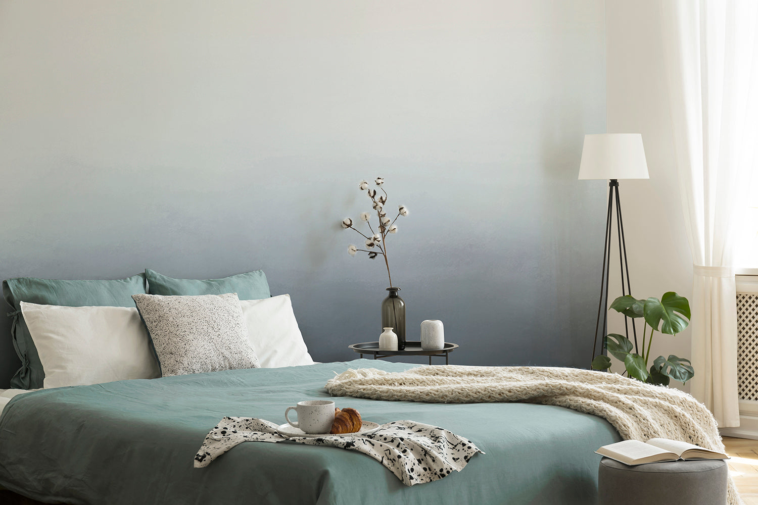
Featured: Blake Horizon, Ombre Mural Wallpaper
Abstract Watercolour Wallpaper #7: Fracture, Abstract Mural Wallpaper
Fracture is a stronger choice for homeowners who want abstract watercolour wallpaper with graphic energy and modern drama. Instead of soft washes alone, this mural uses bold fractured lines that ripple across the wall, creating a dynamic feature with clear visual impact.
It works particularly well in living rooms, entryways, home offices, and creative studios where the wall is intended to make a statement. The design feels artistic and contemporary, but its freeform pattern prevents it from looking too rigid. For best results, pair it with simple furniture and restrained accessories so the wallpaper remains the main focal point.
Featured: Fracture, Abstract Mural Wallpaper
Abstract Watercolour Wallpaper #8: Ressa, Abstract Geometric Wallpaper
Ressa offers a more structured take on abstract watercolour wallpaper, making it useful for design-forward interiors that need depth and definition. Its overlapping shapes and clean lines create movement across the wall while keeping the overall look crisp and contemporary.
For homeowners, this type of wallpaper is practical when a room feels too plain but does not need a highly decorative mural. It can work as a feature wall or across a full room, depending on how bold you want the final effect to be. Ressa is especially suited to modern living spaces, bedrooms, offices, and creative corners.
Featured: Ressa, Abstract Geometric Wallpaper
Abstract Watercolour Wallpaper #9: Soft Contours, Abstract Mural Wallpaper
Soft Contours is a refined option for homeowners looking for abstract watercolour wallpaper with a grounded, organic feel. Its layered shapes, curved lines, and earthy tones create a balance between structure and softness, giving the room a calm but designed appearance.
The hand-painted look makes it feel warm and tactile, while the muted palette keeps it easy to coordinate with existing furniture. Available in Greige, Green, and Brown, it pairs well with minimalist styling, warm woods, neutral upholstery, and contemporary décor. This design is particularly effective in living rooms, bedrooms, and quiet spaces where you want subtle sophistication rather than visual noise.
Featured: Soft Contours, Abstract Mural Wallpaper
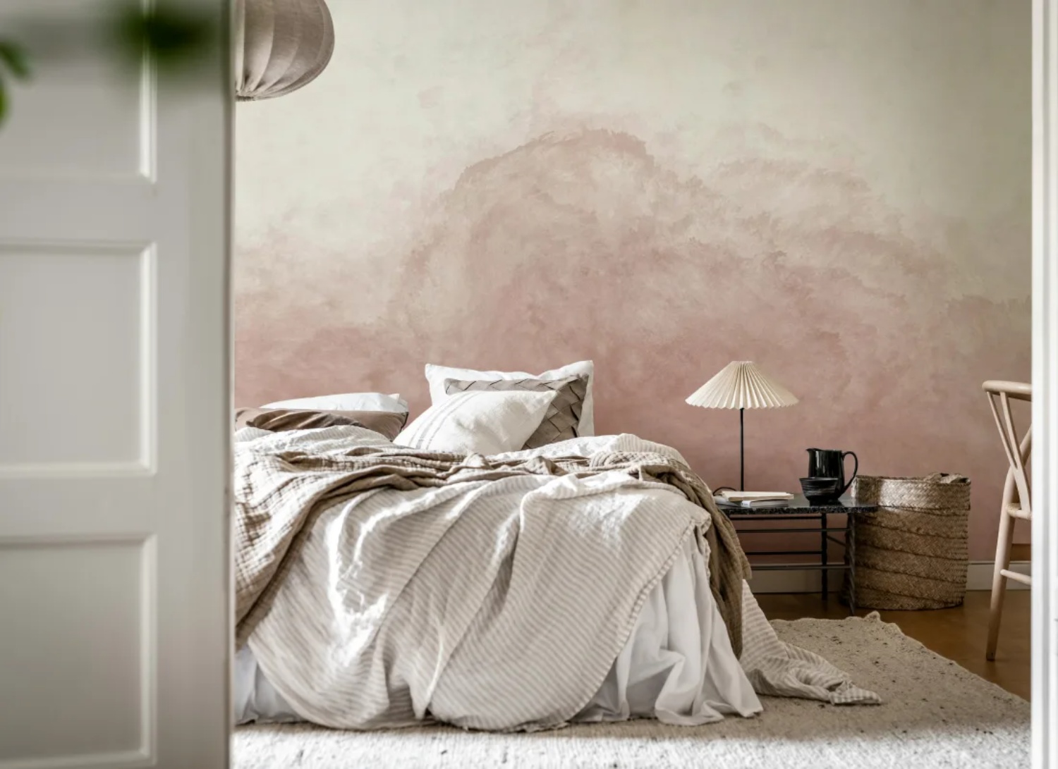
Abstract Watercolour Wallpaper #10: Delilah Waves, Watercolor Ombre Wallpaper
Delilah Waves is a gentle choice for homeowners who want abstract watercolour wallpaper with a soft sense of motion. Its ombre wash moves from deeper tones into lighter shades, while delicate hand-painted brushstrokes add a calm, flowing quality across the wall.
Available in Sand and Blue, the design can feel warm and neutral or fresh and tranquil depending on the colourway. It is especially useful in bedrooms, living rooms, and restful corners where the aim is to create a serene retreat. Paired with natural textures, soft furnishings, and minimalist décor, Delilah Waves brings quiet sophistication without making the room feel overly styled.
Featured: Delilah Waves, Watercolor Ombre Wallpaper
Abstract Watercolour Wallpaper #11: Stella Skies, Ombre Wallpaper
Stella Skies is a calm and airy abstract watercolour wallpaper for homeowners who want to make a room feel more open. Its smooth ombre transition flows from light to dark, creating the feeling of a soft horizon without adding busy detail.
This design works well in bedrooms, living rooms, and quiet corners where a peaceful backdrop matters more than strong pattern. It can also help smaller rooms feel less visually crowded because the gradient keeps the wall simple and spacious. For easy styling, pair Stella Skies with pale woods, soft neutrals, and simple furniture.
Featured: Stella Skies, Ombre Wallpaper
Discover more ombre wallpaper ideas and why everyone is loving this trend.
Abstract Watercolour Wallpaper #12: Gradient Ombre, Mural Wallpaper
Gradient Ombre, Mural Wallpaper is a practical choice for homeowners who want abstract watercolour wallpaper with subtle depth rather than a detailed motif. Its flowing tonal transition creates dimension across the wall, helping the room feel polished while keeping the overall atmosphere relaxed.
Because the design is soft and understated, it suits bedrooms, living rooms, and statement walls where you want elegance without visual clutter. It can work with both contemporary and classic interiors, making it a flexible option if your furniture style may change over time. The gentle gradient adds sophistication while remaining easy to live with every day.
Featured: Gradient Ombre, Mural Wallpaper
Abstract Watercolour Wallpaper #13: Mountain Landscape, Mural Wallpaper
Mountain Landscape, Mural Wallpaper is ideal for homeowners who like abstract watercolour wallpaper with a subtle landscape influence. Its faint ridgelines and gentle earthy hues create the feeling of distant hills, adding calm depth without making the wall feel too illustrative.
This makes it especially suitable for bedrooms, living rooms, and study areas where a still, grounding atmosphere is helpful. The layered design can make a room feel more expansive, almost like looking out towards a quiet horizon. It works well with natural textures, simple furniture, and warm neutral palettes, bringing a soft outdoor mood into the home.
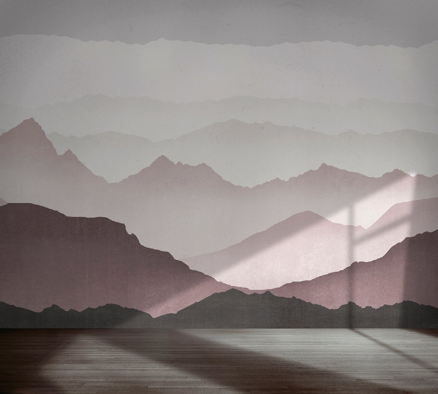
Featured: Mountain Landscape, Mural Wallpaper
Immerse yourself in the breathtaking beauty of our landscape wallpaper designs.
Abstract Watercolour Wallpaper #14: Forest Landscape, Mural Wallpaper
Forest Landscape, Mural Wallpaper brings a nature-inspired direction to abstract watercolour wallpaper, using rolling hills, forest forms, and an ombre colour scheme to create a calm sense of depth. It is a good option for homeowners who want the feeling of the outdoors without choosing a highly detailed scenic mural.
The layered landscape effect can help living spaces feel more tranquil and grounded. It is especially useful in rooms where you want to soften hard furniture lines or introduce a more restful mood. Pair it with wood, woven textures, indoor plants, and simple upholstery to strengthen the natural atmosphere.
Featured: Forest Landscape, Mural Wallpaper
Abstract Watercolour Wallpaper #15: Merlina, Ombre Mural Wallpaper
Merlina, Ombre Mural Wallpaper is suited to homeowners who want abstract watercolour wallpaper with a bolder but still calming presence. Its soft gradients move from deep blue into lighter tones, creating the impression of painted skies, shifting horizons, or atmospheric watercolour washes.
This design works especially well in bedrooms and living areas where you want a focal wall that feels artistic rather than busy. The deeper blue tones add drama, while the blended finish keeps the look soothing. Merlina is a strong option for adding depth, movement, and a modern painted effect to a room without overwhelming the rest of the décor.
Featured: Merlina, Ombre Mural Wallpaper
Abstract Watercolour Wallpaper #16: Aista, Ombre Watercolour Wallpaper
Aista, Ombre Watercolour Wallpaper is a strong choice for homeowners who want a simple but expressive abstract watercolour wallpaper. Its gradient ombre effect moves smoothly from dark to light tones, creating depth and atmosphere without relying on a detailed pattern.
The watercolour finish gives the design an artistic softness, making it suitable for bedrooms, living rooms, reading corners, or statement walls. Because the look is fluid and minimal, it can work with modern furniture, soft textiles, and neutral décor while still adding visual interest.
Featured: Aista, Ombre Watercolour Wallpaper
Abstract Watercolour Wallpaper #17: Watercolour Pastel Brushstrokes, Mural Wallpaper
Watercolour Pastel Brushstrokes, Mural Wallpaper is ideal for homeowners who want abstract watercolour wallpaper with a softer, more decorative feel. Its palette of dusty peach, clay, dusty blue, and blush creates a warm and harmonious backdrop that feels artistic but still easy to live with.
The graceful brushstrokes add movement and personality, making this design well suited to bedrooms, creative rooms, nurseries, children’s rooms, or relaxed living spaces. It works especially well with pale woods, soft furnishings, and simple styling where the wall can bring colour and charm to everyday moments.
Featured: Watercolour Pastel Brushstrokes, Mural Wallpaper
Abstract Watercolour Wallpaper #18: Marigold Mountain, Watercolor Wallpaper
Marigold Mountain, Watercolor Wallpaper is a calming option for homeowners who like abstract watercolour wallpaper with gentle landscape influence. Its flowing layers suggest mountain silhouettes, adding depth and stillness without making the room feel overly scenic.
This makes it practical for bedrooms, living areas, and quiet corners where a tranquil backdrop is important. The soft watercolour strokes help the wall feel expressive, while the understated composition keeps it versatile. Available in five harmonious colourways, Marigold Mountain can adapt to minimalist interiors, warm neutral schemes, and softly styled contemporary homes.
Featured: Marigold Mountain, Watercolor Wallpaper
Abstract Watercolour Wallpaper #19: Under The Tuscan Sun, Mural Wallpaper
Under The Tuscan Sun, Mural Wallpaper brings a warmer, countryside-inspired interpretation to abstract watercolour wallpaper. Its sweeping landscape details evoke the openness and charm of Tuscany, helping interiors feel inviting, relaxed, and connected to nature.
For homeowners, this design works especially well in living rooms, dining areas, or spaces where you want warmth and a sense of escape. The mural creates an atmospheric backdrop without feeling too formal, making it suitable for homes that lean towards cosy, natural, or Mediterranean-inspired styling.
Featured: Under The Tuscan Sun, Mural Wallpaper
Best Rooms For Abstract Watercolour Wallpaper Style
Dining Room
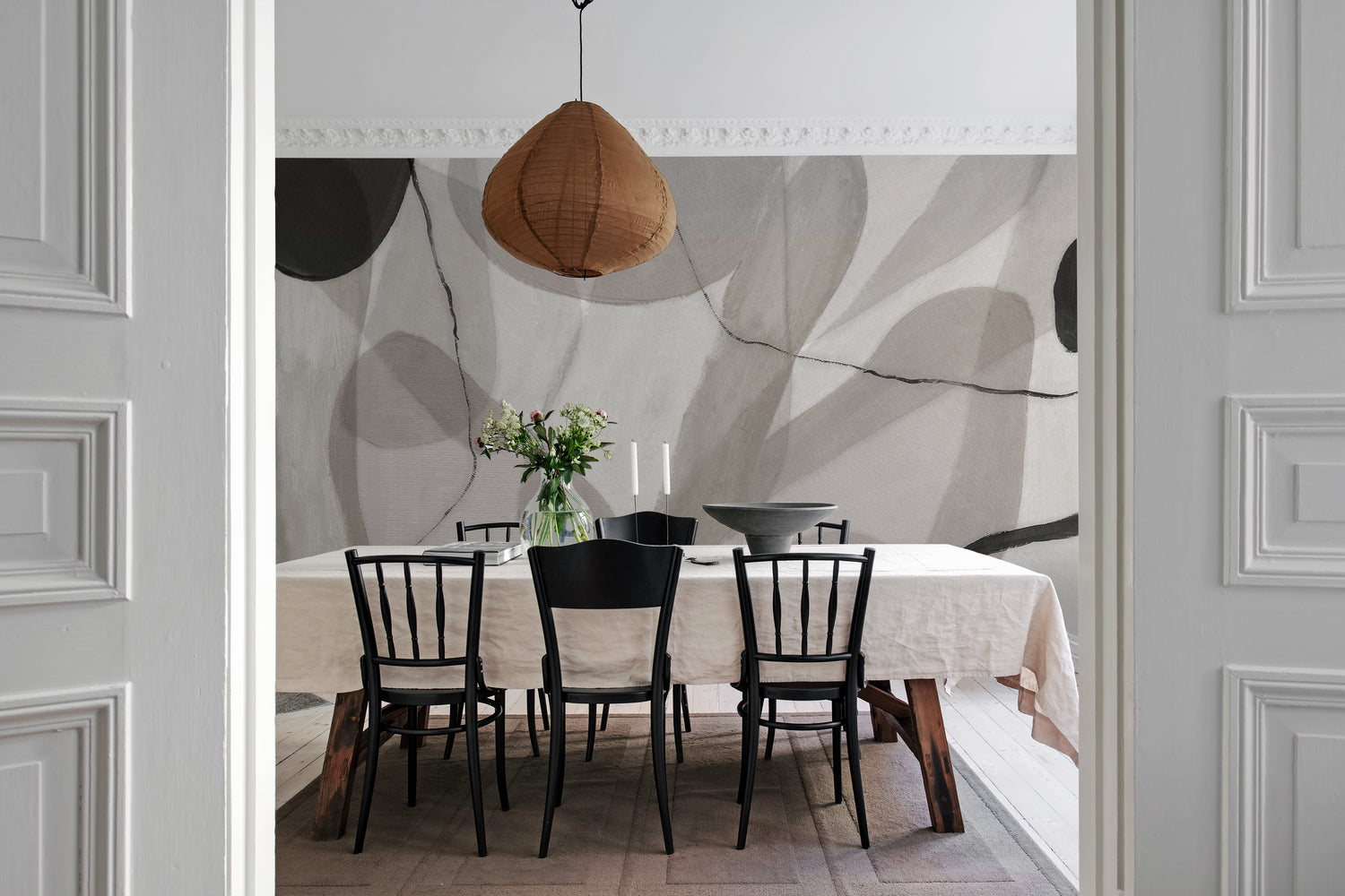
Abstract watercolour wallpaper works beautifully in dining rooms because it adds atmosphere without overwhelming the table setting. Softer curved designs, such as Soft Curve, Abstract Mural Wallpaper, can help create a more relaxed gathering space while still feeling considered and decorative. For homeowners, it is especially practical on one main feature wall, such as behind a dining bench, sideboard, or statement lighting. This keeps the space stylish but easy to live with.
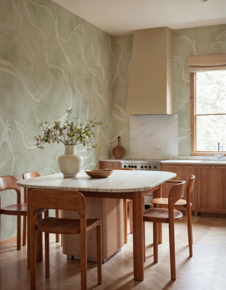
Featured: Soft Curve Abstract Mural Wallpaper
Create a beautiful gathering space with our collection of dining room wallpapers. From traditional patterns and rich colours for formal dining settings, to light, airy motifs for everyday gatherings, our wallpaper designs are curated to suit a variety of styles.
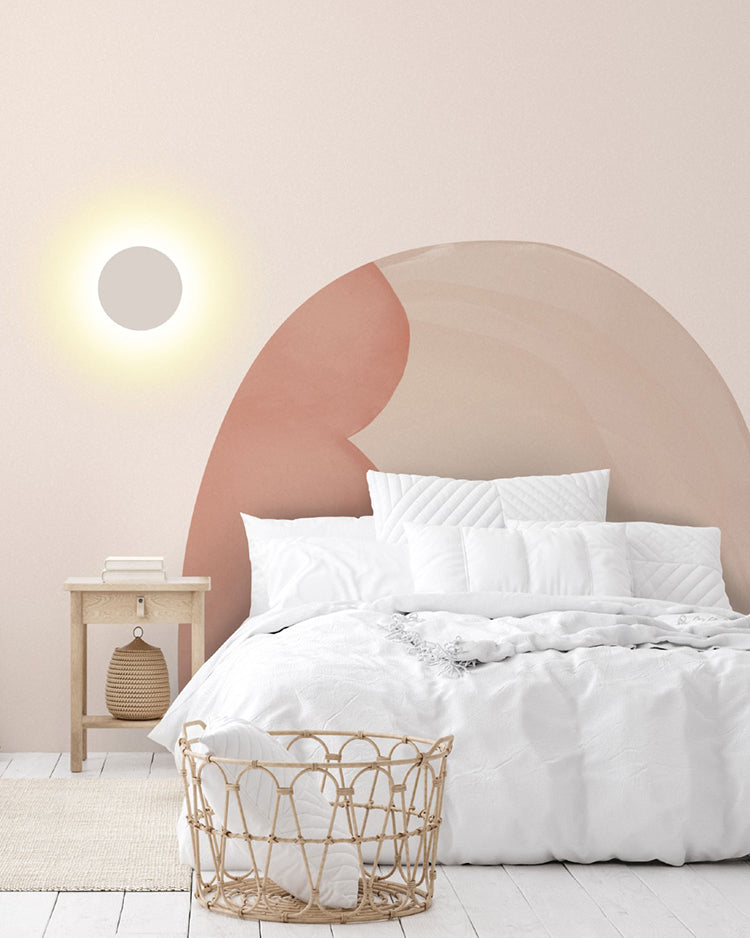
Bedroom
In bedrooms, abstract watercolour wallpaper can make the room feel softer, calmer, and more personal. Designs like Abstract Watercolor Mural Wallpaper are well suited to walls behind the bed, where the artwork can act almost like an oversized headboard. For practical decorating, homeowners may want to choose tones that work with existing bedding, curtains, and bedside furniture. Blush, beige, muted green, and soft neutral shades are particularly easy to style.
Featured: Abstract Watercolor Mural Wallpaper
Your bedroom should be a sanctuary — a space that reflects your personal style and helps you unwind at the end of the day. Explore our bedroom wallpaper designs to create your perfect retreat.
Living Room
A living room is one of the best places to use abstract watercolour wallpaper because it can introduce colour, movement, and personality into a shared space. A stronger design like Terrain Bold Mural Wallpaper can work well behind a sofa, media unit, or reading corner. For homeowners, the key is balance: let the wallpaper become the visual anchor, then keep surrounding furniture and accessories more pared back.
Featured: Terrain Bold Mural Wallpaper
Discover more living room wallpapers that not only reflect your personal style but also help create a warm, welcoming atmosphere your whole family will enjoy.
Kid’s Room
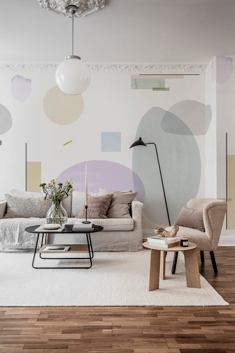
Abstract watercolour wallpaper is a practical choice for a kid’s room because it can feel playful without being too themed. Designs such as Dome Ombre Gradient Wallpaper offer colour and softness while still being versatile as children grow. Instead of character-led designs that may date quickly, abstract gradients and watercolour effects can work with changing furniture, toys, and bedding. For homeowners, this makes it a longer-lasting decorating choice.
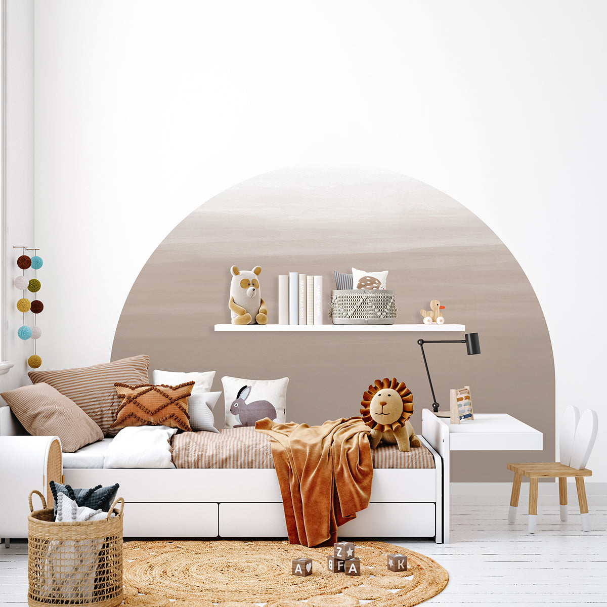
Featured: Dome Ombre Gradient Wallpaper
Choose your child’s favourite design from our curated collection of kids wallpapers.
How To Choose The Right Colour For Abstract Watercolour Wallpaper
Soft Blues And Greens For Calm And Relaxing Spaces
Blue and green are among the most popular colours for abstract watercolour wallpaper because they naturally create a sense of calm. Inspired by water, skies, forests, and natural landscapes, these shades can make a room feel more peaceful and restorative.
For homeowners, blue and green abstract watercolour wallpapers work particularly well in bedrooms, living rooms, reading corners, and home offices where relaxation and focus are important. Lighter tones tend to feel airy and spacious, while deeper shades create a more cocooning atmosphere.
As a practical rule, if your goal is to create a room that feels restful and timeless, soft blue and green palettes are often a safe choice.
Warm Neutrals And Earth Tones For Cosy Interiors
Abstract watercolour wallpapers featuring beige, sand, greige, taupe, terracotta, or clay tones are ideal for creating warmth and comfort. These colours complement many of the materials homeowners already use, including timber furniture, woven textures, natural stone, and linen fabrics.
Earth-toned wallpapers are particularly useful in open-plan living areas, dining rooms, and bedrooms because they create a welcoming atmosphere without dominating the space. They also tend to age well, making them a practical choice for homeowners who do not want to redecorate frequently.
If your existing furniture and flooring contain warm undertones, earth-inspired watercolour designs will often feel naturally cohesive.
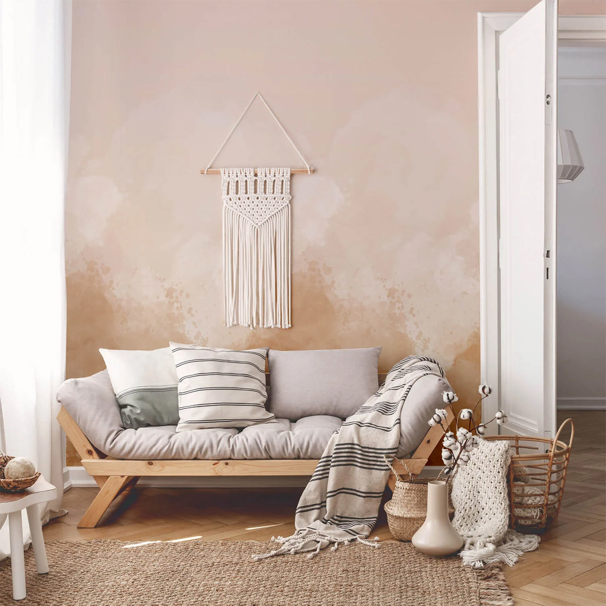
Pink And Pastel Watercolour Wallpapers For Soft Character
Pink, blush, lavender, and pastel abstract watercolour wallpapers can introduce colour without overwhelming a room. These softer shades often feel playful, artistic, and uplifting while still maintaining the fluid elegance associated with watercolour designs.
Many homeowners use pastel watercolour wallpapers in bedrooms, nurseries, dressing rooms, and creative spaces where a lighter and more expressive mood is desired. When balanced with neutral furniture and natural materials, pastel colours can feel sophisticated rather than overly decorative.
A useful guideline is to treat pastel wallpapers as a subtle accent rather than pairing them with multiple strong colours elsewhere in the room.
Dark Abstract Watercolour Wallpapers For Depth And Drama
Dark abstract watercolour wallpaper creates a richer and more atmospheric environment. Deep blues, charcoal greys, forest greens, and dark earth tones can add visual depth while making feature walls feel more impactful.
These colours often work best in rooms with good natural light or layered lighting, where the darker tones can be appreciated without making the space feel enclosed. Living rooms, dining rooms, bedrooms, and home offices can all benefit from darker watercolour designs when the goal is to create a more sophisticated mood.
For homeowners who enjoy contrast, dark wallpapers often pair beautifully with lighter furniture, metallic accents, and warm timber finishes.
Should You Match Wallpaper Colours To Room Size?
Room size matters, but it should not be the only factor when choosing wallpaper colour. While lighter abstract watercolour wallpapers can help smaller rooms feel more spacious, darker colours can also work beautifully in compact spaces when used intentionally.
Rather than focusing solely on square metres, consider how much natural light the room receives and the atmosphere you want to create. A small room with excellent daylight can often support darker wallpaper, while a large room may benefit from softer colours if the goal is to create a more relaxing environment.
The most successful colour choices are usually based on the mood you want to achieve rather than strict decorating rules.
Choose Colour Based On The Feeling You Want To Create
A simple way to choose the right abstract watercolour wallpaper colour is to start with the desired mood of the room:
- Blue and green tones often feel calm and restorative.
- Beige, sand, and earthy hues feel warm and welcoming.
- Pink and pastel shades feel gentle, creative, and uplifting.
- Dark colours feel sophisticated, dramatic, and intimate.
When homeowners choose wallpaper based on how they want the space to feel, the final result often remains enjoyable for years rather than following short-lived design trends.
How To Choose Between Light And Dark Abstract Watercolour Wallpaper
Light Abstract Watercolour Wallpaper: Best For Bright, Airy Spaces
Light abstract watercolour wallpaper is often the easiest option for homeowners who want to make a room feel larger, brighter, and more open. Soft gradients, pale washes, and gentle watercolour effects reflect more light around the room, helping smaller spaces feel less enclosed.
Light designs are particularly effective in bedrooms, hallways, home offices, and living rooms where the goal is to create a calm and welcoming atmosphere. They also provide a flexible backdrop that works with a wide range of furniture styles and colour palettes.
Featured: Watercolour Pastel Ombre Wallpaper
Create a sense of openness and ease with our curated collection of light wallpaper designs.
Dark Abstract Watercolour Wallpaper: Best For Depth And Drama
Dark abstract watercolour wallpaper creates a completely different mood. Rather than making a room feel larger, it introduces depth, contrast, and atmosphere. Rich watercolour tones can make walls appear more layered and sophisticated, helping feature walls stand out with confidence.
Dark designs work particularly well in larger living rooms, dining rooms, bedrooms, and home offices where there is enough natural or layered lighting to balance the deeper colours. When paired with lighter furniture, metallic accents, or warm timber finishes, dark abstract wallpapers can feel both dramatic and inviting.
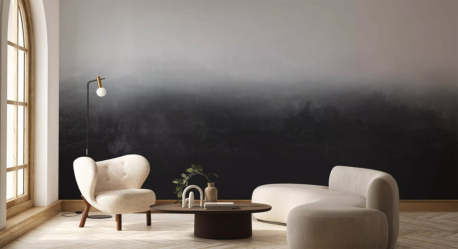
Featured: Greg Horizon Ombre Wallpaper
From deep blues and rich greens to dramatic blacks and warm earthy tones, dark wallpapers add depth, contrast, and atmosphere to any space. Make a confident design statement with our curated collection of dark wallpaper designs.
Which Should You Choose?
Choose light abstract watercolour wallpaper if you want to make a room feel larger and brighter, create a calm and airy atmosphere, complement minimalist or Scandinavian interiors, or improve light flow in smaller spaces.
Choose dark abstract watercolour wallpaper if you want to create a cosy and intimate atmosphere, add visual depth and sophistication, make a feature wall stand out, or introduce contrast into light-coloured interiors.
In many homes, the decision comes down to the mood you want to create. Light abstract watercolour wallpapers tend to feel fresh and relaxing, while dark abstract watercolour wallpapers offer a richer and more dramatic design statement. Both can work beautifully when matched to the room's size, lighting conditions, and overall interior style.


