
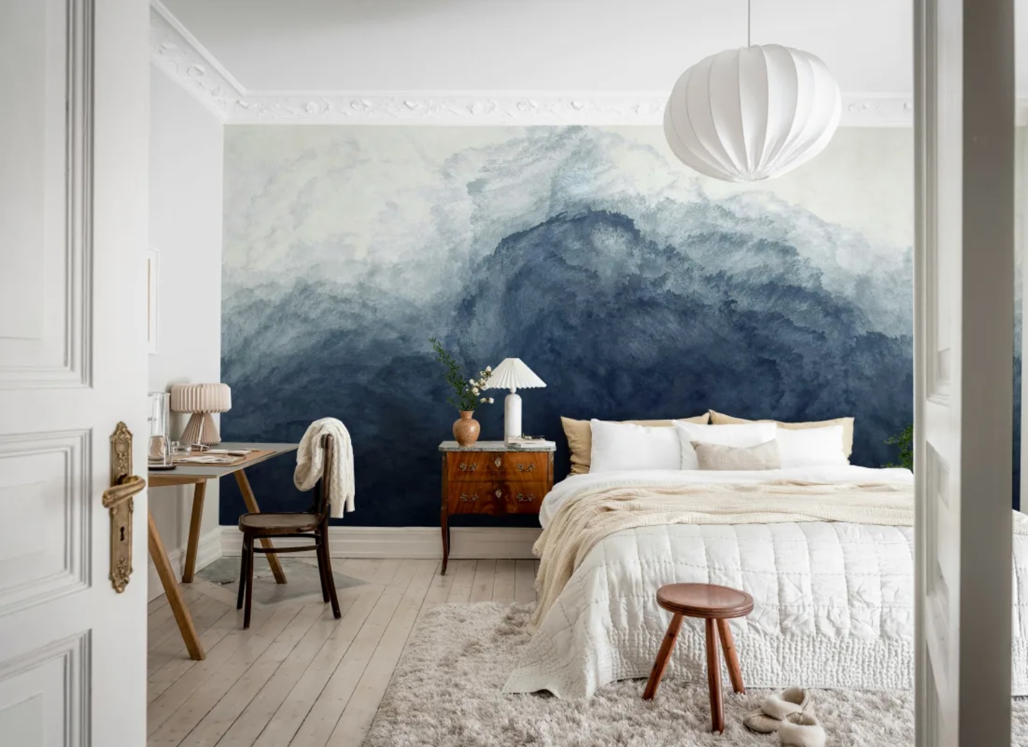
Few wallpapers do as much with as little as an ombre design. Blue ombre wallpaper works through a single slow shift in colour, from pale sky blue down into deep navy or teal, and that gradual fade is what makes a room feel calmer the moment it goes up. Whether you're drawn to soft watercolour washes, misty landscapes, ocean-inspired murals or wide horizon gradients, blue carries the effect better than any other colour, cool and restful without ever tipping into cold. Because there's no repeat to line up and no motif to grow tired of, it also suits the rooms you spend the most time in.
In this guide, we'll walk through the different blue ombre wallpaper styles, from abstract watercolour to landscape, ocean and sky, and look at which rooms suit them best. We'll compare light and dark designs to help you decide which is right for your space, share our favourite blue ombre wallpaper murals, and cover practical styling tips on colours, placement and finishing touches. You'll also find guidance on choosing shades for the light your room actually gets, and why ordering samples is worth the wait.
What Are The Different Blue Ombre Wallpaper Styles?
Blue ombre wallpaper falls into four main styles: abstract watercolour, landscape, ocean and sky. Each one uses the same gradual fade from deep to pale blue, but the mood shifts depending on whether the design suggests a scene or stays completely abstract.
Abstract Watercolour Blue Ombre Wallpaper
If you like the idea of colour that moves across a wall rather than a pattern that repeats, abstract watercolour is the easiest place to start. Soft-edged washes of blue bleed into cream, grey or the faintest green, with no fixed subject to read into. That looseness is what makes it so forgiving: it behaves more like a hand-painted finish than a wallpaper, so it settles happily against beams, linen upholstery and other natural textures. Because the deepest tones usually gather low on the wall, the design draws the eye downwards and keeps a room feeling grounded rather than busy.
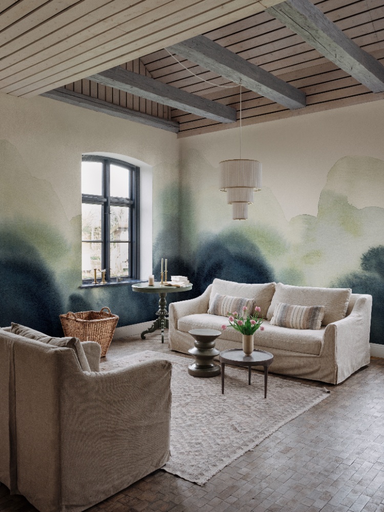
Featured: Flowing Hills, Abstract Mural Wallpaper
Explore the different types of abstract watercolour wallpaper, the best rooms to use them in, how to choose the right colours for your space, and practical styling tips to help you create a cohesive and beautiful home.
Landscape Blue Ombre Wallpaper
Landscape designs give blue ombre a sense of distance. Misty treelines, hills and far horizons fade upwards from a solid blue base into pale, hazy sky, which tricks the eye into reading depth where there is only a flat wall. It is a genuinely useful effect in smaller or narrow rooms, where a scene that recedes feels more open than a bold repeat ever will. Keep the rest of the scheme quiet, with plain tiles, simple joinery and one warm accent, and the wallpaper will carry the room on its own.
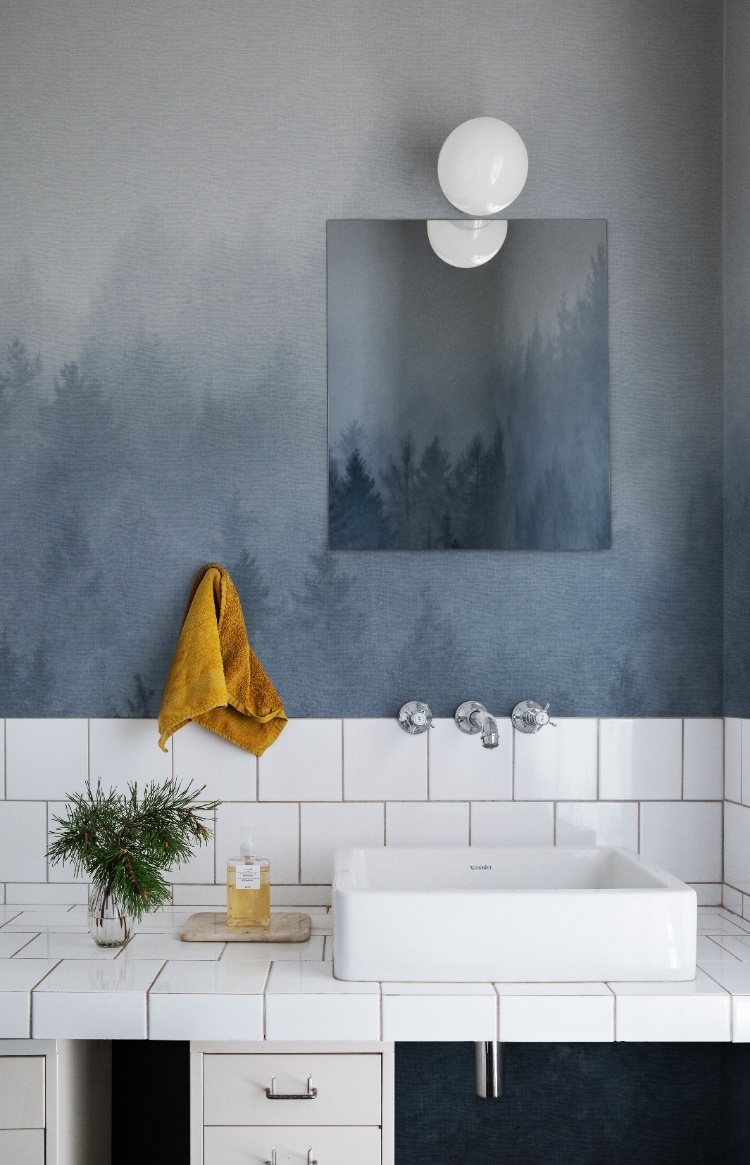
Featured: Cloudy Forest, Mural Wallpaper
Immerse yourself in the breathtaking beauty of our landscape wallpaper designs.
Ocean Blue Ombre Wallpaper
Ocean-inspired ombre is the most dramatic of the four styles, and the one to choose when you want a single wall to do all the talking. Deep navy gathers at the base and lifts into pale sea glass and cream at the top, with painterly movement that suggests a swell without spelling it out. That strength of colour at floor level makes it a natural fit behind a bed or a sofa, where furniture softens the darkest part of the design. Balance it with warm woods and off-white textiles so the depth reads as restful rather than heavy.
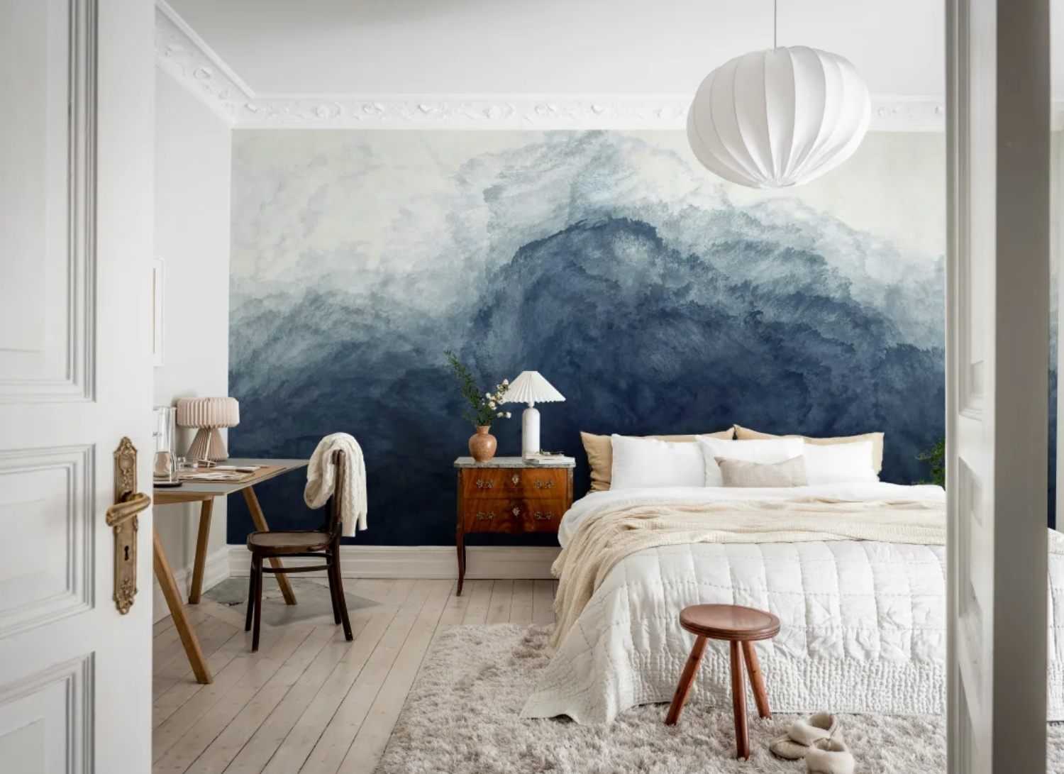
Featured: Abstract Watercolor, Mural Wallpaper
Whether you prefer subtle marine motifs or immersive seascape murals, ocean wallpaper creates depth, balance and a lasting sense of calm throughout your home. Discover more ocean wallpaper designs.
Sky And Cloud Blue Ombre Wallpaper
Whether you want a room to feel wide open or simply calmer, sky and cloud ombre is the softest way to bring blue onto the walls. These designs work in broad horizontal bands with blurred edges, light gathering at the top and deeper blue pooling through the middle like a horizon seen through haze. Some hold to blues and greys alone, while others let a band of warm clay or sand cut across the gradient, which stops the coolness from tipping into chill and gives the wall a natural focal line. There is no repeat to line up, so the design flows around corners and curved walls without a visible break, and the colours shift gently as daylight moves through the room.
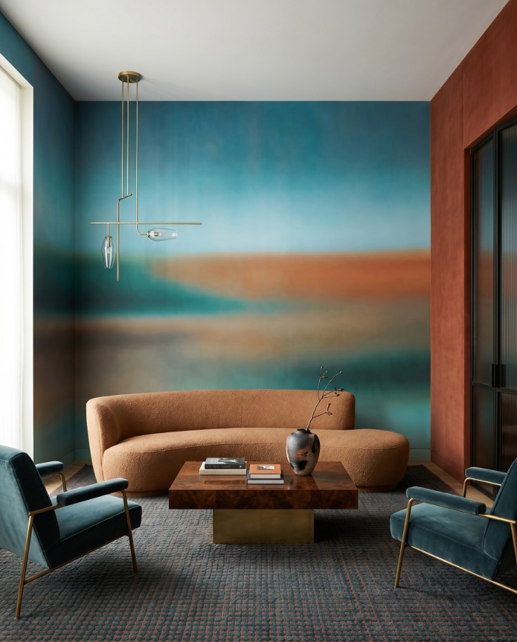
Featured: Rotko Clay, Ombre Mural Wallpaper
From soft, pastel skies to dramatic cloudscapes and dreamy sunsets, our sky and cloud wallpapers evoke a sense of calm, lightness, and spaciousness — perfect for creating a peaceful retreat at home.
Which Rooms Are Best For Blue Ombre Wallpaper?
Blue Ombre Wallpaper For Bedrooms
A bedroom is where blue ombre makes the most sense, because the gradient does the same thing good bedroom lighting does: it softens. Hung behind or above the bed, a design that fades from deep blue at the top into near-white lower down keeps the strongest colour at eye level while leaving the space around the headboard light and uncluttered. Blue is also the easiest colour to wake up to, cool enough to feel restful without turning cold. In a smaller bedroom, choose a gradient with plenty of pale ground so the walls do not close in, and run the fade towards the window to make the most of natural light. Layer in white bedding, warm wood and one deeper accent, and the room feels finished without much else.
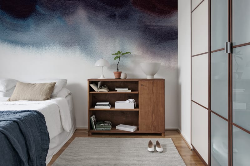
Featured: Merlina, Ombre Mural Wallpaper
Your bedroom should be a sanctuary — a space that reflects your personal style and helps you unwind at the end of the day. Explore our bedroom wallpaper designs to create your perfect retreat.
Blue Ombre Wallpaper For Dining Rooms
In a dining room, blue ombre gives you atmosphere without the formality of a traditional pattern. A pale, watery gradient across the main wall reads as a soft backdrop by day and deepens beautifully under candlelight or a low pendant in the evening, which is when the room tends to get used most. Because dining rooms are usually filled with a table, chairs and low storage, much of the lower wall disappears from view, so a design that carries its interest in the upper half earns its place. Scale matters here too: one large, loose wash suits a long wall better than a tight repeat, which can feel restless behind a table. Keep furniture pale and natural, and the blue stays the focus.
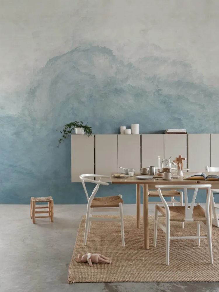
Featured: Abstract Watercolor, Mural Wallpaper
Create a beautiful gathering space with our collection of dining room wallpapers. From traditional patterns and rich colours for formal dining settings, to light, airy motifs for everyday gatherings, our wallpaper designs are curated to suit a variety of styles.
Blue Ombre Wallpaper For Kids' Rooms
Blue ombre is a rare thing in a child's room: a design they will not outgrow in two years. A gentle fade from soft grey into muted blue gives a nursery the calm of a plain wall with far more character, and it sits happily behind whatever comes next, from framed animal prints to a growing collection of drawings. There is no motif to date, so the same wallpaper works behind a cot and, later, a desk. Lighter gradients suit smaller and north-facing rooms, where you want the walls to hold light rather than absorb it. Pair it with pale wood, soft greys and a few warm accents, then bring in colour through bedding and toys that are easy to swap as tastes change.
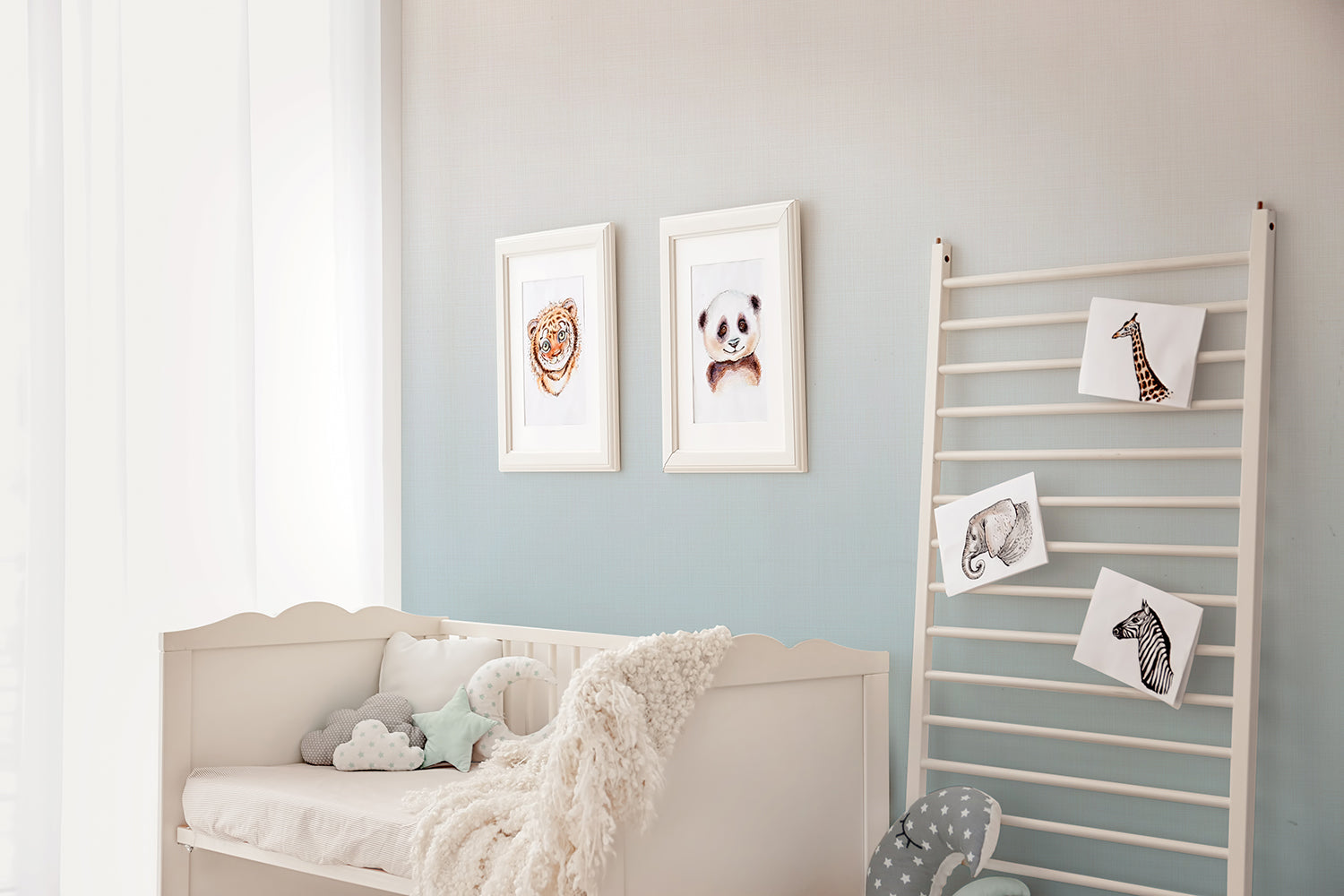
Featured: Tessa, Ombre Wallpaper
Choose your child’s favourite design from our curated collection of kids wallpapers.
Blue Ombre Wallpaper For Living Rooms
Living rooms give blue ombre the wall space it deserves. A wide, horizontal gradient stretched behind a sofa reads almost like an abstract artwork, which is why it works so well in a room where people sit and look at the walls for long stretches. The deeper blue through the middle of the design sits at seated eye level, while the paler top keeps ceilings feeling high, a useful trick in open-plan spaces. Because there is no repeat to align, the design also flows around corners and curved walls without a visible break. Ground it with a mid-tone sofa in olive, clay or oatmeal rather than another blue, and keep coffee table styling simple so the wall stays the main event.
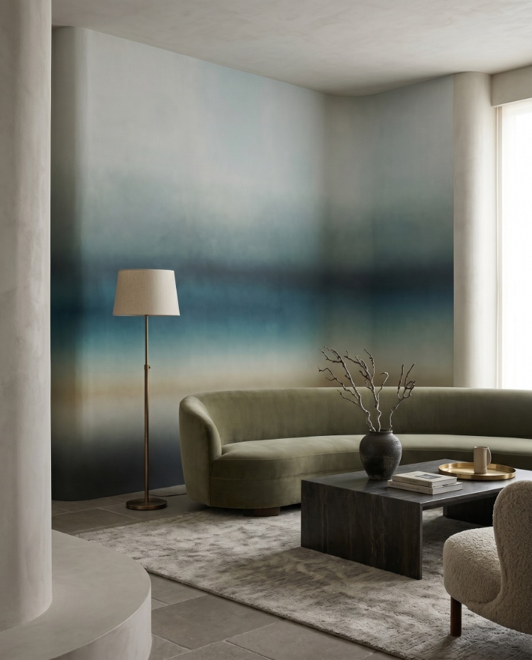
Featured: Rotko Blush, Ombre Mural Wallpaper
Discover more living room wallpapers that not only reflect your personal style but also help create a warm, welcoming atmosphere your whole family will enjoy.
Blue Ombre Wallpaper For Entryways
An entryway is the one space where you can afford to be bold, because nobody lingers long enough to tire of it. Blue ombre works particularly well here because most halls are short on natural light, and a gradient that lifts towards the ceiling stops a narrow space reading like a corridor. Choose a soft, chalky finish over a high-contrast mural if the wall is broken up by doors, radiators or coat hooks, since a subtle wash absorbs those interruptions where a stronger scene would fight them. This is also the exception to leaving a gradient wall bare: a gentle blue wash makes an excellent backdrop for a framed print or a mirror above a console. Keep the furniture light in tone, in oak or pale timber, so the hall stays bright.
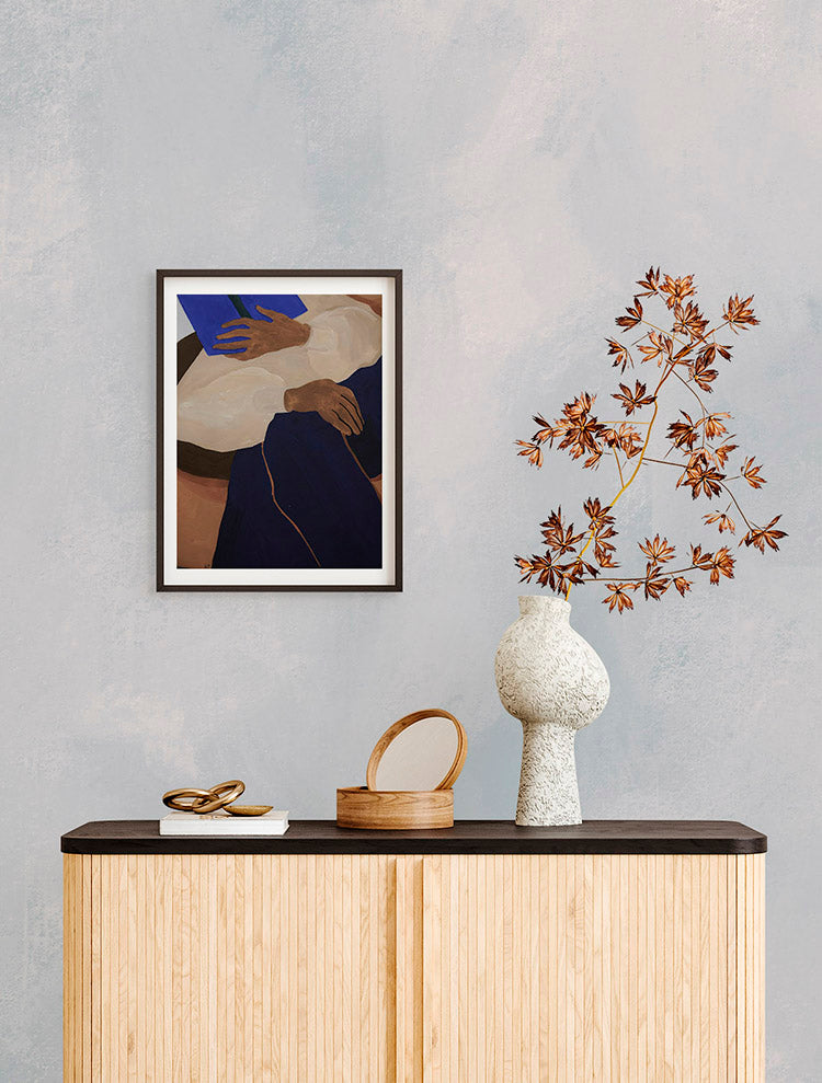
Featured: Addison Chalk, Ombre Wallpaper
If you're looking to give your entryway some love, explore our small entry design ideas and wallpapers to get inspired!
Blue Ombre Wallpaper #1: Blake Horizon, Ombre Mural Wallpaper
Blake Horizon, Ombre Mural Wallpaper is blue ombre wallpaper at its most restrained, made for rooms you want to feel calm rather than busy. The gradient runs smoothly from light to deep with no break to catch the eye, so it reads as a single wash of colour across the wall. That quietness is what makes it such a good fit for bedrooms, reading corners and quieter living spaces, where the last thing you want is a pattern demanding attention. It sits beautifully with soft linens, pale timber and simple contemporary furniture, and comes in three colourways so you can pitch the depth to suit your light.
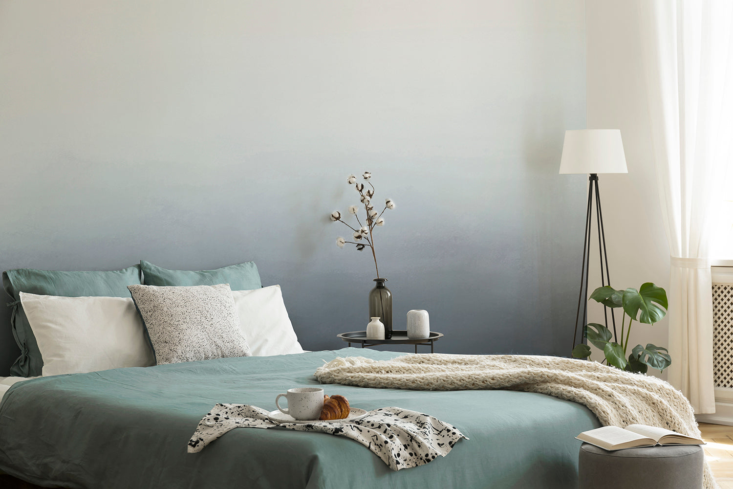
Featured: Blake Horizon, Ombre Mural Wallpaper
Blue Ombre Wallpaper #2: Calbri, Ombre Wallpaper
If you want blue ombre wallpaper that feels considered rather than dramatic, Calbri, Ombre Wallpaper is a gentle place to land. Two tones blend into one another in a soft, faded transition, giving the wall depth without hard edges or a repeating motif to date it. The effect is soothing up close and quietly graphic from across the room, which makes it an easy choice for bedrooms, landings and anywhere you want calm to be the first thing you notice. Pair it with plain bedding, natural textures and warm metals to keep the mood serene.
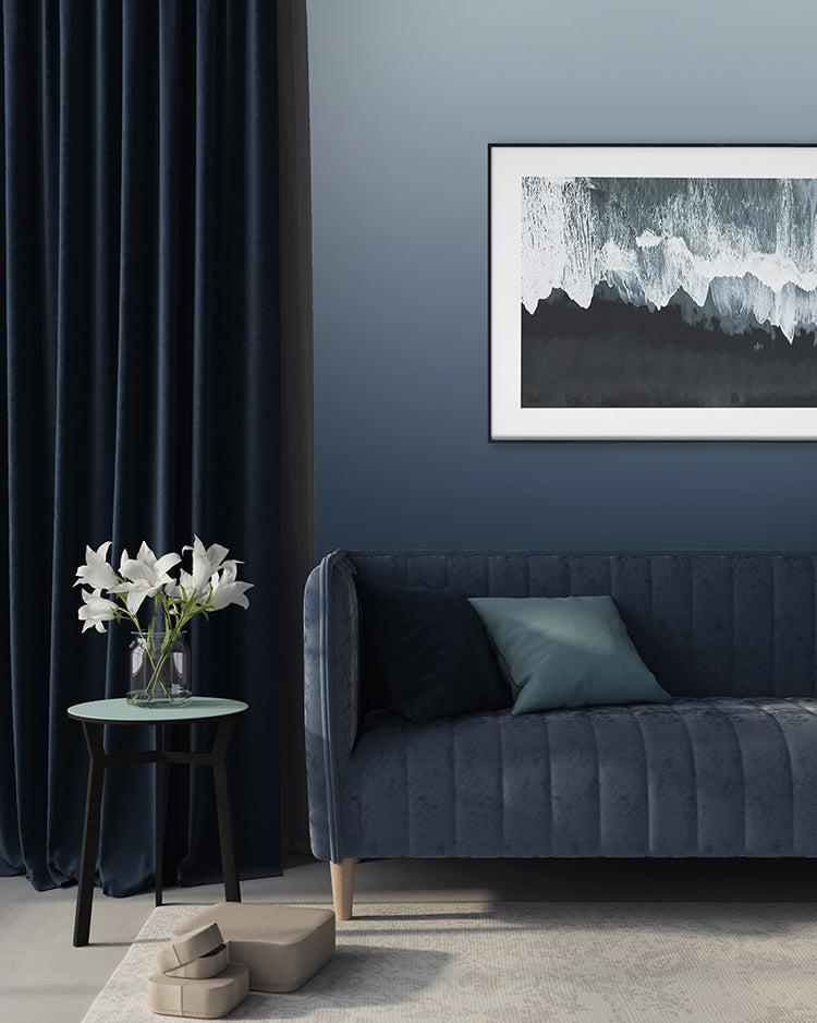
Featured: Calbri, Ombre Wallpaper
Blue Ombre Wallpaper #3: Vista, Watercolor Ombre Wallpaper
At the softest end of the range sits Vista, Watercolor Ombre Wallpaper, where dusky blue settles low on the wall and lifts into a pale, almost white haze towards the ceiling. The watercolour texture stops it reading as flat paint, but there is no defined subject to hold your attention, only the suggestion of a distant horizon seen through mist. That restraint makes it a quiet choice for minimalist interiors and a practical one for rooms that already have plenty going on. Style it simply, with oak, white joinery and a few ceramics, and the wall stays calm.
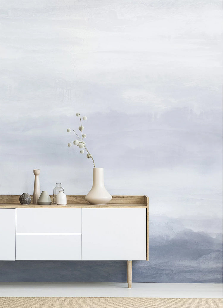
Featured: Vista, Watercolor Ombre Wallpaper
Blue Ombre Wallpaper #4: Forest Landscape, Ombre Mural Wallpaper
For anyone drawn to the outdoors, Forest Landscape, Ombre Mural Wallpaper brings a wooded horizon indoors without losing the softness of a gradient. Trees and rolling hills sit inside a deepening wash of colour, so the design reads as scenery from a distance and as texture up close. The depth in the darker tones gives a room real perspective, which is useful in narrow hallways or smaller rooms that need to feel further back than they are. Set it against natural wood, wool and stone, and it makes a space feel grounded and quietly private.
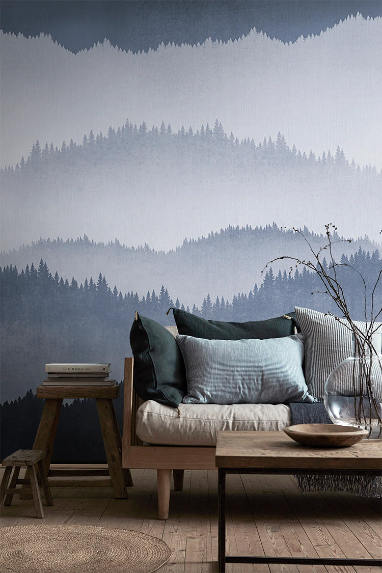
Featured: Forest Landscape, Ombre Mural Wallpaper
Blue Ombre Wallpaper #5: Gradient Ombre, Mural Wallpaper
Gradient Ombre, Mural Wallpaper is blue ombre wallpaper at its most flexible, the one to reach for when you want colour without committing to a scene or a pattern. Its gentle shift from light to deeper tone gives a flat wall dimension while keeping the room open and unhurried. It suits bedrooms and living rooms equally, and works just as well on a single statement wall as it does wrapped around a whole room. With four colourways to choose from, it settles as easily into a contemporary scheme as a more classic one.
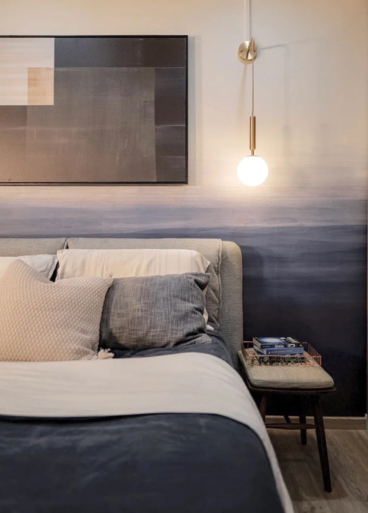
Featured: Gradient Ombre, Mural Wallpaper
Blue Ombre Wallpaper #6: Roerich Hills, Abstract Mural Wallpaper
There is a case for letting a room go properly dark, and Roerich Hills, Abstract Mural Wallpaper makes it beautifully. Ranges of hills layer back in deep navy teal, dissolving into near-black shadow at their base beneath a pale, misty sky, with the soft bleed of an ink wash rather than the crispness of a printed pattern. This is blue ombre wallpaper with real presence, closer to a piece of art than a wallcovering, so it suits rooms you want to feel enveloping: a study, a dining room, a bedroom you retreat into. Set against dark panelling, black trim and deep textured upholstery, the effect is cocooning rather than heavy.
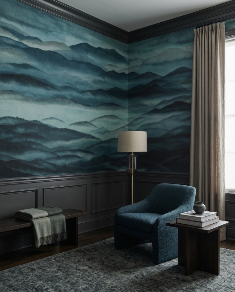
Featured: Roerich Hills, Abstract Mural Wallpaper
Blue Ombre Wallpaper #7: Roerich Light, Abstract Mural Wallpaper
Roerich Light, Abstract Mural Wallpaper shows the warmer side of blue ombre wallpaper. Near-black mountains in the foreground give way to teal-blue ranges layered into the distance, with a soft golden sky washing across the top of the design. That touch of gold is what sets it apart, keeping the cooler tones from feeling austere while the contrast still delivers a proper focal wall. The effect is closer to an ink-wash painting than a print, and it sits comfortably alongside dark wood, brass and richly textured upholstery in living rooms, dining rooms, entryways and home offices.
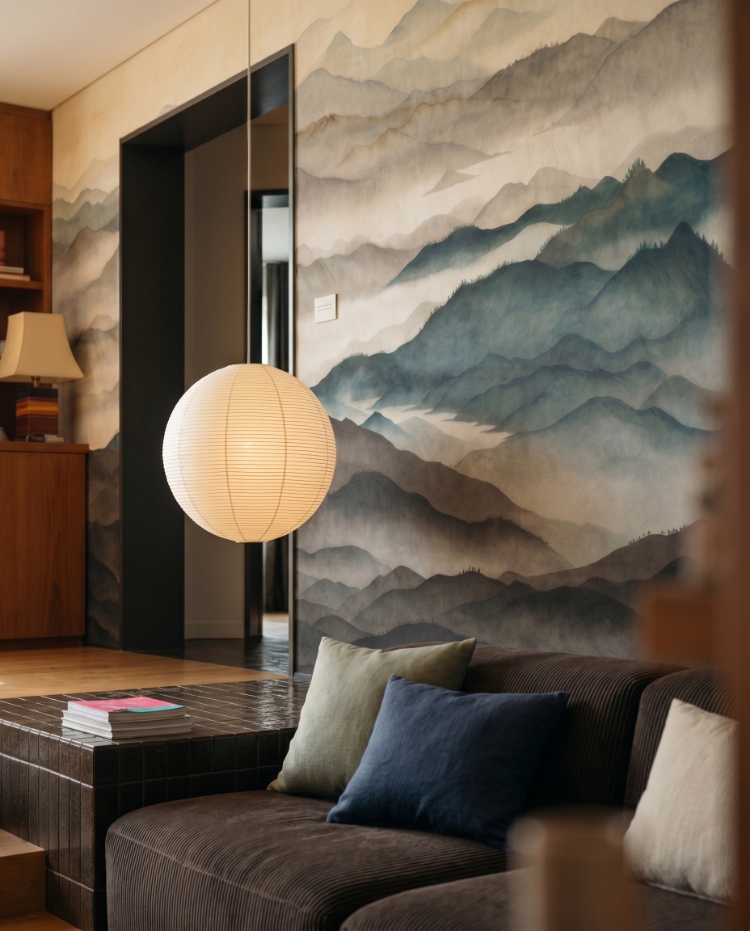
Featured: Roerich Light, Abstract Mural Wallpaper
Blue Ombre Wallpaper #9: Delilah Waves, Watercolour Ombre Wallpaper
Hand-painted brushwork is what sets Delilah Waves, Watercolour Ombre Wallpaper apart from a flat gradient. The wash moves on a gentle diagonal rather than a straight horizontal line, with deeper slate blue low on the wall lifting into the palest grey-white above, so there is a real sense of movement across the design. It is soft enough to sit behind a console table, a bed or a dining sideboard without dominating the room, which makes it one of the more versatile blue ombre wallpaper designs here. Style it with pale wood, ceramics and a little greenery, and choose between Blue and Sand depending on how cool you want the room to feel.
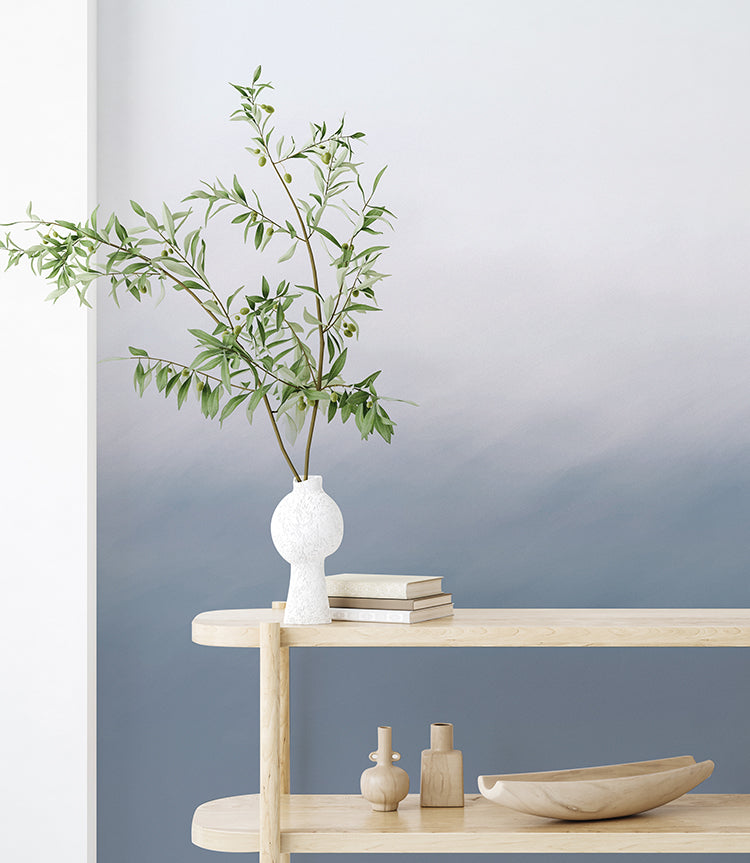
Featured: Delilah Waves, Watercolour Ombre Wallpaper
Should You Choose Light Or Dark Blue Ombre Wallpaper?
Choose light blue ombre wallpaper when you want a room to feel larger and brighter, and dark blue when you want it to feel enclosed and atmospheric. The right answer depends less on the design itself than on how much natural light the room gets and what you actually use it for.
Light Blue Ombre Wallpaper
Light blue ombre wallpaper suits rooms that need to feel bigger than they are. Pale gradients bounce what daylight there is around the walls, and because the colour fades out rather than stopping at a hard line, the corners of a room read as softer and further away. That makes it a reliable choice for north-facing bedrooms, box rooms and nurseries, and for anywhere with a low ceiling, since the eye keeps travelling upwards into the palest part of the design. The trade-off is presence. In a large, bright room a very pale gradient can disappear, so look for one with enough tonal shift to still register from across the space.
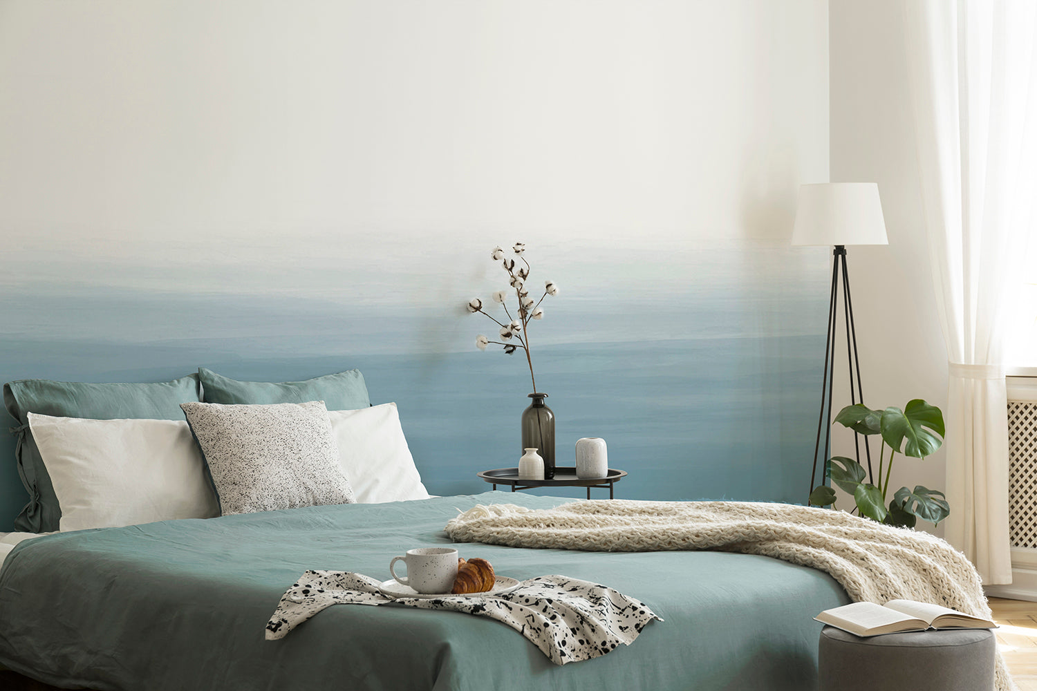
Featured: Gradient Ombre, Mural Wallpaper
Create a sense of openness and ease with our curated collection of light wallpaper designs.
Dark Blue Ombre Wallpaper
A dark blue ombre wallpaper turns a room into somewhere you want to linger after dark. Deep navy and teal absorb light rather than reflecting it, which sounds like a problem and is usually the opposite: instead of a small room feeling smaller, the walls stop announcing exactly where they are, and the space reads as enveloping. It works particularly well in rooms used mostly in the evening, such as dining rooms, studies and bedrooms. A dark gradient also behaves differently from dark paint, because the fade into paler tones keeps part of the wall open where flat dark colour would press down on the room.
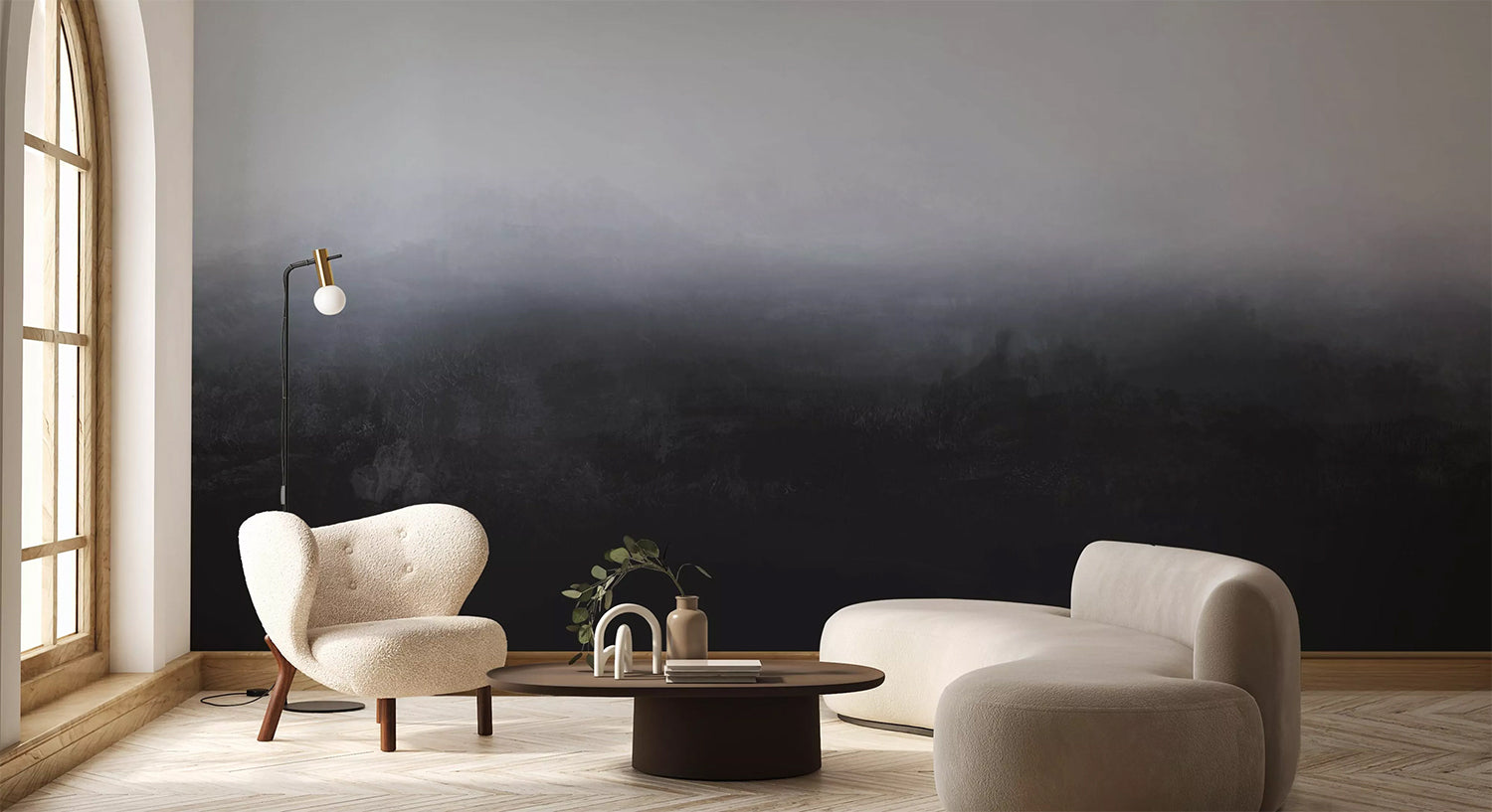
Featured: Greg Horizon, Ombre Mural Wallpaper
From deep blues and rich greens to dramatic blacks and warm earthy tones, dark wallpapers add depth, contrast, and atmosphere to any space. Make a confident design statement with our curated collection of dark wallpaper designs.
How To Decide For Your Room
If you are torn, let the room's light and purpose decide rather than the design. Rooms that already struggle for daylight and need to feel bigger, such as small bathrooms, hallways and children's rooms, do better with the pale end of the range. Rooms you want to feel intimate, or that you mostly use in lamplight, can take the deepest navy without any loss. Dusky and grey blues sit between the two and are the safest choice when a room has to do both jobs, working as a soft neutral by day and gaining depth in the evening.
How Do You Style Blue Ombre Wallpaper?
Blue ombre wallpaper styles best when everything else in the room stays quiet. The design already brings movement and depth, so the rest of the scheme should support it with warm materials and a restrained palette rather than compete with it.
What Colours Go With Blue Ombre Wallpaper
Warm neutrals are the natural partners for blue ombre wallpaper. Oatmeal, sand, cream and pale timber counter the coolness in blue and stop a room tipping into chill, which is the most common problem with an all-blue scheme. For an accent, look to the opposite side of the colour wheel. Clay, rust and terracotta lift a teal or navy gradient without fighting it, as does a warm olive. Hardware is worth a thought too: brass and aged gold add warmth to cooler blues, black gives a crisper and more graphic finish, and chrome keeps a scheme cool and contemporary.
Which Way Should The Gradient Run
Which way the gradient runs changes the shape of a room, so it is worth choosing a design with that in mind. One that is palest at the top draws the eye upwards and makes a low ceiling feel higher, which is why it is the usual choice for bedrooms and hallways. A design with the pale tone low and depth gathering above gives a more dramatic, weather-like effect and suits taller rooms that can afford to lose a little height. Wherever the deepest tones sit, try to keep them behind furniture. A dark base disappearing behind a sofa or a bed reads as intentional, while dark colour across an empty wall you look straight at can feel heavy.
Furniture, Art And Finishing Touches
A gradient wall wants very little hung on it. With no repeating pattern to break up, the wall already works as a single piece of art, and covering it with framed prints undoes the effect. Keep it clear, or limit yourself to one mirror, which will catch the light and echo the softness of the design. Bring the colour into the rest of the room instead, taking one tone from the gradient and repeating it in cushions, throws or a rug. Lamplight matters more than you might expect: a warm bulb close to the wall reveals depth in a dark gradient that overhead lighting flattens out.
What Should You Consider Before Ordering Blue Ombre Wallpaper?
Two things are worth checking before you order: how the design will look under your own light, and how the gradient will sit against your wall. Because these designs are murals rather than repeating patterns, each one is made to the measurements of the wall it is going on, so a little planning up front saves disappointment later.
How Daylight Changes A Gradient
The same blue ombre wallpaper can look like two different designs at either end of the day. Morning light in an east-facing room brings out the cooler, greyer notes in a gradient, while low evening sun warms the same wall considerably and deepens the darker tones. North-facing rooms hold a steady, cool light throughout the day, which suits paler and dustier blues, whereas south-facing rooms can carry a stronger navy without it closing in. Look at the wall you have in mind at a few points in the day before deciding, and think about which of those moments matters most for how you use the room.
Start With Samples
Colour and finish are genuinely hard to judge on a screen. Blues in particular shift depending on your monitor, and the softness of a watercolour gradient is something you need to see in person. Ordering a few samples lets you tape them to the actual wall, live with them for a day or two, and watch how each one behaves as the light changes and against your existing flooring and furniture. If you are deciding between colourways, this is the step that settles it.
Choosing The Perfect Blue Ombre Wallpaper For Your Home
The best blue ombre wallpaper is one that suits your personal style while working with the light your room actually has. Whether you're drawn to soft watercolour washes, misty landscape murals, deep ocean gradients or wide horizon skies, a well-chosen ombre design can turn a plain wall into one of the most memorable rooms in your home. Pair it with warm neutrals, natural wood and considered lighting to create a space that feels both practical and beautifully designed.
Ready to start your project? Explore more ombre wallpaper ideas and tips to help you choose, place and style a gradient design in any room of your home.
Transform Your Home with Made-to-Measure Wallpaper
Explore our full collection of wallpaper designs and get inspired to find the perfect design for your home. Installation services are available in selected countries — just add it at checkout if it’s offered in your area.
At Hello Circus, we believe every wall deserves something special. That’s why all our wallpapers are custom-made to fit your wall’s exact dimensions — no generic rolls, just a perfect fit. Priced by the square metre (Height × Width × Unit Price), you only pay for what you need.
Choose the Right Wallpaper Material
Whether you’re decorating your forever home, updating a rental property, or refreshing a single feature wall, choosing the right wallpaper material can make all the difference. At Hello Circus, every wallpaper design is available in three premium materials, so you can select the option that best suits your space, installation preferences, and lifestyle.
- Non-Woven Matte Wallpaper: Our most popular choice, featuring a smooth, non-reflective finish that creates a beautifully soft look. Durable, breathable, and easy to install using the paste-the-wall method, it’s ideal for most residential interiors.
- Heavy Duty Textured Vinyl Wallpaper: Designed for busy households and commercial spaces, this premium textured finish offers added durability and a luxurious tactile feel. It’s perfect for high-traffic areas where extra resilience is required.
- Peel and Stick Wallpaper: A self-adhesive option that makes decorating quick and convenient. Ideal for renters, DIY enthusiasts, or anyone who prefers a paste-free installation, peel and stick wallpaper allows you to refresh your walls with minimal fuss while enjoying the same beautiful Hello Circus designs.
Whichever material you choose, every wallpaper is custom-made to your wall’s exact dimensions using high-quality printing and vibrant, colour-rich inks, ensuring a beautiful finish that’s made to last.
Curious About the Cost? Try Our Wallpaper Visualiser
- Enter your wall’s width and height for an instant price.
- Preview how your chosen wallpaper will look on your wall — especially helpful for murals, where placement matters.
Still deciding? Order a sample to feel the texture, quality, and finish before you commit.
How to Calculate How Much Wallpaper You Need?
Before purchasing, it’s important to measure your wall accurately to avoid over- or under-ordering. Here’s a simple way to get started:
- Measure the width of the wall from edge to edge.
- Measure the height from floor to ceiling.
- Allow for extra, around 10cm, to account for trimming and pattern matching.
Need help? Read our guide on how to measure your wall for wallpaper or get in touch with us.
Why Choose Hello Circus Wallpaper?
What makes our wallpapers different? Every Hello Circus wallpaper is made to order using premium materials designed to deliver exceptional quality, durability, and beautiful colour reproduction.
- Premium quality: Printed in Europe on durable non-woven paper, our wallpapers are reinforced with nylon fibres to stay smooth, strong, and long-lasting.
- Matte and non-reflective: Our non-woven wallpapers are coated with a soft, non-reflective matte finish that brings warmth and elegance to your space without harsh glare.
- Safe and non-toxic: We use VOC-free inks and PVC-free, breathable paper, so you can create a beautiful home without worrying about harmful chemicals — especially important for little ones.
- Antimicrobial protection: Helps prevent the growth of mould, mildew, and bacteria, keeping your walls cleaner and fresher for longer.
- Wallpaper washability: All our wallpapers are washable, meaning everyday dirt and water stains can be wiped away using a damp cloth or sponge.
- Resistant to colour fading: Designed with colourfast technology to keep your wallpaper vibrant and rich over time.
- Fire resilient: Our wallpapers meet European fire safety standards (EN ISO 11925-2), providing an extra layer of reassurance for your home.
Read more about our wallpaper materials and check out our ultimate guide to wallpapers for answers to the most commonly asked questions.
Let’s Connect
Have a project in mind or interested in partnering with us? We’d love to hear from you.
- Bulk orders
- Corporate orders
- Selling with us
- Collaborations
- Press features
Feel free to get in touch.



