
Pastel green might be the easiest colour to live with that still counts as a colour. Green is what our eyes rest on by default, so a pale one settles a room rather than decorating it, and because green sits exactly between the warm and cool halves of the spectrum it holds its character in flat winter light where a pale blue or grey would turn cold. It also happens to suit wood, linen, stone and most of what you already own, which is why it turns up as readily in a kitchen or a home office as it does in a nursery.
In this guide we'll walk through five pastel green wallpaper styles worth knowing, from abstracts and botanicals to checks, stripes and hand-drawn toile, and look at which of six rooms each one suits best. We'll help you choose between a repeating pattern and a made-to-measure mural, then share our favourite designs, picked for how they behave on a real wall rather than how they look in a swatch. Along the way you'll find practical advice on the three things that decide whether green reads fresh or flat: the light your room gets, the colours you put beside it, and how to choose a shade that will not date.
What Are The Different Pastel Green Wallpaper Styles?
Popular pastel green wallpaper styles include painterly abstracts, botanical prints, gingham checks, vertical stripes and hand-drawn toile scenes. Green is the one pale shade the eye reads as restful before it reads as decoration, so the style you pick does more than the shade itself to decide whether a room feels fresh and modern or soft and traditional.
Abstract Pastel Green Wallpaper
If you want green on the wall without a single leaf in sight, abstract is the style to reach for. Brushed blocks, wavy lines and soft-edged shapes give pale green a quiet, gallery-like quality, and because nothing in the design is literal your eye reads the wall as texture rather than as a picture. That makes abstract pastel green wallpaper an easy choice for living rooms, entryways and open-plan spaces, where the wall has to sit behind furniture instead of competing with it. Look for a design with enough contrast between the green and the ground to survive a sofa in front of it, since the palest abstracts can flatten out at low level. Walnut, cream bouclé and one black accent finish it well.

Featured: Erik, Wave Pattern Wallpaper
Bring creativity and character into your home with our curated collection of abstract wallpaper designs.
Botanical Pastel Green Wallpaper
Botanicals are the natural home for a pale green, and the pairing is so obvious it tends to be underrated. Ferns, foliage and trailing stems drawn in green on a green ground read as soft texture from across the room and only reveal their detail up close, which is exactly what makes botanical pastel green wallpaper so easy to live with in a room you use every day. It suits bedrooms, bathrooms and dining rooms, where the association with growing things does half the work of making a space feel calm. Decide early how much contrast you want: tone-on-tone greens stay quiet, while a white or cream outline keeps the leaves legible in a room that gets little daylight. Style it with oak, washed linen and stoneware.

Featured: Noelle Fern, Tropical Pattern Wallpaper
Explore more botanical wallpapers to bring the detail and calm of the natural world onto your walls.
Checkered Pastel Green Wallpaper
There is something steadying about a check, and a soft green keeps it from ever feeling stiff. The squares read powdery rather than graphic, so you get rhythm and order on the wall without the crispness a stronger colour would bring, and the grid gives a plain room a sense of structure it did not have before. Checkered pastel green wallpaper earns its place in kitchens, utility rooms, pantries and children's rooms, where a gentle repeat makes a modest space look tidy and considered. Keep the scale generous in a room with little daylight, as larger checks hold their shape in low light while small ones blur into a flat wash. Cream, oak and a touch of terracotta stop green checks reading cold.
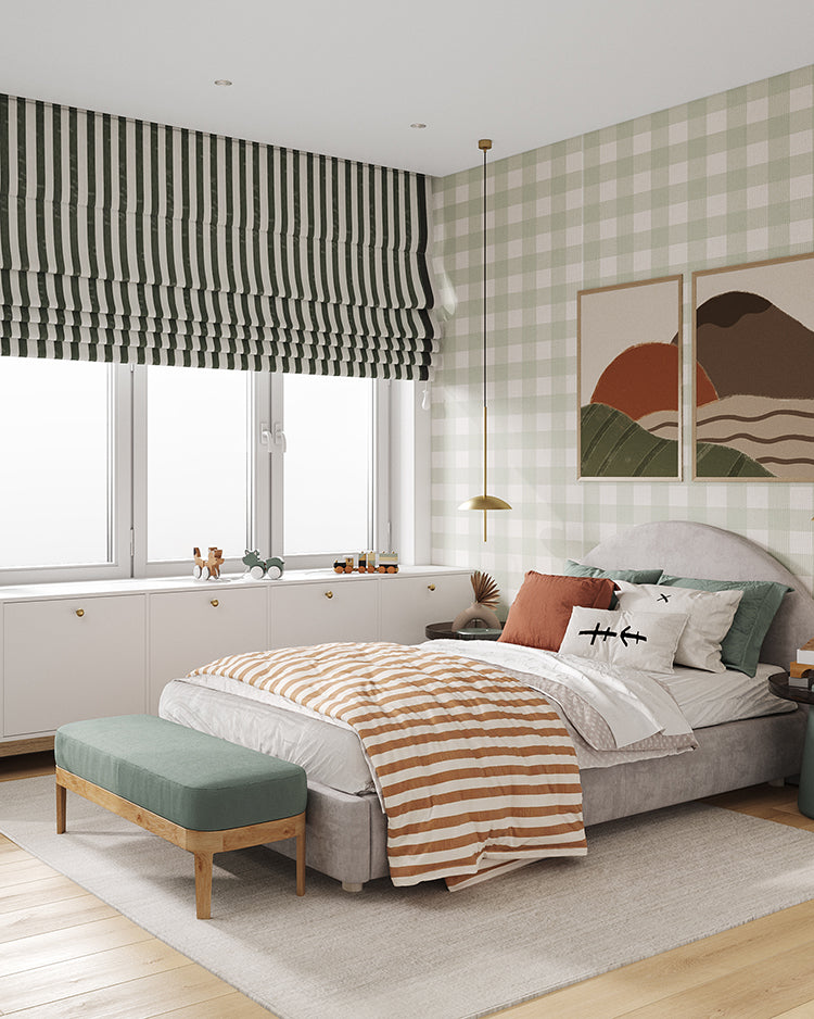
Featured: Gingham, Pattern Wallpaper
Explore more checkered wallpapers that offer a timeless balance of rhythm and symmetry.
Striped Pastel Green Wallpaper
A stripe is the quickest way to give pastel green some backbone. Vertical lines in green and cream draw the eye upwards and bring architecture to a wall, and where the stripe is drawn with a soft painted edge it reads closer to panelling than to pattern. Striped pastel green wallpaper is a reliable choice behind a bed, along a hallway or around a dining room, where you want character without a busy print to look at every day. Match the width to the room: narrow stripes suit small spaces and tight corners, while wide bands need wall space to be appreciated. Stripes also sit easily with whatever furniture you already own, because structure never competes with subject matter.

Featured: Kyra, Striped Wallpaper
Effortlessly classic and endlessly versatile, striped wallpaper designs bring structure, balance, and a refined sense of style to any room. Explore our striped wallpaper collection for more inspiration.
Toile Pastel Green Wallpaper
Toile is the oldest style on this list and the one that rewards a closer look. A single ink colour printed on a plain ground, drawn into pastoral scenes of trees, figures and animals, means the colour itself carries the whole design, so toile pastel green wallpaper reads as soft texture from the doorway and only turns into a story once you are standing beside it. It suits bedrooms, children's rooms, dining rooms and period homes, where a hand-drawn line flatters painted woodwork and older timber. Because the detail is so fine, check the contrast between line and ground before ordering for a dim room, as the palest green toiles can wash out under artificial light. Cream linen, antique wood and soft white paintwork keep it from turning formal.
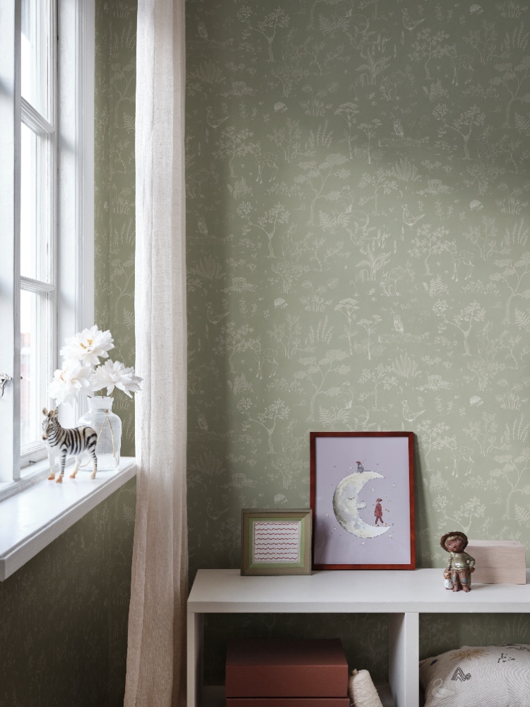
Featured: Hollie, Woodland Animal Pattern Wallpaper
See how toile has outlasted every passing trend in our guide to classic wallpaper styles.
Which Rooms Are Best For Pastel Green Wallpaper?
Pastel green wallpaper suits living rooms, bedrooms, kitchens, dining rooms, home offices and children's rooms, and it behaves differently in each. Green sits in the middle of the spectrum, so it neither warms nor cools a room the way pink or blue does, which is why it holds its colour in north-facing light and still looks fresh in a room that gets sun all afternoon.
Living Room
A living room is where pastel green proves it is a neutral rather than a statement. A pale green wall behaves like a warm off-white across a large surface, shifting gently through the day and turning softer once the lamps come on, which matters in a room used morning and evening. Give it the wall behind the sofa or the chimney breast, where there is enough uninterrupted height to take the design in at a glance, and keep the pattern scale generous so it does not disappear behind furniture. Keep your largest pieces neutral, in cream, oatmeal or grey, so the green reads as a backdrop rather than a theme. Warm timber, bouclé and one deeper accent, rust or chocolate, finish the room.

Featured: Broken Stripes, Abstract Pattern Wallpaper
Discover more living room wallpapers that not only reflect your personal style but also help create a warm, welcoming atmosphere your whole family will enjoy.
Bedroom
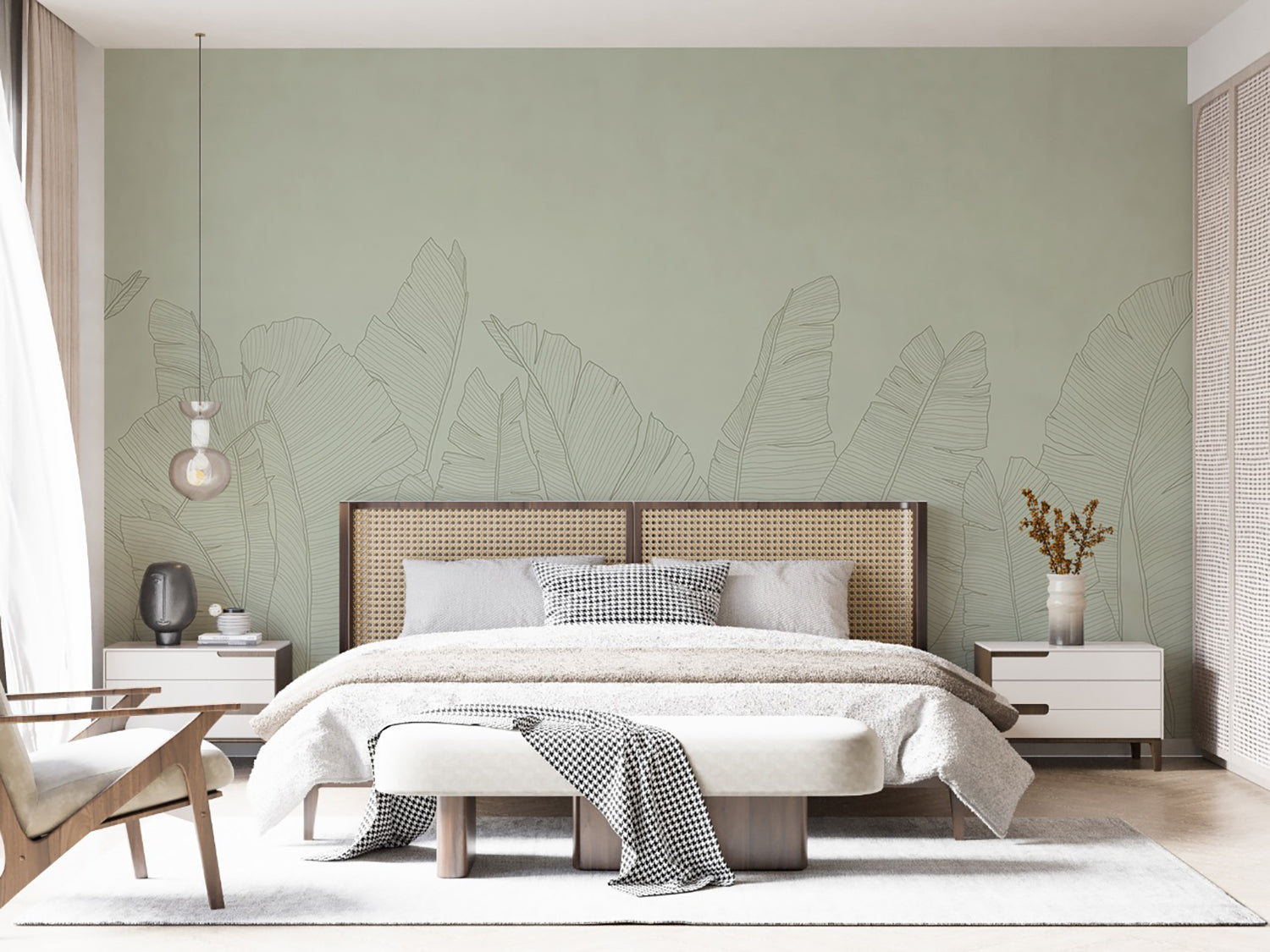
Green is the most restful colour you can put in a bedroom, and a pale one keeps the room soft without making it dark. A muted green wall lowers the visual energy of the space while still giving it something to look at, which is the balance most bedrooms miss when they are painted plain white. Keep the design on the headboard wall and leave the other three quiet, so the pattern greets you as you walk in and sits out of sight when you are lying down. Check your heights before ordering if you are using a mural: you will want wall visible above the headboard, roughly 110cm from the floor, while a fine repeat works at any height. White bedding, cane and pale oak keep a green bedroom feeling fresh.

Featured: Banana Foliage, Tropical Mural Wallpaper
Your bedroom should be a sanctuary, a space that reflects your personal style and helps you unwind at the end of the day. Explore our bedroom wallpaper designs to create your perfect retreat.
Kitchen
Kitchens take pastel green more easily than almost any other colour, because it flatters everything a kitchen is already made of. Timber boards, brass taps, marble and stoneware all look richer against a soft green than they do against a cool white wall, and the colour reads clean without the clinical edge white can have. Paper the upper wall, above a splashback or a run of tiling, which keeps the paper clear of water and grease and gives a galley kitchen a horizontal line that makes it feel wider. Choose a smaller repeat where the wall carries open shelving, since a large design is lost behind jars and crockery. Pale green also sits happily beside cream, sage and natural wood cabinetry.

Featured: Lykke, Checkered Pattern Wallpaper
Whether you're designing a cosy breakfast nook, refreshing a dry kitchen, or adding charm to your pantry, our kitchen wallpapers offer the perfect balance of style and function.
Dining Room
A dining room is one of the few spaces you can paper on all four walls, and pastel green is a good colour to do it with. Most dining happens under lamplight, and where a cool grey turns flat after dark a soft green stays fresh, holding just enough colour to keep the room from feeling like a corridor with a table in it. Because dining furniture sits low, the top two thirds of every wall stay visible, so a pattern here is seen whole rather than in fragments and a tonal repeat will not tire you out over a long meal. Build in a banquette if the room is narrow, and keep the table and chairs in pale wood so the green stays the quietest thing about the room.

Featured: Saltwater Foliage, Pattern Wallpaper
Create a beautiful gathering space with our collection of dining room wallpapers. From traditional patterns and rich colours for formal dining settings, to light, airy motifs for everyday gatherings, our wallpaper designs are curated to suit a variety of styles.
Home Office
Green is the easiest colour to look at for hours at a time, which is the whole argument for using it in a home office. It gives the eye somewhere restful to land between tasks without the stimulation of a strong colour or the glare of a white wall, and it photographs well, which is worth thinking about if you are on video calls. Put the paper on the wall behind your desk or the one you face, but keep a high-contrast design out of the frame directly behind a screen, where a busy repeat competes with what you are reading. Fine, delicate prints work best here for the same reason. Finish with natural wood, a rattan chair and one good task lamp.
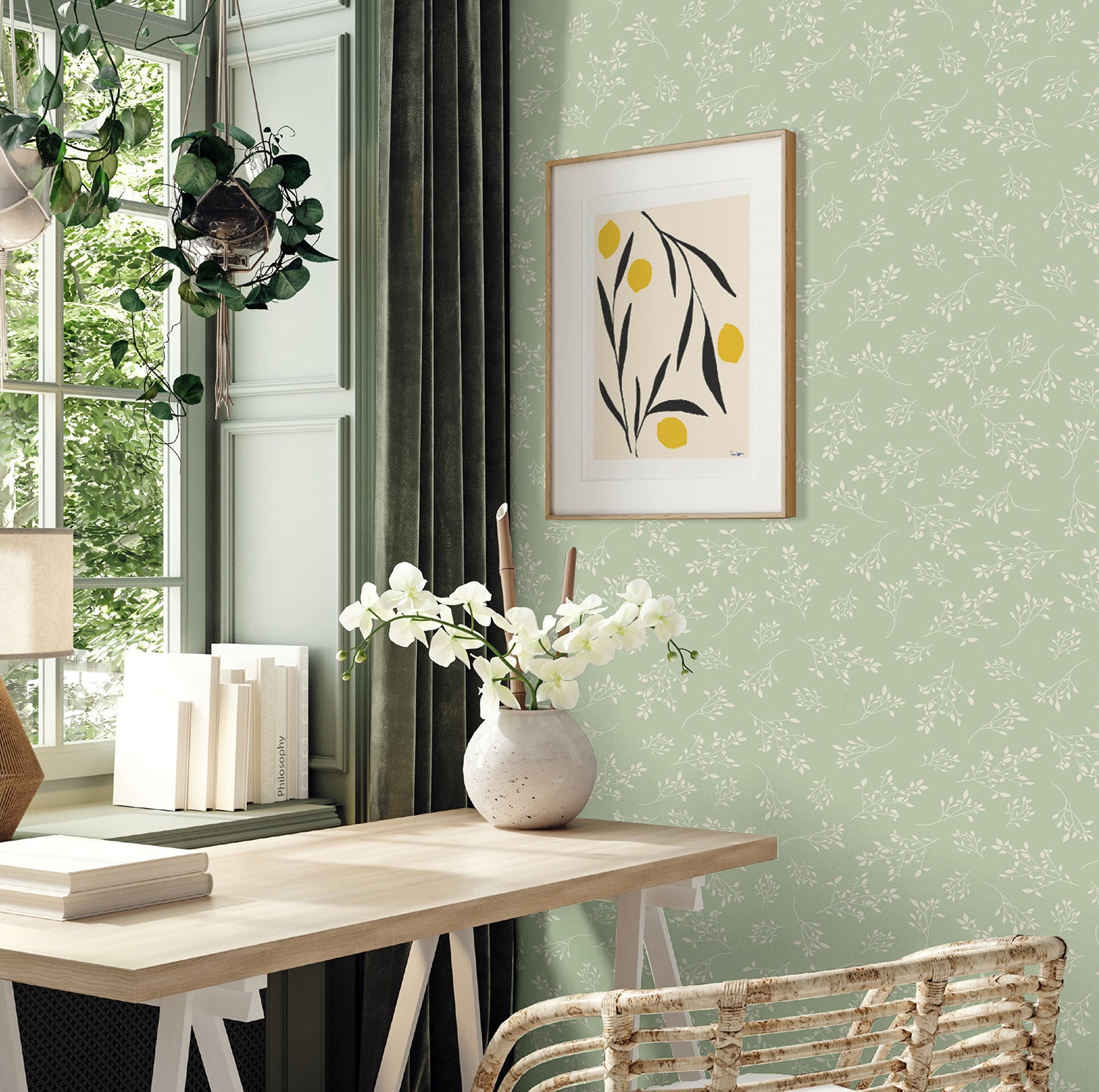
Featured: Delicate Foliages, Pattern Wallpaper
An office doesn't have to feel dull or uninspiring. Whether you're drawn to calming scenery that helps you unwind and refocus, or energising patterns that boost creativity, our collection of modern office wallpapers is designed to support the way you work.
Kid's Room
The trick in a child's room is choosing a green they will not outgrow, and a muted shade lasts far longer than a bright one. Softer greens read as a backdrop rather than a colour scheme, so the room can change around them as toys, posters and furniture come and go, and they suit a nursery and a nine-year-old equally. Designs with something to look at, a landscape, a scene or a repeating story, earn their keep here because they hold a child's attention for years and give the room a subject beyond its colour. Choose a washable or textured finish for the lower metre, where sticky hands land, and keep one wall plain for shelves and growth charts. Pale wood, cream and navy balance it.

Featured: Montfort, Toile Mural Wallpaper
Choose your child's favourite design from our curated collection of kids wallpapers.
Should You Choose Pastel Green Pattern Or Mural Wallpaper?
Choose a mural if you want one wall to be the focal point of the room, and a pattern if you want colour spread evenly across several walls or the room is broken up by windows, doors and built-in units. A mural is one large design scaled to fit your wall, while a pattern repeats on every drop. In a pale green that difference matters more than it would in a stronger colour, since a mural concentrates a soft shade into something with real presence, while a pattern spreads it into an all-over calm.
Pastel Green Mural Wallpaper
If you want a wall that feels like a piece of artwork, a mural is the way to use pastel green. Large-scale scenes such as blossoming branches, misty landscapes and sweeping foliage hold real depth, and the gradual shifts between pale green, cream and shadow look almost like daylight moving across the wall. Murals are printed to your measurements, so measure the width and height at three points each and use the largest figure, since very few walls are perfectly square. A mural can wrap around a corner for a more enveloping feel, but plan where the corner falls so a key part of the design is not folded into it. Keep furnishings plain and textured, with linen curtains and solid-coloured upholstery, so the wall stays the focus.

Featured: Spring Tree, Nature Mural Wallpaper
Create a room that tells a story with our stunning collection of mural wallpapers.
Pastel Green Pattern Wallpaper
Pattern is the practical choice for rooms full of interruptions, such as kitchens, hallways and home offices, where cabinets, windows, splashbacks and sockets break up the walls. Because the design repeats on every drop, a cut around a socket or a window frame disappears into the pattern instead of slicing through the middle of a scene. Soft green repeats also let you paper every wall in a room without the colour taking over, since the cream or white ground between the motifs keeps everything light. Check the pattern repeat before you order. Large repeats suit tall, uninterrupted walls, while smaller repeats work better with low ceilings and tight spaces, and a large repeat creates more waste when matching drops, so ask how much extra to allow.

Featured: Rippling Leaves, Pattern Wallpaper
From classic and timeless patterns to modern and whimsical prints, our pattern wallpaper collection offers a wide range of options to transform your living spaces.
How Does Light Change The Way Pastel Green Looks?
Light changes pastel green more than it changes most pale colours, because green sits between the warm and cool halves of the spectrum and can be pulled either way. The same paper can read fresh and leafy in one room and flat grey-green in the room next door.
North-Facing And Low-Light Rooms
Pastel green holds up better than blue or grey in cool northern light, but only if you choose a shade with yellow in it. North light is flat and blue-biased, so it strips warmth out of a colour: a mint or seafoam that looked clean on the sample will settle into something grey and faintly cold once it is on the wall, while a sage with a yellow base or a soft pistachio still reads as a colour rather than a shadow. Tape a full drop to the wall you actually plan to paper, not the one opposite, since the wall facing the window receives far more light than the wall beside it. Look at it at nine in the morning and again at four in the afternoon. If it has gone grey by four, it will look grey for most of the winter.
South-Facing And Bright Rooms
Bright rooms can carry the cooler greens that fail everywhere else, and mint and seafoam are at their best here. Strong daylight adds warmth and intensity of its own, so a cool green reads crisp and fresh instead of clinical. The risk in a sunny room runs the other way: a yellow-leaning pistachio or spring green can tip acidic in full sun, particularly in late afternoon when the light itself turns yellow and pushes the paper further than you intended. If the room takes direct afternoon sun, judge your sample at the hottest part of the day rather than in the morning. It is also worth asking about lightfastness for a wall in direct sun for most of the day, because fading on a pale green shows up as an uneven patch rather than an even softening.
Choosing Bulbs
Bulb temperature shifts pastel green further than it shifts most colours, so choose the bulbs and the paper together rather than one after the other. A warm 2700K bulb pushes green towards yellow and makes a sage look softer and more olive, while a cool 4000K bulb pushes the same paper towards blue and leaves it looking crisper and a little institutional. In bedrooms and living rooms, 2700K suits almost any green. In a kitchen or a home office, where you want the room to feel alert, 3000K is a safer middle than 4000K. Mixed colour temperatures are the real trap, since a warm pendant above a cool LED strip will show you two different greens on one wall. Keep every bulb in the room the same.
Pastel Green Wallpaper #1: Smooth Brush, Abstract Mural Wallpaper
Oversized brushstrokes give Smooth Brush, Abstract Mural Wallpaper its slow sense of movement, with broad sweeping curves layered across the wall in soft tonal green. There is no repeat to follow, so the design brings depth and texture while staying calm enough to live with in a room you eat or work in every day. As pastel green wallpaper for a feature wall it pairs easily with natural timber, linen upholstery and stone, which makes it a dependable fit for Scandinavian, Japandi and contemporary interiors. Use it in living rooms, bedrooms, dining rooms, home offices and hallways. Four colourways, including Green.

Featured: Smooth Brush, Abstract Mural Wallpaper
Pastel Green Wallpaper #2: Graceful Geese, Animal Pattern Wallpaper
Little white geese wander across Graceful Geese, Animal Pattern Wallpaper with tiny leaves scattered between them, which is enough to make a room feel considered without much effort from you. The motifs are small and well spaced, so the pattern keeps a child's room light and uncluttered while giving pastel green wallpaper a gentle sense of movement across all four walls. Nurseries and children's rooms are the obvious home for it, though it is quiet enough for a guest bedroom. It sits easily with terracotta, mustard and pale wood.

Featured: Graceful Geese, Animal Pattern Wallpaper
Pastel Green Wallpaper #3: Oriental Crane Garden, Mural Wallpaper
Inspired by classical Asian garden painting, Oriental Crane Garden, Mural Wallpaper sets white cranes wading among lotus blooms, flowering branches and soft marshland grasses. The brushstroke detail is fine and the composition unhurried, so in the Jade colourway it works as pastel green wallpaper that brings stillness to a room instead of asking for attention. It suits living rooms, bedrooms, dining areas and quieter spaces such as reading rooms and studies, and the painterly style sits beautifully with warm timber, linen textures and Japandi or minimalist interiors. Four colourways are available: Natural, Jade, Dark and Navy.

Featured: Oriental Crane Garden, Mural Wallpaper
Pastel Green Wallpaper #4: Lilo Fern, Tropical Pattern Wallpaper
Soft layered fern fronds give Lilo Fern, Tropical Pattern Wallpaper its sense of movement, drawn tone on tone so the pattern reads as texture before it reads as a print. That restraint is the point. This is pastel green wallpaper for anyone who wants the calm of a botanical without a strong motif to decorate around, and it keeps a room feeling open and modern. It works in living rooms, dining areas and bedrooms, and the near-neutral ground makes it easy to live with for years. Three colourways are available: Green, Sand and Blue.

Featured: Lilo Fern, Tropical Pattern Wallpaper
Pastel Green Wallpaper #5: Fox on the Moon, Mural Wallpaper
Few murals hold a child's attention the way Fox on the Moon, Mural Wallpaper does, with a fox and a small rabbit perched on the moon beneath drifting clouds and shooting stars. In the green colourway the sky washes from soft mint at the top to a warm pale glow near the horizon, which gives you pastel green wallpaper with the depth of a painting rather than a flat backdrop. Children keep finding new details in it for years, so it outlasts most nursery schemes. Use it in nurseries, bedrooms, playrooms and studies, alongside pale wood and plain white furniture.

Featured: Fox on the Moon, Mural Wallpaper
Pastel Green Wallpaper #6: Frida, Dove Pattern Wallpaper
Small white doves in mid-flight, each carrying an olive branch, scatter across Frida, Dove Pattern Wallpaper in a rhythm that makes a wall feel like it is breathing. The silhouettes are simple and widely spaced, so the design stays light and open rather than busy, and the Olive Green colourway offers a deeper, greyer take on pastel green wallpaper for rooms that can carry a little more colour. Nurseries, children's bedrooms, playrooms and bedrooms are where it was meant to go. Style it with natural wood, pale textiles and warm lighting. Three colourways: Light Blue, Sandstone and Olive Green.

Featured: Frida, Dove Pattern Wallpaper
Pastel Green Wallpaper #7: Saltwater Blooms, Pattern Wallpaper
Aquatic flowers and flowing wave lines wind together in Saltwater Blooms, Pattern Wallpaper, a design that balances softness against rhythm. The blooms are drawn large and open in fine outline, so from across a room the wall reads as a pale textured surface and only resolves into flowers once you are close to it. In the Sage colourway it sits at the quietest end of pastel green wallpaper, which makes it a good choice for a feature wall, a bedroom or any living space that needs depth without much colour. Pair it with cane, pale timber and a blush accent.

Featured: Saltwater Blooms, Pattern Wallpaper
Pastel Green Wallpaper #8: Monochrome Dino, Mural Wallpaper
Dinosaurs drawn in fine white line work stride through palms and tropical foliage across Monochrome Dino, Mural Wallpaper, giving a child plenty to find without turning the room into a theme park. The single-colour treatment is what makes it work, since the detail stays calm from across the room, so this reads as pastel green wallpaper a child grows into rather than out of. It suits nurseries, kids' bedrooms, playrooms, reading corners and family spaces, and the muted palette sits happily with mustard, rust and black metal furniture. Six colourways are available, including Green.

Featured: Monochrome Dino, Mural Wallpaper
Pastel Green Wallpaper #9: Heather Fern, Pattern Wallpaper
Hand-drawn fern fronds weave an airy, organic pattern across Heather Fern, Pattern Wallpaper, turning a wall into something closer to a whispered forest than a print. The fronds are generous in scale but pale against their ground, so the design fills a large wall without weighing it down, which is exactly what you want from pastel green wallpaper in a room meant for rest. Bedrooms, bathrooms, dining areas and home offices all suit it. Three colourways blend with styles ranging from coastal and rustic to Scandinavian and Japandi.

Featured: Heather Fern, Pattern Wallpaper
Pastel Green Wallpaper #10: Harry, Checkered Pattern Wallpaper
If you want a pattern that will not date, a gingham-inspired check is hard to beat, and Harry, Checkered Pattern Wallpaper draws it in softly textured tones that keep the grid gentle. The geometry is clean enough to feel current and familiar enough to feel like it has always been there, which is why it works as pastel green wallpaper in country cottages and contemporary flats alike. It belongs in kitchens, dining rooms, bedrooms, hallways, breakfast nooks and boutique commercial spaces, and it looks equally good against warm wood or crisp white cabinetry. Four colourways: Forest Green, Spring Green, Sandstone and Misty Blue.

Featured: Harry, Checkered Pattern Wallpaper
Pastel Green Wallpaper #11: Shiplap, Vertical Striped Wallpaper
Tongue-and-groove panelling is one of the quickest ways to give a plain wall some architecture, and Shiplap, Vertical Striped Wallpaper does it without a carpenter. Each plank measures 1300mm long with a 200mm groove, and the vertical line draws the eye upwards, which earns its keep in a room with a low ceiling. In Mint Green it gives you pastel green wallpaper with structure rather than pattern, so it sits behind furniture without competing with it. Run it up the full wall, or stop at dado or picture-rail height and paint above.

Featured: Shiplap, Vertical Striped Wallpaper
Pastel Green Wallpaper #12: Picking Seashells, Pattern Wallpaper
Scattered scallop shells and small dots give Picking Seashells, Pattern Wallpaper an unhurried seaside feel that never tips into novelty. The motif is simple and evenly spread, so it brings a plain wall to life while leaving quiet space between the shells, and the sage ground makes this one of the more grounded pastel green wallpaper options in the list. It suits bedrooms, bathrooms, studies and children's rooms equally well, which is unusual, and it is a natural choice for anyone drawn to the coast. Style it with raw wood, cream and a black accent.

Featured: Picking Seashells, Pattern Wallpaper
What Colours Go With Pastel Green Wallpaper?
Pastel green goes with warm woods, cream, terracotta and brass, and it struggles against brilliant white and cool grey. Green already contains both blue and yellow, so it pairs easily with anything that picks up one of those and awkwardly with anything that picks up neither.
Warm Woods, Rattan And Brass
Wood is the pairing that needs no thought at all, because green and timber already occur together everywhere outside your window. Oak, ash and rattan sit against a pale green without a hint of clash, and walnut gives you a deeper contrast that stops a soft green room looking washed out. Metals matter more than people expect: brass and aged gold warm the green, while chrome and brushed nickel cool it and can leave a sage looking grey. If the room has cool-toned fixtures you cannot change, which is usually a kitchen or a bathroom, choose a green on the yellow side to compensate. Keep the room to two wood tones rather than four, otherwise the green stops tying things together and starts competing with them.
Earthy Contrasts: Terracotta, Rust And Clay
Terracotta and rust sit opposite green on the colour wheel, which is why even a small amount of either lifts a pastel green room. The contrast does the work a second pattern would do, without giving the eye anything more to read. Keep it to accents rather than large pieces: a couple of cushions, a throw, a vase or a lampshade is enough, and roughly one part rust to five parts green and neutral is the ratio that holds. Past that the room starts to read autumnal rather than fresh, which is a different look and a harder one to live with year-round. If you want more warmth without adding more colour, a jute or sisal rug does it quietly and costs you nothing in brightness.
Neutrals That Do Not Dull It
Cream, bone and soft white flatter pastel green, and brilliant white drains it. A pure white beside a pale green makes the green look grey and slightly dirty by comparison, and because the white in a room is usually its woodwork, the problem turns up exactly where it is hardest to ignore. Match skirting, architraves and window frames to a warm off-white rather than defaulting to brilliant white, and take an offcut of the paper with you to match against rather than choosing from a chart under shop lighting. Greige and oatmeal work well for larger soft furnishings. Cool grey is the one to avoid, since it shares green's blue element and the two end up sitting flat against each other.
How Do You Keep Pastel Green Wallpaper Feeling Current?
Choose a muted green over a saturated one, keep it as a backdrop rather than a theme, and steer around the two or three shades that belong to a particular decade. Green carries more history than the other pastels, which only becomes a problem if you ignore it.
Avoid The Shades With A Decade Attached
A handful of greens are tied so firmly to a period that they date a room the moment anyone walks in. Avocado is the obvious one, the yellow-heavy green of 1970s bathroom suites, and it sits close enough to a warm pistachio that it is worth holding your sample against a photograph of the real thing before you commit. The second is the pale institutional green of mid-century hospitals and schools, a flat colour with a lot of grey and no warmth in it. What those two have in common is more useful than either on its own: both are mid-tone, slightly muddy, and both sit alone on the wall with nothing drawn on them. A pastel green carrying a pattern, a line drawing or any tonal variation reads as a design you chose.
Choose Muted Over Saturated
Muted greens outlast saturated ones by a wide margin, and the difference is visible on the sample long before it is visible on the wall. A strong, clean green belongs to whichever year it was fashionable and will keep announcing that year for as long as it is up, while a greyed or dusty green behaves like a neutral and stops registering as a decision at all. Hold the sample against a plain white sheet in daylight. If the green looks noticeably brighter than everything around it, treat that as a warning. Wallpaper tends to stay up far longer than a paint colour, so the honest question is not whether you like it today but whether you will still be happy to see it in several years.
Let It Be The Backdrop, Not The Theme
The quickest way to date a green room is to match everything in it to the wall. Green bedding, green cushions, a green lampshade and green plant pots turn a colour into a scheme, and schemes date in a way that backgrounds never do. Pick the green up once more in the room at most, in something small and easily swapped, then let the rest of the space be neutral, wood and a single contrast. There is a simple test for whether you have overdone it: if you stripped the wallpaper off tomorrow, would the rest of the room still make sense? If the answer is no, the green is carrying more of the room than it should, and every change you make later will have to work around it.
Choosing The Perfect Pastel Green Wallpaper For Your Home
The best pastel green wallpaper is the one that stops announcing itself and simply makes a room easier to be in. Whether you are drawn to a painterly mural behind a dining table, a soft check in a kitchen or a fine toile in a child's room, the same three decisions do most of the work: judge the shade in the light your own room actually gets rather than on a screen, keep brilliant white off the woodwork beside it, and let the green be the background rather than the theme. Get those right and green stops being a colour you chose and becomes the reason the room feels settled.
Ready to start your project? Explore our full collection of green wallpaper, where the palest sage sits alongside deeper forest and olive, or browse our pastel wallpaper collection to see soft greens next to blush, blue and butter yellow. Every design is made to order and sized to your wall, so the same paper can cover a single feature wall or a whole room, and samples are available if you would like to see a shade in place before you commit.
Transform Your Home with Made-to-Measure Wallpaper
Explore our full collection of wallpaper designs and get inspired to find the perfect design for your home. Installation services are available in selected countries, so just add it at checkout if it’s offered in your area.
At Hello Circus, we believe every wall deserves something special. That’s why all our wallpapers are custom-made to fit your wall’s exact dimensions, with no generic rolls, just a perfect fit. Priced by the square metre (Height × Width × Unit Price), you only pay for what you need.
Choose the Right Wallpaper Material
Whether you’re decorating your forever home, updating a rental property, or refreshing a single feature wall, choosing the right wallpaper material can make all the difference. At Hello Circus, every wallpaper design is available in three premium materials, so you can select the option that best suits your space, installation preferences, and lifestyle.
- Non-Woven Matte Wallpaper: Our most popular choice, featuring a smooth, non-reflective finish that creates a beautifully soft look. Durable, breathable, and easy to install using the paste-the-wall method, it’s ideal for most residential interiors.
- Heavy Duty Textured Vinyl Wallpaper: Designed for busy households and commercial spaces, this premium textured finish offers added durability and a luxurious tactile feel. It’s perfect for high-traffic areas where extra resilience is required.
- Peel and Stick Wallpaper: A self-adhesive option that makes decorating quick and convenient. Ideal for renters, DIY enthusiasts, or anyone who prefers a paste-free installation, peel and stick wallpaper allows you to refresh your walls with minimal fuss while enjoying the same beautiful Hello Circus designs.
Whichever material you choose, every wallpaper is custom-made to your wall’s exact dimensions using high-quality printing and vibrant, colour-rich inks, ensuring a beautiful finish that’s made to last.
Curious About the Cost? Try Our Wallpaper Visualiser
- Enter your wall’s width and height for an instant price.
- Preview how your chosen wallpaper will look on your wall, which is especially helpful for murals, where placement matters.
Still deciding? Order a sample to feel the texture, quality, and finish before you commit.
How to Calculate How Much Wallpaper You Need?
Before purchasing, it’s important to measure your wall accurately to avoid over- or under-ordering. Here’s a simple way to get started:
- Measure the width of the wall from edge to edge.
- Measure the height from floor to ceiling.
- Allow for extra, around 10cm, to account for trimming and pattern matching.
Need help? Read our guide on how to measure your wall for wallpaper or get in touch with us.
Why Choose Hello Circus Wallpaper?
What makes our wallpapers different? Every Hello Circus wallpaper is made to order using premium materials designed to deliver exceptional quality, durability, and beautiful colour reproduction.
- Premium quality: Printed in Europe on durable non-woven paper, our wallpapers are reinforced with nylon fibres to stay smooth, strong, and long-lasting.
- Matte and non-reflective: Our non-woven wallpapers are coated with a soft, non-reflective matte finish that brings warmth and elegance to your space without harsh glare.
- Safe and non-toxic: We use VOC-free inks and PVC-free, breathable paper, so you can create a beautiful home without worrying about harmful chemicals, which matters most with little ones around.
- Antimicrobial protection: Helps prevent the growth of mould, mildew, and bacteria, keeping your walls cleaner and fresher for longer.
- Wallpaper washability: All our wallpapers are washable, meaning everyday dirt and water stains can be wiped away using a damp cloth or sponge.
- Resistant to colour fading: Designed with colourfast technology to keep your wallpaper vibrant and rich over time.
- Fire resilient: Our wallpapers meet European fire safety standards (EN ISO 11925-2), providing an extra layer of reassurance for your home.
Read more about our wallpaper materials and check out our ultimate guide to wallpapers for answers to the most commonly asked questions.
Let’s Connect
Have a project in mind or interested in partnering with us? We’d love to hear from you.
- Bulk orders
- Corporate orders
- Selling with us
- Collaborations
- Press features
Feel free to get in touch.



