
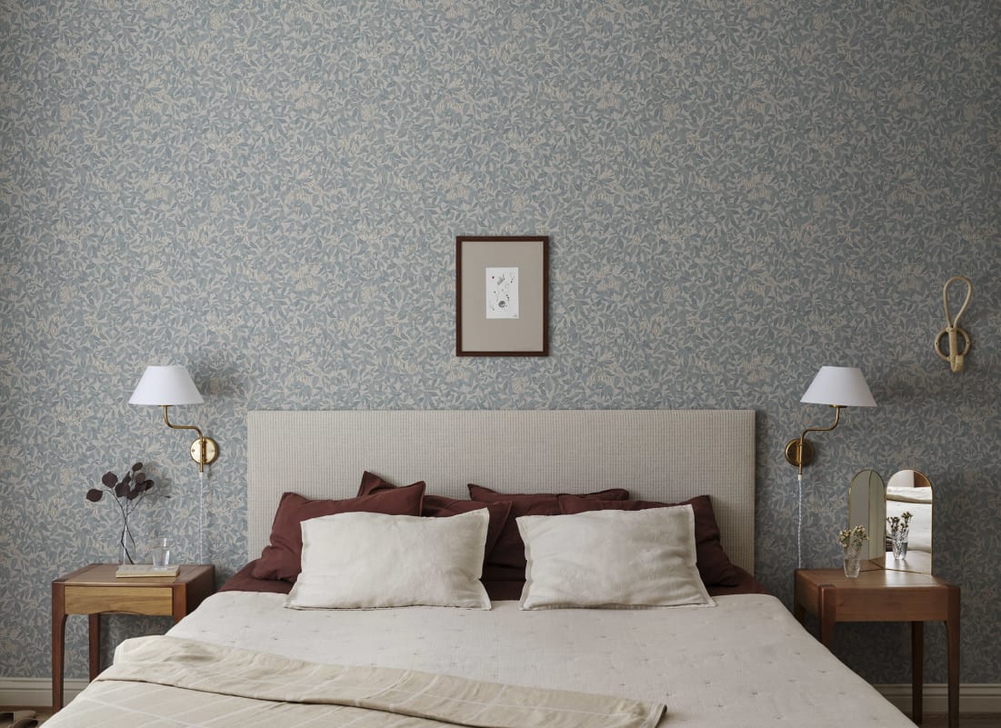
There's a reason cottagecore wallpaper has held on long after most interior trends have come and gone — it doesn't chase anything sleek or of-the-moment, it just borrows the quiet, unhurried feel of a countryside cottage and brings it indoors. From loose wildflower sprigs and gingham checks to richer, moodier botanicals and toile scenes, the aesthetic covers more ground than people often expect, all while sharing that same faded, hand-drawn softness. Because the look is built on imperfection rather than precision, it's forgiving to work with — you can lean into a single accent wall or commit to a full room without either choice feeling wrong.
In this guide, we'll walk through the different cottagecore wallpaper styles, compare pattern and mural options, help you choose between light and dark palettes, and share the colourways that come up again and again across the aesthetic. You'll also find room-by-room recommendations and practical styling tips to help the pattern feel considered rather than overwhelming.
What Are The Different Cottagecore Wallpaper Styles?
Cottagecore wallpaper spans several distinct style categories, each capturing a soft, romanticised take on countryside living rather than one single look. What ties them together is a muted, faded colour palette and a hand-drawn quality — imperfect linework and naturalistic scale rather than crisp, graphic repeats.
Toile Wallpaper
Toile wallpaper is cottagecore's most traditional style, built from countryside scenes — trees, cottages, pastoral landscapes — rendered in a single ink tone against a cream background. The illustrative, storybook character sets it apart from the smaller, busier florals elsewhere in the aesthetic, giving a room a calmer, more classic feel. It works particularly well in a kitchen or dining room, where the warm, earthy tones of a terracotta toile pair naturally with wood and cream cabinetry.
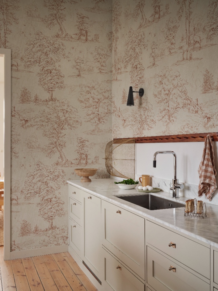
Featured: Montfort, Toile Mural Wallpaper
Wildflower Wallpaper
For anyone who wants pattern without it shouting for attention, wildflower wallpaper is where cottagecore usually begins. Look for loose, hand-drawn sprigs and trailing botanicals set on a soft sage or muted pastel ground, scattered across the wall rather than locked into a tight, repeating grid. Because the scale stays small and the palette stays quiet, it works especially well in a bedroom or home office, where you want the room to feel calm rather than busy.
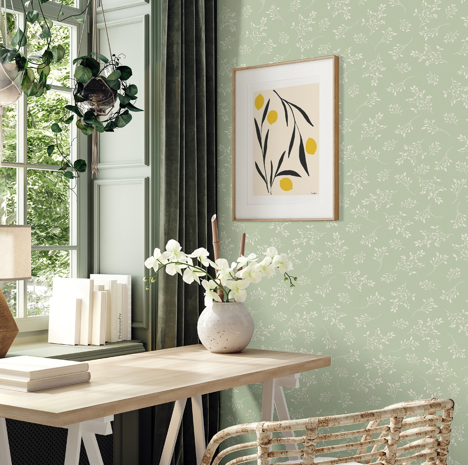
Featured: Delicate Foliages, Pattern Wallpaper
Explore more wildflower wallpaper ideas to bring nature indoors.
Checkered Wallpaper
If you're after texture rather than a bold statement, checkered wallpaper adds a quiet rhythm that suits cottagecore's farmhouse leanings. The key is scale and tone — a fine, closely woven check in a soft sand or cream colourway reads as cosy rather than graphic, unlike the bolder, high-contrast checks that belong to other aesthetics entirely. It's a natural fit for kitchens and dining spaces, and works particularly well as a supporting pattern alongside a floral rather than carrying a room on its own.
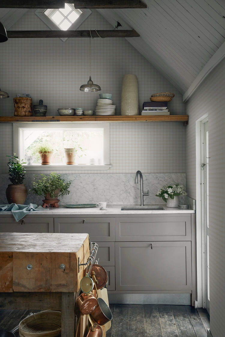
Featured: Herman, Plaid Pattern Wallpaper
Explore more checkered wallpapers that offer a timeless balance of rhythm and symmetry.
Bird Wallpaper
Bird wallpaper brings a slower, more storybook quality to a room, especially when the birds are woven through trailing foliage rather than placed as isolated motifs. A tonal palette — soft blues or muted greens against a warm cream ground — keeps the pattern feeling gentle rather than busy, even at a larger, mural-like scale. It suits bedrooms particularly well, where the quieter detail rewards a slower look each morning.
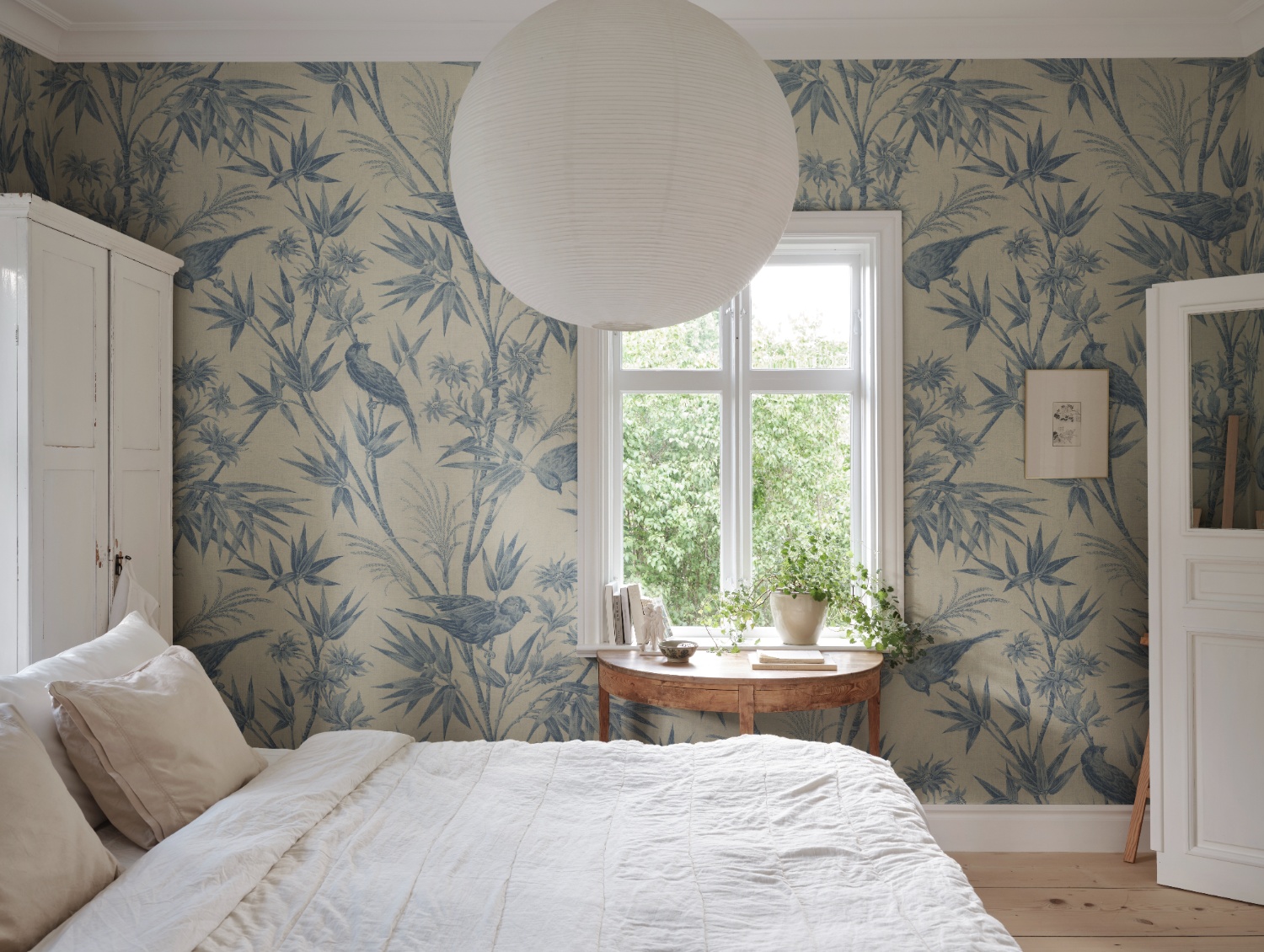
Featured: Celeste, Bird and Floral Mural Wallpaper
Discover our favourite bird wallpapers that promise to transform any room into a stunning retreat.
Botanical Wallpaper
There's a strong botanical thread running through cottagecore, most often expressed as large-scale fern fronds or leafy patterns in soft, tonal grey-green rather than bright, saturated leaf prints. Because the pattern reads as texture more than a bold repeat, it sits comfortably behind open shelving, plants and natural materials rather than competing with them. It's especially well suited to kitchens, where a wall of soft greenery can make the room feel like an extension of the garden.
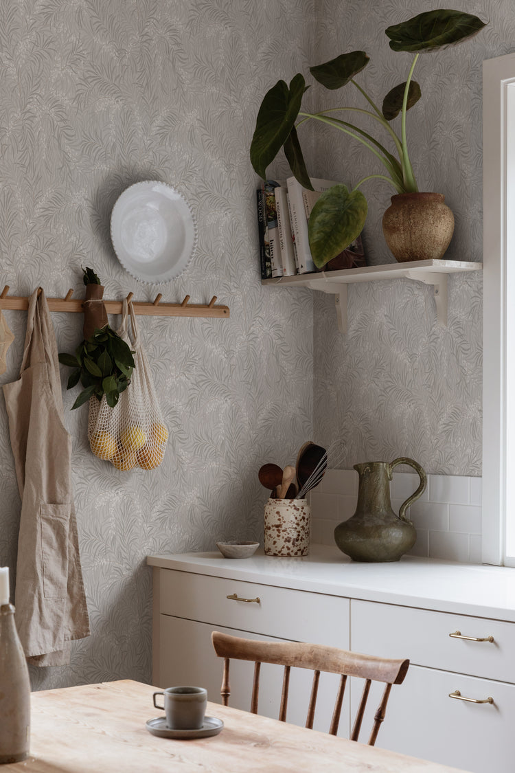
Featured: Idun, Tropical Pattern Wallpaper
Fruit Motifs Wallpaper
Look to fruit motifs for a warmer, more orchard-inspired note within cottagecore — trailing branches carrying berries, pomegranates or other round fruit through soft, dusty foliage. The palette tends to pair a muted blue-grey leaf with a rust or terracotta fruit, giving the pattern gentle contrast without tipping into anything bold. It's a natural choice for a kitchen or dining space, where the imagery echoes the room's everyday use.
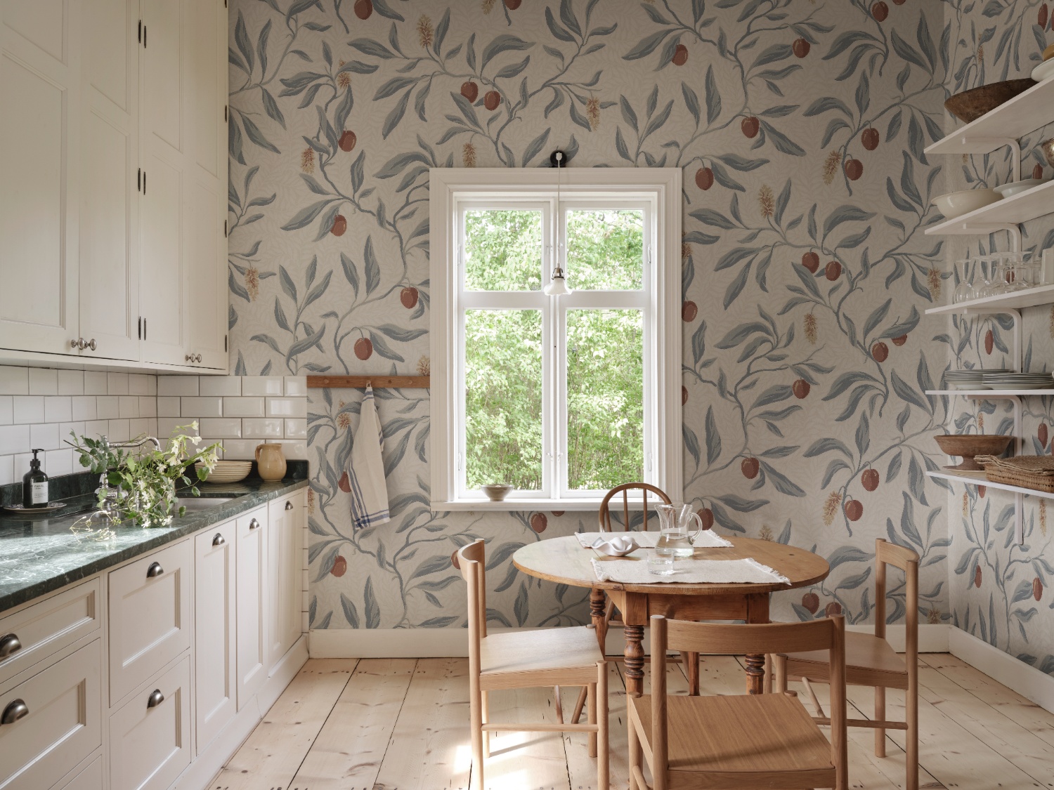
Featured: Vinnie, Botanical Mural Wallpaper
Which Rooms Are Best For Cottagecore Wallpaper?
Bedroom
A bedroom is where cottagecore wallpaper does its gentlest work, and it's often the room where people feel most comfortable committing to a full-wall pattern. Because you spend more time here in low light — morning and evening — a soft, tonal ditsy print reads as calming rather than busy, especially in muted grey, sage or blush tones. Room size matters less here than in a busier space, since the pattern is there to be lived with slowly rather than glanced at in passing. Pair it with natural textures — linen bedding, rattan, warm wood — to keep the whole room feeling soft and unstudied.
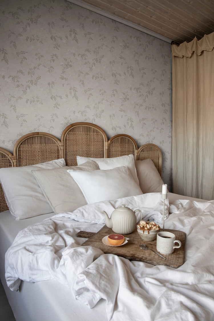
Featured: Irene, Floral Pattern Wallpaper
Your bedroom should be a sanctuary — a space that reflects your personal style and helps you unwind at the end of the day. Explore our bedroom wallpaper designs to create your perfect retreat.
Living Room
The living room is where cottagecore wallpaper gets to be a little more decorative, since it's a space built around gathering rather than winding down. A mid-scale floral in a warm, dusty colourway — think faded rose or muted mauve — brings warmth to a room that often gets a lot of natural daylight, without feeling overly saturated. Because living rooms tend to be larger and broken up by furniture, windows and doorways, a busier pattern reads as textural rather than overwhelming. Keep styling simple — linen upholstery, a few fresh or dried stems — so the wallpaper stays the focal point.
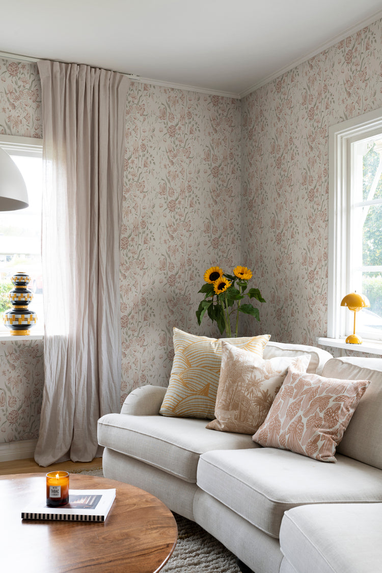
Featured: Karins Bukett, Floral Pattern Wallpaper
Discover more living room wallpapers that not only reflect your personal style but also help create a warm, welcoming atmosphere your whole family will enjoy.
Dining Room
Dining rooms are one of the few places in a cottagecore home where you can afford to go bolder, since the room is used for shorter stretches and benefits from a bit of drama over the table. A dense, William Morris–style botanical in deeper, richer tones — moss, rust, cream — brings warmth and atmosphere, particularly useful in a room with limited daylight or evening-only use. Because dining rooms are rarely oversized, a busier all-over pattern can still feel intentional when paired with warm wood furniture and soft lighting. It's a good opportunity to bring in a deeper, more autumnal side of cottagecore that might feel too heavy elsewhere.
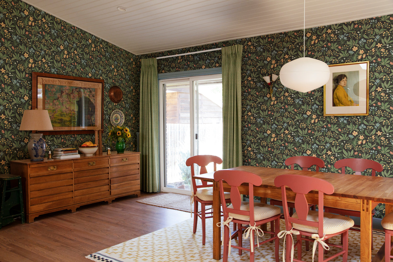
Featured: Huset i Solen, Floral Pattern Wallpaper
Create a beautiful gathering space with our collection of dining room wallpapers. From traditional patterns and rich colours for formal dining settings, to light, airy motifs for everyday gatherings, our wallpaper designs are curated to suit a variety of styles.
Kitchen
Kitchens are one of the most popular rooms for cottagecore wallpaper, since the aesthetic's love of botanicals and warm, earthy tones suits a space built around everyday use. A warm honey or ochre tone with a subtle, tonal texture works well against white or cream cabinetry, especially in kitchens that don't get much direct daylight and need a bit of warmth. Because kitchens often have broken-up wall space — between cabinetry, shelving and splashbacks — a soft, tone-on-tone pattern tends to read better than something with high contrast. Let open shelving, dried herbs and stoneware do the rest of the styling work.
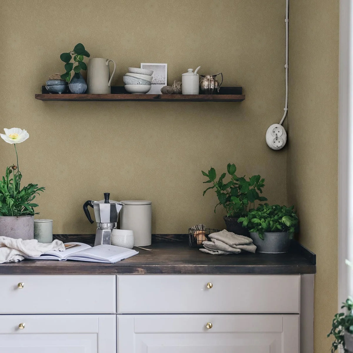
Featured: Anton, Floral Pattern Wallpaper
Whether you're designing a cosy breakfast nook, refreshing a dry kitchen, or adding charm to your pantry, our kitchen wallpapers offer the perfect balance of style and function.
Bathroom
A bathroom is a good place to use a denser, more saturated cottagecore floral, since the room is small enough that a bold pattern still feels contained rather than overwhelming. A blue-green botanical against a cream ground brings colour to a space that's often short on natural light, especially when paired with white metro tiles to keep some visual breathing room. Because bathrooms are used briefly rather than lived in, pattern scale can go bigger here than you might choose for a bedroom — just check the wallpaper's suited to a high-moisture material if it's going near a shower or bath.
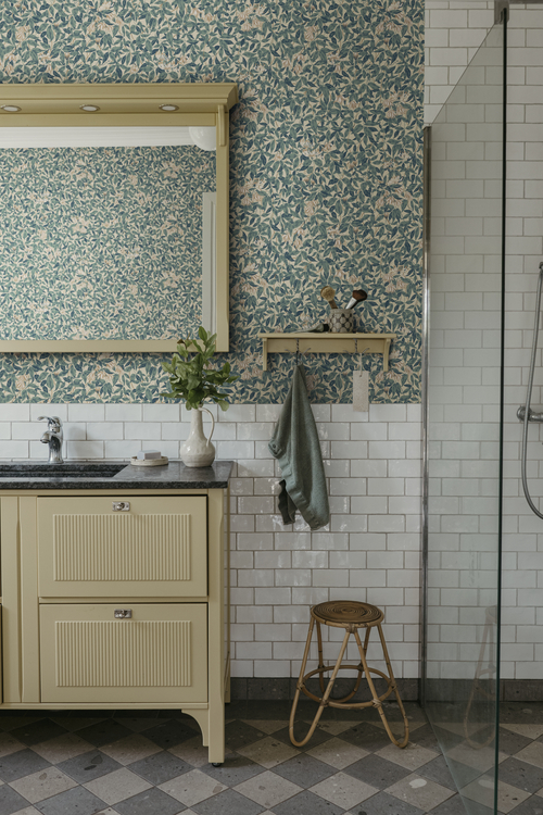
Featured: Linnea, Floral Pattern Wallpaper
Turn your bathroom into a tranquil hideaway with our thoughtfully curated collection of bathroom wallpaper designs.
Entryway
An entryway is a space you move through rather than linger in, which makes it a good spot for a busier, more textural cottagecore pattern that might feel like too much elsewhere. A dense, all-over botanical in muted greens works particularly well here, especially in a hallway that gets brief natural light from a front door or side window. Because entryways are often narrow, a tonal pattern — rather than one with strong contrast — helps the space feel cohesive instead of closed in. A few well-placed hooks, a bench or a seasonal wreath are usually all the styling this space needs.
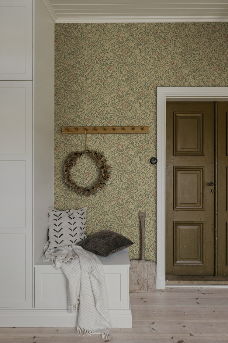
Featured: Simon, Botanical Pattern Wallpaper
If you're looking to give your entryway some love, explore our small entry design ideas and wallpapers to get inspired!
Kid's Room
A kid's room is where cottagecore can lean a little more storybook, since the aesthetic's woodland and botanical motifs suit a space built around imagination. A darker, denser fern or foliage print works well on a feature wall, particularly in a room with bunk beds or a loft layout where only part of the wall is visible at once. Because kids' rooms often mix pattern with a lot of furniture and storage, a tonal, lower-contrast print keeps the room feeling calm rather than overstimulating. Pair it with natural materials like rattan and light wood to keep the space feeling grounded.
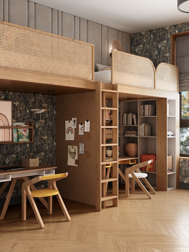
Featured: Fernwood, Botanical Pattern Wallpaper
Choose your child's favourite design from our curated collection of kids wallpapers.
What Are Popular Colourways For Cottagecore Wallpaper?
Cottagecore wallpaper favours a soft, faded colour palette over anything bold or saturated — the mood is gentle and lived-in rather than graphic. These colourways come up again and again across the aesthetic, though each suits a slightly different range of styles.
Sage Green
If cottagecore had to be reduced to a single colour, it would probably be sage green — the shade of herb gardens, dried lavender stems and quiet countryside hedgerows. Its slightly greyed-down, muted quality means it rarely competes with whatever pattern sits on top of it, which is why you'll find it behind botanical prints, gingham checks and toile scenes alike. Bedrooms and kitchens benefit most from it, letting the colour recede into the background rather than demand attention.
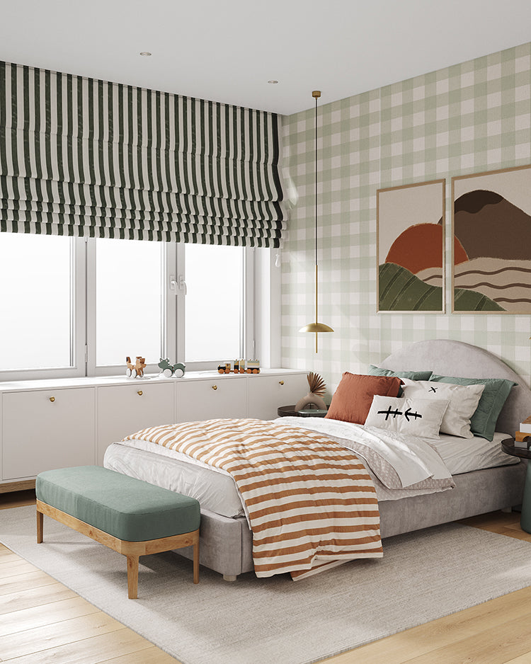
Featured: Gingham, Pattern Wallpaper
Dusty Rose
Dusty rose reads as faded rather than sweet, which is what keeps it from tipping into anything overtly girly. Cream floral motifs, ditsy sprigs and poppy-style blooms all sit comfortably against it, since the low-saturation base lets the linework carry the pattern rather than the colour. Children's rooms and bedrooms are where this colourway shows up most often, its gentleness suiting a slower, more restful mood.
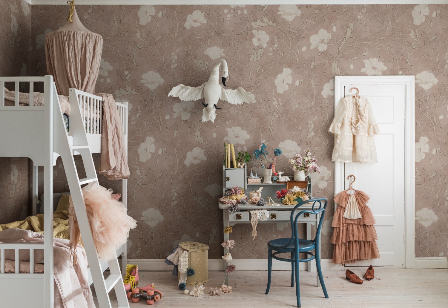
Featured: Poppy, Floral Pattern Wallpaper
Beige
For anyone who wants the pattern to do the talking rather than the colour, beige is cottagecore's quietest option — closer to unbleached linen or aged parchment than a conventional neutral. Fine linework designs benefit most from it: climbing vines, delicate botanicals and toile scenes all hold their detail against a beige ground precisely because there's so little contrast to compete with. Entryways and living rooms are particularly well suited to it, where a warmer neutral keeps a busier pattern feeling restrained rather than overwhelming.
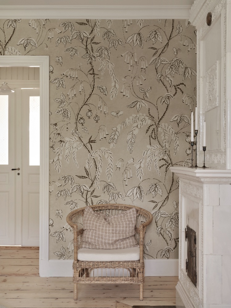
Featured: Ottilia, Floral Pattern Wallpaper
Discover the perfect blend of elegance and serenity with our wide range of beige wallpaper designs.
Terracotta
Terracotta leans earthier than a true red or orange, closer to sun-baked clay or the last of autumn's foliage. Soft botanical or leaf-based prints pair naturally with it, especially when the terracotta stays tonal against a cream ground so the pattern reads as texture rather than a bold statement. Kitchens and dining rooms make the most of this warmth, adding a cosy, gathered-around-the-table feel that suits how those rooms are actually used.
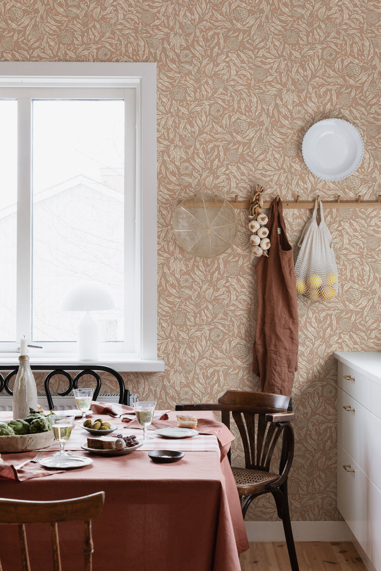
Featured: Olof, Floral Pattern Wallpaper
With those style, room and colour building blocks in mind, here's a closer look at some of our favourite cottagecore wallpapers — each one bringing a slightly different take on the aesthetic to life.
Cottagecore Wallpaper #1: Pixie, Floral Pattern Wallpaper
For a nursery or bedroom that leans playful without losing its cottagecore softness, Pixie, Floral Pattern Wallpaper is a lovely place to start. Lush trailing foliage, delicate blossoms and fluttering butterflies fill the design, with a few hidden pixies tucked between the leaves for anyone who looks closely. Available in Green, Dark Blue and Light Blue, its soft, detailed artistry works equally well in a calm reading corner or a more whimsical kids' space. It's an easy pick if you want cottagecore's storybook charm with a little extra magic.
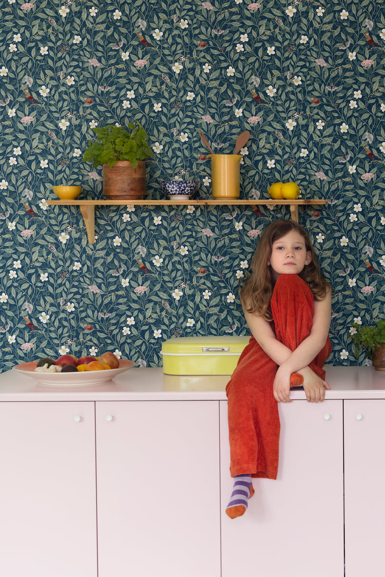
Featured: Pixie, Floral Pattern Wallpaper
Cottagecore Wallpaper #2: Vera, Floral Pattern Wallpaper
Vera, Floral Pattern Wallpaper takes cottagecore in a slightly more structured direction, pairing trailing botanical vines and floral clusters with a subtle, linen-like grid texture underneath. That layered, illustrative-on-textured effect gives it real depth without losing the softness the aesthetic is known for. The deep Blue colourway suits dining rooms, breakfast nooks and entryways particularly well — spaces where people gather and linger — and it pairs naturally with oak furniture, stoneware and rattan for a modern cottage feel. Also available in Beige, Burgundy and Yellow.
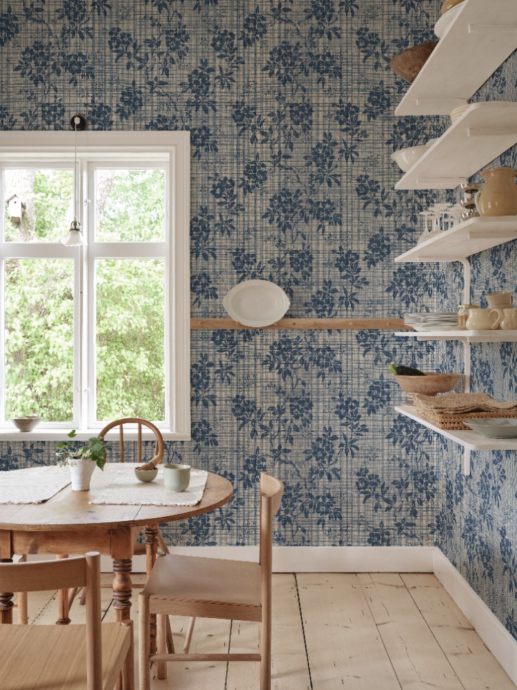
Featured: Vera, Floral Pattern Wallpaper
Cottagecore Wallpaper #3: Karolina Foliage, Pattern Wallpaper
There's a quieter side to cottagecore's love of trailing greenery, and Karolina Foliage, Pattern Wallpaper captures it well — a delicate, tonal leaf pattern that reads as texture rather than a bold print. Its subtlety makes it easy to live with day to day, adding depth to a room without ever competing with furniture or artwork. Available in four colourways, it settles comfortably into living rooms, bedrooms and dining areas alike, wherever you want a calm, timeless backdrop. It's a good choice if you're drawn to cottagecore but want to keep things understated.
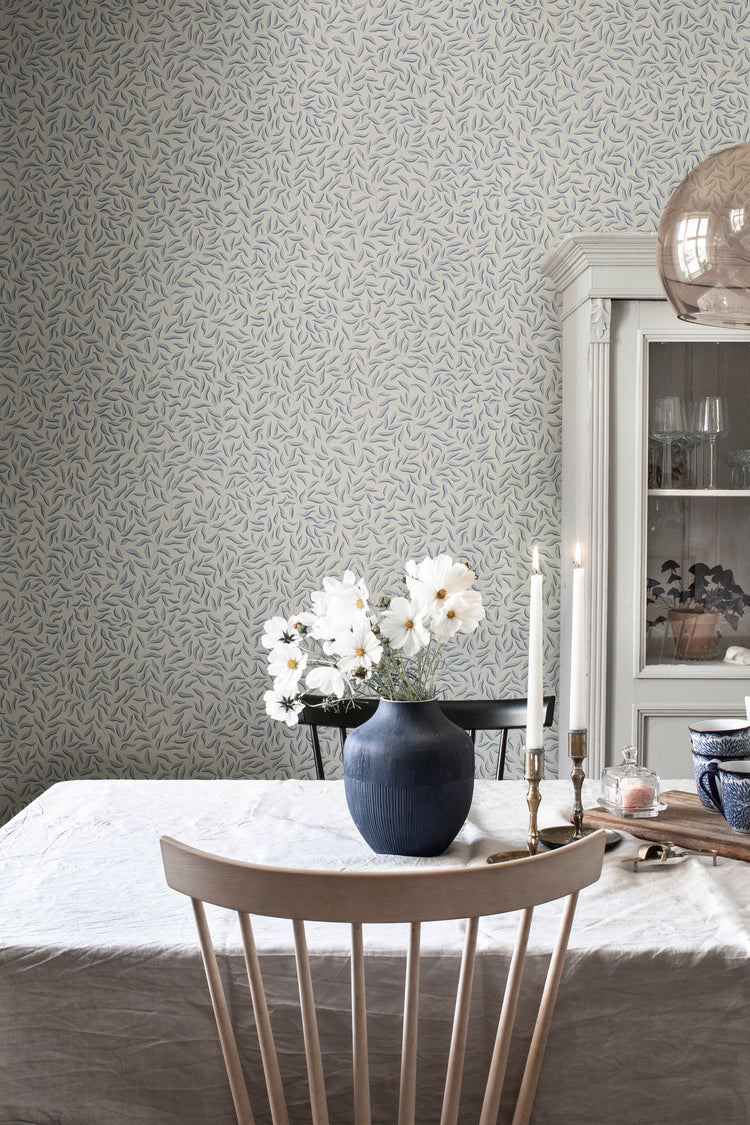
Featured: Karolina Foliage, Pattern Wallpaper
Cottagecore Wallpaper #4: Laura Stripes, Pattern Wallpaper
If cottagecore feels a touch too busy for your taste, Laura Stripes, Pattern Wallpaper offers a gentler way in. Slender, softly drawn stripes bring a quiet rhythm to the wall rather than a bold repeat, giving the design a minimalist, almost linen-like character. That restraint makes it especially versatile — equally at home in a cosy reading nook, a dining space or a bedroom — and it pairs easily with the botanicals and florals elsewhere in a cottagecore scheme. Simple, understated, and easy to build a room around.
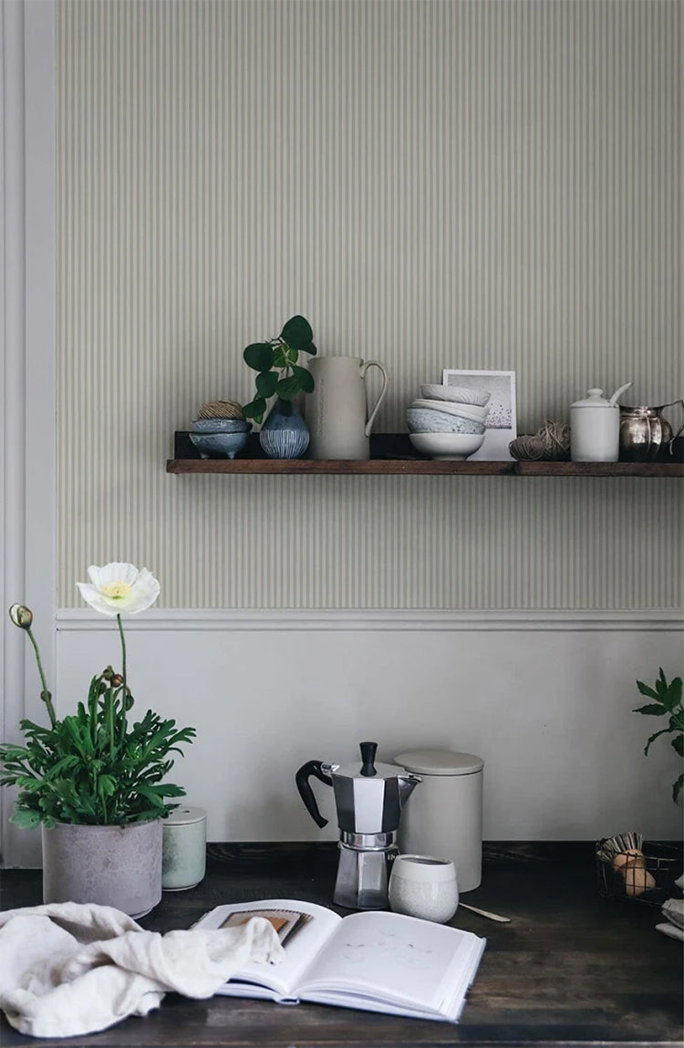
Featured: Laura Stripes, Pattern Wallpaper
Cottagecore Wallpaper #5: Harry, Checkered Pattern Wallpaper
Gingham is one of cottagecore's most recognisable signatures, and Harry, Checkered Pattern Wallpaper gives it a slightly more grown-up register, rendering the check in softly textured tones rather than a crisp, graphic print. That texture is what keeps it feeling relaxed rather than sharp, and it suits country, farmhouse and Scandinavian interiors just as easily as more contemporary spaces. Kitchens, dining rooms, hallways and breakfast nooks all make good use of it, especially paired with warm wood finishes or crisp white cabinetry. Available in Forest Green, Spring Green, Sandstone and Misty Blue.
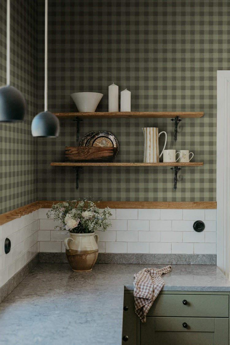
Featured: Harry, Checkered Pattern Wallpaper
Cottagecore Wallpaper #6: Eden and Friends, Pattern Wallpaper
There's a moodier, more storybook side to cottagecore, and Eden and Friends, Pattern Wallpaper leans right into it — deer, birds and other woodland creatures wander through bending trees across a richly detailed, mythical forest scene. In the deep Green colourway, the pattern reads as a dense, textured backdrop from across the room, only revealing its intricate detail up close. It suits a kitchen or dining space that wants real atmosphere rather than a soft, pastel feel, especially alongside dark cabinetry, brass fixtures or natural stone. A good choice if you want cottagecore with a little more drama.
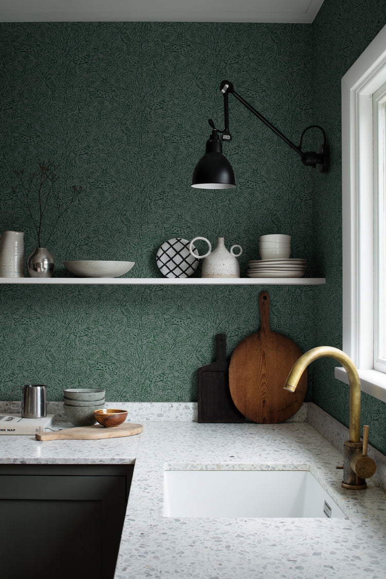
Featured: Eden and Friends, Pattern Wallpaper
Should You Choose A Cottagecore Pattern Or Mural Wallpaper?
Whether cottagecore wallpaper works better as a mural or a repeating pattern comes down to how immersive you want the room to feel, and how much of the wall is actually visible once furniture's in place. Both are true to the aesthetic — the difference is mostly one of scale and how the design behaves across a full wall.
Mural
A mural reads as one continuous scene rather than a repeating tile, which makes it the more immersive option — ideal for a feature wall or a room where you want the wallpaper to feel like the focal point rather than a backdrop. Because the pattern doesn't repeat in an obvious grid, larger motifs like trailing florals or full branches can flow naturally across doorways, corners and awkward wall breaks. It suits bedrooms and living rooms especially well, where there's enough uninterrupted wall space to let the design unfold.
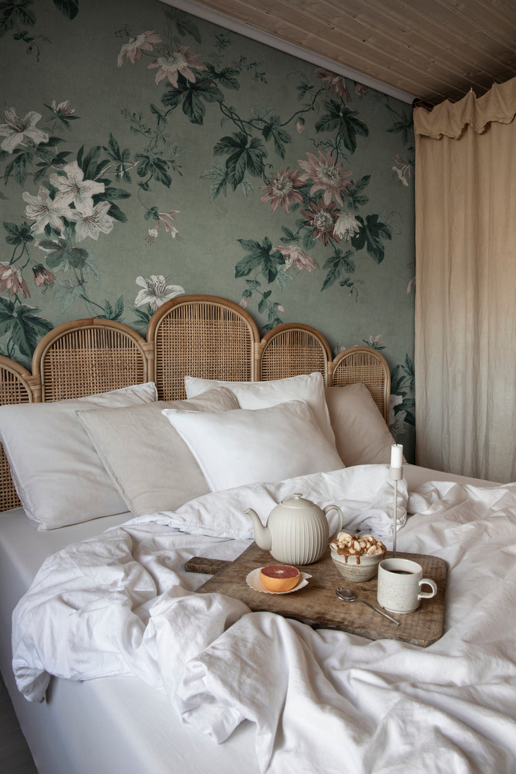
Featured: Faded Passion, Floral Pattern Wallpaper
Create a room that tells a story with our stunning collection of mural wallpapers.
Pattern
A repeating pattern is the more restrained option, built from a single motif that tiles evenly across the wall rather than forming one continuous scene. That predictability makes it easier to work around furniture, shelving and doorways, since the design still reads correctly no matter where a wall gets interrupted. It's a practical choice for smaller or busier rooms — kitchens, hallways, bathrooms — where a mural's larger scale might feel harder to place.
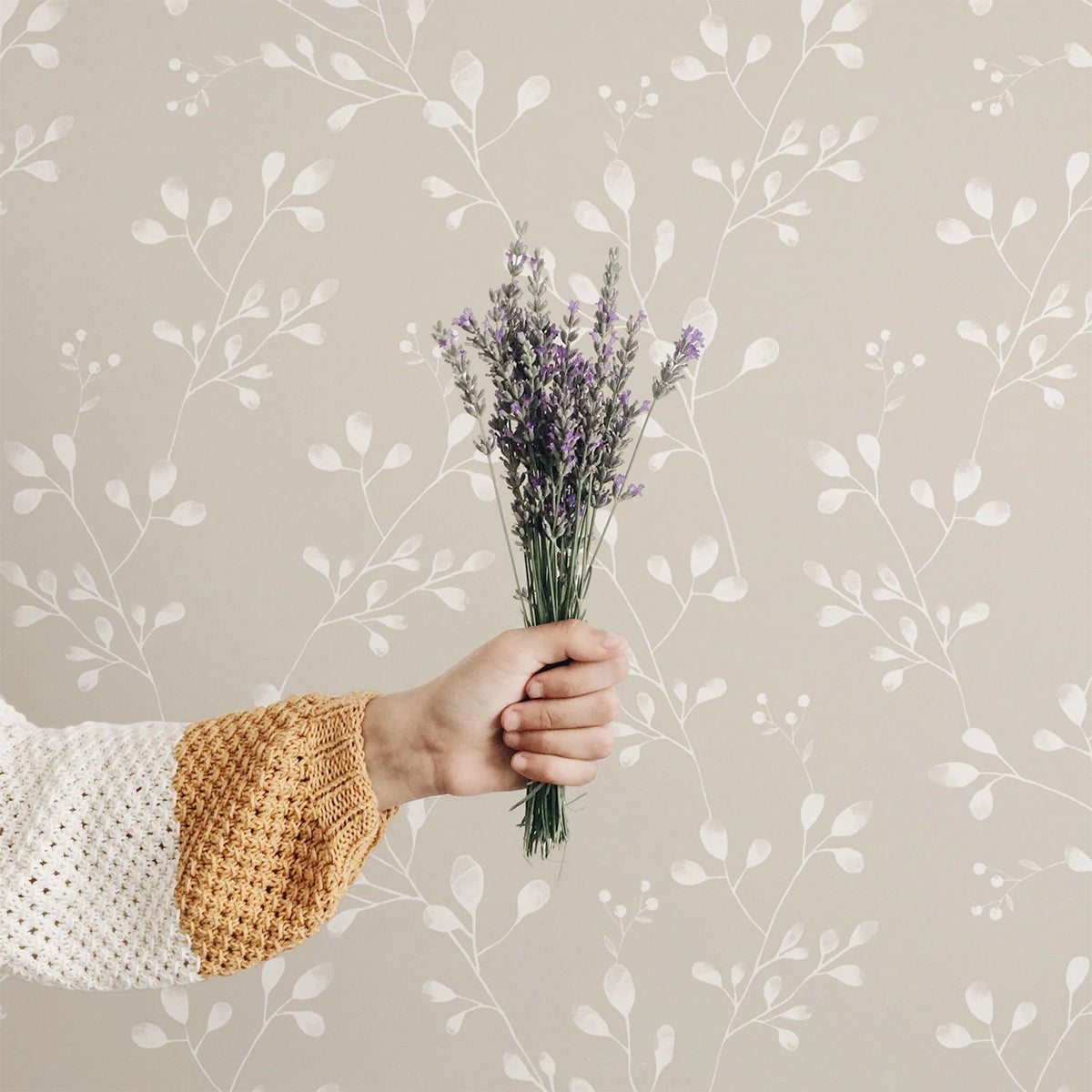
Featured: Vintage Wildflower, Pattern Wallpaper
From classic and timeless patterns to modern and whimsical prints, our pattern wallpaper collection offers a wide range of options to transform your living spaces.
How Do You Choose Between Light Or Dark Cottagecore Wallpaper?
Cottagecore doesn't have to mean pale and pastel — the aesthetic works just as well in a deeper, moodier palette, and the right choice mostly depends on the room's natural light and how you want it to feel.
Light
A light cottagecore wallpaper keeps the room feeling airy and soft, which is why it's the more common choice across the aesthetic — pale sage, cream and blush tones let the pattern read as gentle rather than heavy. It works particularly well in rooms with limited natural light, since the pale background helps bounce what light there is around the space. Kitchens, bathrooms and smaller rooms generally benefit most, where a darker palette might otherwise feel closed in.
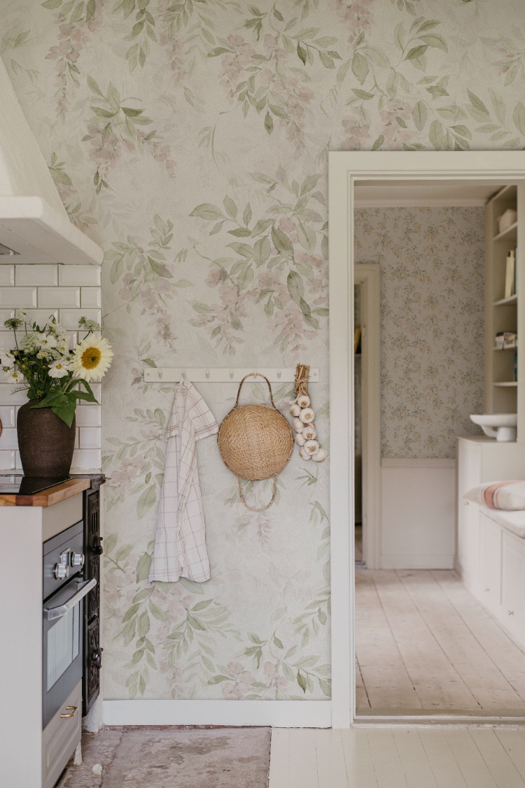
Featured: Lovisa, Floral Mural Wallpaper
Create a sense of openness and ease with our curated collection of light wallpaper designs.
Dark
A dark cottagecore wallpaper trades softness for atmosphere, using deep blues, greens or near-black grounds to give the same botanical or floral motifs a moodier, more enveloping feel. It suits a room with good natural light or one used mainly in the evening, since the darker background can otherwise make a dim room feel smaller. Bedrooms and dining rooms take to it particularly well, especially paired with warm brass fixtures or rich wood tones to keep the space feeling cosy rather than cold.
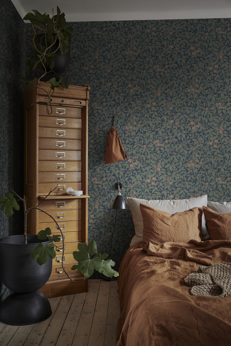
Featured: Linnea, Floral Pattern Wallpaper
From deep blues and rich greens to dramatic blacks and warm earthy tones, dark wallpapers add depth, contrast, and atmosphere to any space. Make a confident design statement with our curated collection of dark wallpaper designs.
How Can You Style Cottagecore Wallpaper Without Overcrowding A Room?
The trick is to keep everything else in the room simple, so the wallpaper carries the pattern rather than competing with it. Because cottagecore prints are already detailed and layered, plain textiles, natural materials and a bit of restraint go a long way toward keeping the room feeling calm rather than busy.
- Keep textiles solid or subtly textured — if the wallpaper is a busy floral or mural, avoid introducing a second print through curtains, cushions or bedding; let those pieces stay plain.
- Lean on natural materials — rattan, linen, raw wood and stoneware echo the wallpaper's handmade quality without adding more visual pattern to the room.
- Match furniture tones to the wallpaper's palette — cream or sage upholstery against a sage floral, for example, lets pieces recede rather than stand out against the wall.
- Leave some plain wall space where you can — pairing a busy pattern with an uncovered adjoining wall, or stopping the paper at a dado rail, stops the whole room from feeling saturated.
- Bring in real botanicals rather than more printed ones — fresh or dried flowers and greenery reinforce cottagecore's "brought indoors" feeling without competing with the wallpaper's own motifs.
- Keep window treatments simple against a large-scale mural — plain linen curtains let a bigger pattern stay the focal point rather than fighting for attention.
Discover The Perfect Cottagecore Wallpaper For Your Home
The best cottagecore wallpaper is one that captures the aesthetic's soft, pastoral character while still suiting how you actually use the room it's going into. Whether you're drawn to loose wildflower sprigs, a storybook toile scene or a richer, moodier botanical, the right choice can turn an ordinary wall into one of the most memorable rooms in your home. Pair it with natural textures like linen, rattan and warm wood, and keep the rest of the room simple, so the finished space feels both practical and beautifully designed.
Ready to start your project? Explore our full collection of cottage-style wallpaper designs to discover made-to-measure options suited to bedrooms, kitchens, living rooms and every other room in a cottagecore home.
Choose the Right Wallpaper Material
Whether you’re decorating your forever home, updating a rental property, or refreshing a single feature wall, choosing the right wallpaper material can make all the difference. At Hello Circus, every wallpaper design is available in three premium materials, so you can select the option that best suits your space, installation preferences, and lifestyle.
- Non-Woven Matte Wallpaper: Our most popular choice, featuring a smooth, non-reflective finish that creates a beautifully soft look. Durable, breathable, and easy to install using the paste-the-wall method, it’s ideal for most residential interiors.
- Heavy Duty Textured Vinyl Wallpaper: Designed for busy households and commercial spaces, this premium textured finish offers added durability and a luxurious tactile feel. It’s perfect for high-traffic areas where extra resilience is required.
- Peel and Stick Wallpaper: A self-adhesive option that makes decorating quick and convenient. Ideal for renters, DIY enthusiasts, or anyone who prefers a paste-free installation, peel and stick wallpaper allows you to refresh your walls with minimal fuss while enjoying the same beautiful Hello Circus designs.
Whichever material you choose, every wallpaper is custom-made to your wall’s exact dimensions using high-quality printing and vibrant, colour-rich inks, ensuring a beautiful finish that’s made to last.
Curious About the Cost? Try Our Wallpaper Visualiser
At Hello Circus, we believe every wall deserves something special. That’s why all our wallpapers are custom-made to fit your wall’s exact dimensions — no generic rolls, just a perfect fit. Priced by the square metre (Height × Width × Unit Price), you only pay for what you need.
- Enter your wall’s width and height for an instant price.
- Preview how your chosen wallpaper will look on your wall — especially helpful for murals, where placement matters.
Still deciding? Order a sample to feel the texture, quality, and finish before you commit.
How to Calculate How Much Wallpaper You Need?
Before purchasing, it’s important to measure your wall accurately to avoid over- or under-ordering. Here’s a simple way to get started:
- Measure the width of the wall from edge to edge.
- Measure the height from floor to ceiling.
- Allow for extra, around 10cm, to account for trimming and pattern matching.
Need help? Read our guide on how to measure your wall for wallpaper or get in touch with us.
Why Choose Hello Circus Wallpaper?
What makes our wallpapers different? Every Hello Circus wallpaper is made to order using premium materials designed to deliver exceptional quality, durability, and beautiful colour reproduction.
- Premium quality: Printed in Europe on durable non-woven paper, our wallpapers are reinforced with nylon fibres to stay smooth, strong, and long-lasting.
- Matte and non-reflective: Our non-woven wallpapers are coated with a soft, non-reflective matte finish that brings warmth and elegance to your space without harsh glare.
- Safe and non-toxic: We use VOC-free inks and PVC-free, breathable paper, so you can create a beautiful home without worrying about harmful chemicals — especially important for little ones.
- Antimicrobial protection: Helps prevent the growth of mould, mildew, and bacteria, keeping your walls cleaner and fresher for longer.
- Wallpaper washability: All our wallpapers are washable, meaning everyday dirt and water stains can be wiped away using a damp cloth or sponge.
- Resistant to colour fading: Designed with colourfast technology to keep your wallpaper vibrant and rich over time.
- Fire resilient: Our wallpapers meet European fire safety standards (EN ISO 11925-2), providing an extra layer of reassurance for your home.
Read more about our wallpaper materials and check out our ultimate guide to wallpapers for answers to the most commonly asked questions.
Let’s Connect
Have a project in mind or interested in partnering with us? We’d love to hear from you.
- Bulk orders
- Corporate orders
- Selling with us
- Collaborations
- Press features
Feel free to get in touch.



