
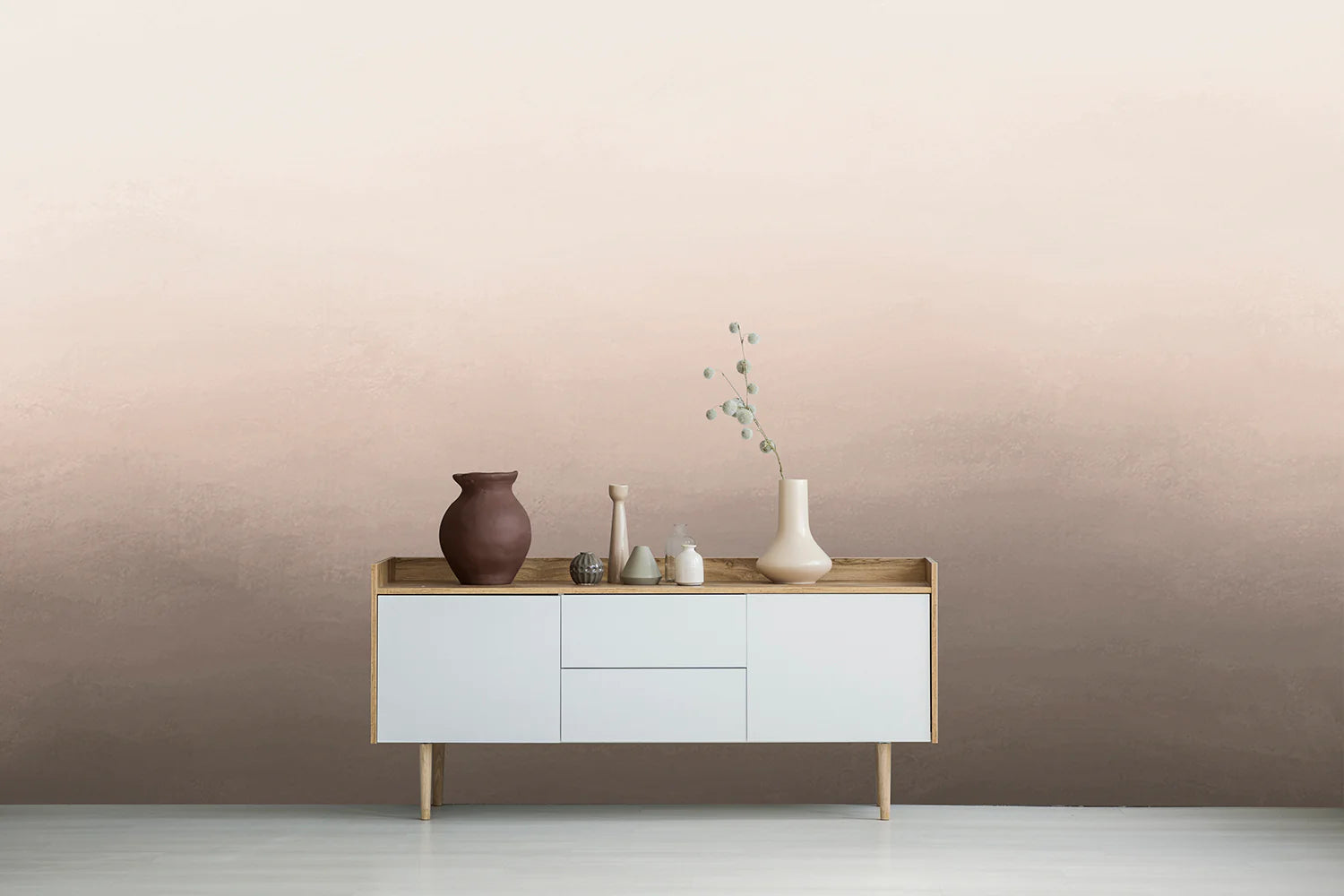
Ombre wallpaper is a wall covering printed with a gradual colour gradient, where one shade fades softly into the next instead of meeting at a hard line. That single quality explains why it keeps turning up in design features and on every interiors feed you scroll. A gradient brings depth and movement to a wall without the visual noise of a repeating pattern, which makes it one of the very few statement finishes that still feels calm to live with months later. It flatters small rooms and large ones, sits happily in a minimalist flat or a layered, collected home, and never quite dates the way a bold print can.
If you're weighing it up for your own place, this guide walks through everything you need to decide with confidence: the four main styles of ombre wallpaper and what each one does to a room, the six colourways our customers reach for most, the five rooms where ombre works hardest, some of our favourite ombre wallpapers from our collection, how to choose between light and dark, and the styling tips that actually matter once the paper is on the wall.
What Are The Different Styles of Ombre Wallpaper?
Ombre wallpaper comes in four main styles, and the one you choose matters more than the colour. A sky gradient, a sunset fade, a landscape mural and an abstract watercolour all use the same principle of blended colour, but each does something different to a room. Here's how to tell them apart and which spaces they suit.
Sky and Cloud Ombre Wallpaper
Sky and cloud designs are the softest style of ombre wallpaper, using pale, diffused gradients that mimic open sky rather than a defined subject. Because the eye reads the palest tones as distance, this style makes a room feel more spacious than it is, which is why it works so well in compact bedrooms, nurseries and rooms with lower ceilings. Pastel skies keep the mood light, while dramatic cloudscapes and dreamy sunsets add depth without adding weight. Choose this style if your priority is calm and a sense of air.
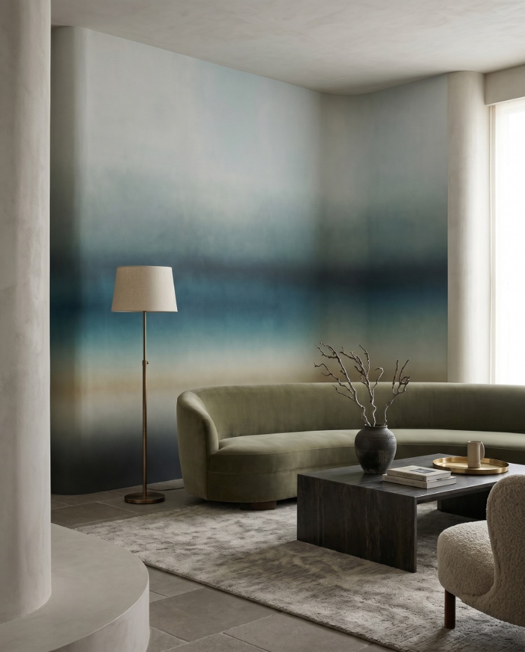
Featured: Rotko Blush, Ombre Mural Wallpaper
From soft, pastel skies to dramatic cloudscapes and dreamy sunsets, our sky and cloud wallpapers bring a sense of calm, lightness and spaciousness to a room, perfect for creating a peaceful retreat at home.
Ombre Sunset Wallpaper
Sunset ombre wallpaper runs on warm tones, moving through amber, terracotta, blush and gold to recreate the glow of late light. Its real strength is practical: warm gradients lift rooms that get little natural light or face away from the sun, where cooler palettes tend to read as flat and grey. The effect is strongest in living and dining rooms, where you're most often in the space during the evening. Pick this style if you want a wall that feels warm at every hour rather than only at midday.
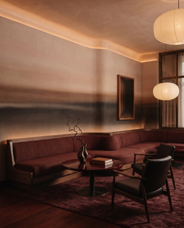
Featured: Rotko Dawn, Ombre Mural Wallpaper
Landscape Ombre Wallpaper
Landscape designs carry the gradient through an actual scene, with hills, forests or mountain ridges fading into mist as they recede. This is the style to choose when you want a mural with a subject rather than pure colour, since the layered depth gives a flat wall a genuine sense of distance. It suits larger walls where the full scene can be read from across the room, and it works beautifully in living and dining rooms that need a focal point. The gradient still does the heavy lifting, so it stays calmer than a conventional patterned mural.
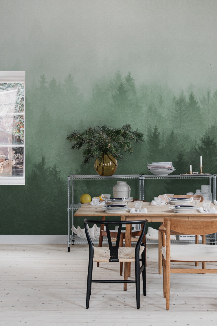
Featured: Cloudy Forest, Mural Wallpaper
Immerse yourself in the beauty of the outdoors with our landscape wallpaper designs.
Abstract Watercolour Ombre Wallpaper
Abstract watercolour ombre wallpaper is the most textural of the four styles, with visible brushwork, pooling pigment and soft bleeds where the colours meet. That painterly quality gives a wall a hand-finished look, and as a bonus, the organic texture is far more forgiving of slightly uneven walls than a smooth digital gradient. It suits bedrooms, lounges and creative spaces where you want artistry without a literal subject. Go with this style if you like the idea of a gradient but want it to feel painted rather than printed.
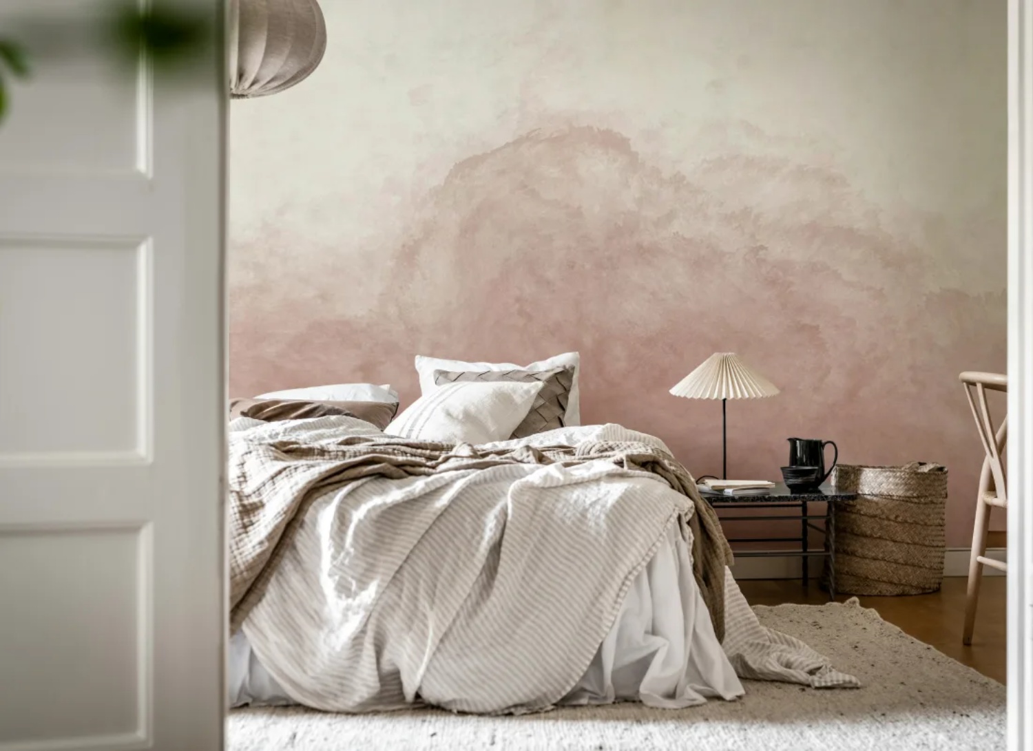
Featured: Abstract Watercolor, Mural Wallpaper
Learn more about the different types of abstract watercolour wallpaper, the best rooms to use them in, how to choose the right colours for your space, and practical styling tips for a cohesive home.
Most Popular Ombre Colourways
Colour choice does more to shape an ombre wall than the gradient itself. The same fade reads as romantic in blush, restful in blue, and architectural in grey, so it's worth starting with the mood you want rather than the design. Below are the five ombre colourways our customers reach for most, and the interiors each one suits.
Pink Ombre Wallpaper
Pink ombre wallpaper suits nurseries, dressing rooms and smaller bedrooms, where its fade from blush to near-white keeps the space feeling open rather than closed in. Because the palest end of the gradient sits close to a white ceiling, the wall reads as taller than it is. Soft pinks also warm up rooms that face north or get little afternoon light, which is where cooler neutrals can turn flat and grey. Style it with white or pale timber furniture, linen bedding and a single brass or rattan accent to keep it from tipping too sweet.
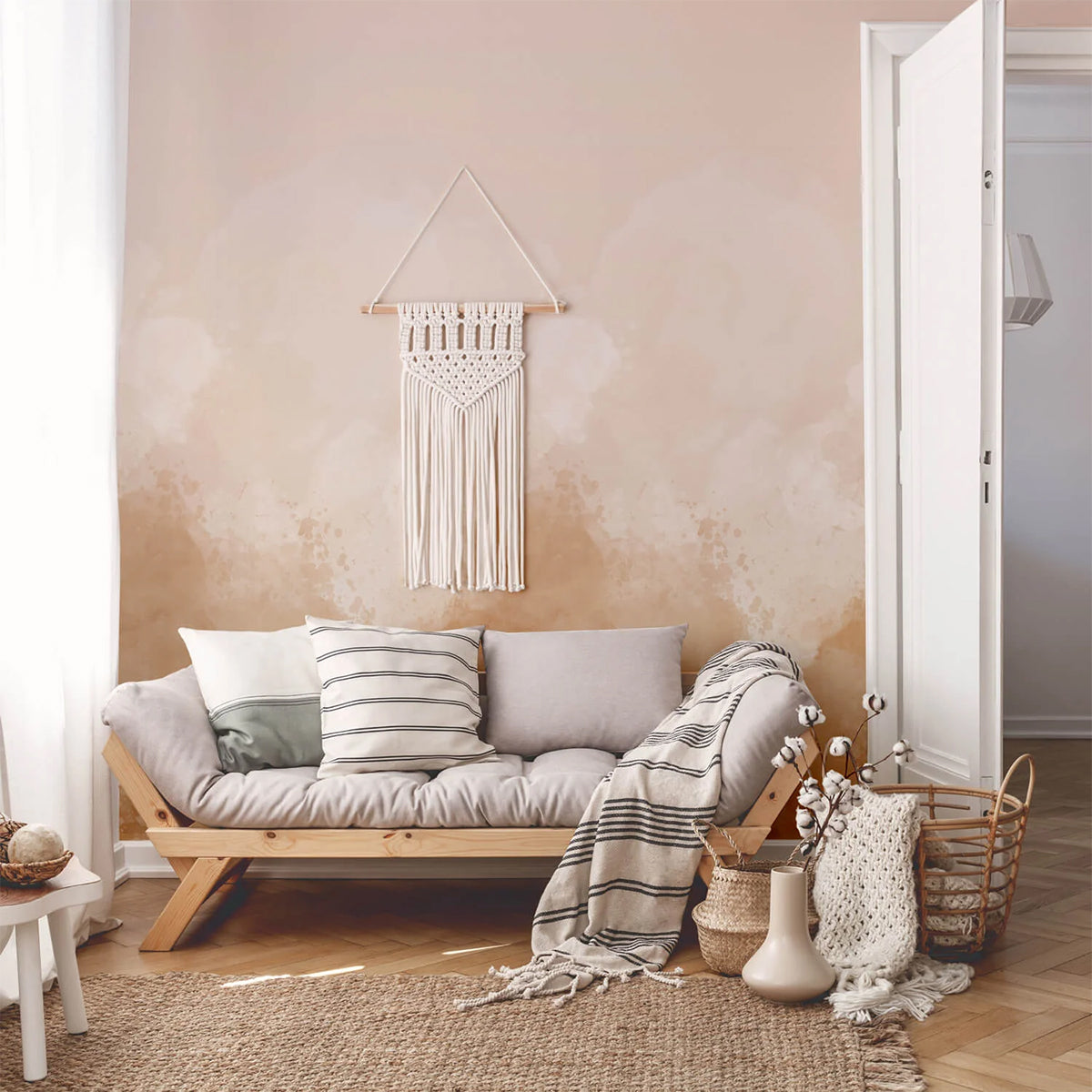
Featured: Watercolour Pastel, Ombre Mural Wallpaper
Blue Ombre Wallpaper
Blue ombre wallpaper is the most versatile of the five, working equally well in coastal living rooms, Scandinavian bedrooms and Japandi-styled studies. The deeper end of the gradient anchors a wall the way a dark paint would, while the lighter end stops it from feeling heavy, so you get the grounding effect without losing brightness. Cooler blues also hold up well in rooms with strong afternoon sun, which tends to wash out warmer tones. Pair with pale oak, off-white walls on the remaining three sides, and textured linen or wool.
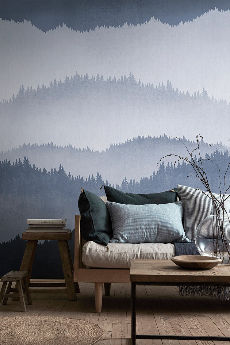
Featured: Forest Landscape, Ombre Mural Wallpaper
Brown Ombre Wallpaper
Brown ombre wallpaper creates the cocooning effect that mid-century dens, boho living rooms and reading corners rely on. Its gradient echoes natural landscapes, so it sits comfortably alongside timber, woven rattan and brass without needing much else to feel finished. Warm browns are also forgiving in rooms with limited natural light, where a cool neutral would read as dull. If your space already has a lot of wood, choose a gradient with a clear tonal shift so the wall stays distinct from the furniture instead of blending into it.
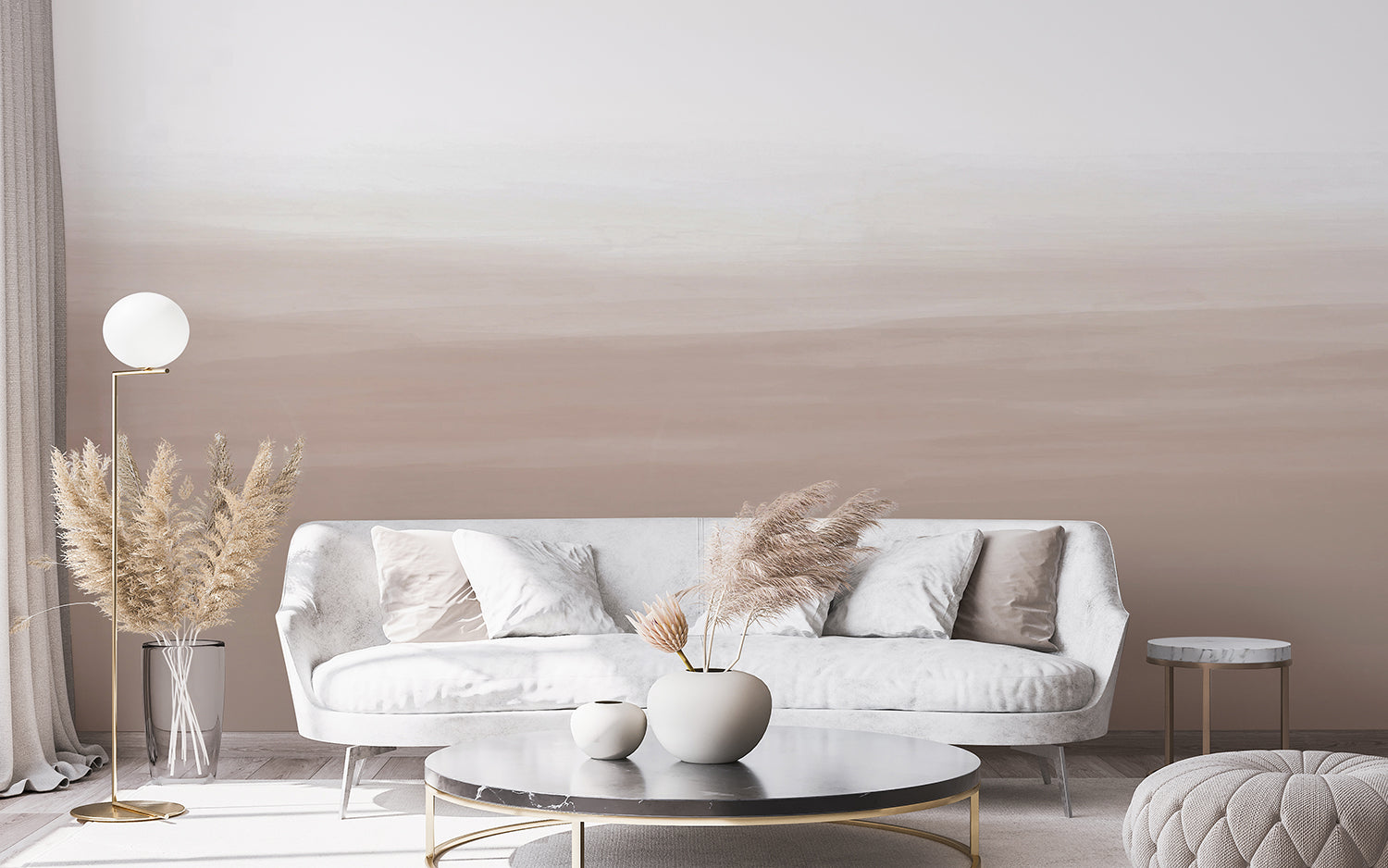
Featured: Gradient Ombre, Mural Wallpaper
Green Ombre Wallpaper
Green ombre wallpaper is the one colourway that bridges neutral and colour, which is why it suits people who want more than beige but aren't ready for a bold wall. Soft sage recedes almost like a warm grey and keeps a room feeling restful, while deeper forest tones bring the enclosed, restorative quality that works so well in studies, dining rooms and reading corners. Because green already appears in whatever plants and timber you own, the gradient tends to look settled from day one rather than needing a scheme built around it. Pair it with rattan, unlacquered brass, terracotta pots and pale oak for a room that feels grown rather than decorated.
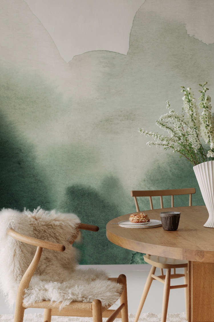
Featured: Flowing Hills, Abstract Mural Wallpaper
From sweeping sceneries to botanical prints and subtle, elegant textures, you'll find something to love in our green wallpaper collection.
Beige Ombre Wallpaper
Beige ombre wallpaper is the safest choice for open-plan homes, because it adds dimension to a wall without committing the space to a colour. In a lounge that flows into a dining area, a beige gradient gives the eye somewhere to rest while still letting your sofa, art and rugs lead. It also photographs beautifully in bright rooms, where the tonal shift catches natural light through the day. Layer it with cream, camel and unbleached cotton, then add one darker element such as a walnut console to give the scheme a floor.
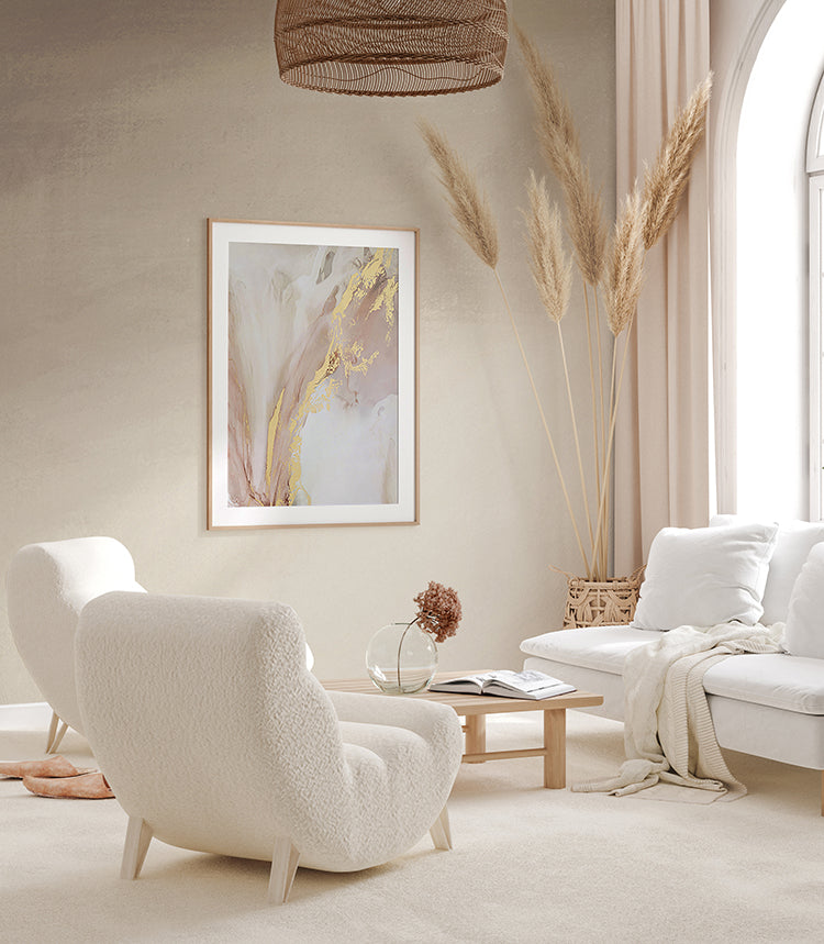
Featured: Stella Skies, Ombre Mural Wallpaper
Grey Ombre Wallpaper
Grey ombre wallpaper is the best backdrop of the five for artwork, gallery walls and statement lighting, because it adds movement without competing for attention. In monochrome, industrial and modern interiors, the tonal fade solves the problem of a flat neutral wall looking unfinished. It's also the easiest colourway to live with long term, since grey shifts with whatever you put in front of it rather than dating alongside a trend. Keep the rest of the palette tight, then break it with one warm material such as leather, oak or a woven rug.
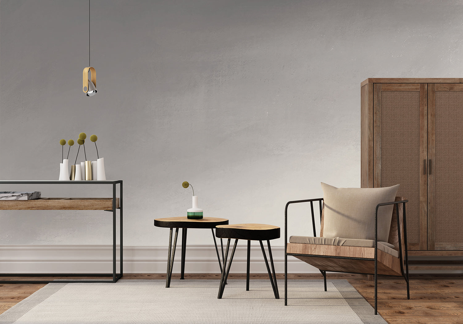
Featured: Stella Skies, Ombre Mural Wallpaper
Best Rooms for Ombre Wallpaper
Ombre wallpaper works in almost any room, but it earns its place in five in particular: the living room, bedroom, nursery, kid's room and dining room. What these spaces share is a single wall that can carry a focal point without fighting the furniture. Here's how to choose the right wall and gradient direction in each one.
Living Room
In a living room, the best wall for ombre wallpaper is the one behind your sofa, not the one behind the TV. A gradient behind the sofa frames the seating and stays visible from the entrance, while a wall behind a screen ends up half-covered by the console and mostly viewed in the dark. If your ceiling sits at the standard 2.6m, choose a design that fades lighter towards the top, which draws the eye upward and stops a low ceiling from pressing down. Warmer tones such as terracotta and soft peach suit family rooms, while cool greys and blues keep a compact space feeling open.
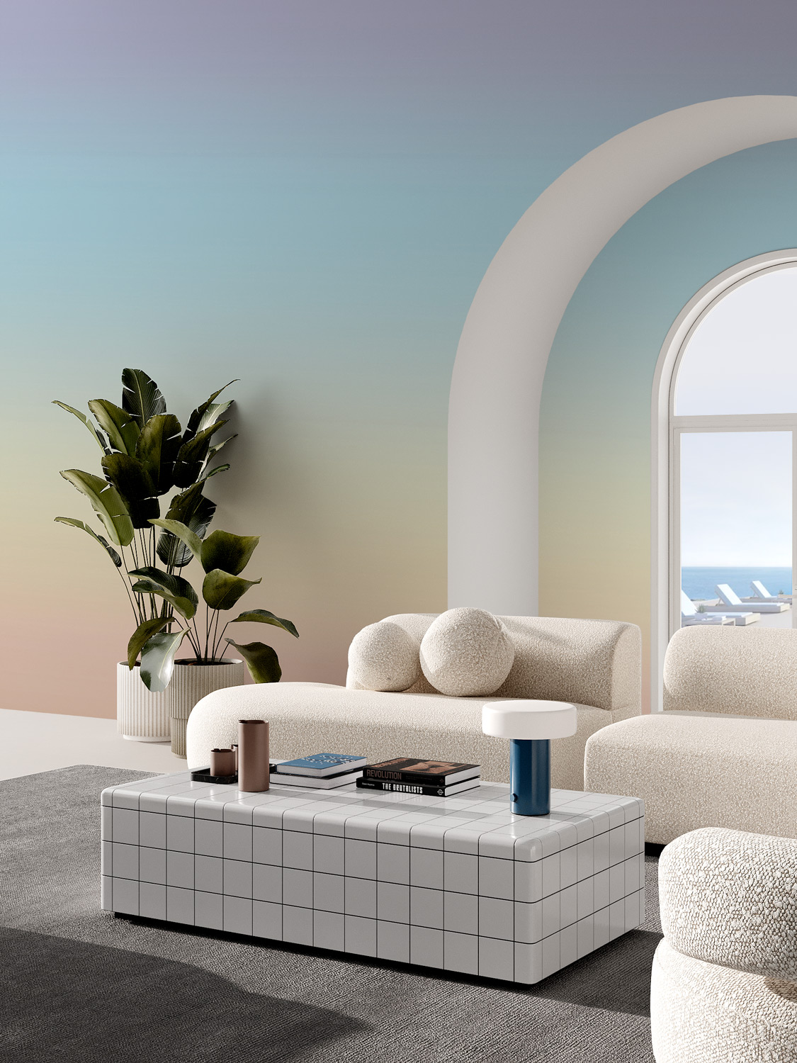
Featured: Luminate Gradient, Ombre Mural Wallpaper
Browse more living room wallpapers to find a design that reflects your style and makes the space feel welcoming to everyone who visits.
Bedroom
The headboard wall is where ombre wallpaper belongs in a bedroom, since it puts the gradient behind you rather than in your line of sight when you're trying to sleep. Measure your headboard first: anything above 1.2m will cover the lower third of the wall, so pick a design whose most interesting transition sits above that line. Restful tones such as blush, lavender and dusty blue suit the room best, and gradients that mimic dusk or sunrise reinforce the wind-down cue at the end of the day. Keep the remaining three walls in a plain shade drawn from the palest end of the gradient.
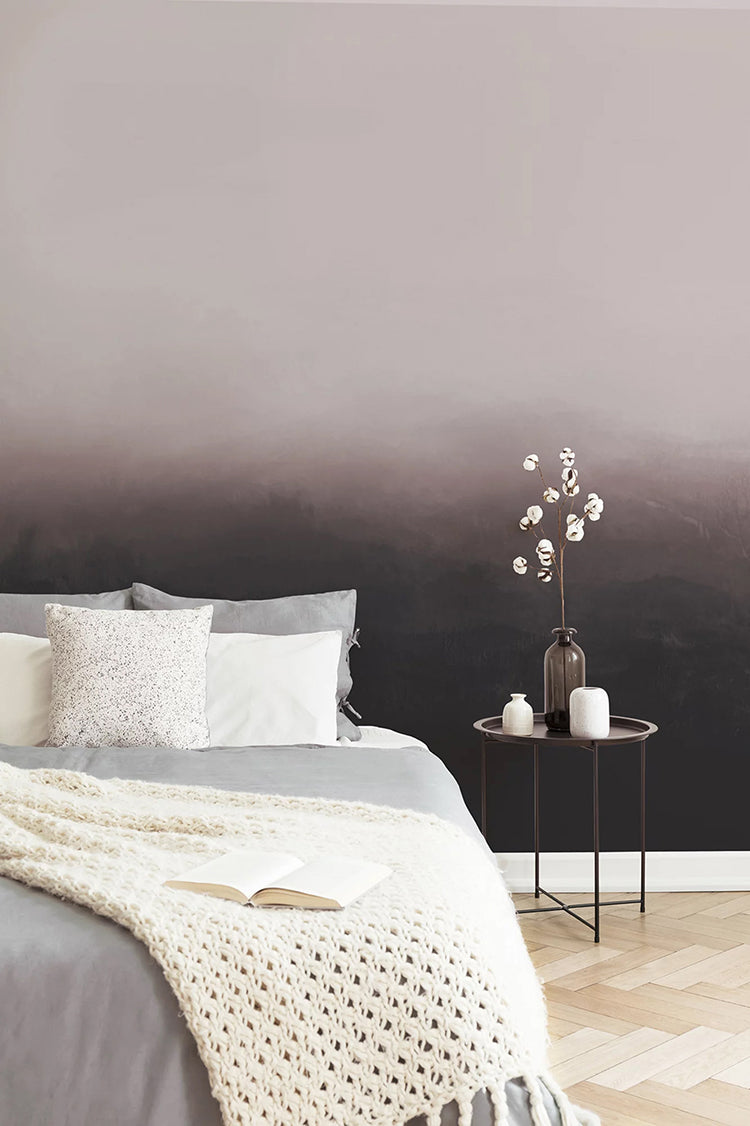
Featured: Greg Horizon, Ombre Mural Wallpaper
Your bedroom should feel like a sanctuary, a space that reflects your style and helps you unwind at the end of the day. Explore our bedroom wallpaper designs to create your perfect retreat.
Nursery Room
Pastel ombre wallpaper works in a nursery because it grows with the child, which saves you re-papering at age four when a themed mural stops feeling right. Soft lilacs and blush pinks give babies gentle visual contrast without the overstimulation of a busy print. One practical tip: choose a gradient that runs darker at the skirting and lighter towards the ceiling, since the lower half of a nursery wall takes the most scuffs from cots, changing tables and small hands. Papering the cot wall alone is usually enough, and it keeps the rest of the room bright for daytime naps.
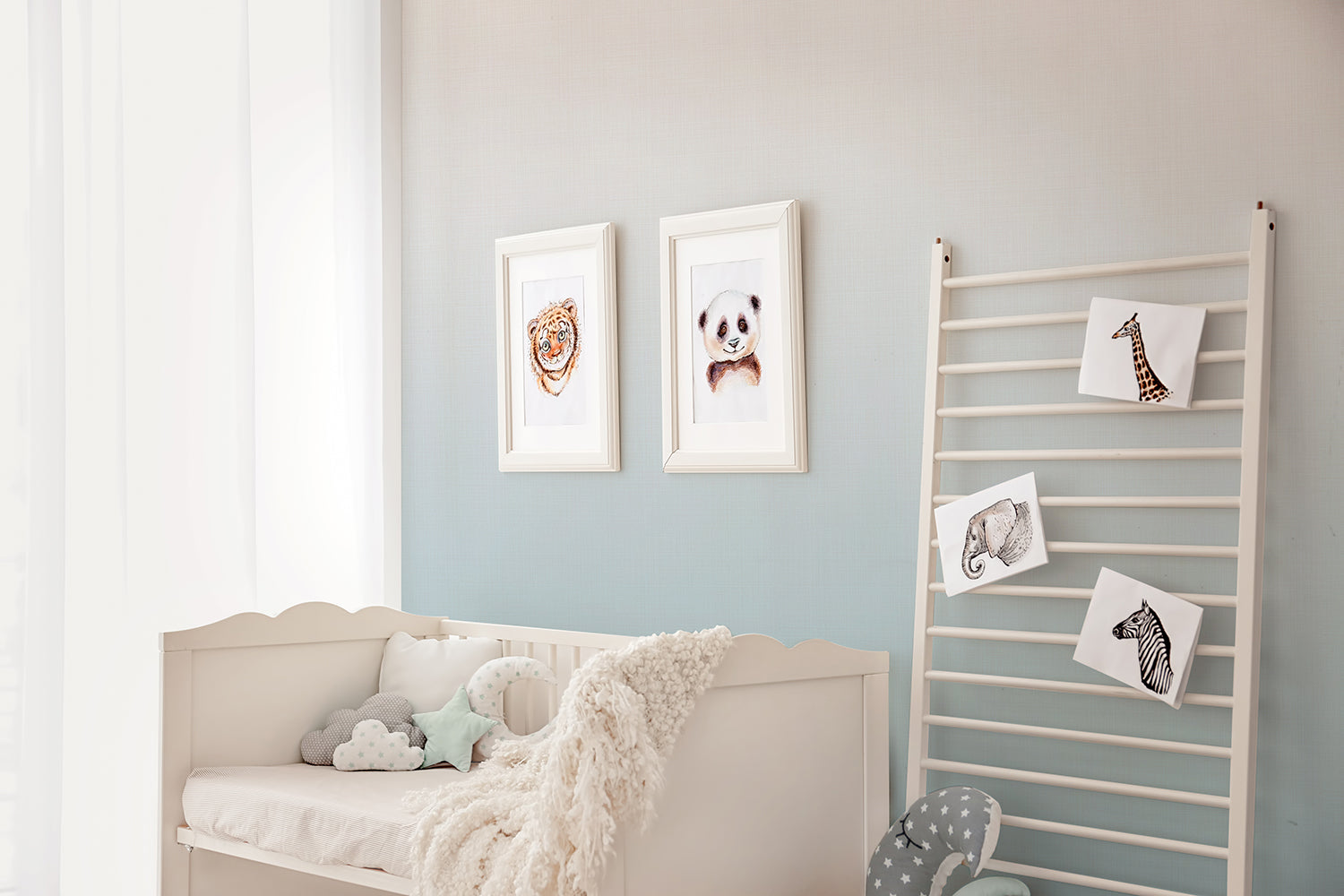
Featured: Tessa, Ombre Wallpaper
Designing a baby room is one of the most joyful parts of preparing for your little one's arrival. Create a cosy, inspiring space with our baby room wallpaper ideas, perfect for turning any nursery into a welcoming haven.
Kid's Room
For a kid's room, ombre wallpaper solves the problem every parent runs into: character prints date within a couple of years, while a gradient doesn't. Bolder hues and sky-inspired fades bring in colour and imagination without the chaos of a repeating pattern, and they stay a neutral backdrop as your child's taste shifts from dinosaurs to something else entirely. Put the gradient on the bed or study wall, then let the changeable elements be posters, shelf styling and bedding, all of which cost far less to swap than a wall.
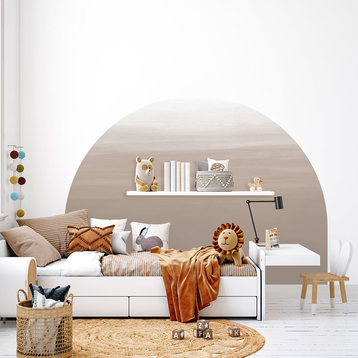
Featured: Dome, Ombre Gradient Wallpaper
Let your child pick their favourite design from our curated collection of kids wallpapers.
Dining Room
Dining rooms are usually the smallest of the five spaces, which makes them ideal for a gradient in muted jewel tones or earthy hues that would feel heavy across a larger area. Paper the wall your guests face when seated, or the one visible from the entrance, so the colour reads as intentional rather than incidental. Check your lighting before you commit: warm 2700K bulbs, common in dining pendants, deepen reds and greens beautifully but can turn cool greys muddy. Hold a sample against the wall in the evening with your actual pendant switched on.
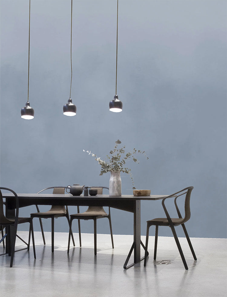
Featured: Watercolour Gradient, Ombre Mural Wallpaper
Set the scene for every gathering with our collection of dining room wallpapers, from rich colours for formal dining to light, airy motifs for everyday meals.
Best Ombre and Gradient Wallpaper Designs
Here are 18 of our best ombre and gradient wallpaper designs, from soft neutrals that quietly recede into the background to saturated murals that carry a room on their own. The newest arrivals come first, starting with the Rotko colour field murals and the hand-painted Roerich landscape series, followed by the ombre designs our customers return to again and again. For each one, you'll find the palette, the interior styles it suits, and the rooms where it works hardest.
1. Dusk Hour, Ombre Wallpaper
Dusk Hour is the most unexpected palette of the group, blending green, pink and nude hues into a gradient that echoes the last light of a sunset. Those three tones shouldn't work together as easily as they do, and that slight surprise is exactly what keeps the design from feeling predictable. It brings gentle movement and warmth to bedrooms, lounges and creative nooks without raising the energy of the room. Pick it if you love soft pastels but want something a little less obvious.
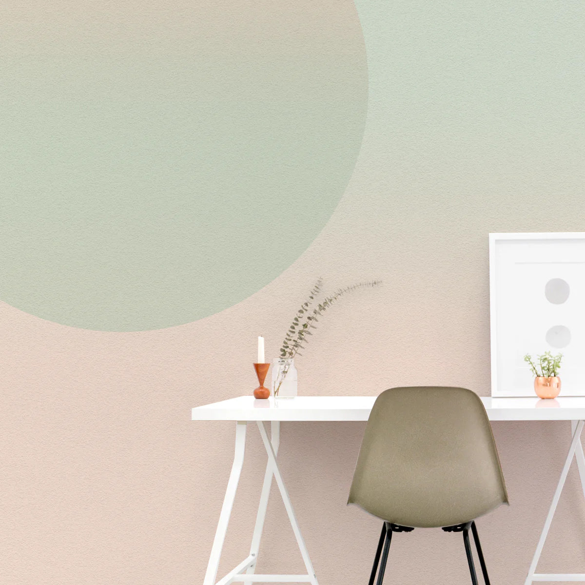
Featured: Dusk Hour, Ombre Wallpaper
Refresh your interiors with light, airy hues from our pastel wallpaper collection.
2. Rotko Clay, Ombre Mural Wallpaper
Rotko Clay brings the most colour of the Rotko series, layering rich teal, warm clay, muted taupe and soft blue into diffused bands that suggest the meeting of land, sea and sky. The contrast between the cool teal and the earthy clay is what gives this design its presence, making it a genuine focal wall rather than a quiet backdrop. It works in modern, minimalist, Japandi, Scandinavian and contemporary schemes, and pairs particularly well with walnut, natural stone, brushed brass and textured fabrics. Best suited to living rooms, dining rooms and home offices where the wall can take centre stage.
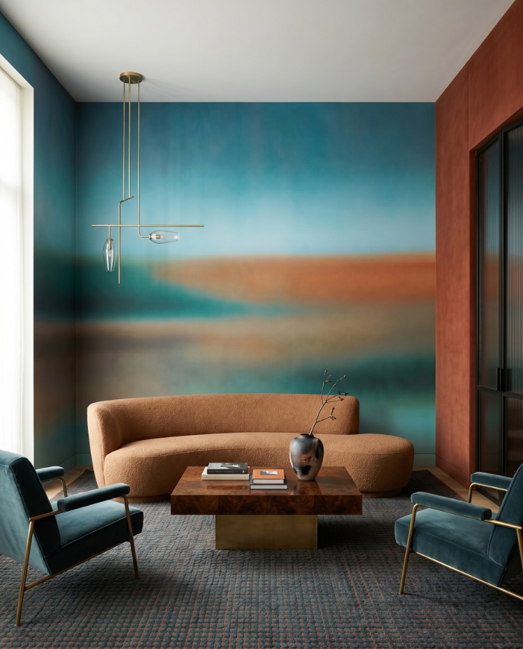
Featured: Rotko Clay, Ombre Mural Wallpaper
See the full range of tones in our multi-colour wallpaper designs.
3. Rotko Ash, Ombre Mural Wallpaper
Cool and composed, Rotko Ash blends warm ash, stone and deep blue into soft layers that read as calm rather than cold. The deep blue anchors the lower half of the wall while the ash and stone tones lift towards the top, which is why this design works so well behind a bed or a low sofa. It complements Japandi, Scandinavian, minimalist and modern interiors, and looks its best alongside natural timber, linen, stone finishes and sculptural furniture. Consider it for bedrooms, living rooms, dining rooms, home offices and hallways.
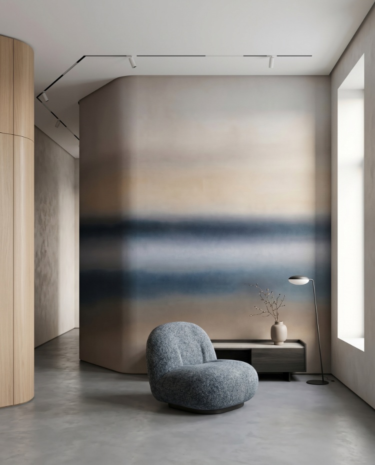
Featured: Rotko Ash, Ombre Mural Wallpaper
Find your shade of calm in our collection of blue wallpapers.
4. Blake Horizon, Ombre Mural Wallpaper
Blake Horizon travels from light to dark in one continuous journey, creating a soothing sense of spaciousness across a wall. Its painterly gradient adds elegance without pattern, which is why it works so reliably as a soft focal point in minimalist living rooms, bedrooms and offices. The horizon effect suits wide walls best, where there's room for the full transition to unfold. Choose Blake Horizon when you want a wall that feels expansive, artistic and quietly confident.
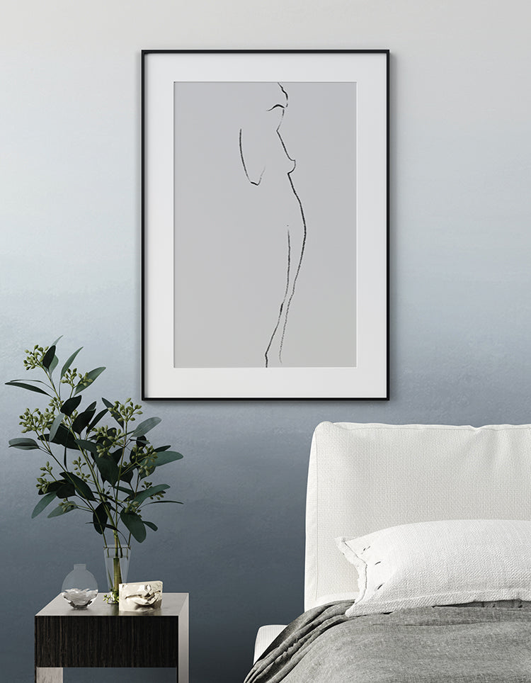
Featured: Blake Horizon, Ombre Mural Wallpaper
5. Calbri, Ombre Wallpaper
Calbri offers the gentlest transition of the seven, blending complementary shades so seamlessly that the gradient reads as texture rather than colour change. Sage green and soft neutral options make it a quiet choice for bedrooms, hallways and reading nooks where serenity matters more than impact. Because the shift is so subtle, it also suits narrow spaces such as corridors, where a bolder gradient would feel cramped. Its simplicity makes it easy to live with in both modern and nature-inspired interiors.
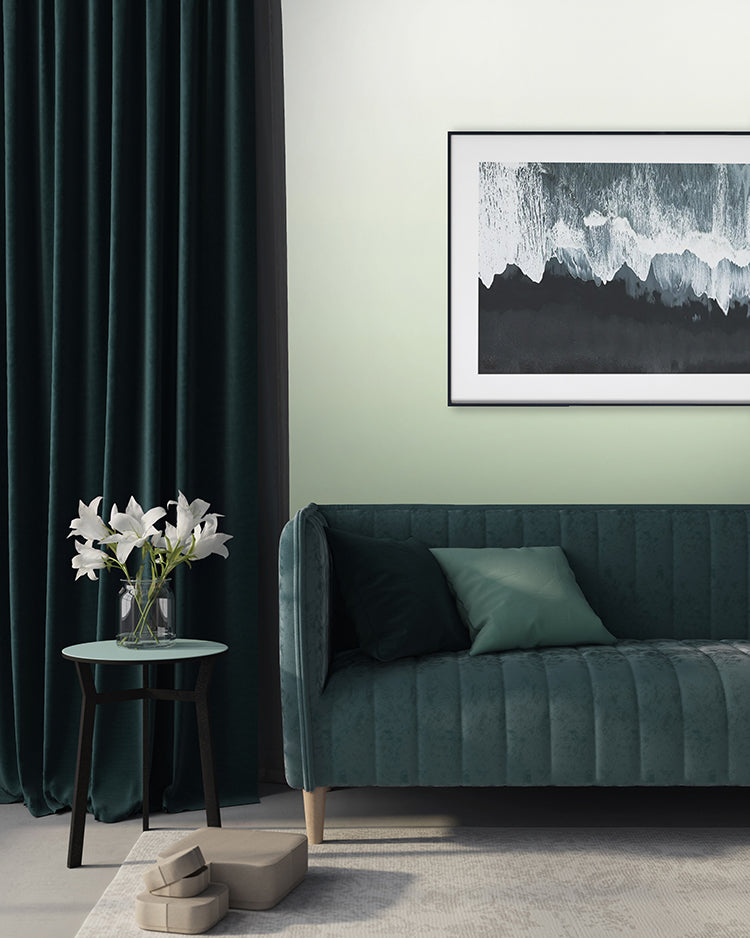
Featured: Calbri, Ombre Wallpaper
From sweeping sceneries to botanical prints and subtle textures, you'll find something to love in our green wallpaper collection.
6. Roerich Twilight, Abstract Mural Wallpaper
Roerich Twilight layers mist-covered mountain peaks in warm sienna and gold that fade into cool blue-grey shadow, giving you both warmth and depth on a single wall. Inspired by ink-wash landscape painting, its soft gradients and hand-painted texture read as one continuous scene rather than a repeating pattern, which is what gives the design its gallery-like quality. It complements Japandi, minimalist, Scandinavian, wabi-sabi and warm contemporary interiors, and grounds a room beautifully alongside boucle upholstery, burl wood and natural stone accessories. Ideal for living rooms, bedrooms, home offices, dining rooms and hallways.
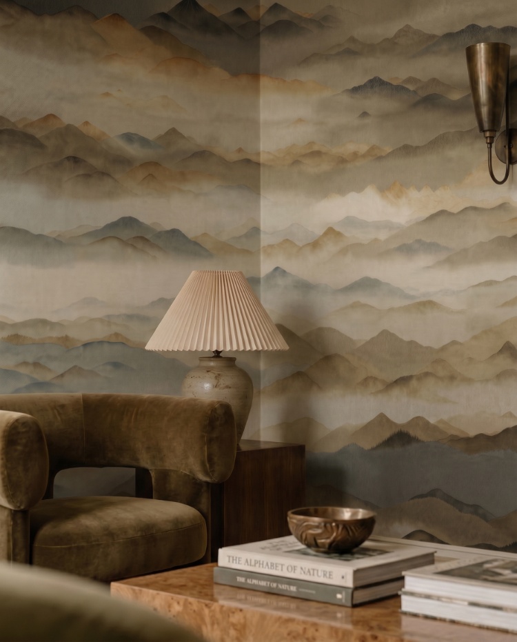
Featured: Roerich Twilight, Abstract Mural Wallpaper
7. Roerich Valley, Abstract Mural Wallpaper
Golden hour, held on a wall. Roerich Valley renders rolling peaks in honeyed gold, amber and soft sienna, with cool blue-grey undertones layered beneath to keep the warmth from turning flat. The hand-painted gradient stretches as a single continuous vista, so the design suits a long dining or living room wall where you can see the full sweep of it. It complements Japandi, minimalist, warm contemporary and modern Scandinavian interiors, and comes into its own against travertine, brass and warm timber finishes. Best placed in dining rooms, living rooms, bedrooms and home offices.
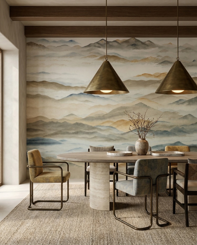
Featured: Roerich Valley, Abstract Mural Wallpaper
8. Roerich Silence, Abstract Mural Wallpaper
Roerich Silence has the widest tonal range of the series, running from pale amber haze at the sunlit peaks down to near-black shadow in the foreground. That spread gives the mural a slow, contemplative depth, and because the darkest tones sit low on the wall, the design grounds a room without making the ceiling feel closer. It complements Japandi, minimalist and Japanese-inspired interiors, and settles comfortably into warm contemporary spaces too. Paired with dark wood, linen and richly textured upholstery, it works well in living rooms, bedrooms, home offices and dining rooms.
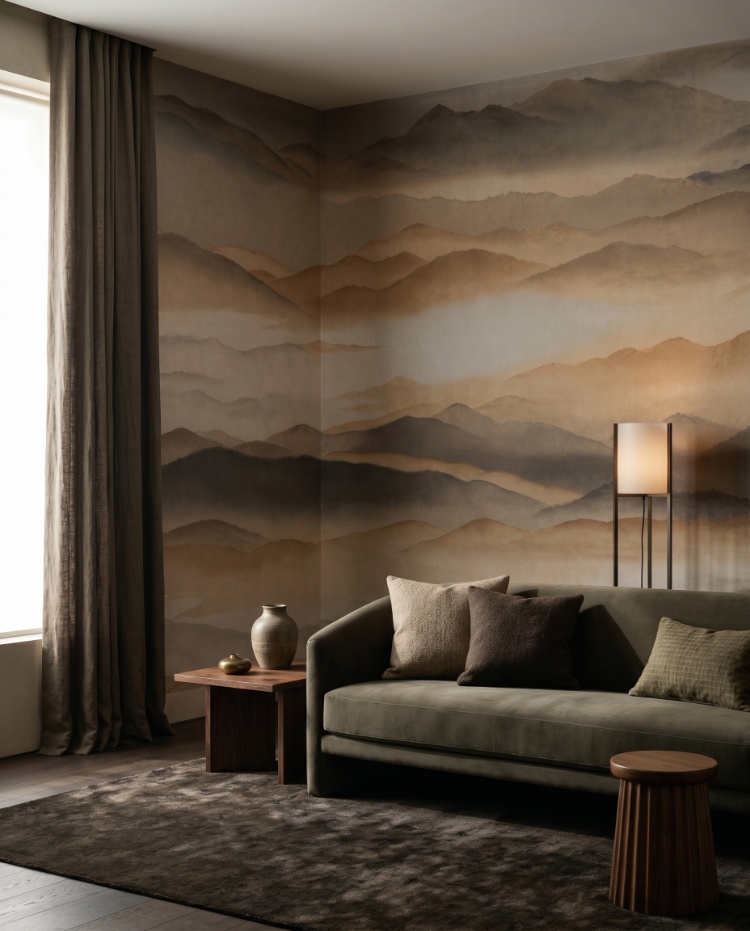
Featured: Roerich Silence, Abstract Mural Wallpaper
9. Roerich Light, Abstract Mural Wallpaper
The boldest design in the series, Roerich Light shifts from near-black foreground mountains through a jewel-toned teal-blue forest to a soft golden sky above. Its high contrast and saturated tones make it a statement art piece rather than a background pattern, so give it a wall that can be seen properly from across the room. It complements Japandi, Japanese-inspired and modern eclectic interiors, and holds its own beside dark wood, brass and richly textured upholstery. Consider it for living rooms, dining rooms, home offices, bathrooms, entryways and hallways.
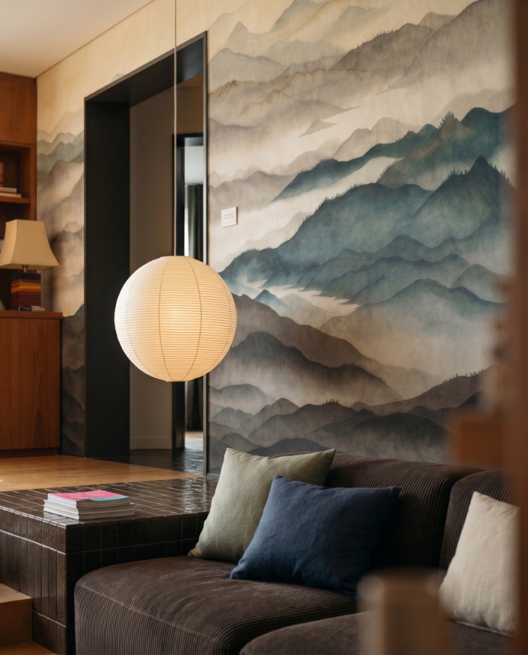
Featured: Roerich Light, Abstract Mural Wallpaper
10. Roerich Peaks, Abstract Mural Wallpaper
Roerich Peaks is the quietest design in the series, with ridgelines rendered in muted stone and taupe that dissolve into mist rather than resolving into a sharp outline. Its almost monochrome palette makes it a backdrop rather than a focal point, which is exactly what you want if your furniture, art or textiles are already doing the talking. It complements Japandi, minimalist and Japanese-inspired interiors, and its stillness suits rooms you pass through as much as rooms you sit in. Well placed in living rooms, bedrooms, home offices and hallways.
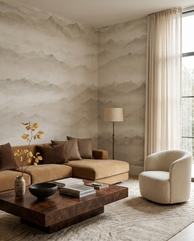
Featured: Roerich Peaks, Abstract Mural Wallpaper
Discover more understated tones in our curation of grey wallpapers.
11. Vista, Watercolor Ombre Wallpaper
Vista mimics the look of a softly painted sky, sweeping from deeper tones into lighter hues with a watercolour texture that keeps the effect organic rather than digital. The grey colourway is especially forgiving, sitting quietly behind whatever furniture or artwork you place in front of it. Hallways, studies and bedrooms all benefit from its calm backdrop, and the vertical lift of the gradient helps a narrow space feel taller. It pairs naturally with modern, Nordic and nature-inspired styles.
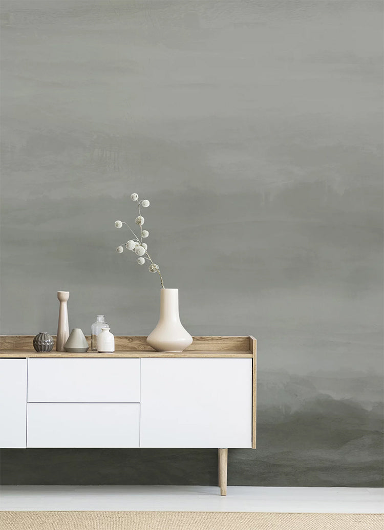
Featured: Vista, Watercolor Ombre Wallpaper
12. Twilight, Ombre Mural Wallpaper
Twilight captures the moment daylight gives way to dusk, with a smooth gradient fade and tonal shifts subtle enough that the wall never dominates the room. That restraint is the point: it delivers depth and a calm atmosphere while leaving your furniture and art to carry the scheme. The versatile palette suits minimalist and modern homes, working equally well in living rooms, bedrooms and home offices. Choose it if you want timeless design with a contemporary edge rather than a strong statement.
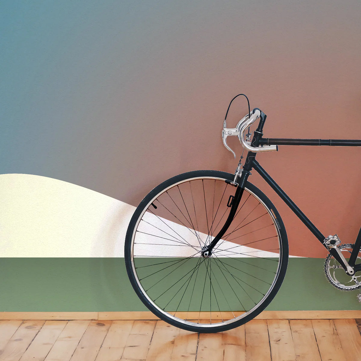
Featured: Twilight, Ombre Mural Wallpaper
13. Aista, Ombre Watercolour Wallpaper
Aista flows from darker hues into light, soft tones, with a watercolour finish that adds fluidity you don't get from a flat printed gradient. The painterly texture is what makes it feel bespoke, closer to a commissioned piece than a wallcovering. It brings a romantic, peaceful mood while staying true to minimalist roots, which makes it a strong fit for bedrooms, lounges and reading corners. Style it simply and let the gradient do the work.
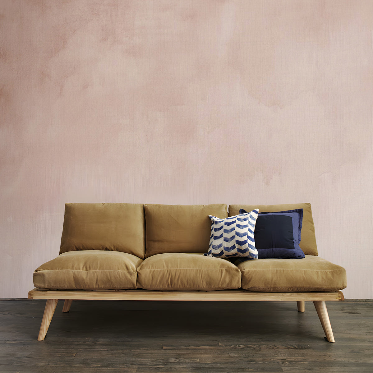
Featured: Aista, Ombre Watercolour Wallpaper
Add warmth and a touch of romance to your home with our collection of pink and red wallpaper designs.
14. Merlina, Ombre Mural Wallpaper
Merlina moves from deep blue tones into soft, sky-like gradients, giving you the mood of a painted horizon on a single wall. The tranquil movement of colour creates visual depth and a sense of space, which is particularly useful in compact rooms or entryways that need lifting. It performs best in rooms with good natural light, where the lighter end of the gradient can catch and reflect it. Merlina suits homes built on clean lines, artistic themes and contemporary aesthetics with a little personality.
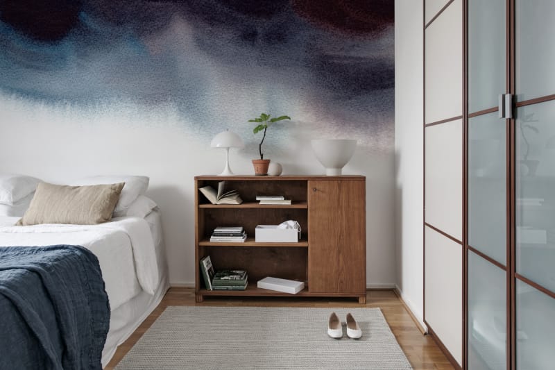
Featured: Merlina, Ombre Mural Wallpaper
How to Choose Between Light and Dark Ombre Wallpaper
Choose light ombre wallpaper when you want a room to feel larger and brighter, and dark ombre when you want it to feel intimate and enclosed. Room size matters less here than most people expect. The better questions are how much natural light the space gets, what time of day you actually use it, and how heavy your existing furniture is. Work through those three and the answer usually settles itself.
When to Choose Light Ombre Wallpaper
Light ombre wallpaper is the right call if your room has a single window, faces away from the sun, or sits under a ceiling of 2.6m or lower. Pale gradients reflect what light there is instead of absorbing it, so the walls recede and the room reads as more open. It's also the better partner for heavy furniture, since a dark sofa, wardrobe or dining table needs somewhere bright to sit against or the whole room turns weighty. One caveat worth planning for: in a very bright room, a soft gradient can wash out completely by midday, so choose a design with a clear tonal shift rather than the palest option on the page.
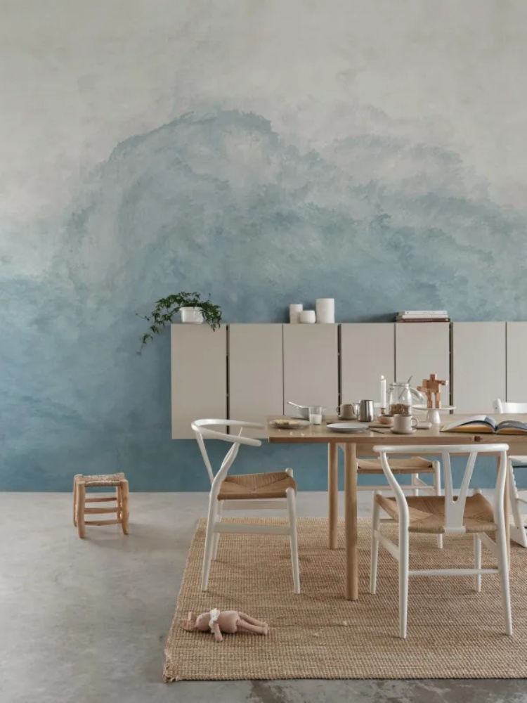
Featured: Abstract Watercolor, Mural Wallpaper
Create a sense of openness and ease with our curated collection of light wallpaper designs.
When to Choose Dark Ombre Wallpaper
Dark ombre wallpaper belongs in rooms you use after sunset, which usually means bedrooms, dining rooms, studies and powder rooms. Here's the point most people get backwards: a small, windowless room is often the best candidate for a dark gradient, not the worst. A space like that will never feel airy no matter what you put on the walls, so leaning into depth gives it a purpose instead of leaving it looking like a compromise. Dark ombre also makes pale furniture, ceramics and artwork stand out sharply. What it does need is layered lighting, meaning table lamps and wall lights at different heights rather than one ceiling fixture, which flattens a dark wall and drains the gradient of all its depth.
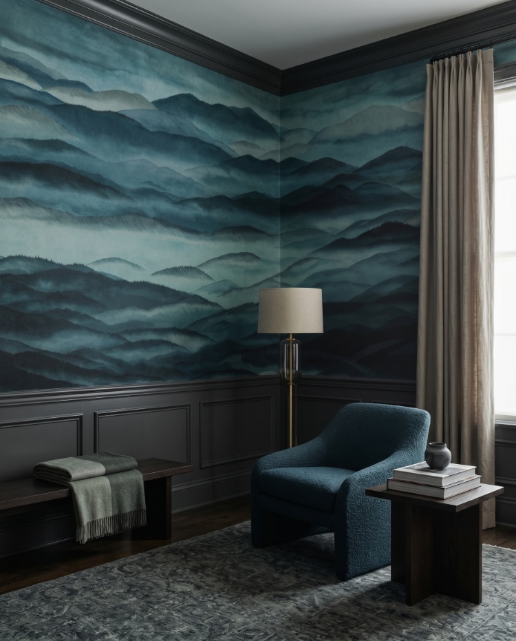
Featured: Roerich Hills, Abstract Mural Wallpaper
From deep blues and rich greens to dramatic blacks and warm earthy tones, dark wallpapers add depth, contrast and atmosphere to any space. Make a confident design statement with our collection of dark wallpaper designs.
Two Rules That Apply Either Way
Whichever direction you go, keep the paler end of the gradient towards the ceiling. A wall that lightens as it rises lifts the eye and adds visual height, while the reverse can make a standard ceiling feel like it's closing in. And before you commit, tape a sample to the wall and look at it three times across a single day: mid-morning, late afternoon, and again at night with your lamps on. Ombre gradients shift more dramatically with changing light than flat colour does, and the evening view is the one most people forget to check.
How to Style Ombre Wallpaper
An ombre wall changes how everything around it reads, so a few decisions matter more than they would with plain paint. These eight tips cover the ones that make the biggest difference.
- Match your other walls to the palest tone, not the mid-tone. Take an offcut to the paint counter and colour-match the lightest band in the gradient. Matching the middle is the most common mistake, and it leaves the room looking like an ombre effect that ran out of steam halfway.
- Keep tall furniture off the ombre wall. A bookcase, wardrobe or high-backed headboard cuts a gradient in half and turns one continuous fade into two disconnected colour blocks. Low-back sofas, platform beds and console tables let the full transition stay visible, so put anything tall on an adjacent wall.
- Light it from the side, not head on. A downlight or spot aimed straight at the wall flattens a gradient into a single flat wash after dark. A floor lamp or table lamp positioned beside the wall rather than in front of it rakes light across the surface and keeps the tonal shift readable at night.
- Pull your accent colour from the deepest band. The pale end of the gradient is already covering a whole wall, so repeating it in cushions and throws adds nothing. Draw accents from the darkest tone instead, and use it in only two places, such as cushions plus one larger piece like a rug or curtains. Beyond two, the room starts to look themed.
- Add texture, because the gradient has none. Printed ombre is perfectly smooth, which is exactly why a room with a glass table and a leather sofa can feel oddly cold beside it. Bouclé, linen, rattan and a wool rug with real pile give the eye something tactile to balance against.
- Hang art on the wall next door. A frame placed across the transition point competes with the fade and usually loses. If you want artwork on the ombre wall itself, position it over the most even stretch of colour, generally the top or bottom third, and keep it to a single piece rather than a gallery arrangement.
- Commit to one metal. Brass and warm gold lift cool gradients in grey and blue, while chrome and black metal sharpen warm ones in terracotta and sand. Mixing both across the same room muddies the effect, so choose based on the gradient's undertone and carry it through lighting, handles and frames.
- Mount curtains high and wide if there's a window. Fix the track at ceiling height and extend it well past the window frame so the curtains stack against the wall rather than across the gradient. Choose a curtain fabric close to the palest tone in the paper, which keeps the interruption as quiet as possible.
Transform Your Home with Made-to-Measure Wallpaper
Explore our full collection of wallpaper designs and get inspired to find the perfect design for your home. Installation services are available in selected countries — just add it at checkout if it’s offered in your area.
At Hello Circus, we believe every wall deserves something special. That’s why all our wallpapers are custom-made to fit your wall’s exact dimensions — no generic rolls, just a perfect fit. Priced by the square metre (Height × Width × Unit Price), you only pay for what you need.
Choose the Right Wallpaper Material
Whether you’re decorating your forever home, updating a rental property, or refreshing a single feature wall, choosing the right wallpaper material can make all the difference. At Hello Circus, every wallpaper design is available in three premium materials, so you can select the option that best suits your space, installation preferences, and lifestyle.
- Non-Woven Matte Wallpaper: Our most popular choice, featuring a smooth, non-reflective finish that creates a beautifully soft look. Durable, breathable, and easy to install using the paste-the-wall method, it’s ideal for most residential interiors.
- Heavy Duty Textured Vinyl Wallpaper: Designed for busy households and commercial spaces, this premium textured finish offers added durability and a luxurious tactile feel. It’s perfect for high-traffic areas where extra resilience is required.
- Peel and Stick Wallpaper: A self-adhesive option that makes decorating quick and convenient. Ideal for renters, DIY enthusiasts, or anyone who prefers a paste-free installation, peel and stick wallpaper allows you to refresh your walls with minimal fuss while enjoying the same beautiful Hello Circus designs.
Whichever material you choose, every wallpaper is custom-made to your wall’s exact dimensions using high-quality printing and vibrant, colour-rich inks, ensuring a beautiful finish that’s made to last.
Curious About the Cost? Try Our Wallpaper Visualiser
- Enter your wall’s width and height for an instant price.
- Preview how your chosen wallpaper will look on your wall — especially helpful for murals, where placement matters.
Still deciding? Order a sample to feel the texture, quality, and finish before you commit.
How to Calculate How Much Wallpaper You Need?
Before purchasing, it’s important to measure your wall accurately to avoid over- or under-ordering. Here’s a simple way to get started:
- Measure the width of the wall from edge to edge.
- Measure the height from floor to ceiling.
- Allow for extra, around 10cm, to account for trimming and pattern matching.
Need help? Read our guide on how to measure your wall for wallpaper or get in touch with us.
Why Choose Hello Circus Wallpaper?
What makes our wallpapers different? Every Hello Circus wallpaper is made to order using premium materials designed to deliver exceptional quality, durability, and beautiful colour reproduction.
- Premium quality: Printed in Europe on durable non-woven paper, our wallpapers are reinforced with nylon fibres to stay smooth, strong, and long-lasting.
- Matte and non-reflective: Our non-woven wallpapers are coated with a soft, non-reflective matte finish that brings warmth and elegance to your space without harsh glare.
- Safe and non-toxic: We use VOC-free inks and PVC-free, breathable paper, so you can create a beautiful home without worrying about harmful chemicals — especially important for little ones.
- Antimicrobial protection: Helps prevent the growth of mould, mildew, and bacteria, keeping your walls cleaner and fresher for longer.
- Wallpaper washability: All our wallpapers are washable, meaning everyday dirt and water stains can be wiped away using a damp cloth or sponge.
- Resistant to colour fading: Designed with colourfast technology to keep your wallpaper vibrant and rich over time.
- Fire resilient: Our wallpapers meet European fire safety standards (EN ISO 11925-2), providing an extra layer of reassurance for your home.
Read more about our wallpaper materials and check out our ultimate guide to wallpapers for answers to the most commonly asked questions.
Let’s Connect
Have a project in mind or interested in partnering with us? We’d love to hear from you.
- Bulk orders
- Corporate orders
- Selling with us
- Collaborations
- Press features
Feel free to get in touch.



